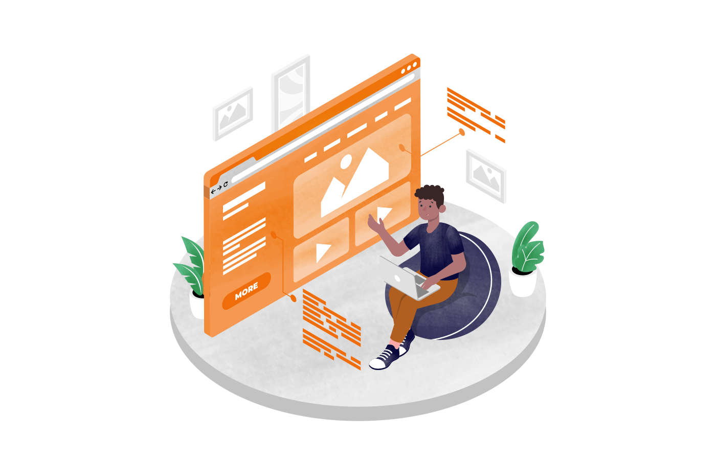

Most people think an ad is what prompts people to buy. But it’s the landing page that convinces visitors to buy.
We’ve seen this play out with countless ecommerce stores — similar products, same offer, but one gets sales, the other doesn’t. The difference? Using more landing pages for improving online shopping experience.
In this blog, we’ll break down 7 types of landing pages for ecommerce that work well. Not just the landing page design, but also the reasons behind their success. What makes the best ecommerce landing pages tick and how can you use them to drive more sales without redesigning your ecommerce website?
Let’s get started.
What is an Ecommerce Landing Page?
An effective ecommerce landing page is a standalone page designed to convert your website visitors into customers. Unlike regular product pages on your ecommerce site, a landing page is built for transactional intent and not for browsing.
- It’s not your homepage, or a blog post;
- It’s not your product listing either.
If you compare landing pages vs product pages, landing page is the page you send paid and organic traffic to when you want people to act. A product page has more detailed information and is shared when you want to make them aware about your offerings.
A good ecommerce landing page doesn’t try to do everything. It does one thing well — encourage visitors to convert. No menus, no noise. Just a focused message, for a targeted audience.
- It’s where you send visitors from your Facebook ad, email, or promotions;
- It cuts the small talk and gets to the offer, directly;
- Think of it as a dedicated page focused on product details and a single goal. No distractions;
- Designed to feel less like a catalog, more like a curated recommendation.
Why Ecommerce Store Needs Dedicated Landing Pages?
Sending people to your homepage is like handing them a full catalog when they ask for a single product. Too many options. No direction. Most will bounce.
That’s why store owners build landing pages. When you customize landing pages to shopper’s intent, it removes the noise and pushes the user toward one clear action.
Here are some reasons why your online store needs a landing page:
- Boost conversion rates. When the message matches the intent, people convert. A landing page focuses on one product or offer, not everything you sell. That clarity helps turn browsers into buyers—without making them work for it;
- Improve customer experience. Nobody likes clicking an ad and landing on something unrelated. A smart ecommerce landing page design fixes that—they feel consistent, clear, and purpose-built. Fewer clicks, less confusion, and a smoother shopping experience;
- Support targeted marketing campaigns. If you’re running Meta or Google ad campaigns or social media promotions, you need targeted landing pages for the specific campaign and audience. It’s the first page a visitor sees and makes the offer feel like a personal recommendation;
- Simplify the customer journey. Think of a landing page as a fast lane to conversion. It removes extra steps between ‘I’m interested’ and ‘I bought it.’ to funnel visitors and reduce drop-offs.
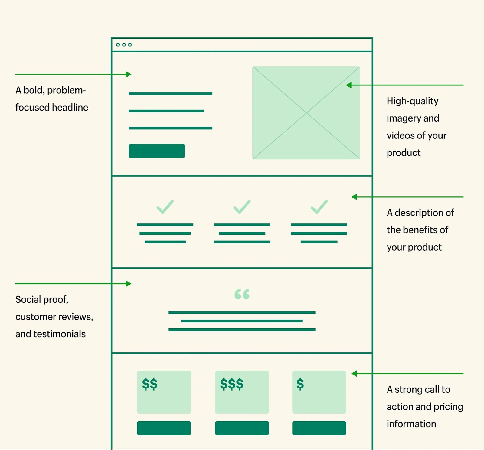
Essential Elements of Ecommerce Landing Pages
A landing page doesn’t need to be flashy. It just needs to grab attention, build trust, and drive action—fast. The best ecommerce landing page templates have several elements to keep visitors engaged.
Here’s what great ecommerce landing pages get right:
- Clear and compelling headlines. Make it obvious what you’re offering and why it matters—within the first 3 seconds;
- Engaging visuals and product imagery. Use high-quality images or videos that highlight key features, context, and quality. No grainy product shots;
- Persuasive copy and product descriptions. Keep it crisp. Focus on benefits, not jargon. Think ‘What’s in it for me?’ from a shopper’s lens;
- Strong CTA. Make your ask bold and visible. ‘Add to cart,’ ‘Try free,’ or ‘Claim offer’—tell them what to do next;
- Add trust signals (customer testimonials, badges, reviews). Social proof makes or breaks trust. Show video testimonials, reviews, ratings, or a guarantee to remove hesitation;
- Optimize for mobile and user experience. Most organic and paid traffic is mobile-first. So, pick a responsive landing page design that loads fast, and is scroll-friendly;
- Simplified checkout or lead capture forms. Fewer fields, fewer drop-offs. Keep it minimal so user lands and doesn’t bounce halfway through.
7 Ecommerce Landing Pages Examples: What Works and Why
Now that we’ve covered the essentials, let’s look at ecommerce landing page examples that work really well for store conversions.
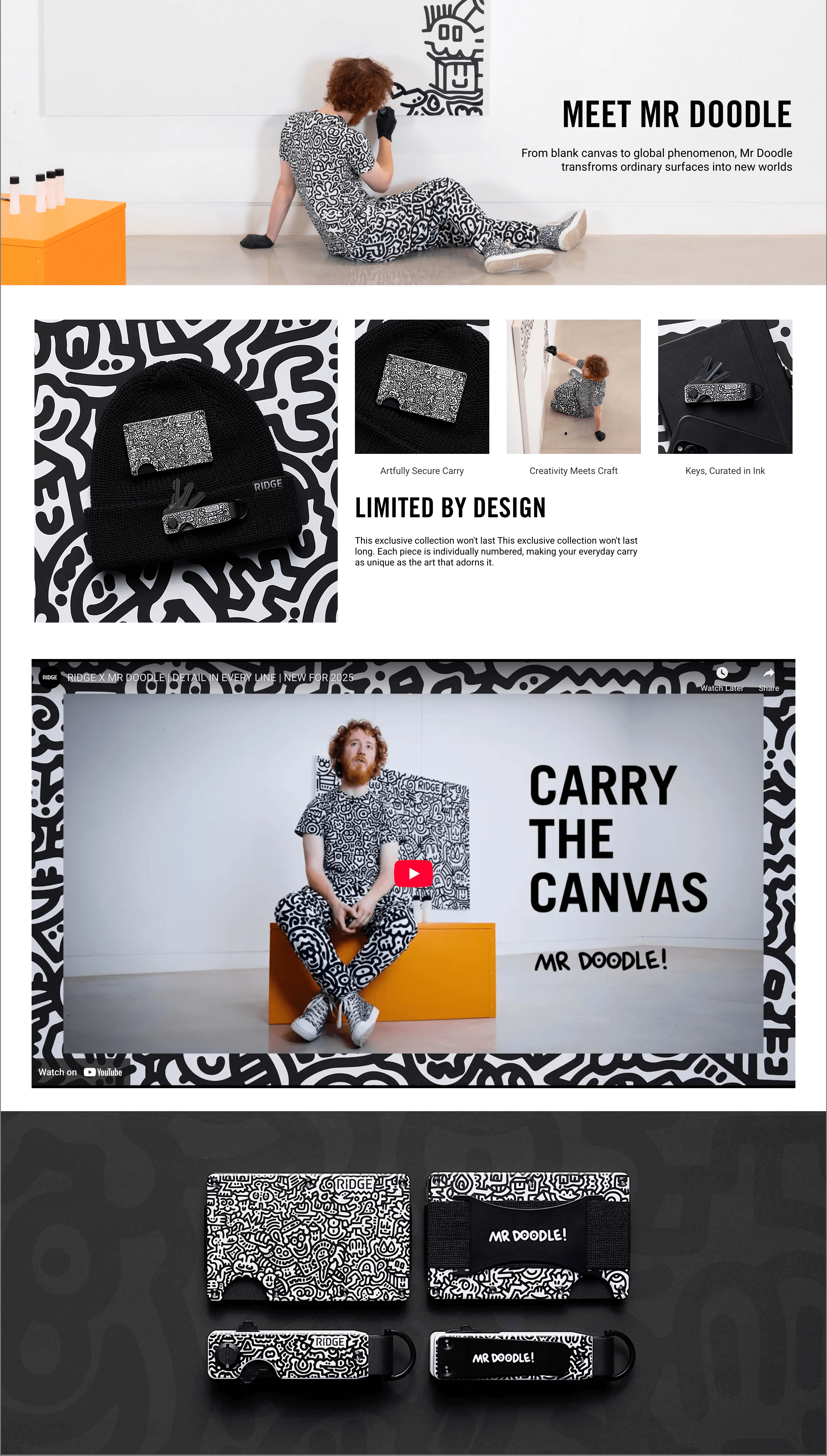
Single-Product Landing Page
- Type. Single product sales landing page;
- Brand. Ridge;
- Page purpose. Promote the Daily Driver Kit (wallet + accessories).
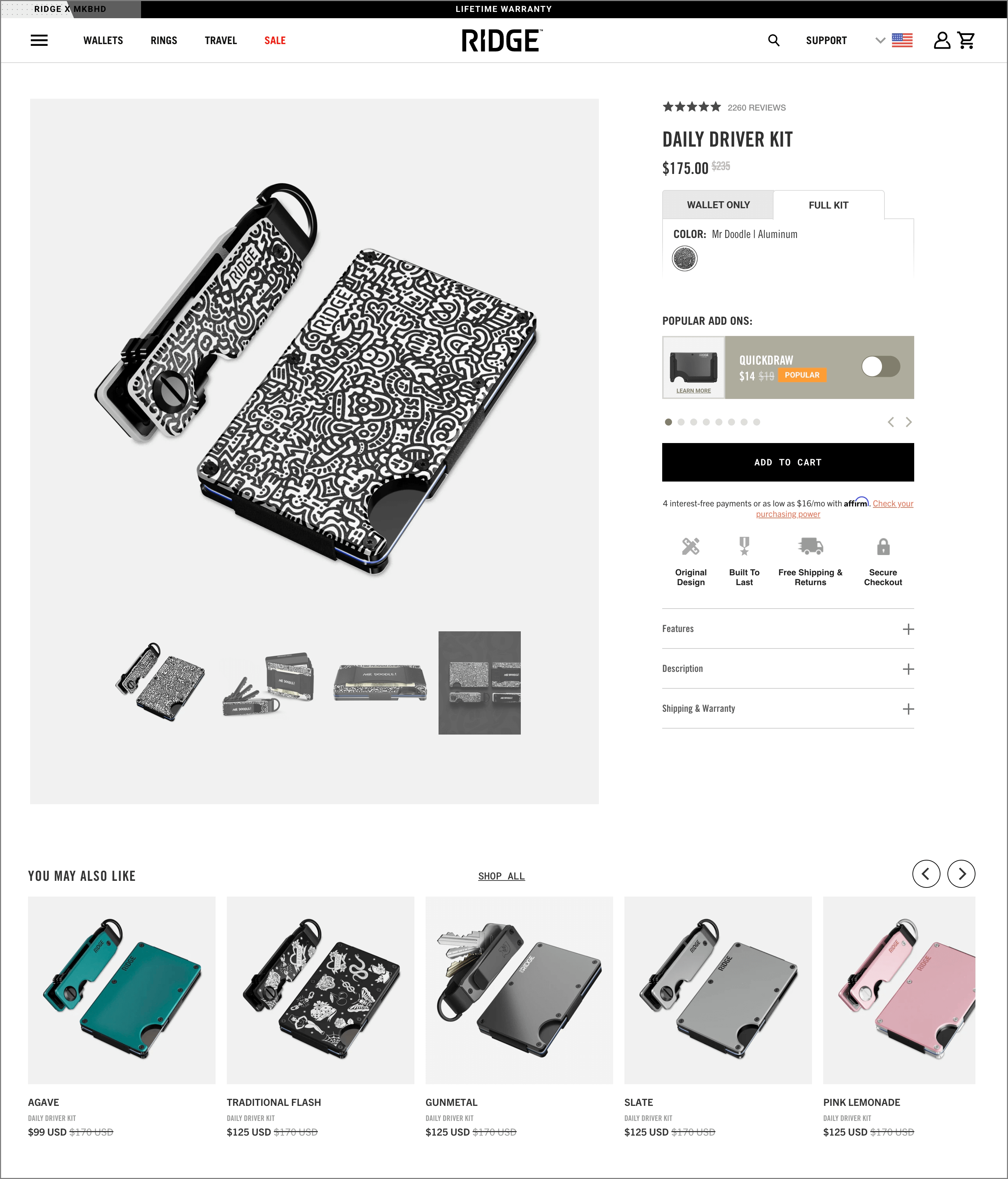
This landing page is a masterclass in focused ecommerce UX. The high-contrast, zoomed-in product image dominates the screen, offering a tactile sense of texture, finish, and design. There’s no fluff — just product, price, variations, and key selling points, all above the fold.
What’s smart here is how they’ve bundled the product as a “kit” (vs. just a wallet). This immediately increases perceived value. You’re not buying just a wallet—you’re buying the complete everyday carry experience.
The toggle between “Wallet Only” and “Full Kit” further personalizes the offer, while the “Popular Add-Ons” section slides in seamlessly—upselling without interrupting the buying flow.
Why it works?
- Zoomed-in product imagery is great for a product like a wallet;
- Price anchoring makes the $175 feel like a steal vs. the original $225;
- Modular bundle option increases average order value without a hard upsell;
Seasonal or Promotional Landing Page
- Type. Promotional page;
- Brand. Gymshark;
- Page purpose. Promote a holiday gifting campaign with curated product bundles.
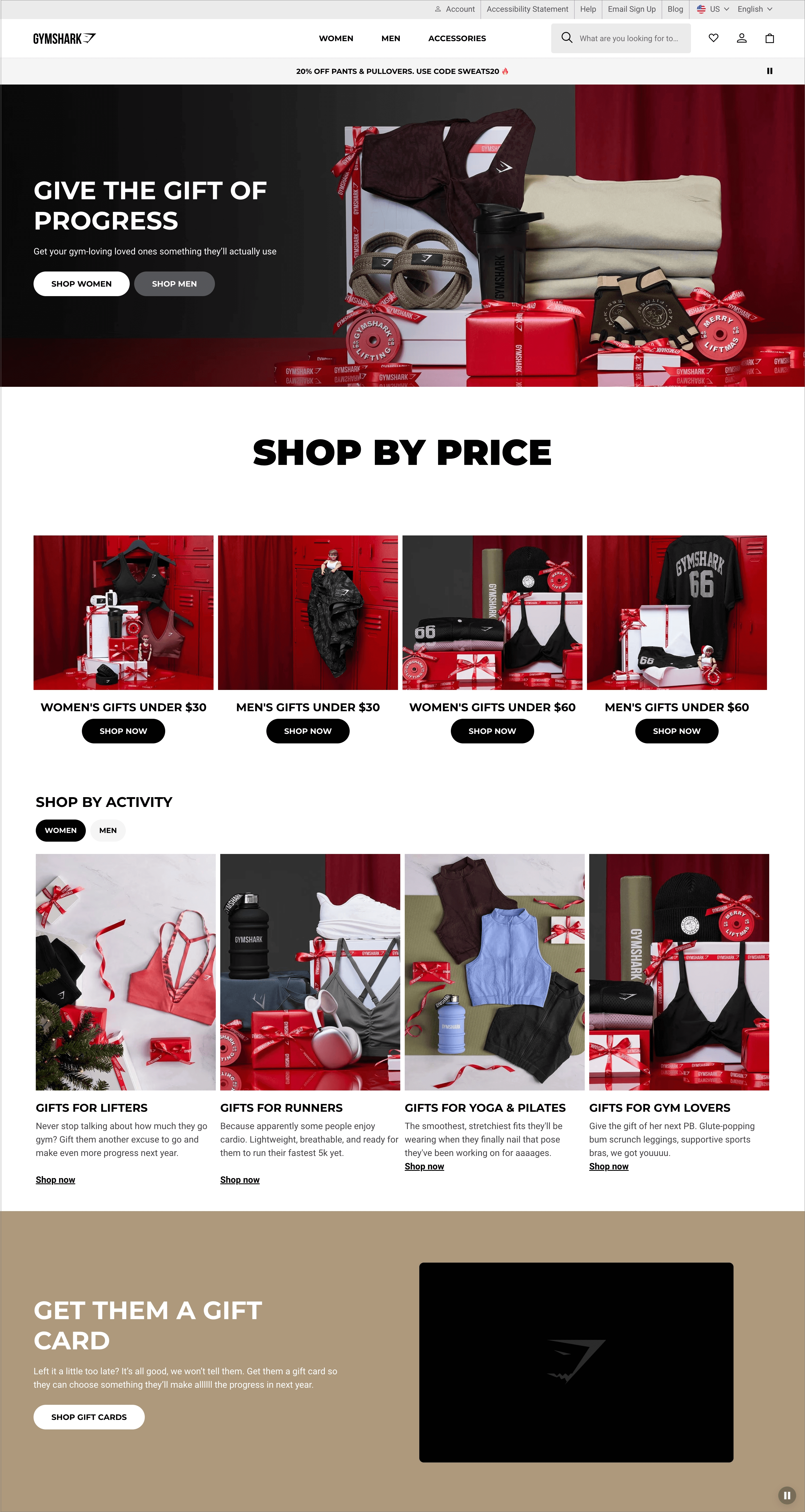
Gymshark’s ‘Gift of Progress’ campaign goes beyond basic discount codes and offers. It reframes gifting around fitness goals.
The product flat-lays are beautifully styled, showing bundles in a way that feels premium but attainable. By splitting the CTA (‘Shop Women’ and ‘Shop Men’), they simplify the decision-making process while making the options feel personalized.
What stands out most is how effortless the offer feels. There’s no pop-up overload, no aggressive countdown timer, just a thoughtful layout, strong branding, and crystal-clear messaging.
Why it works?
- Emotion-first headline ties gifting to self-improvement, not just products;
- Bundled visual layout shows exactly what you’re gifting;
- Split CTA design helps potential customers filter choices based on the recipient.
Category-Focused Landing Page
- Type. Category landing page;
- Brand. Medik8;
- Page purpose. Promote the brand’s peptide range as a unified skincare solution.
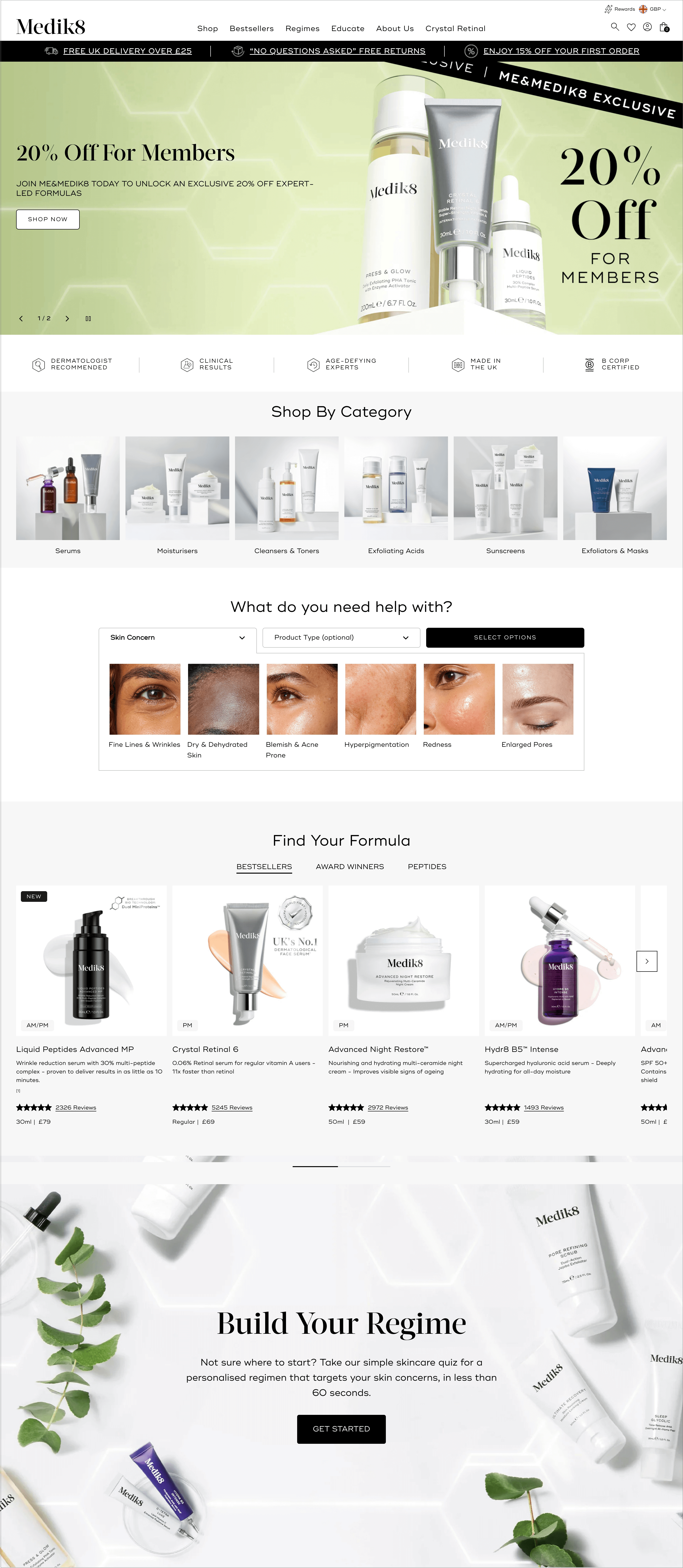
This is how you turn a product category into an experience. It tells a cohesive brand story around potent skincare. The muted palette, high-resolution photos, and clean layout make the products feel premium.
Every element on this page whispers “science meets luxury,” and that’s exactly the positioning skincare buyers are drawn to.
Instead of cluttering the whole page with jargon or technical overload, they lead with benefits, which appeal directly to outcome-driven shoppers. The top black bar with offers (easy returns, extra discounts) acts as a subtle nudge, pushing shoppers to try the brand.
Why it works?
- Minimalist layout keeps the focus on product benefits and visual hierarchy;
- Targeted copywriting speaks in benefits, not ingredients, ideal for moody buyers;
- Studio-style product showcases reinforce luxury and quality perception.
Subscription Product Landing Page
- Type. Subscription product page;
- Brand. Genius Litter;
- Page Purpose. Promote recurring subscriptions for health-monitoring cat litter.
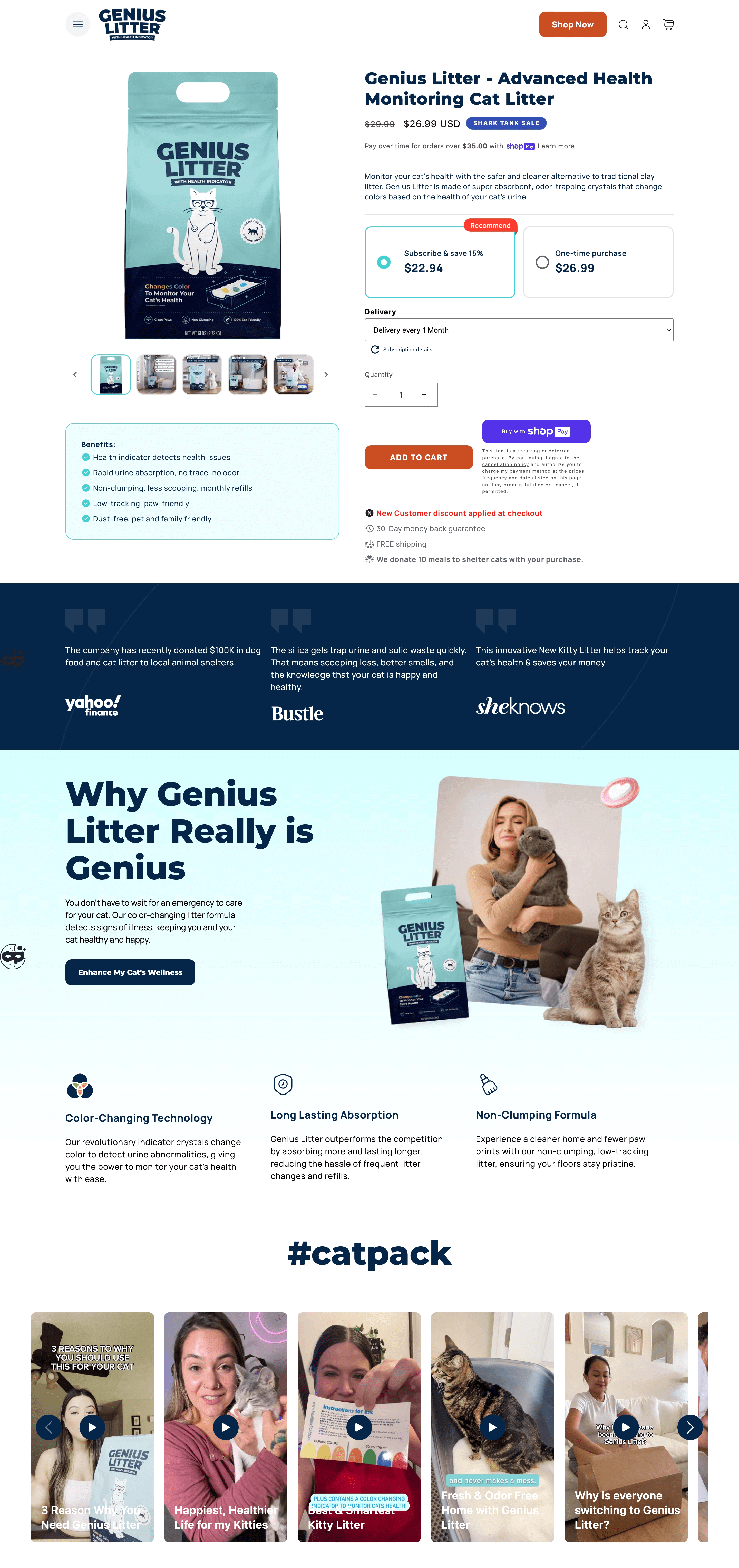
This landing page nails a tricky product category and makes it feel essential and convenient for a pet parent. What stands out instantly is the strong product USP: ‘Changes Color To Monitor Your Cat’s Health.’
It’s positioned not as litter, but as a wellness product for your pet. That alone reframes the buying mindset—from routine necessity to proactive care.
They use tiered pricing smartly to push the subscription box model. The recommended plan isn’t hidden. It’s highlighted with a bold CTA and a clear ‘Subscribe & Save 15%’ pitch. Plus, the price difference ($22.94 vs $26.99) is just enough to make you choose the recurring model, without feeling pressured.
The simplicity of the layout with big visuals, short copy, and clean toggle, makes the decision frictionless.
Why it works?
- Unique value proposition turns a boring product into a health product for pets;
- Subscription vs. one-time toggle makes recurring purchase decision feel logical and rewarding;
- Anchored pricing shows savings clearly without cluttering the offer.
Lead-Generation Landing Page
- Type. Interactive lead gen quiz page;
- Brand. LIV Watches;
- Page purpose. Capture leads through an interactive quiz for product recommendations.
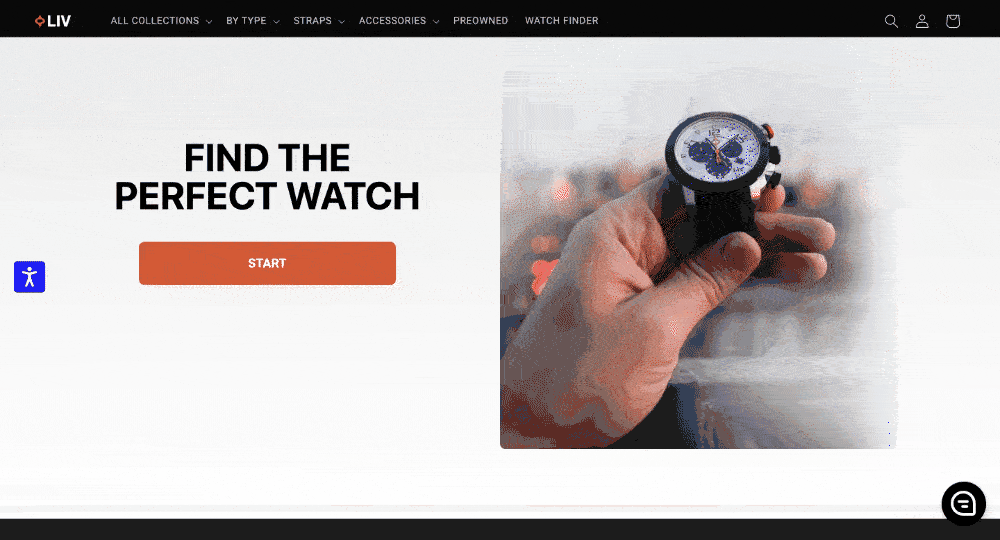
This landing page is a smart shift from the usual lead gen tactics. Instead, the brand uses curiosity and a personalization pitch to earn a signup.
The ‘Find the Perfect Watch’ headline sets a clear promise, while the bold “Start” CTA adds a gamified energy to the experience. It feels more like a fun tool than a sales funnel.
The quiz itself is intuitive, walking users through wrist sizes, style preferences, materials, and use cases. Each step pulls the shopper deeper into the funnel without feeling pushy.
The genius moment comes at the end: ‘We’ve got your match. Where should we send it?’ That flip of the script, from ‘Give us your email’ to ‘Get your personalized result’, is what makes this so effective.
Why it works?
- Interactive quiz format boosts engagement and holds visitor’s attention till the end;
- Makes the users feel like the product recommendation is tailored to their preferences;
- Email capture feels earned, not forced and adds value before the ask.
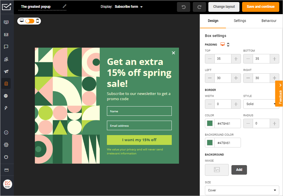
Effortless lead generation starts here. Use Sender’s drag-and-drop builder and ready-made popups to turn visitors into subscribers — no sweat.
Upsell & Cross-Sell Landing Page
- Type. Cross-sell landing page;
- Brand. True Classic;
- Page purpose. Post-purchase offer to upsell a discounted Mystery Boxers 3-Pack.
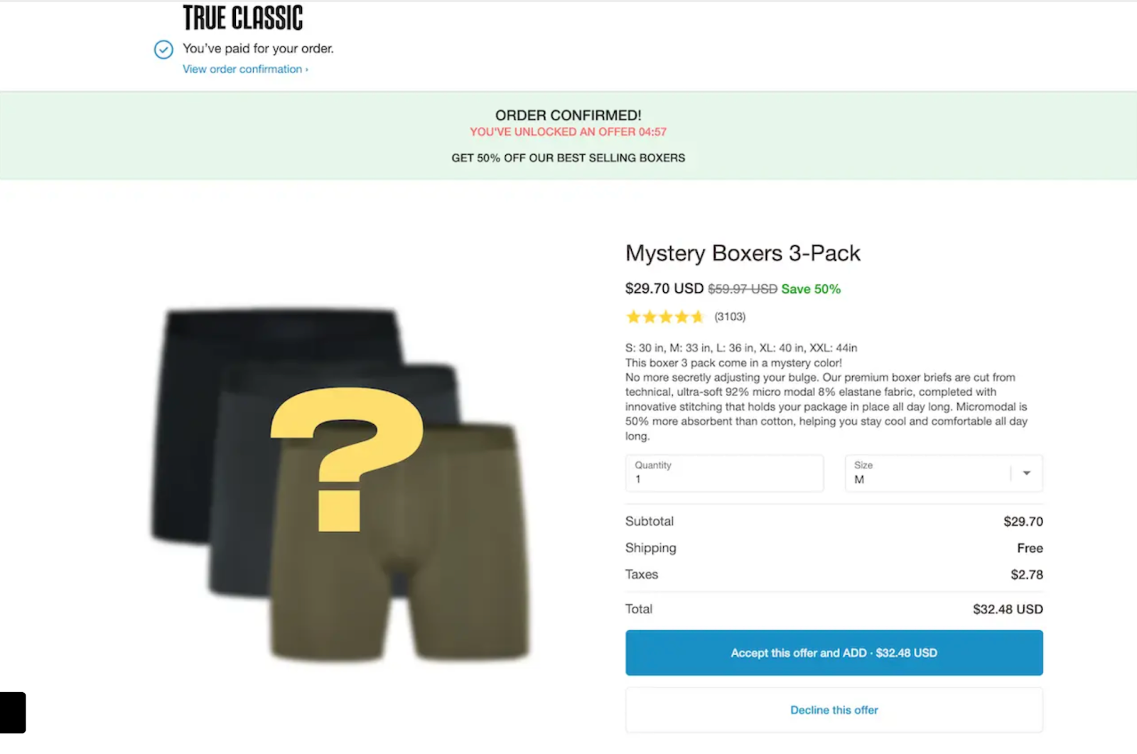
This is one of the cleanest examples of a post-purchase upsell done right. The existing customer’s order is confirmed, trust is already built, and the wallet is already open. That’s when they witness a limited-time offer they didn’t see coming. It’s framed like a reward, not a pitch.
The offer sits right on the thank you screen, with a countdown and a message: ‘You’ve unlocked an offer.’
The copy is casual, benefit-rich, and gives just enough mystery with the ‘mystery color’ angle. That adds novelty and curiosity. The massive discount (50% off) and the “Accept this offer” button in bold blue makes the next action a no-brainer.
This page doesn’t interrupt the journey. It extends it. And that’s exactly what smart ecommerce brands do with post-purchase upsells and cross-sell offers.
Why it works?
- The banner copy, right below the confirmation, makes the offer feel like a gift, not a cross-sell;
- Countdown timer creates urgency without being aggressive;
- One-click CTA means zero friction to buy.
Health and Fitness
- Type. Product showcase page;
- Brand. lemme;
- Page purpose. Drive interest in the brand’s metabolic health supplement.
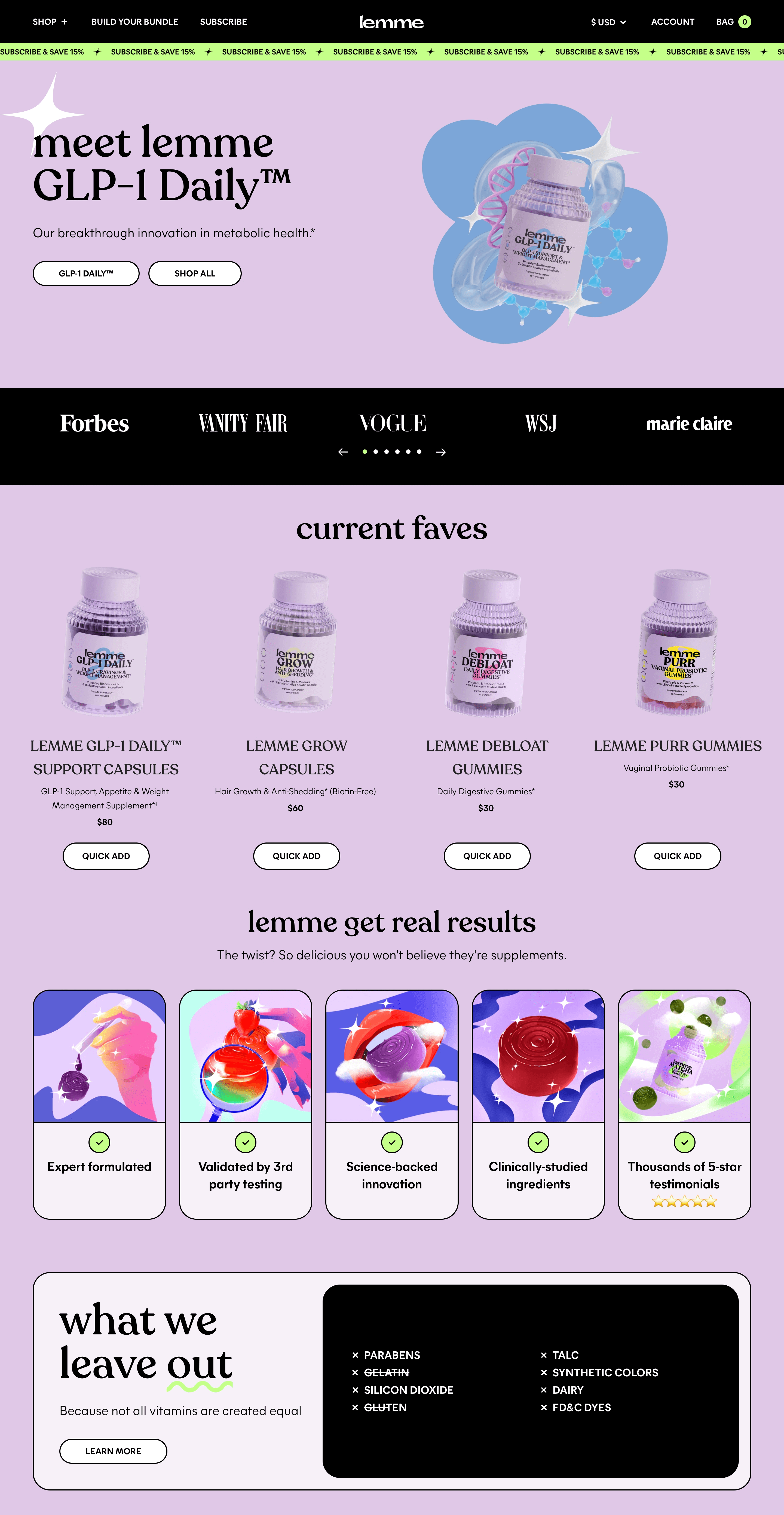
This landing page feels like a wellness brand that gets its audience. From the playful, pastel aesthetic to the simple headline, ‘meet lemmé GLP-1 Daily’, the page leads with personality and curiosity instead of preachy science.
The brand doesn’t lean on before-after photos or fear-mongering language, which you’ll see on many landing pages in this industry. It creates a clean, hype-free space that feels modern, safe, and product-first. And that’s rare in health ecommerce.
And that works. Why? Because health buyers today want to feel empowered, not overwhelmed.
What’s also smart is how the brand immediately places two CTAs. One is for focused buyers, the other for browsers. No pressure, just choice. The green ‘Subscribe & Save 15%’ banner up top is introducing visitors to the idea of a recurring order, planting the idea without getting in the way of the visual experience.
Why it works?
- Aesthetic-first layout makes the product feel relatable and vibe-driven;
- Simple, benefit-focused messaging prevents overwhelm;
- Clear product focus with soft CTA pairings guides both intent-led and casual users.
Also read:
- How to Create a Landing Page That Converts
- 12 High Converting Landing Pages Examples & How to Build One
- 35+ Landing Page Statistics with Industry Benchmarks