


You pour your heart and soul into crafting the perfect product, only to hear crickets when you finally unveil it. Your landing page gets website visitors, sure, but it’s not turning those visitors into paying customers. Frustrating, right?
Let’s face it, a dull landing page can be a dream killer. Maybe it’s missing that “wow” factor, or perhaps it lacks the psychological hooks to reel people in. Either way, it’s a letdown.
But don’t lose hope! We’ve analyzed many landing pages and handpicked a few to spark your creativity and set you on the right path. Ready to level up? Let’s start.
What is a Landing Page?
Think of a landing page as your sales pitch in digital form. Its sole mission? To generate leads or convert visitors into buyers.
While other pages are a mix of information, pictures, and navigation links, a landing page streamlines the user experience, focusing everything on a single offer and a direct call-to-action (CTA).
So, what’s the magic formula? Capture their attention, hit them with a message they can’t ignore, and then make it irresistibly easy for them to take the next step—be it making a purchase, signing up for a newsletter, or filling out a form on the spot.
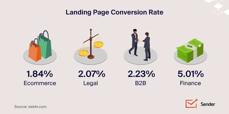
Also read: 35+ Landing Page Statistics with Industry Benchmarks
20 High-Converting Landing Page Examples
Searching for some creative landing page ideas or examples of the best landing pages? Let’s look at some of the best landing samples to inspire you to create your own. Here are the top landing pages with great conversion rates:
Sender – Email Marketing Landing Page Example
Sender is a robust marketing automation solution that can handle all your email and SMS marketing needs. Its landing page for email automation portrays the benefits and proposition, compelling users to sign up for a free plan.
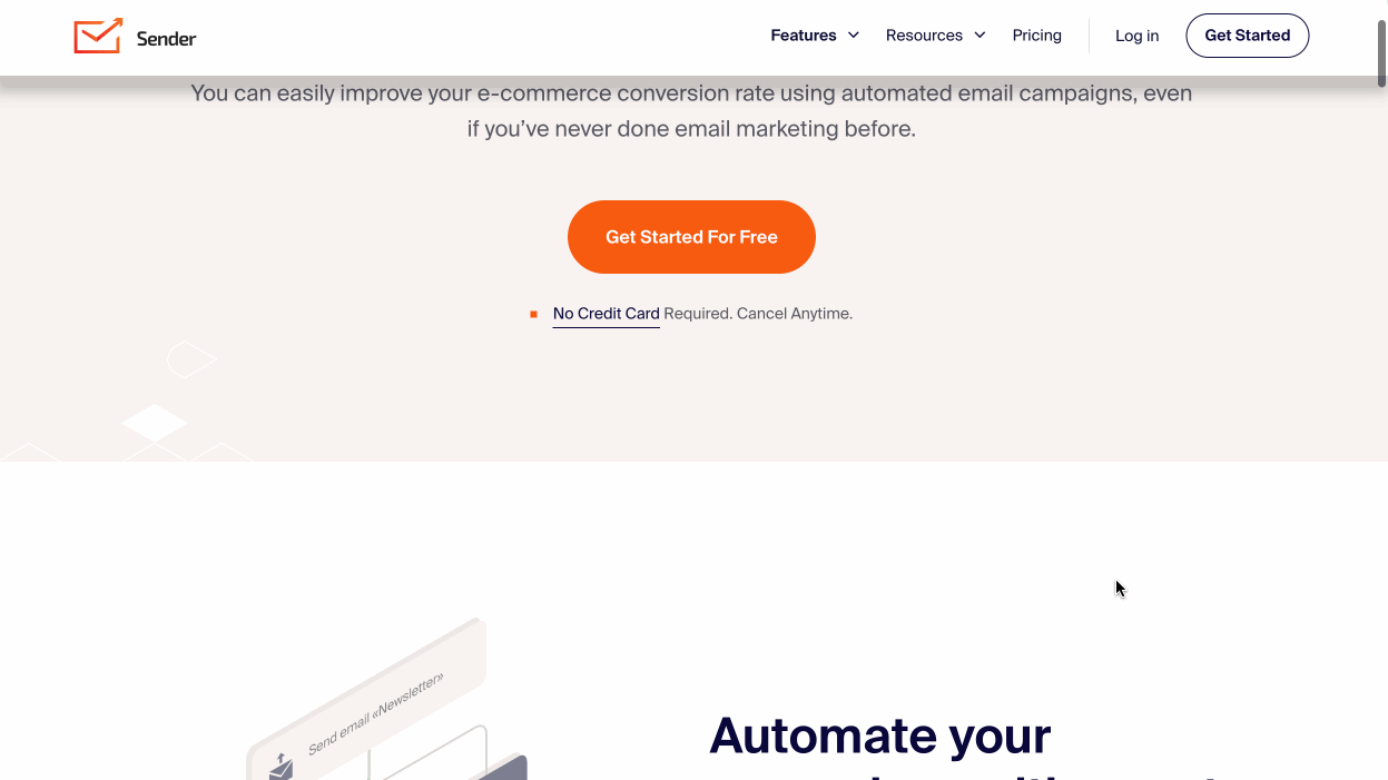
The benefits-oriented headline and subheadline directly appeal to their target audience. The contrasting CTA button is a click magnet. Multiple sections highlighting the features and benefits and detailed FAQs help users decide faster to sign up for the service.
Why it works?
- Clean design: Simple and eye-catchy web design;
- Crisp sections: Dedicated section for benefits and features;
- Standout CTA: Contrasting CTA button that pops out.
If Sender’s landing page worked its magic on you — check out the tool yourself.
Leadpages – High Converting Landing Page
Leadpages help startups improve conversions through high-impact landing page examples and templates. So, having high-converting landing pages on their own website is a must. Have a look at their landing page promoting their free trial offer:
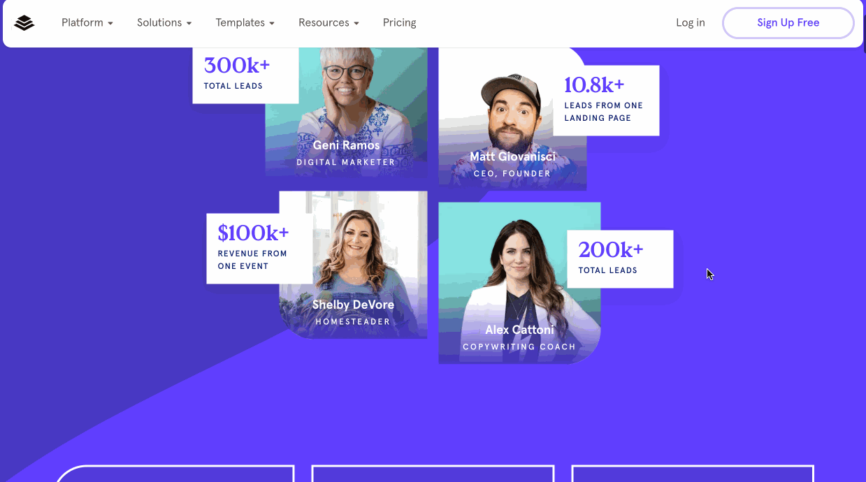
They’ve added images of users who had real impact after using Leadpages on the hero section, making a convincing case in favour of the tool. The data-led approach is evident throughout the page copy, and there are ample testimonials in every section.
Why it works?
- Relevant testimonials: Social proof throughout the landing page;
- Data-driven copy: Use of data for refined positioning;
- Useful sections: Valuable page sections to help make decision faster.
Magicspoon – Great Example of Vibrant Landing Page
Magicspoon has a beautiful landing page, with lots of colors and aesthetic elements. It targets potential customers through a mix of illustrative product images, strong social proof, and interactive choices. Have a look:
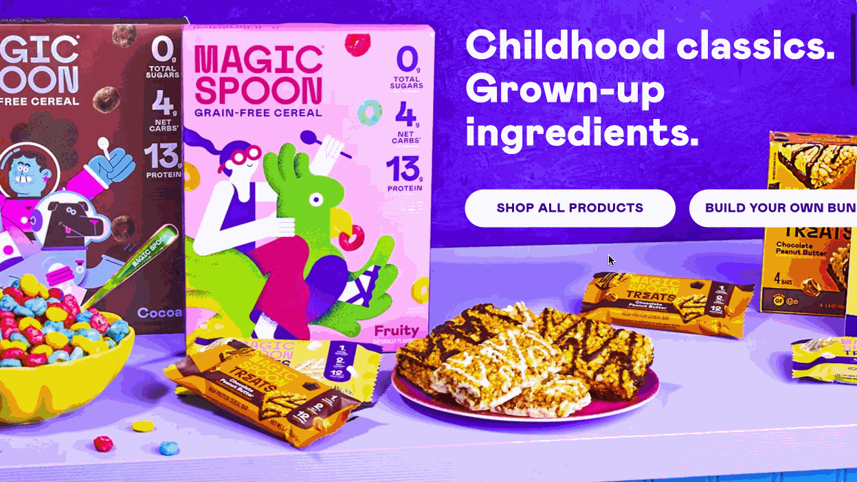
The copy on the page invokes strong nostalgia. Use of PR clips from large publications increases credibility of a brand, which is essential in a competitive industry like cereal.
They’ve used several hand-drawn elements along with a section on different flavor options that keeps the visitor engaged. Use of testimonials from credible people further enhances the brand image.
Why it works?
- On-brand Aesthetics: Design in line with the product packaging & brand guidelines;
- Social Proof: PR bylines and real testimonials from experts increase credibility;
- Strong CTA: Try now is a great way to pull users further into the buyers journey.
Clickfunnels – All-in-One Sales Funnel Landing Page Example
Clickfunnels is a popular funnel builder that has a visually appealing landing page for their tool. Take a look at their landing page:
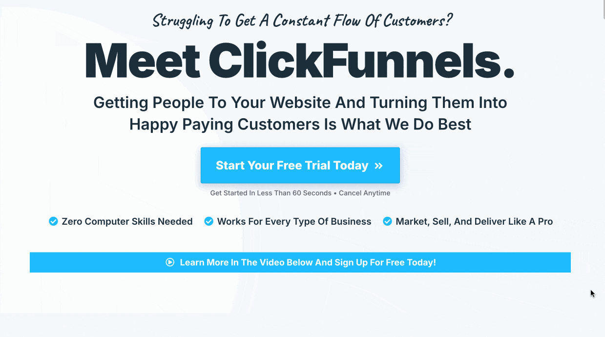
The problem-driven headline followed by a video is eye-catching. There’s ample proof on the page, from reviews to images of famous entrepreneurs in each section. The way they’ve presented the tool as an alternative/replacement to other digital tools is useful for the visitor.
Why it works?
- Video header: Use of engaging video in hero section;
- Problem-centric copy: Content addressing the core problems of audience;
- Social proof: Relevant social proof to make decision easier.
Netflix – Personalized Landing Page Example
Netflix has an interesting take on personalizing the landing pages for existing users. For logged-in users, the homepage transforms into a personalized experience, different from other landing pages for general visitors. Have a look:
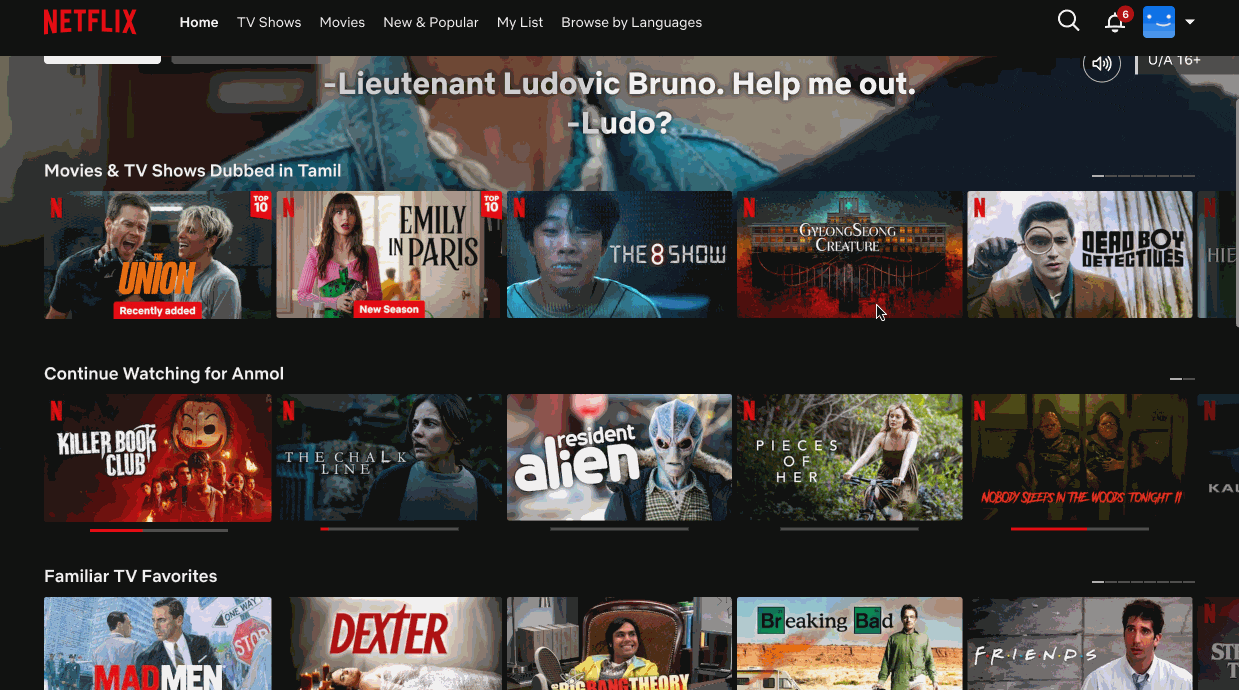
Content recommendations on the page are based on individual viewing history and preferences. A personalized homepage typically features rows of recommended shows and movies categorized by genres, trending content, and “Because you watched” sections.
This level of customization not only enhances user engagement but also significantly increases the time spent on the platform, as users are more likely to find content that appeals to their tastes quickly.
Why it works?
- Personalized experience: Utilized user data for personalized content;
- Relevant flow: Contextual copy & design based on user interactions;
- Simple layout: Use a structured layout on the landing page.
Unbounce – Conversion-optimized Template Landing Page
Unbounce’s landing page showcases its conversion optimization platform. It highlights key features like AI-powered page creation and testing. The structure emphasizes benefits, showcasing templates, and integration capabilities.
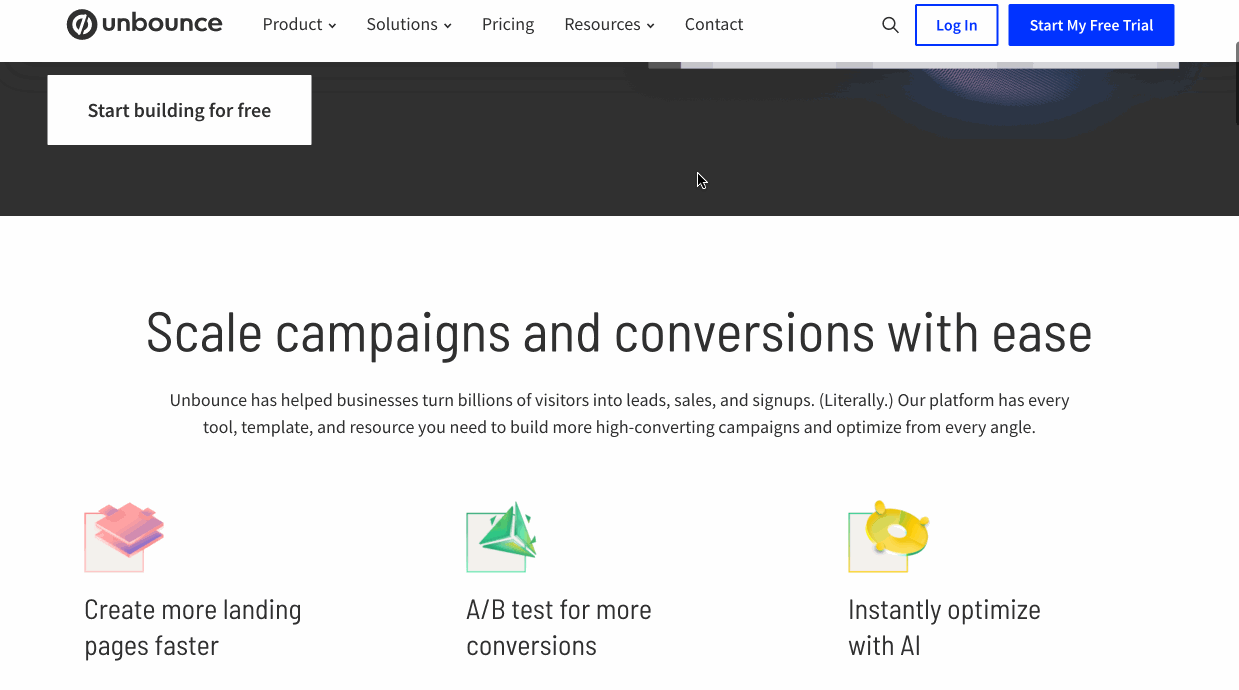
Long landing pages like this one use social proof and value propositions effectively. It features customer testimonials and specific conversion improvement claims. The layout guides visitors through product features and use cases. A clear call to action encourages visitors to sign up for free trials or demos.
Why it works?
- Highlighted benefits: Prominent placement of benefits and features;
- Use of social proof: To build credibility and trust;
- Relevant CTAs: Offer clear paths to conversion (trial/demo).
Also read: 15 Must-See Product Landing Page Examples
VWO – A/B Testing Landing Page Example
A/B testing involves experimenting with landing page elements and finding a winning landing page combination. VWO uses a focused landing page on an ‘alternative to’ keyword to A/ B test the effectiveness. Have a look:
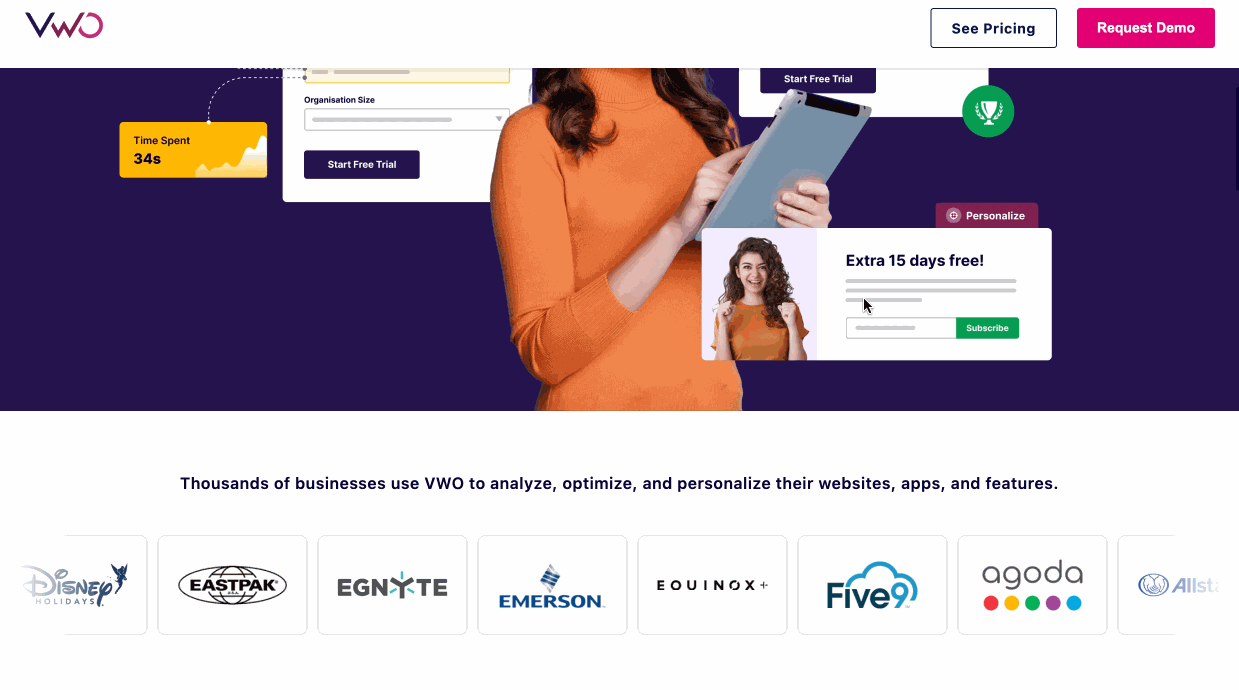
The landing page is in a comparison format, comparing the tool to one of the popular alternatives, Optimizely. They’ve highlighted all the advantages over the competitor throughout the page. The use of graphs, tables, and tabbed sections has highlighted the value in picking the solution over another tool.
They’ve also added customer testimonials and case studies to show value. Interactive elements allow visitors to explore detailed feature comparisons, and making an informed decision.
Why it works?
- Experimental layout: Different elements that are unique to a landing page flow;
- Use of real numbers: Performance metrics with visual elements;
- Data-driven copy: Use of tables and graphs to showcase data and benefits.
Mixpanel – Analytics-driven Landing Page Example
Analytics can help you build a landing page based on your customers’ interests. Mixpanel, a product analytics platform, has used the same approach to create its landing page. Here’s what it looks like:
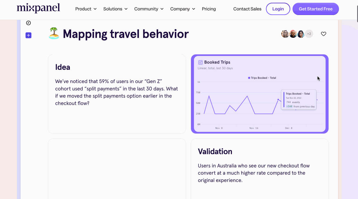
From the looks of it, it appears they know what their audience needs — a clear understanding of how the product works. There are ample examples to demonstrate the workflow and use of interactive elements help understand the product’s capabilities quickly.
The layout guides visitors through the product benefits & use cases logically. The design is clean, making complex analytics concepts easily understandable.
Why it works?
- Real examples: Use of practical examples to illustrate the process;
- Intuitive design: Visual elements making the entire page intuitive;
- Impact-driven: Demonstrates a clear path from product to impact.
Patreon – Creator-focused Landing Page Example
Patreon’s creator page Patreon’s landing page for creators showcases how the platform can help content creators monetize their work. Here’s how it looks:
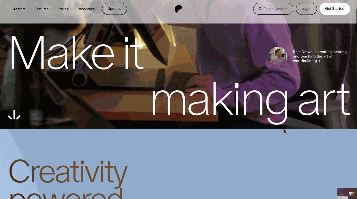
The landing page is designed like a cinematic experience with large image sections highlighting creator success stories. The page emphasizes on direct creator-fan connections without an intermediary. Interactive elements highlight different creator-focused benefits.
There are enough examples and testimonials throughout the page to showcase credibility and boost trust.
Why it works?
- Real stories: Showcase of several success stories;
- Benefit-driven copy: Highlights of direct benefits clearly;
- Story-driven layout: Use of a visually appealing layout that tells a story.
Teachable – Course Creator Landing Page Example
Teachable is a popular platform that helps people launch their own courses. It’s a SaaS solution, but its landing page has lots of good things for a course creator to learn. Have a look:
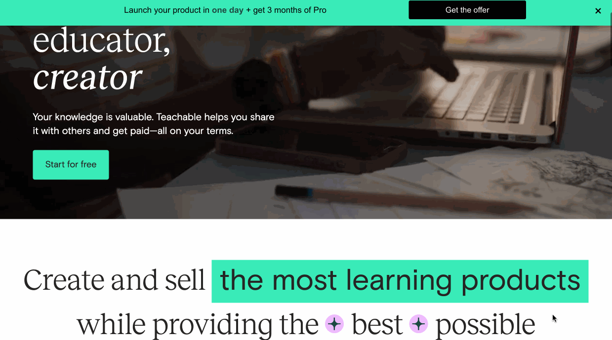
The landing page highlights key features through distinct and structured sections. The layout guides visitors through the course creation process, and visual elements illustrate different course types and creator benefits.
Interactive elements allow easy exploration of creator-specific features. The design also uses customer testimonials to build credibility.
Why it works?
- Scannable layout: Clearly outlined course benefits and structure;
- Credible: Use of social proof like reviews and testimonials;
- Benefit-driven copy: Emphasis on ease of starting and scaling.
Stripe – Visually Appealing Landing Page Example
Stripe’s homepage is known for its clean, modern design, subtle animations, and color scheme that aligns with its brand. Have a look below:
The landing page uses a clean, modern design with subtle animations. It features a hero image with actual screenshots of the tool dashboard. The layout has ample white space and visual cues to guide visitors. Clear call-to-action buttons stand out against the overall design.
Why it works?
- Interesting header: Use of dynamic visuals in the hero section;
- Clean layout: Balance text and images for easy scanning;
- Interactive elements: Use of interactive animations to showcase features.
CXL – Webinar Registration Landing Page Example
CXL hosts regular webinars around common marketing tactics. It hosts dedicated webinar landing pages for each webinar it hosts. Have a look at one of its landing pages about a free webinar about brand storytelling:
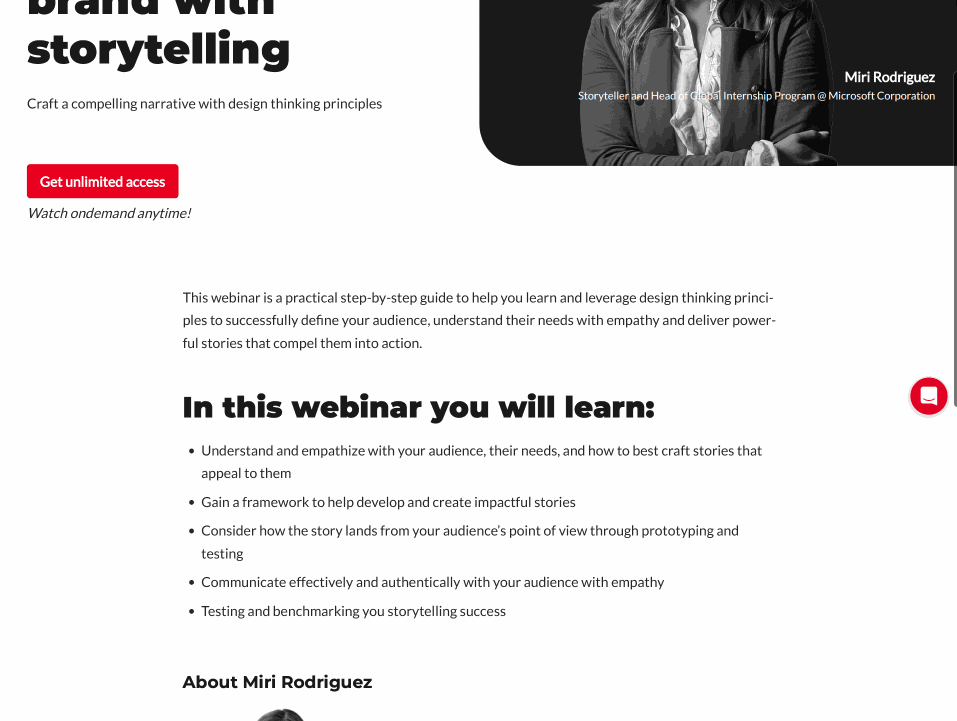
It clearly displays the webinar title and presenter information upfront. It provides a detailed speaker bio to build credibility. The layout also presents key learning points in a bulleted list. Further, the page also emphasizes the webinar’s on-demand availability prominently.
The registration form is simple and easily accessible. Clear calls-to-action encourage immediate sign-up for the webinar.
Why it works?
- Easily scannable: Key learning points in a bulleted list;
- Detailed info: Insightful speaker information for credibility;
- Clear CTAs: Multiple call to action buttons for instant action;
Charity: water – Non-Profitable Landing Page
Building an effective landing page for a not-for-profit is a different ballgame than B2B or ecommerce stores. The focus shifts to mission and impact. Here’s an example of attractive landing page design that can be used by not-for-profit organizations:
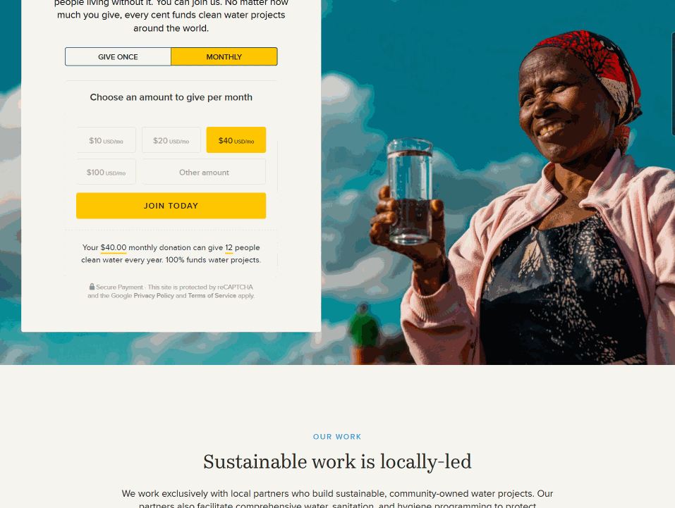
The landing page communicates the mission, shows the impact of donations, and provides clear ways to get involved. It effectively uses impactful statistics to highlight the cause and a clean layout to guide visitors.
The design clearly balances emotional appeal with factual information. Clear CTAs about the donation options are prominently displayed throughout the page.
Why it works?
- Relevant media: Use of impactful images and statistics to highlight the cause;
- Choice for visitors: Multiple donation options on the page;
- Balanced copy: Balance emotional appeal with factual information.
Shopify – Good Landing Page Example
Shopify is famous for creating engaging and high-converting landing pages; this list wouldn’t be complete without their mention. Shopify Plus’ web page is one of the best professional landing page examples in recent times:
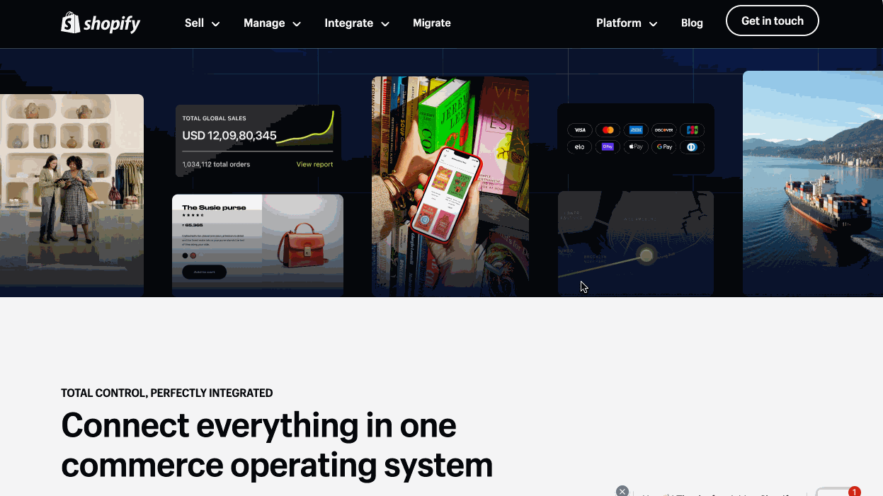
Shopify Plus is an enterprise product targeted at large ecommerce store owners and big businesses. The copy, and positioning depict how Shopify is not just for ‘DIY’ and bootstrapped businesses, but for scalability, too.
The customer logos, compelling real-world results & numbers, and strategic CTAs work well to grab attention and book a call with the sales team.
Why it works?
- Interactive GIFs: GIFs on the page showing platform utility;
- Add numbers: Use of statistics highlighting product effectiveness;
- Real reviews: Mention of success stories and case studies.
Search Engine Journal – Free PDF Landing Page Example
Search Engine Journal is an authority in the SEO space. It periodically publishes free reports and guides on SEO. Most of their own landing pages are hosted on a separate section of the website. Its page is one of the great landing page examples of the ‘Keep it Simple, Stupid’ principle.
Effective landing page templates use minimal design with relevant information to compel users to share their email, like above. Used as a lead magnet page, it mentions what a prospect can learn by downloading the guide.
Why it works?
- Minimal design: Straightforward landing page design;
- Simple form: Opt-in form with minimum fields;
- Crisp copy: Benefits-driven copy that directly appeals to visitors.
Airbnb – Website Landing Page Example
Airbnb has some cool landing pages throughout its website, but the one worth mentioning is its pages for hosts to list their homes on Airbnb.
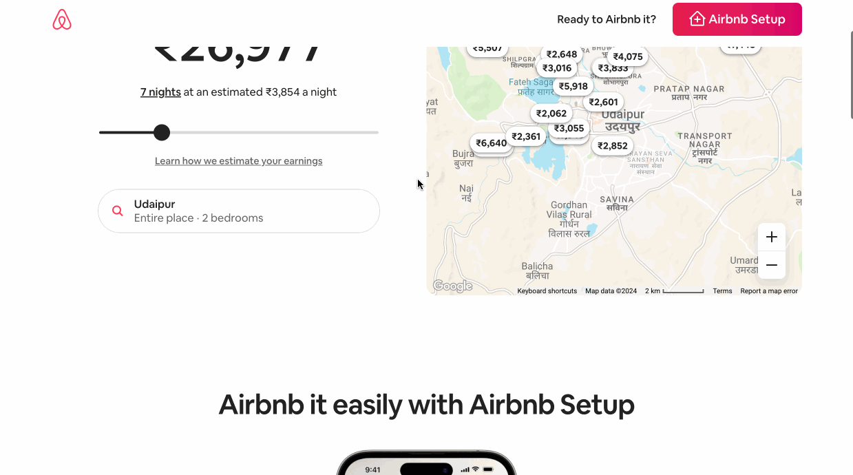
The large interactive calculator above the folder instantly grabs the attention and invokes FOMO — among hosts about the potential income they can earn when they host on Airbnb.
The FAQ section and checklist on the page are strong elements that address apprehensions and convince visitors to start listing or talking with a ‘Superhost’ near them.
Why it works?
- Make it interactive: Interactive elements on the landing page;
- Highlighted CTA: Contrasting CTA button;
- Thematic design: Design theme that matches brand guidelines.
Hotjar – Sales Landing Page Example
Hotjar is a powerful heatmap tool that lets website owners see how visitors interact with their web pages. Their own landing page is quite effective at compelling users to sign up.
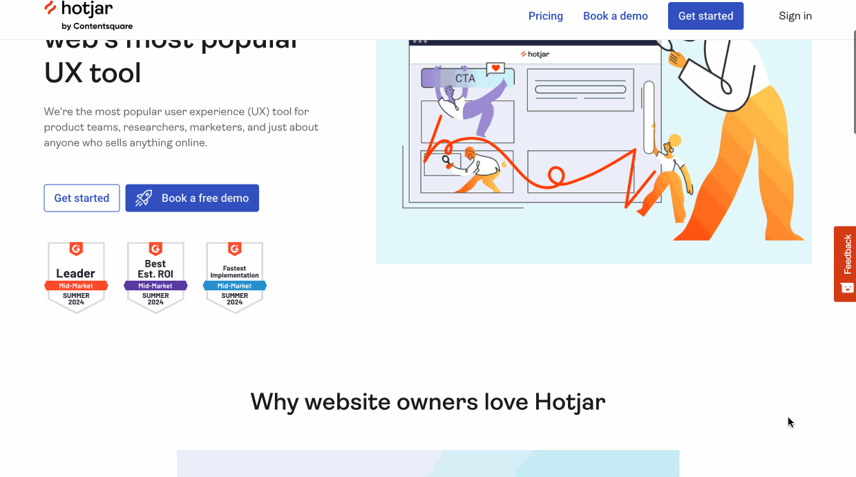
The landing page headline, explainer video, and CTA buttons are conversion magnets. Further, social proof, such as video testimonials and real landing page case studies, is a great trust builder.
The details about the feature and an inclusion-centric CTA would compel prospects on the fence to create a free account.
Why it works?
- Explainer video: Detailed explainer video in the hero section;
- Minimal design: Use of illustrative graphics and visuals;
- Real examples: Genuine testimonials and case studies.
Wag Dog Walker – Landing Page Design Example
Wag dog walking service connects dog owners to walkers. Their landing page for interested dog walkers is a nice example of how to encourage more people to share their details right off the bat.
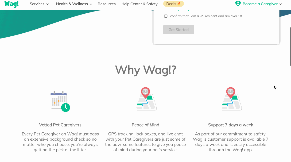
You can’t miss this sign-up form—it’s practically a billboard taking up half your screen! And let’s talk about that fresh color scheme—it’s a visual delight.
But wait, there’s more! Authentic endorsements from real pet caregivers, complete with clickable video testimonials, elevate this from a simple sign-up to a credible, engaging experience.
Why it works?
- Direct headline: Clear headline defining purpose of the page;
- Social proof: Relevant social proof to increase authenticity;
- Video testimonials: Real videos build credibility and trust.
Good Health Organic Snacks – Promotional Landing Page Example
Good Health Organic is a sub-brand by UTZ for cheese lovers who love to consume cheese daily. The brand offers three different varieties that are highlighted on a dedicated landing page.
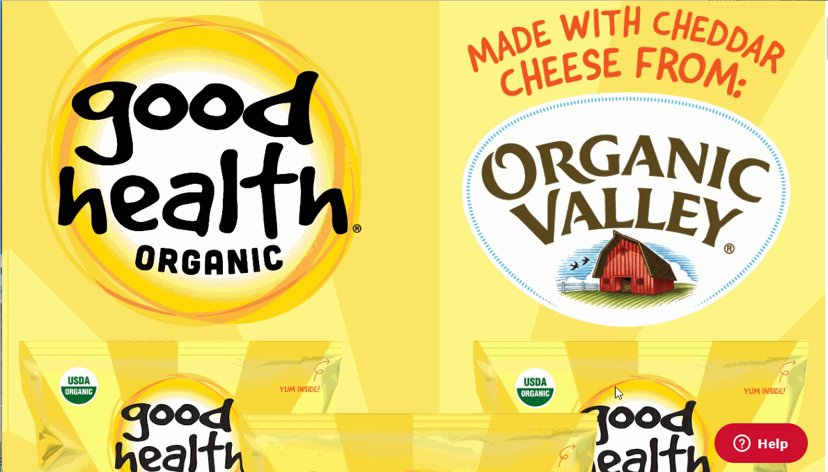
The vibrant color scheme hits the right notes with prospective buyers — a fun and easygoing snack to be munched anytime.
The CTAs — add to cart or grocery basket directly compels users to check out, which is a nice way to invoke action from ecommerce shoppers. This is a simple and effective way to launch a new product with great landing pages.
Why it works?
- Colorful theme: Simple yet vibrant landing page design;
- Contextual CTAs: Compels visitors to buy instantly in just a few clicks;
- Interactive elements: Attention-grabbing GIFs throughout the landing page.
Kodiak Cakes – Beautiful Landing Page
Kodiac Cakes has a beautiful and compelling landing page for their whole grain breakfast range. With great product imagery and social proof, the landing page compels buyers to add a product to cart.
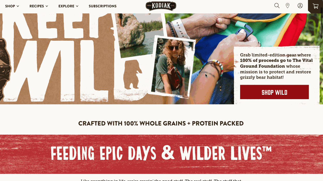
The landing page has a simple agenda — making users curious about the healthy range and present it as a great outdoor breakfast option. Contextual product images and the recipe section makes visitors crave for a bite.
There’s even a social posts section showing real users talking about the product, increasing authenticity and credibility.
Why it works?
- Visuals matter: Use beautiful product visuals and informative sections;
- Scroll-stopping header: Alluring header with a strong mission and contextual image;
- Relevant CTAs: Action-oriented CTA compelling visitor to take action.
What Should a Landing Page Include?
The decision about what to include in your landing page depends on your goals. Always ask yourself what you want to achieve from the landing page.
- Do you want more people to subscribe to your newsletter?
- Do you want to sell something?
- Do you want to book more demos or capture qualified leads?
Your answers will determine the elements of your landing page. For example, if you want to capture lead information for qualification, one of the landing page’s best practices includes having a form with multiple fields.
Irrespective of your goal, a successful landing page should ideally include the following:
- A compelling headline that communicates the main benefit or invokes curiosity;
- Engaging visuals to grab the attention;
- Persuasive copy that highlights the unique selling points of the product;
- Prominent call-to-action (CTA) with action-inducing language to encourage immediate response;
- Form or conversion element for visitors to enter their information;
- Social proof like testimonials, reviews, ratings, or success stories to gain trust.
Want to learn more? Check out these handpicked articles:
- 10 Best Landing Page Builders for 2024 (Free & Paid Options)
- 17 Landing Page Optimization Best Practices for Better Conversions
- How to Create a Landing Page That Converts