

The average website conversion rate sits somewhere between 1% and 4%. Landing pages, done well, convert at around 9.7%. That gap is the entire reason this format exists, and it’s why every dollar of paid traffic should probably be pointed at a single landing page rather than at a homepage.
The catch is that “done well” is doing a lot of work in that sentence. Most landing pages aren’t done well. They have three competing CTAs, a headline that could belong to any company in the category, a form asking for information the marketing team will never use, and a mobile layout that breaks below 400 pixels. The format rewards discipline, and discipline is rare.
This extensive guide is written for marketers, founders, and anyone running paid traffic who wants the page on the other end of the click to actually pull its weight.
Use the table of contents to jump to whatever you need. Or read it straight through if you’re starting from scratch.
What Is a Landing Page?
A landing page is a standalone web page built around a single conversion goal. No sprawling navigation, no parallel pitches competing for attention, just one offer and one action. The two questions worth answering up front: what makes it different from any other page, and where does it actually fit in the journey from stranger to customer.
Landing Page Definition and Purpose
The cleanest definition: one page, one goal, one CTA. That’s the whole idea. A landing page strips out the things that make a homepage a homepage (top nav, footer links, “explore our blog” modules) because every extra link is a chance for the visitor to do something other than convert. Removing competing options isn’t a stylistic choice, it’s the entire point of the format.
Think of it as a focused conversation. Someone clicked a specific ad, opened a specific email, scanned a specific QR code. They arrived expecting one thing. The landing page delivers that one thing and asks for one decision. Sign up, book the demo, download the guide, buy the thing. That’s it.
How Landing Pages Fit Into a Funnel
Landing pages aren’t one-size-fits-all, they shift depending on where the visitor is in the marketing funnel. Top-of-funnel pages usually trade a lead magnet (a checklist, a guide, a free tool) for an email address. The bar for commitment is low because the relationship is new.
Mid-funnel pages do more persuading. Demo signups, webinar registrations, free trial pages: these visitors know who you are, they’re weighing whether you’re worth their time. Copy gets longer, social proof carries more weight.
Bottom-funnel pages are where money changes hands. Sales pages, checkout flows, upgrade pages. Friction matters here in a way it doesn’t earlier.
The traffic source matters as much as the funnel stage. A paid ad that promises “50% off running shoes” has to land on a page about 50% off running shoes. Break that promise and the click was wasted.
Landing Page vs. Homepage (And Other Pages)
People mix these up constantly, and it costs them conversions. A homepage tries to serve everyone, a landing page serves one person with one goal. Product pages and blog posts each play their own role too. The distinction isn’t pedantic, it directly shapes what you build and how it performs. Below: the differences in plain terms, then when to reach for which.
Key Differences at a Glance
Five dimensions cover most of the gap:
| Dimension | Landing Page | Homepage |
| Purpose | One conversion goal | Multiple, brand overview |
| Navigation | Stripped or hidden | Full nav and footer |
| CTAs | One, repeated | Several, competing |
| Audience | Narrow, segmented | Broad, mixed |
| Traffic source | Paid ads, email, QR | Organic, direct, branded search |
A homepage is a lobby. People wander in, browse, decide where to go. A landing page is a single doorway with a sign that says exactly what’s inside. Both have their place, they just answer different questions for different visitors.
For a side-by-side breakdown including when each one wins, read our full comparison of landing pages vs. homepages.
When to Use Which
The rule of thumb is almost embarrassingly simple. If you’re spending money to send a specific audience to a specific offer, build a landing page. If you’re catching general interest from people who Googled your brand or wandered in from a podcast mention, the homepage is fine.
A few examples. Running a Facebook ad for a 30% off sale on yoga mats? Landing page. Someone heard your CEO on a podcast and typed your domain into the URL bar? Homepage. Sending a webinar invite to your email list? Landing page. Pitching a new investor who wants to “see what you do”? Homepage.
Types of Landing Pages
Landing pages are usually grouped by goal, not by industry. A SaaS company and a real estate agency might both run lead generation pages, the format is the same even if the offer isn’t. The categories below cover the formats you’ll actually encounter: lead gen, click-through, product, squeeze, sales, and long-form. Industry examples come later in the guide.
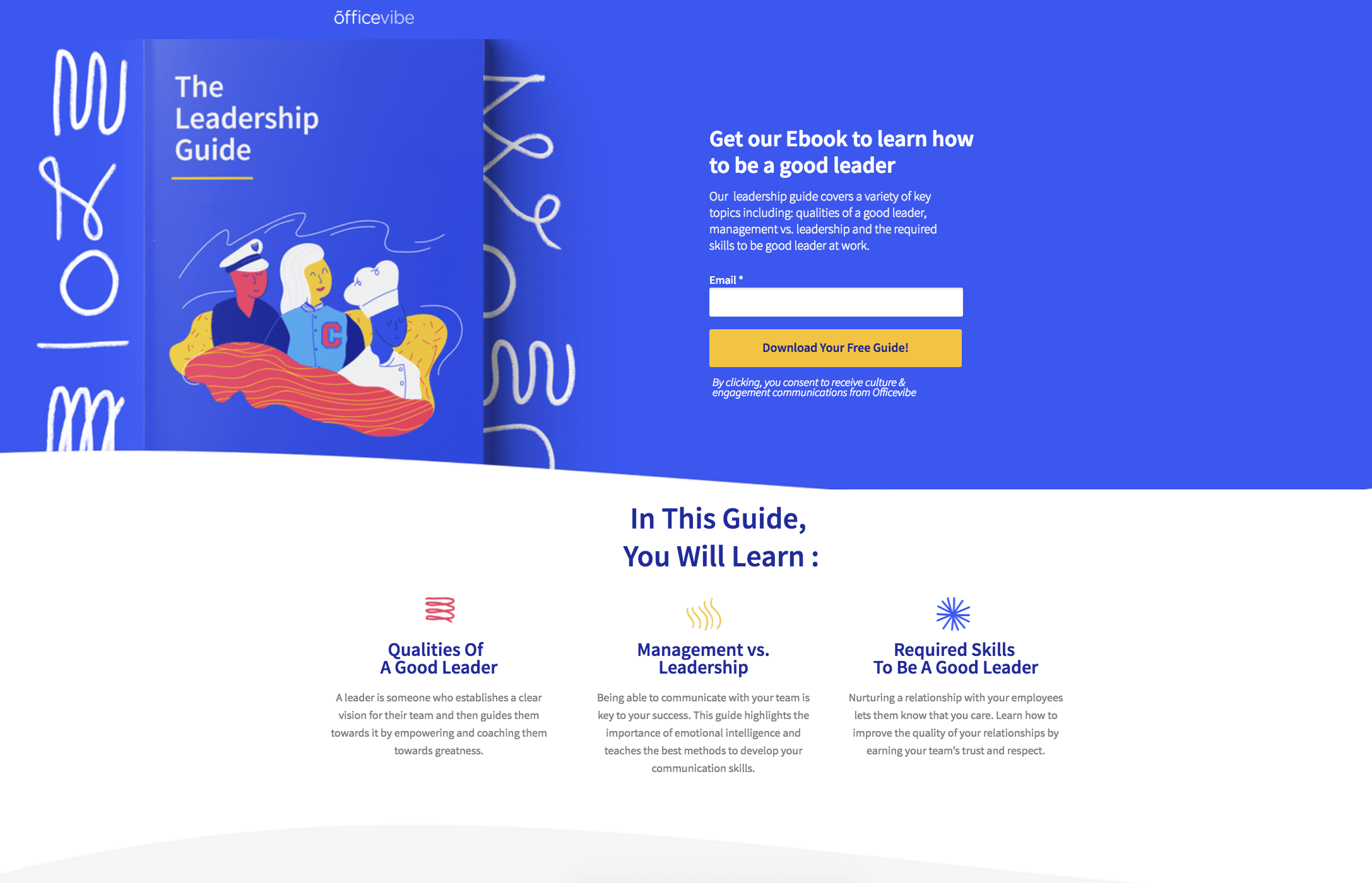
Lead Generation Pages
The job here is straightforward: trade something valuable for contact info. An ebook, a webinar registration, a free tool, a template pack, a checklist. The visitor gives up their email (sometimes a name and company too), and gets the asset in return.
Lead generation pages tend to lead with the offer, show the deliverable visually, and put the form above the fold or pretty close to it. CTAs read like promises of access: “Download the guide,” “Save my seat,” “Get the template.” The shorter the form, the higher the conversion rate, generally speaking. But more fields can mean better leads, which matters more to your sales team than your conversion rate.
Click-Through and Product Pages
Click-through pages are the warm-up act. They sit between an ad and the checkout (or signup), giving the visitor enough context to commit before they’re asked for a credit card. Common in ecommerce campaigns and free trial flows where dropping someone straight into a cart feels like a cold pitch.
Product pages are different. They sell one specific SKU or feature, with copy and visuals built around that one thing. Not a category page, not a catalog browse, just this product, these benefits, this CTA. The discipline is the same as any landing page: cut what doesn’t sell, repeat what does.
For a full breakdown of product page strategy and conversion patterns, see our guide to product landing pages.
Squeeze, Sales, and Long-Form Pages
Squeeze pages are the minimalists of the bunch. One headline, one form field (usually just email), one button. That’s it. They work best at the very top of the funnel, when you just need an email to start a conversation.
Sales pages do the opposite. They’re built to close, with stacked CTAs, objection handling, guarantees, and pricing all on one page. Common for digital products and online courses where the entire pitch happens before checkout.
Long-form pages are for high-consideration purchases: enterprise software, premium courses, anything that costs enough to need a real argument. Detailed copy, FAQs, testimonials, comparison tables, deeper proof. They look intimidating but convert well when the audience is genuinely evaluating.
Anatomy of a High-Converting Landing Page
High-converting landing pages aren’t great because of one trick. They work because the parts work together: a headline that lands, a hero that reinforces it, a CTA you can’t miss, a form that doesn’t ask too much, social proof that feels earned, and a layout that guides the eye without making you think. Miss one and the whole thing wobbles.
Headline, Hero, and Value Proposition
The above-the-fold trio does most of the heavy lifting. The headline carries the promise. The subheadline clarifies, adds the angle the headline left out, or names the audience. The hero visual (a product shot, a screenshot, a person using the thing) reinforces both. Together they have to answer three things in roughly two seconds: what is this, who is it for, and why should I care right now.
Message match matters here more than people give it credit for. If the ad said “Cut your CAC in half,” the headline should echo that, not pivot to “Welcome to ProductCo.” Visitors arrive with an expectation. Confirm it before you try to expand it.
CTA and Conversion Forms
The CTA button is the single decision point on the page. Make it impossible to miss: high contrast, clear placement, repeated as the page gets longer. Action-first copy works better than label copy. “Get my free audit” beats “Submit.” The button should describe what happens next, from the visitor’s point of view. Supporting micro-copy under the button (“No credit card required,” “30-second signup”) removes the last hesitations before the click.
Landing pages with forms are the actual conversion mechanism, and every field is friction. Email and name will out-convert email, name, company, role, phone, and “how did you hear about us?” almost every time. Whether that’s worth it depends on what your sales team needs.
Social Proof and Trust Signals
People trust other people more than they trust your copy. Testimonials, customer logos, review counts, case study snippets, security badges, money-back guarantees: all of it works, but only when it feels real.
Specificity is the lever. “Trusted by 5,000+ marketing teams” beats “trusted by many.” A testimonial with a full name, photo, and company title beats an anonymous quote. A G2 badge with the actual rating beats a generic “highly rated” claim. Place lighter proof (logos, ratings) near the hero, heavier proof (full testimonials, case studies) near the CTA where doubt is highest.
Visual Hierarchy and Mobile-First Layout
Layout tells the eye where to go. The F-pattern (left-aligned scanning) and Z-pattern (corner-to-corner sweep) are useful starting points, though on mobile the question becomes simpler: is everything in a clean single column, and is the CTA reachable with one thumb. Most landing page traffic is mobile now, so designing for the small screen first and scaling up tends to produce better results than the reverse.
Whitespace isn’t decoration, it’s a focusing tool. The more space around the headline and CTA, the more weight they carry. Crowded pages convert worse, almost without exception.
How to Create a Landing Page Step-By-Step
Building a landing page is sequential. Define the goal, write the copy, design and ship. Skip the first step and the rest doesn’t matter, you’ll have a polished page pointed at nothing in particular. The three phases below cover the workflow at a strategic level, with execution detail handled in the best practices section.
Define Goal and Audience
Pick one goal. Not “generate leads and build awareness,” not “drive signups and demos.” One. Every other decision flows from this, and trying to serve two goals on one page is the most common reason landing pages underperform.
Then define the audience by source and intent, not by persona doc abstractions. A paid ad clicker who saw a discount headline expects to see that discount on the page. An email subscriber who’s been on your list for a year knows who you are and doesn’t need the elevator pitch. An organic searcher arrived with a question and wants the answer fast.
Match the offer to where they are. Cold paid traffic isn’t ready for a demo request, warm email traffic is bored by another lead magnet. Get this pairing wrong and the best copy in the world won’t save the page.
Write Copy That Converts
Start with the headline. Not the hero image, not the layout, the headline. Until that promise is clear and specific, nothing else has anything to anchor to.
The structure that works most of the time: lead with the promise, support it with proof, close with the action. The promise goes above the fold. Proof (benefits, testimonials, screenshots, logos) fills the middle. The action repeats throughout, with the strongest CTA placement near both the top and the bottom.
Keep it scannable. Short paragraphs, plenty of subheads, bullet lists where they earn their place. Most visitors don’t read, they skim, and a wall of text loses them before the offer registers. Address objections inline as they come up (“no credit card required,” “cancel anytime,” “your data stays yours”) rather than burying them in an FAQ at the bottom.
Design, Build, and Publish
To create a landing page, first pick a builder (more on that in the next section). Apply the visual hierarchy from earlier: hero, social proof, benefits, CTA, with whitespace doing real work between sections. Connect the form to your CRM or email tool before you publish, not after, because the first leads always slip through the cracks otherwise.
Set up analytics and conversion tracking up front. At minimum, you want page views, form submissions, and a conversion rate by traffic source. Without that, you can’t tell what’s working. Build the thank-you page too, not as an afterthought but as part of the launch checklist, since it’s where you set up the next step in the relationship.
QA on a real phone, not just the device emulator in your builder. Tap the CTA, fill out the form, check that the thank-you page loads. Then ship. You can polish after launch, you can’t optimize a page that isn’t live.
Landing Page Builders: How to Choose
The builder you pick shapes how fast you can ship, what you can integrate with, and what your stack ends up costing. It’s not a glamorous decision, but the wrong choice locks you into slow iteration cycles or forces an awkward migration six months in. Two things to sort out: what category of tool fits your needs, and what to actually evaluate inside that category.
Builder Categories Compared
There are roughly four kinds of tools to choose from.
Dedicated landing page builders (Unbounce, Leadpages, Instapage) focus narrowly on the format. They tend to have the deepest A/B testing and conversion features, but you’re paying for a tool that does one job.
All-in-one marketing platforms (Sender, ActiveCampaign, HubSpot) include landing page builders alongside email marketing, automation, and CRM features. The builder might be slightly less specialized, but the tradeoff is everything talks to everything else without duct-taping integrations together.
Website builders with landing page capabilities (Webflow, Wix, Squarespace) work fine if you’re already on them, less ideal if you’re picking a tool just for landing pages. The strength is design flexibility, the weakness is conversion-specific features.
Code-based options (Next.js, plain HTML, headless CMS setups) give you total control. They also require a developer every time you want to change a headline, which is usually a dealbreaker.
What to Look For in 2026
A few things have moved from “nice to have” to “expected”:
- Native A/B testing without a separate tool.
- Mobile-first templates that don’t fall apart below 400 pixels.
- Native integrations with your CRM and email platform, not just Zapier as a workaround.
- Page speed performance benchmarked against Core Web Vitals (slow pages convert worse, full stop).
AI personalization has moved from experimental to expected. The best builders now generate page drafts from a prompt or brand kit in a minute or two, and serve dynamic content based on referrer, geography, or audience segment without requiring a developer. The differentiator isn’t whether the feature exists, it’s whether the output is actually usable without an hour of cleanup.
Beyond that, look if form submissions automatically set up workflows, built-in exit-intent popup support for catching abandoning visitors, and how painful it is to duplicate and tweak a page for a new campaign. That last one matters more than people expect.
Landing Page Best Practices
If anatomy tells you what to put on the page, best practices tell you how to make each piece actually do its job. Same headline, same form, same CTA, executed well versus executed sloppily, and you can see the gap in the conversion rate. The rules below cover the three areas where execution matters most.
Copy and Messaging Rules
Specificity beats cleverness almost every time. “Save 4 hours a week on reporting” lands harder than “Streamline your workflow.” Numbers, named outcomes, and concrete before/after framing give the reader something to hold onto. Vague benefit copy gets skimmed and forgotten.
Write to one person, not to a market. “You” beats “businesses” or “teams” almost universally. Drop the corporate scaffolding (“we’re excited to introduce,” “in today’s competitive landscape”) and start with what the visitor wants. Voice matters less than clarity, but a consistent voice makes the whole page feel intentional rather than assembled.
Repeat the CTA. By the time someone has scrolled past the third proof element, they shouldn’t have to scroll back up to find the button.
Design and UX Principles
Visual hierarchy should point at the CTA. Everything on the page is either pulling the eye toward the action or pulling it away, there is no neutral. Whitespace around the button, contrast against the surrounding section, and size relative to other elements all matter.
Keep the palette tight. One accent color for the CTA, one or two supporting colors for everything else. The moment your page has four button colors, none of them feels like the primary action.
Imagery should support the offer, not decorate around it. Stock photos of smiling people in front of laptops add nothing. Product screenshots, demo gifs, real customer photos, or annotated diagrams pull their weight.
Micro-interactions (hover states, form field validation, smooth scrolling) reduce friction when they’re subtle and create friction when they’re not. Test them on slow connections.
Speed, Mobile, and Accessibility
Core Web Vitals affect conversions, not just SEO rankings. A page that takes four seconds to load loses a meaningful chunk of visitors before they see the headline. Compress images, lazy-load below the fold, cut the third-party scripts you don’t actually need.
Mobile design isn’t just shrinking the desktop version. Thumb zones (the bottom two-thirds of the screen) are where CTAs should live. Vertical-first media works better than landscape video. Forms should default to the right keyboard type per field (email keyboard for email, number pad for phone).
Accessibility is mostly basics: alt text on every image, contrast ratios that pass WCAG AA, keyboard navigation that works without a mouse, screen reader labels on form fields and buttons. None of this is exotic, and skipping it locks out a real portion of your audience.
Landing Page Optimization and A/B Testing
A landing page isn’t done when you hit publish, it’s started. Conversion rate optimization (CRO) is the discipline of treating the first version as a hypothesis, the conversion rate as the data, and everything that follows as an iteration. Below: what to track, how to run tests that actually tell you something, and the mistakes that quietly waste months of optimization effort.
What to Measure
The core metrics are the obvious ones, but they only mean something in context. Conversion rate is the headline number, though 5% on a page getting 200 visitors a month tells you almost nothing. Bounce rate, time on page, and scroll depth fill in the picture: are people leaving before the headline, or scrolling to the bottom and still not converting? Different problems, different fixes.
Form abandonment deserves its own attention. If 60% start the form and 30% finish, the form is the bottleneck.
Funnel-stage metrics matter more than page metrics in isolation. Cost per lead, cost per acquisition, and lead-to-customer rate tell you whether the page is producing leads sales can close. A page converting at 8% with unqualified leads is worse than 4% with the right ones.
Heatmaps and session recordings add a qualitative layer numbers can’t.
How to Run a Useful Test
Test one variable at a time. The point of A/B testing is isolating a single change, and if you swap the headline, hero image, and CTA color at once, you’ve learned nothing. Multivariate testing has its place when you have the traffic, but most teams should master clean A/B tests first.
Write the hypothesis before you start. “A more specific headline will convert better because vague benefits get skimmed” is a real hypothesis. “Let’s try a different headline” isn’t.
Sample size matters more than people admit. A 12% lift on 80 conversions is noise. Decide your minimum detectable effect up front, and don’t call a winner until the math says you can.
Prioritize by leverage. Test the headline, hero, value proposition, and CTA before button colors.
Common Optimization Mistakes
Calling winners too early is the most common. The test hits 95% confidence on day three, you ship it, and a week later the lift evaporates. Confidence intervals tighten with sample size, not time.
Testing trivial elements is the second. Button color tests are famous because they’re easy, not because they move the needle. If your conversion rate is 1.8%, the button color isn’t the problem.
Insufficient traffic kills more tests than people realize. At 500 visitors a month, you’re running coin flips. Bundle traffic, run longer, or rely on qualitative methods until volume catches up.
Failing to segment by traffic source is sneaky. A variant might win overall while losing on paid traffic—exactly the segment you’re paying for.
And treating landing page optimization as a one-time project: audiences shift, offers age, competitors copy. Optimization is a habit, not a sprint.
Landing Page Examples by Industry
The anatomy doesn’t change much across industries, the conventions do. SaaS pages tend to lead with a product screenshot or demo and push for trials. Ecommerce leans hard on product photography and reviews. Real estate is built around listings, locations, and tour bookings.
Each vertical has a pattern visitors expect, and breaking that pattern usually costs you more than it earns. Below: how the conventions shake out in four common categories.
SaaS and Product Landing Pages
SaaS pages almost always lead with a product screenshot, an annotated UI shot, or a short demo video. The visitor needs to see what they’re signing up to use, and abstract benefit copy doesn’t get them there. Below the hero, you’ll usually find feature-benefit blocks, integration logos as both proof and reassurance (“yes, we connect to the tools you already use”), and pricing somewhere on the page if it’s a self-serve product.
The CTA splits along the sales model. Self-serve tools use “Start free” or “Try it free” because the friction needs to be near-zero. Enterprise products use “Get a demo” or “Talk to sales” because the buying cycle is longer and the page’s job is to qualify, not close.
Pricing visibility is a giveaway. If it’s hidden behind a “contact us,” you’re looking at an enterprise page.
Ecommerce Landing Pages
Product photography does the heavy lifting in ecommerce landing pages. Multiple angles, lifestyle shots, zoomable detail, ideally video showing the product in use. The hero often features the product on a clean background with a tightly written headline naming the offer or the discount.
Reviews and ratings sit close to the buy button, not buried in a lower section. Scarcity and urgency cues (“only 4 left,” “sale ends Sunday”) show up where they’re true and skip where they aren’t, since fake urgency is increasingly easy to spot and erodes trust fast.
Mobile-first isn’t optional in ecommerce, the majority of traffic is on phones, and the checkout flow has to work with one thumb. Pages that don’t account for this leak conversions in ways desktop analytics won’t immediately reveal.
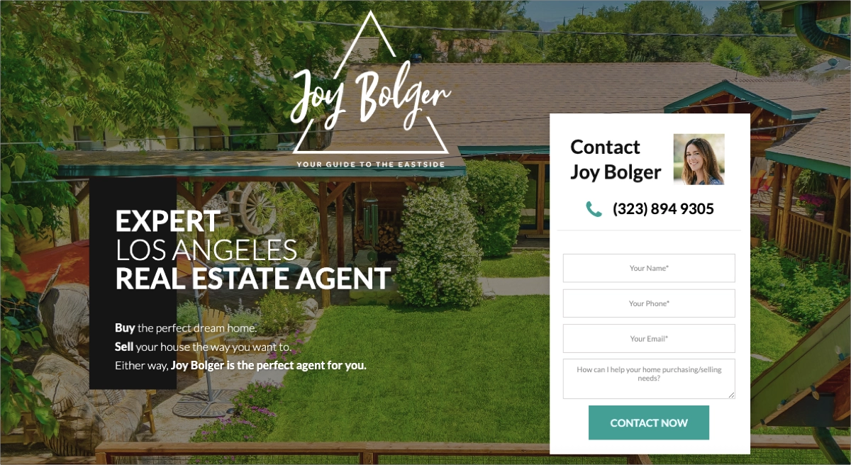
Real Estate Landing Pages
Real estate landing pages tend to be hyper-specific. Either they feature a single listing (photos, price, square footage, location) with a lead capture form for booking a tour, or they’re location-specific (“Homes for sale in Austin’s Mueller neighborhood”), capturing buyer leads at the search stage.
Credibility signals matter more than people expect. Agent photo, brokerage logo, years in market, neighborhood expertise, recent sales. Buyers are making a six- or seven-figure decision, and they want to know who they’re dealing with.
These pages are often built per-listing or per-campaign, which means whoever’s running the marketing needs a builder that makes duplication painless. The agent who can ship a new landing page in 20 minutes per listing has a real edge over the one who can’t.
For real-world real estate page examples and proven patterns, see our guide to real estate landing pages.
General High-Converting Examples
Plenty of high-converting landing pages don’t fit neatly into SaaS, ecommerce, or real estate. Coaches and consultants run sales pages for one-on-one programs. Agencies build pages around case studies and “free audit” lead magnets. Nonprofits use donation pages with story-driven copy. Event organizers build pages around dates, speakers, and ticket tiers. Course creators run long-form sales pages with stacked testimonials.
The common thread across all of them: one clear offer, proof that feels specific rather than generic, and a conversion path that doesn’t ask the visitor to think any harder than they have to. The best pages in any category make the decision feel obvious, not pressured.
Common Landing Page Mistakes to Avoid
Most underperforming pages aren’t broken in some exotic way, they’re broken in the same handful of ways every time. Here’s the list that shows up over and over in audits:
- Multiple competing CTAs. Two or three different actions on one page split attention and reduce the likelihood that any of them get taken.
- Generic headlines. “Welcome to our solution” or “The future of work” tells the visitor nothing. If the headline could belong to any company in your category, it isn’t doing its job.
- Mismatched ad-to-page messaging. The ad promised one thing, the page delivers another. The visitor feels the disconnect immediately, even if they can’t articulate it.
- Slow load times. Every extra second past the two-second mark sheds visitors who never see your offer. Mobile pages on slow networks suffer the most.
- Too many form fields. Each additional field is friction. If you don’t strictly need the phone number, company size, or job title, don’t ask.
- Missing or weak social proof. No testimonials, no logos, no review counts. Visitors trust other people more than they trust you.
- Navigation that lets visitors escape. Full site nav on a landing page is a series of exits. Strip it or hide it.
- Broken mobile layout. Buttons that get cut off, forms that overflow, hero text that’s unreadable below 375px. Test on a real phone, not just the desktop preview.
- No thank-you page or follow-up. The conversion is the start of the relationship, not the end. A blank confirmation message wastes the moment.
- Treating launch as the finish line. The first version is rarely the best version. Pages that don’t get optimized stay average.
Conclusion
Landing pages reward clarity over cleverness. One audience, one offer, one action, executed well enough that the visitor doesn’t have to think about what to do next. Everything in this guide circles back to that idea, whether we were talking about headlines, form length, social proof, or A/B testing.
You now have the framework: understand what a landing page actually is, pick the right type for the goal, build the anatomy that converts, ship it through a process that doesn’t skip steps, then optimize based on what the data tells you. Each layer builds on the last, and skipping any of them shows up in the conversion rate sooner or later.
The last thing worth saying: a landing page is never finished. Audiences change, offers age, competitors catch up. The pages that keep performing are the ones that get revisited, retested, and rewritten on a regular cadence. Build for now, plan to iterate, and treat publish as the start of the work rather than the end.