



Every email designer has a layout in mind before they open the builder: a button sitting right beside an image, a product card with its own background, a header that keeps the logo on one side and the call to action on the other.
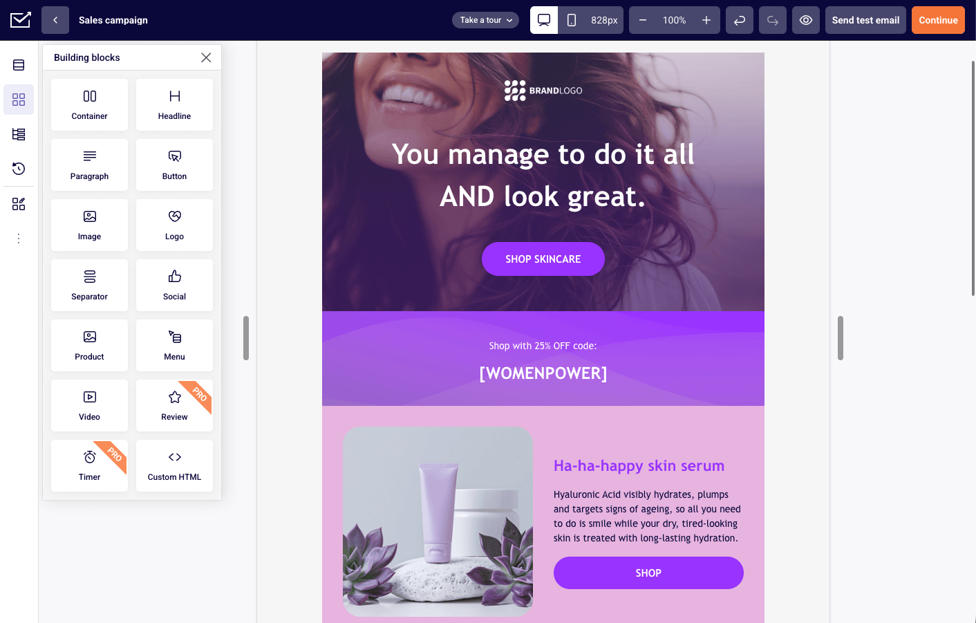
The new email builder is designed to get that picture onto the canvas as directly as possible. You build with Containers: one flexible block you can stack, nest, resize, and adapt for mobile without touching the rest of your design.
Here’s what changes for you:
- Any layout you can sketch, you can build, because Containers nest inside each other
- Mobile takes care of itself by inheriting Desktop settings, with targeted tweaks only where you want them
- Faster everyday editing with rebuilt drag-and-drop, a visual Block tree, reusable block styles, and autosave
The best part? A simple email is still simple. One Stack, content top to bottom, done. The extra power only shows up when you reach for it.
What Changed: From Sections and Columns to Containers
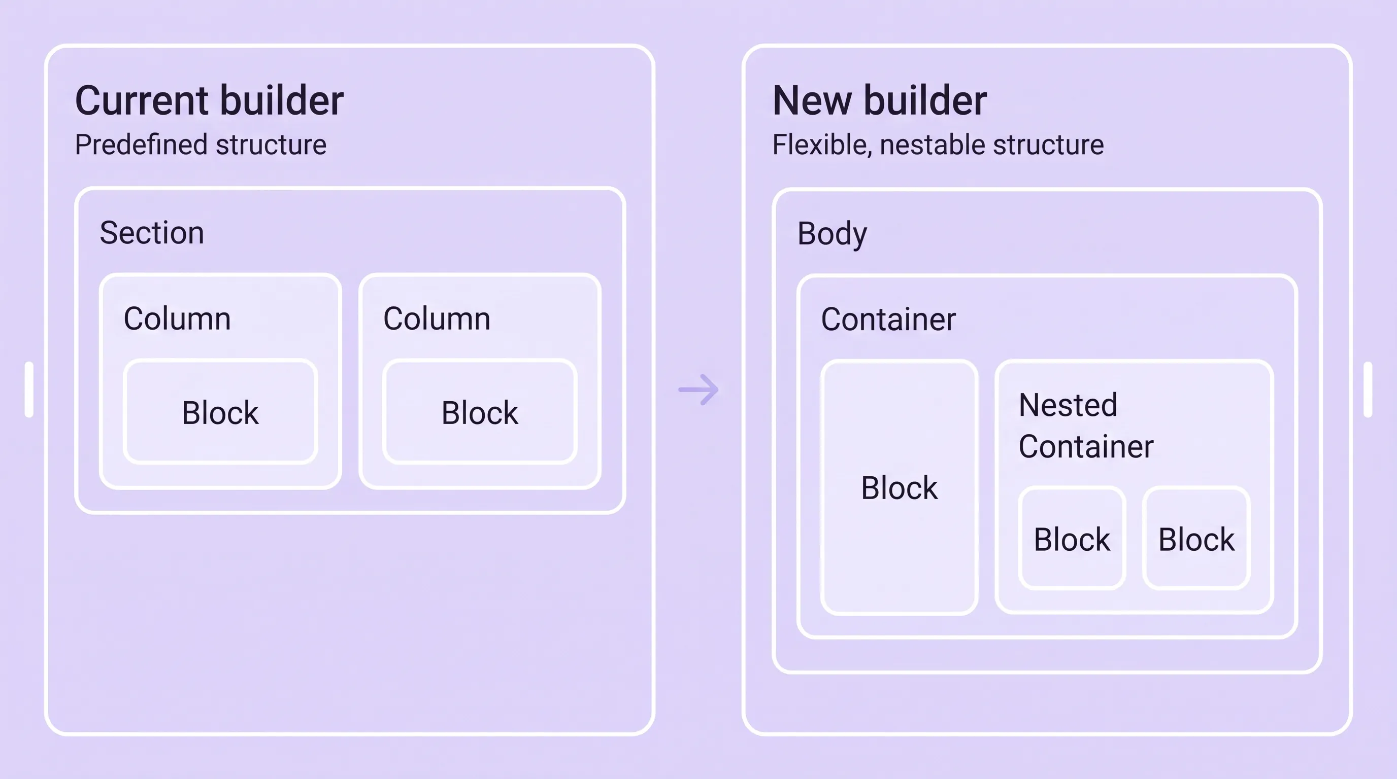
The old builder asked you to choose a structure first. You dropped in a Section, picked a column split, then filled each slot with blocks. If you changed your mind about the split, you rebuilt the section.
The new builder flips that. The hierarchy is simply Body → Container → Block, and a Container can hold other Containers wherever a layout needs more structure: Body → Container → nested Container → Block.
| Old builder | New email builder |
| Sections divided into predefined Columns | Flexible, nestable Containers |
| Column combinations determine the layout | Each Container uses Stack or Row |
| Blocks go into predefined structural slots | Blocks and Containers combine freely |
| Width follows the column structure | Elements use Fit content, Fixed size, or Full width |
| Responsive behavior follows Sections and Columns | Desktop settings are inherited, with targeted Mobile adjustments |
How Containers Work
Containers keep emails simple while opening up far more layout possibilities. Once you know a few core ideas, you can build cards, side-by-side content, and product grids the same way you build a basic newsletter.
One Building Block for Every Layout
A Container holds content blocks (headings, images, buttons, dividers) or other Containers. That’s the whole rule. There is no separate element for a card, a header, a product row, or a two-column split.
For a simple newsletter, one Container is often enough. For something more involved, you nest Containers to build groups, cards, side-by-side content, and product layouts without choosing from a column menu.
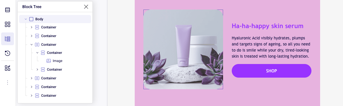
Here’s a practical example. A Row Container holds an image on the left and a second Container on the right. That nested Container uses Stack to arrange a heading, a short description, and a button from top to bottom. Every part stays independently editable, and the whole thing still reads as one clear structure.
Arrange Content with Stack or Row
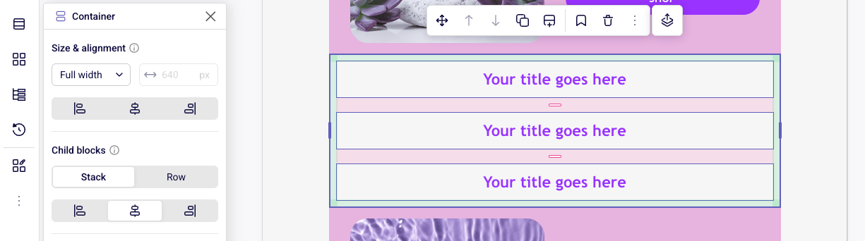
Every Container controls how its direct children line up:
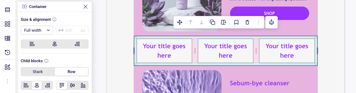
- Stack places items vertically, top to bottom
- Row places items horizontally, side by side
Because Containers nest, you combine directions freely. A Row can hold several Stacks, and a Stack can hold a Row of buttons or icons.
Pro tip: Built a three-item Stack and want it side by side instead? Switch the Container to Row. The contents rearrange in place, so you never rebuild the layout.
How Containers and Blocks Share Control
A Container can be a parent and a child at the same time, and the builder follows one consistent rule:
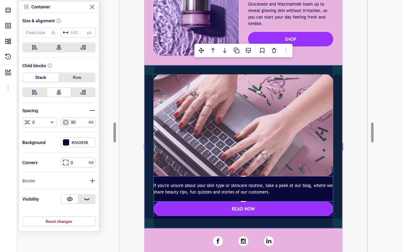
- The Container controls the layout of its direct children through its Content layout settings (direction, spacing, alignment)
- Each child controls its own size and alignment within the space its parent provides, through its Size & alignment settings
The controls adapt to the structure you’ve chosen. In a Row, the parent handles horizontal placement while each item can align vertically. In a Stack, applicable children can align horizontally.
Controls that can’t affect the current layout simply don’t appear. You see fewer contradictory options and spend less time wondering which setting wins.
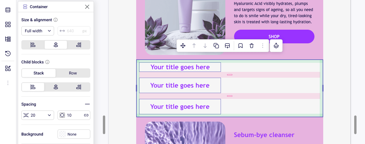
The parent decides the layout; each child decides how it fits.
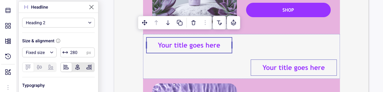
Note: A single block can override its parent’s alignment rule through its own Size & alignment settings. Handy when you want one centered button in an otherwise left-aligned Stack.
Three Sizing Modes
The outermost Container sets a reliable width for the whole email. Inside it, every child Container and block uses one of three modes:
- Fit content uses only the width the content needs (ideal for compact buttons)
- Fixed size uses a specific width you set
- Full width takes all the space the parent provides
Alignment only appears where there is unused space. A Fit content button inside a Stack can sit left, center, or right. A Full width element already fills the space, so the builder hides the horizontal alignment control instead of showing one that does nothing.
Smarter Spacing: Gap vs. Padding
Containers separate two kinds of spacing that older layouts tended to blur together:
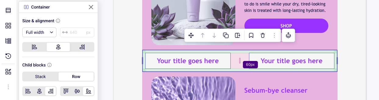
- Gap between items is the distance between the blocks or Containers inside a Container
- Padding is the space between those items and the Container’s outer edges
Gap can be a precise value like 16 px, or Auto. Auto distributes the available space between items rather than holding a fixed distance.
Pro tip: Auto gap is made for headers. Put your logo and a button in a Row, set Gap to Auto, and they stay pinned to opposite ends no matter how wide the email gets. Your previous fixed value stays in the dropdown, so switching back takes one click.
Containers also carry their own background, padding, corners, and border. The same block becomes a card, a banner, or a highlighted section without introducing a new element type.
Responsive Design Without Building Twice
Most of your subscribers will read your email on a phone, so the mobile version matters as much as the desktop one. The new builder keeps both connected: design once, then fine-tune only the details that need to change on smaller screens.
Desktop First, Mobile Inherits
Desktop is your starting point. Mobile inherits every setting automatically, so you never create or maintain two versions of the same email.
When mobile needs a change, you edit that one property in Mobile mode. A Row on Desktop can become a Stack on Mobile. Spacing can tighten, sizing can adjust, or an element can hide entirely.
Only the properties you intentionally change become Mobile-specific. Everything else keeps following Desktop, so a later Desktop edit still flows through to mobile. If you want a refresher on why this matters, see our guide to mobile responsiveness in email.
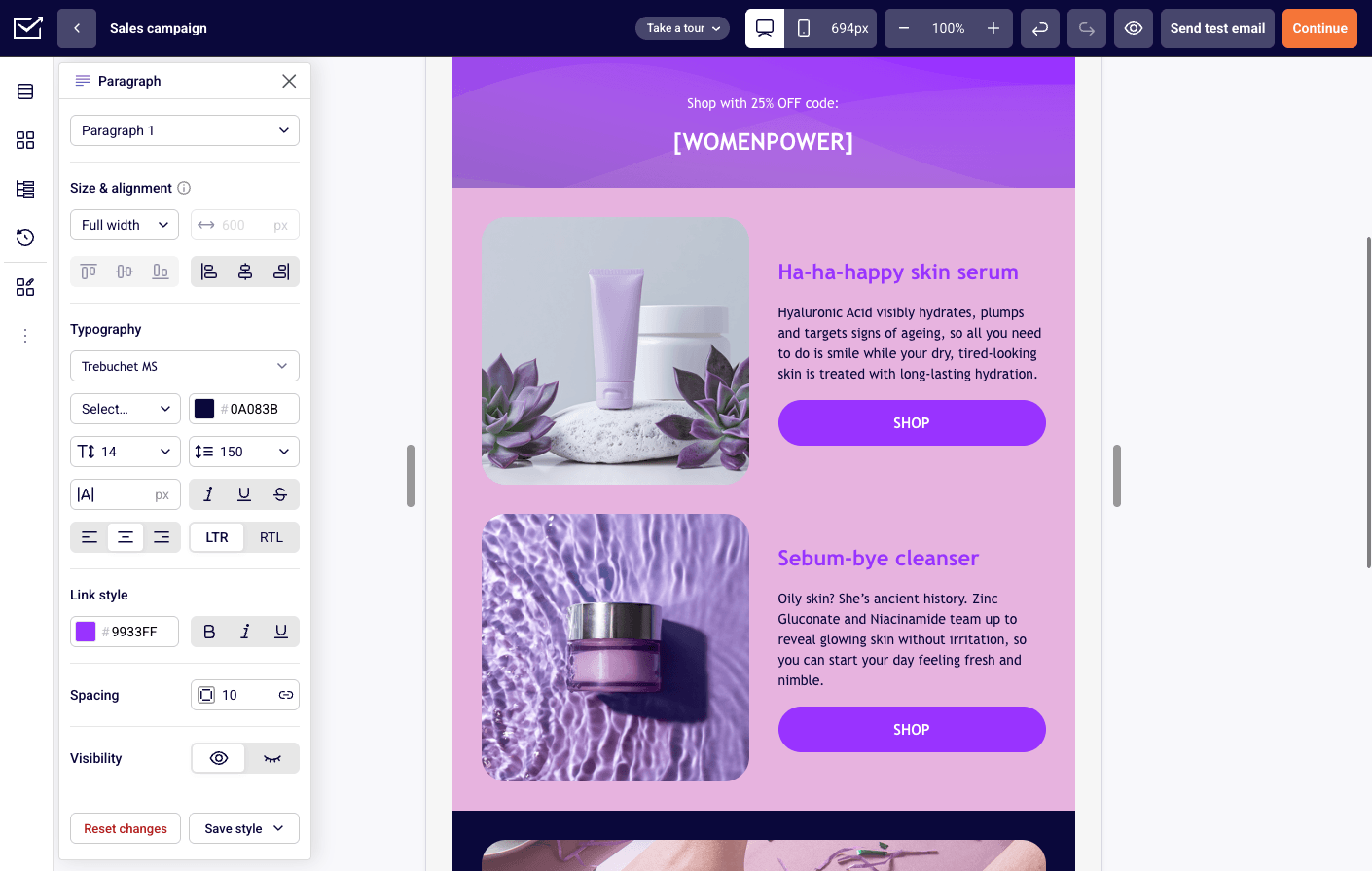
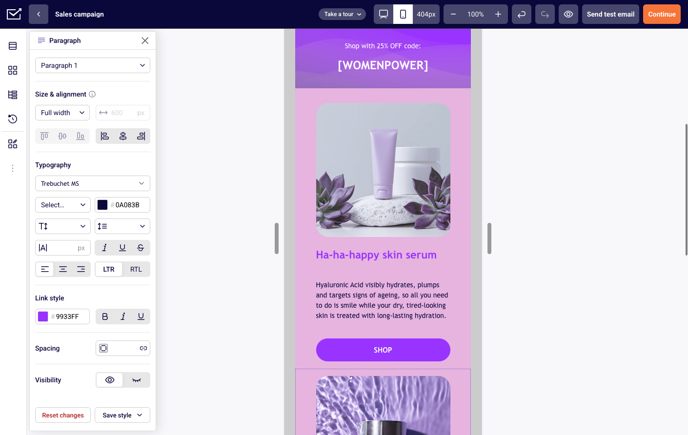
Switch modes from the top bar. Mobile starts as a copy of Desktop and only diverges where you change something.
A Resizable Canvas
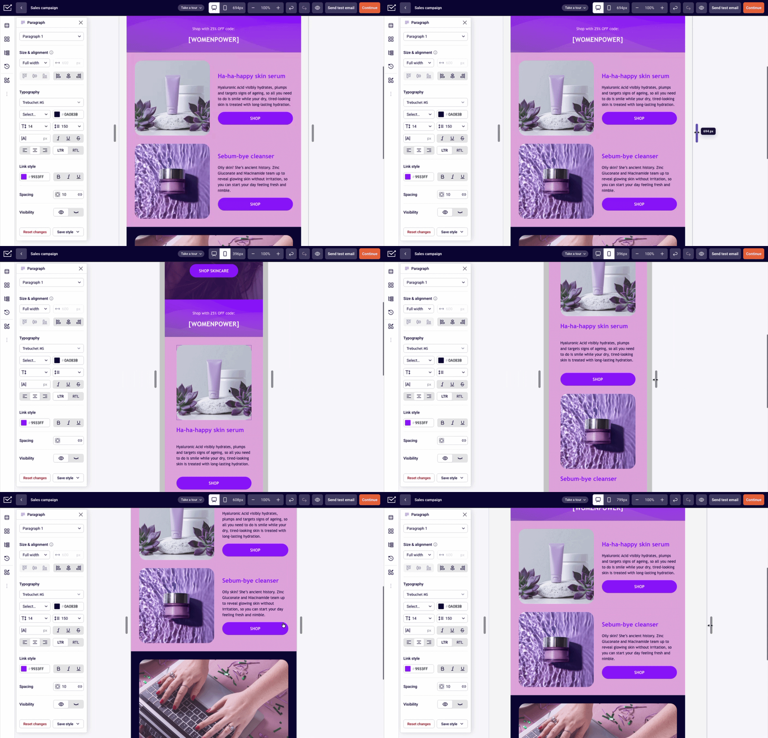
Dedicated Desktop and Mobile modes give you two clear checkpoints. Between them, you can drag the canvas width and watch how your layout responds at any size, while still selecting and editing blocks in context.
That means fewer round trips to a separate preview when you want to check how a layout behaves on tablets or narrow inbox panes.
Faster to Build, Navigate, and Reorganize
Layout flexibility only pays off if everyday editing stays quick. The rest of the builder has been reworked around Containers so that moving, finding, styling, and saving your work takes less effort.
Rebuilt Drag-and-Drop
Drag-and-drop now works directly with the Container hierarchy. Move a block between Containers, drop it into a nested layout, or pick up an entire Container and move a whole section of the email at once.
Clear placement indicators show exactly where an item will land and which Container becomes its parent. Complex moves stop feeling like guesswork.
The Block Tree
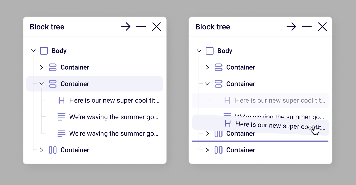
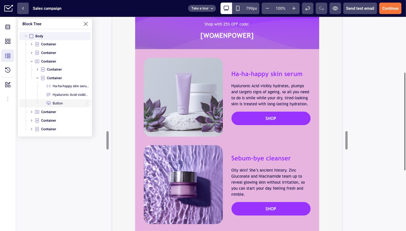
The new Block tree shows your whole email as a hierarchy: Body, Containers, nested Containers, and blocks. Expand or collapse branches, click to select, and reorder or move content from the tree itself.
It’s the fastest way to grab a deeply nested element that’s hard to click on the canvas, and the easiest way to understand where everything lives.
Block Styles and Reusable Presets
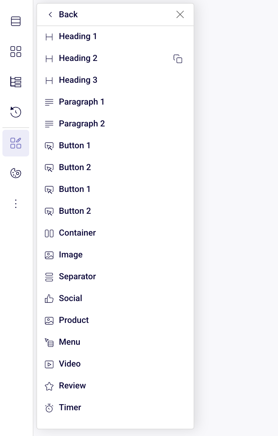
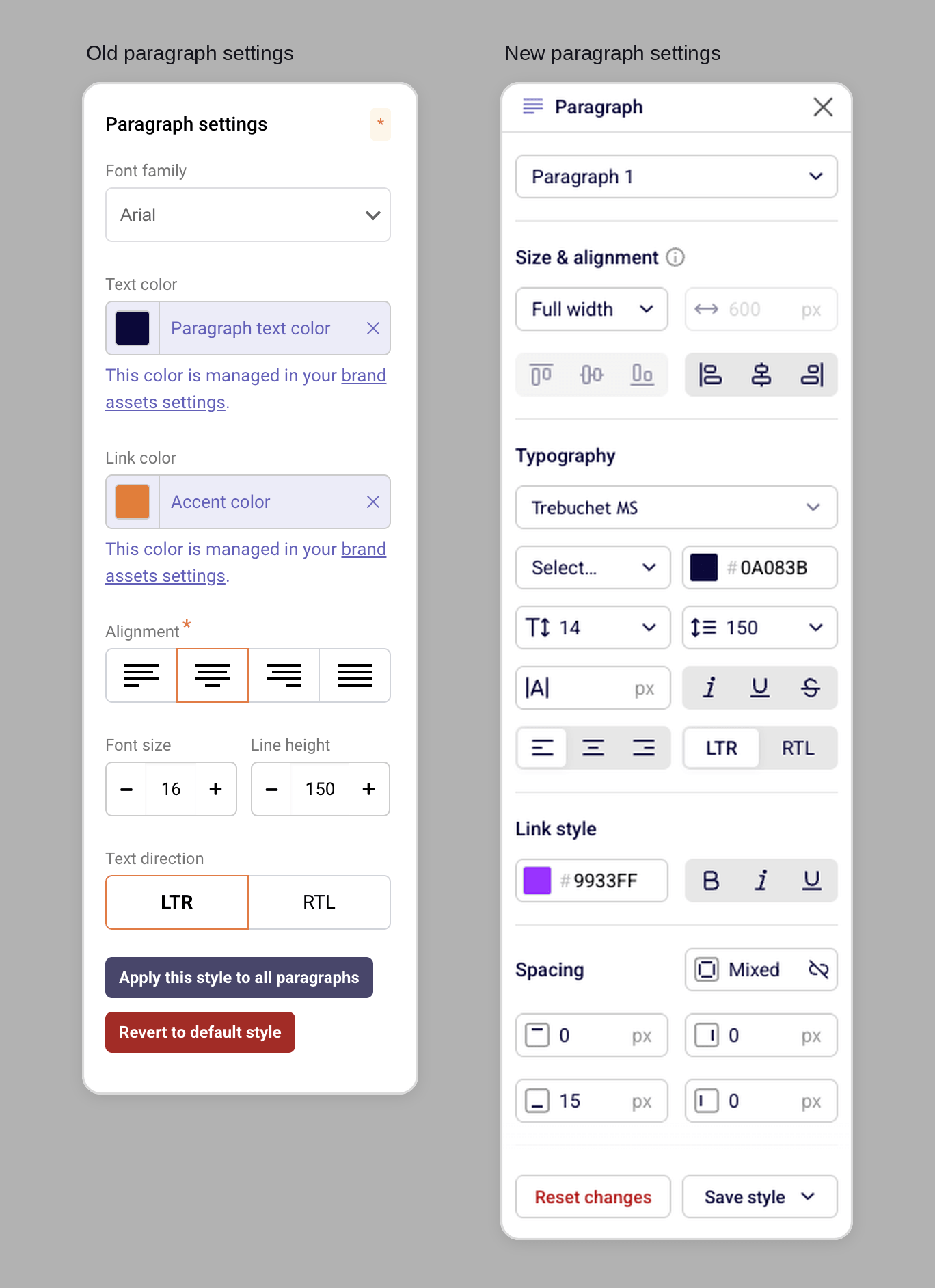
Default styles now define the starting look of headings, paragraphs, buttons, and other supported blocks. You can also create your own style variants and reuse them across an email or a template.
That keeps designs consistent without restyling every block by hand, and it pairs well with your brand colors and fonts. Any individual block can still break from the preset when a design calls for an exception.
A Cleaner Workspace, Plus Autosave
The workspace gives the canvas more room. Navigation and structure panels float and collapse when you need focus, and stay within reach when you don’t.
Your work saves automatically in the background, with a visible autosave status so you know the latest change is stored. The main action is a simple Continue, which moves you to the next step instead of interrupting you with save prompts.
Start Simple, Add Structure Only When You Need It
Containers don’t make a simple email harder. A basic newsletter is still one Stack with content arranged top to bottom.
The extra flexibility waits until you need it: switch to Row, change how an element uses width, set Auto gap, or nest another Container. That’s also why this is a foundation rather than a facelift. The same architecture supports reusable components and future design tools without being boxed in by sections and columns.
Ready to build your next campaign without fighting the column grid? Open the new email builder and start with a single Container.