

Email is still the highest-ROI channel in marketing — by a wide margin. With over 4.5 billion users worldwide and an average return of $36 for every $1 spent (Litmus), the channel quietly outperforms social, search, and paid combined.
But here’s the catch: most marketers don’t have an “email problem.” They have an analytics problem. Dashboards fill up with opens and clicks, yet sends keep going out unchanged month after month. Data sits there. Decisions don’t get made.
This guide fixes that. We’ll walk through the 12 metrics that actually matter, the benchmarks to measure yourself against, the lifecycle and automation analytics most articles skip — and the simple decision framework that turns numbers into revenue.
This article is part of our Email marketing guide.
Quick answer: Email analytics is the practice of measuring how recipients engage with your emails to improve performance, deliverability, and ROI. The five metrics that matter most are open rate, click-through rate, conversion rate, deliverability, and email ROI. Track them weekly, segment them by lifecycle stage, and act on the trends — not the snapshots.
What Is Email Analytics?
Email analytics is the process of collecting, measuring, and interpreting data about your email activity — campaigns, automations, and inbox interactions — to make smarter decisions about who you send to, what you send, and when.
There are two flavors most teams care about:
- Marketing analytics — campaign performance, automation flows, conversions, list health.
- Operational analytics — response time, team workload, SLA compliance for shared inboxes.
This article focuses primarily on marketing analytics, with a section dedicated to operational metrics for sales and support teams that rely on email.
It’s also worth distinguishing email marketing metrics from KPIs. A metric is any number you can measure. A KPI is a metric tied to a specific business goal. Open rate is a metric. “Lift open rate of welcome series from 35% to 45% by Q2” is a KPI. Without that distinction, dashboards become noise.
The 12 Email Analytics Metrics That Matter
Below are the twelve metrics every email program should track. For each, you’ll find the formula, a benchmark, and one or two quick-win tactics to improve it.
1. Open Rate
Formula: (Opened emails ÷ Delivered emails) × 100 Benchmark: 19.2% across industries (WebFX, 2024); 20–50% for high-performing senders (Mailmodo).
Email open rate measures how compelling your subject line and sender name are. Caveat: Apple’s Mail Privacy Protection (MPP) inflates iOS opens, so treat open rate as a directional metric — not a precision one.
Quick wins: A/B test subject lines with curiosity vs. benefit angles; use preview text as a second hook; send to engaged segments first.
2. Click-Through Rate (CTR)
Formula: (Total clicks ÷ Delivered emails) × 100 Benchmark: 2.4% across industries.
Click-Through Rate (CTR) shows whether your content delivers on the subject line’s promise. A high open rate paired with low CTR means the email body, layout, or offer is falling flat.
Quick wins: Use descriptive button copy (“See the fall collection,” not “Click here”); test button vs. text link; place the primary CTA above the fold.
3. Click-to-Open Rate (CTOR)
Formula: (Total clicks ÷ Unique opens) × 100
CTOR isolates content quality from subject-line performance. A weak CTOR signals the email itself isn’t doing its job for people who already showed interest.
Quick wins: Lead with your strongest value prop; keep paragraphs to 2–3 lines; use dynamic content blocks tied to user data.
4. Conversion Rate
Formula: (Conversions ÷ Delivered emails) × 100
Conversion rate is where email turns into revenue. Track conversion types separately — purchases, sign-ups, downloads — and credit each back to the campaign with UTM parameters.
Quick wins: Match landing-page copy and design to the email exactly; add scarcity or urgency where appropriate; layer a post-purchase cross-sell.
5. Bounce Rate
Formula: (Bounces ÷ Sent emails) × 100 Benchmark: 2.5% average; aim below 2%.
Distinguish hard bounces (permanent, invalid addresses) from soft bounces (temporary, full inbox). A spike in hard bounces means it’s time for a list audit.
Quick wins: Validate sign-ups in real time; auto-retry soft bounces twice before suppressing; remove non-openers older than 12 months.
6. Unsubscribe Rate
Formula: (Unsubscribes ÷ Delivered emails) × 100 Benchmark: 0.9% average; healthy programs run below 0.5%.
Each unsubscribe is feedback. Watch for spikes after specific campaigns and revisit content, frequency, or list relevance.
Quick wins: Offer preference centers (frequency + topic) before forcing a full opt-out; ask one feedback question on the unsubscribe page; deploy win-back automations before subscribers go cold.
7. Spam Complaint Rate
Formula: (Complaints ÷ Delivered emails) × 100 Rule of thumb: Stay under 0.1% — ESPs flag senders above this threshold.
Spam complaints damage sender reputation faster than almost any other signal. A single bad campaign can hurt deliverability for weeks.
Quick wins: Make the unsubscribe link obvious; remind subscribers why they signed up in the email itself; suppress anyone inactive for 6+ months.
8. List Growth Rate
Formula: [(New subscribers − unsubscribes − spam complaints) ÷ Total list size] × 100
Even strong engagement can’t save a shrinking list. Break growth down by acquisition channel (pop-ups, social, checkout) to double down on what works.
Quick wins: Run referral campaigns; add sign-up forms to every customer touchpoint; test lead magnets (discounts vs. guides vs. exclusive content).
9. Forwarding / Share Rate
The percentage of recipients who forward your email or click a “share” link. It’s a strong proxy for content value and a free way to grow your list.
Quick wins: Add social share buttons; include “forward to a friend” prompts on high-value content; gate exclusive offers behind a referral.
10. Deliverability Rate
Formula: (Delivered emails ÷ Sent emails) × 100
Different from inbox placement, which measures how many delivered emails actually reach the primary inbox vs. spam. Most ESPs report deliverability; specialized tools report inbox placement.
Quick wins: Verify SPF, DKIM, and DMARC; warm new IPs and domains gradually; use seed lists across major providers before big sends.
11. Email ROI & Cost Per Lead (CPL)
ROI formula: [(Revenue − Cost) ÷ Cost] × 100 CPL formula: Total spend ÷ New leads acquired
ROI ties email directly to the bottom line. The widely cited Litmus benchmark — $36 returned per $1 spent — sets the bar for what email should be doing for your business.
Quick wins: Tag every campaign with UTMs; factor in subscriber LTV, not just first-purchase revenue; compare email ROI quarterly against paid social and search.
12. Engagement Velocity / Time to Reply
For sales and support teams, response time is the single most important email metric. Faster replies correlate directly with higher conversion and CSAT.
Quick wins: Auto-route by tags (“pricing,” “support,” “refund”); store editable templates for the top 10 inquiry types; set a team SLA and review weekly.
Email Marketing Benchmarks by Industry
Benchmarks help you set realistic targets — but only if you treat them as a starting line, not a finish line. Performance varies massively by industry, list quality, and sender history.
| Metric | Cross-industry average |
| Open rate | 19.2% |
| Click-through rate | 2.4% |
| Click-to-open rate | 12–15% |
| Unsubscribe rate | 0.9% |
| Bounce rate | 2.5% |
Source: WebFX 2024 Email Marketing Benchmarks
The numbers shift considerably across industries. Nonprofits and hobbies tend to outperform; ecommerce and B2B SaaS often run slightly below average on opens but stronger on conversion. Don’t compare yourself to a global average if your industry has its own.
Set your own targets in three steps:
- Collect at least two weeks of baseline data from your current sending.
- Pick the median (not the average) as your reference point.
- Set a target 10–15% above baseline — stretching but achievable.
A common trap: chasing a 25% open rate because a competitor reports it. Their list quality, sender reputation, and content cadence are different from yours. Your baseline matters more than theirs.
Email Analytics Across the Customer Lifecycle
Most email analytics articles stop at campaign metrics. The real value lives in lifecycle analytics — measuring performance across the automated flows that move customers from sign-up to repeat purchase. Each stage has its own metrics worth tracking.
Welcome series. Watch activation rate (% who take a defined first action) and time-to-first-purchase. Welcome emails have open rates of 57.8%, while other promotional emails stand at 14.6%, per Experian research, so this is the single highest-leverage automation in your stack.
Lead nurture. Track CTR by sequence step and map drop-off. If 80% open email one but only 20% open email three, the cadence or content is wrong — not the audience.
Abandoned cart. The recovery rate benchmark is 10–15% of otherwise-lost sales (Barilliance). Track recovery revenue separately and test send timing — most brands underuse the second and third reminder.
Post-purchase. Klaviyo benchmarks show post-purchase follow-ups can lift repeat-purchase rates by 31%. Watch repeat-purchase rate within 30, 60, and 90 days, plus review-submission rate as a proxy for advocacy.
Re-engagement / win-back. Reactivation rate (% of dormant subscribers who re-engage) tells you whether your win-back content is working. Pair it with a sunset policy — anyone who doesn’t re-engage after the win-back series gets suppressed.
Transactional. Order confirmations, password resets, and shipping notifications get the highest open rates of any email type. Track open and click rates here too — they’re prime real estate for low-pressure cross-sells.
Segmentation & Behavioral Analytics
Segmentation is what turns a list into a relevance machine. The deeper your segments, the better your engagement metrics — within reason. Match segmentation depth to list size:
- Under 20K subscribers — 2–3 broad segments (engaged, dormant, new).
- 20K–400K — 5–7 behavioral segments based on purchase, browse, and engagement signals.
- Over 400K — predictive or AI-driven segmentation with dynamic membership.
Behavioral data beats demographic data for most use cases. A customer who browsed running shoes last week is a better target for a running-shoe email than a 28-year-old male in Boston. Build segments around behavior first, demographics second.
Engagement-based suppression is the underused lever. Anyone inactive for 6–12 months should be moved to a win-back track or suppressed entirely. Sending to dead addresses tanks deliverability and inflates costs.
Custom events unlock the next level of segmentation. Trigger flows based on specific actions — clicked a pricing page, hit a spend threshold, completed a lesson, abandoned a multi-step form. The more specific the trigger, the more relevant the email, and the higher the conversion rate.
Tip: Don’t over-segment too early. Start with three segments, measure for a quarter, then add complexity. Most teams add segments faster than they can write content for them.
Automation Flow Analytics
Automation flows generate the majority of revenue for mature email programs — but most teams measure them like one-off campaigns. They shouldn’t.
The metrics that matter for an automated flow are different:
- Funnel completion rate — what percentage of entrants reach the end of the sequence?
- Drop-off points — which step loses the most people, and why?
- Step-level CTR — is engagement falling off because the content is weak or the cadence is wrong?
- Trigger-to-conversion lag — how long does it take from entry to conversion?
- A/B test attribution within flows — testing one email in a five-step sequence requires different math than testing a campaign.
Sender’s automation reports surface these natively, including funnel views and step-level performance, so you can see exactly where subscribers stall. The most common fix: shorten the sequence. Many “nine-email nurtures” perform better as four.
Deliverability & Sender Reputation Analytics
Deliverability is the metric that makes every other metric possible. If your emails don’t reach the inbox, nothing else matters.
The fundamentals to monitor:
- Authentication. SPF, DKIM, and DMARC must be correctly configured. Run them through a verification tool any time you change domains or providers. BIMI is a newer standard that adds your logo to inbox previews and reinforces sender legitimacy.
- IP and domain warm-up. New sending infrastructure needs a gradual ramp — start with your most engaged subscribers and build volume over 2–4 weeks.
- Inbox placement vs. delivery rate. A 99% delivery rate doesn’t mean 99% inbox placement. Use seed-list testing across Gmail, Outlook, Yahoo, and Apple Mail to see where you’re actually landing.
- Sender reputation. Tools like Google Postmaster Tools and Sender Score show how mailbox providers see you. Watch for sudden drops — they often precede deliverability issues by days.
Sender’s infrastructure delivers 99.98% of emails to inboxes within seconds, with continuous IP and domain reputation monitoring built in.
From Data to Decisions: A Weekly Review Framework
Tracking is step one. Acting on data is what actually moves the needle — and it’s where most email programs stall. Use this lightweight framework to make analytics review a habit rather than a quarterly fire drill.
Use median, not average. A team average response time of three hours sounds fine, but if one rep responds in 30 minutes and another in 6 hours, you have a serious workload problem hiding inside a healthy-looking number. Same logic applies to opens and clicks across campaigns.
Look at distributions, not single numbers. For response time, that means: how many emails were answered in under 1 hour? Under 4 hours? Over 24 hours? For campaign performance, segment by engagement tier — your top quartile tells a different story than your average.
Run a 15-minute weekly review. Every Monday, look at three things from the previous week:
- Top three campaigns by conversion (and what they had in common).
- Bottom three campaigns by engagement (and what to test next).
- List health — bounces, unsubscribes, complaint rate trends.
That’s it. Done consistently every week, this single ritual outperforms any quarterly deep-dive.
Report upward in one page. Leadership doesn’t want raw metrics; they want outcomes. Translate: “Open rate up 8%” becomes “Welcome series activation up 8%, projecting an additional $14K in Q2 revenue.” Three metrics, three trends, one recommendation. Anything more and the message gets lost.
Mini Case Study: An Ecommerce Brand’s 90-Day Analytics Reset
A mid-sized ecommerce brand running on Sender took stock of their email program after a flat quarter. Their dashboard told a clear story:
- Average open rate: 18% (below industry benchmark)
- Abandoned-cart recovery: 6% (industry baseline is 10–15%)
- Welcome series: single email with a 22% open rate
- No re-engagement automation in place
Three changes, three months later:
- Rebuilt the welcome series as a four-email sequence with a discount, brand story, social proof, and a soft sell.
- Added abandoned-cart timing tests — first reminder at 1 hour, second at 24 hours, third with a discount at 72 hours.
- Launched a 60-day win-back automation with a final “say goodbye” email.
After 90 days: open rate up to 28%, abandoned-cart recovery at 13%, and revenue per send up 2.4×. Same list, same products — only the analytics-driven changes were different.
The data didn’t fix the problem. Acting on the data did.
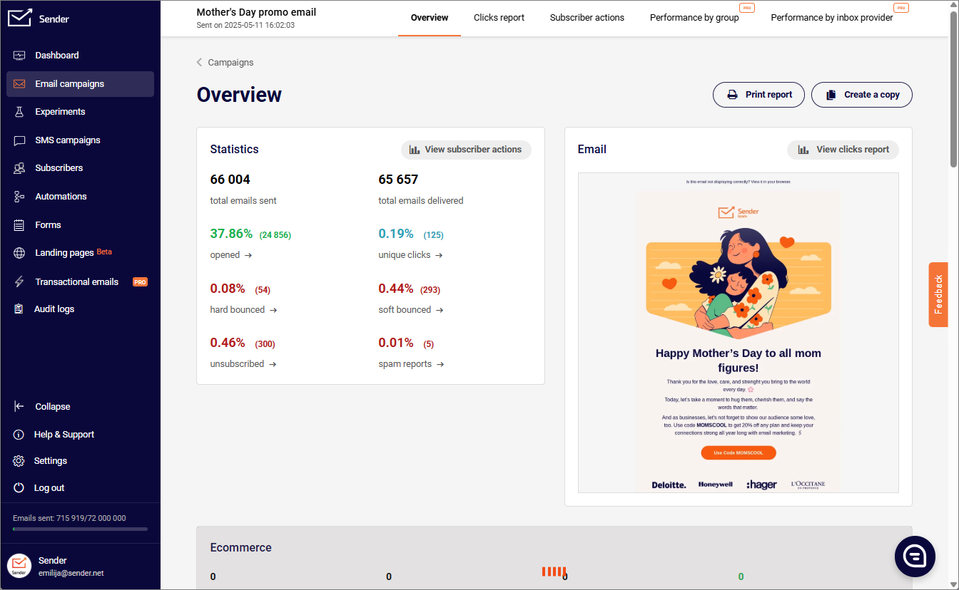
How to Set Up Email Analytics in Sender
Sender’s reporting is built into every plan, including the free tier. Here’s the four-step setup that gets you from zero to actionable data:
- Connect your domain and verify authentication — SPF, DKIM, and DMARC are configured through Sender’s domain settings in minutes.
- Tag every campaign with UTM parameters — Sender’s built-in UTM builder appends them automatically so you can attribute revenue inside Google Analytics.
- Enable custom events — track behaviors like “completed checkout,” “viewed pricing,” or “hit spend threshold” to fuel behavioral automations and segments.
- Set up real-time campaign dashboards — opens, clicks, conversions, and revenue update live as sends go out.
See our help article on viewing campaign reports in Sender for the full walkthrough.
For deeper attribution, Sender’s Google Analytics integration links email-driven traffic to website behavior, and the unified dashboard reports on marketing and transactional emails in one view — a feature most competitors only offer at enterprise tiers.
Common Email Analytics Mistakes to Avoid
Even sophisticated teams fall into these traps. Watch for them:
- Tracking opens only. Post-MPP, open rate alone is unreliable. Pair it with CTR and conversion to get a real picture.
- Ignoring deliverability. A 30% open rate on 60% inbox placement is worse than a 20% open rate on 95% placement.
- Reporting averages over medians. Averages hide outliers; medians show what’s actually typical.
- Over-segmenting too early. Three segments executed well beat fifteen segments executed poorly.
- Skipping UTMs. Without them, attribution falls apart and email gets blamed for revenue it actually drove.
- Forgetting LTV in ROI calculations. A campaign that loses money on first purchase but wins on repeat is a winner — you just need the right time horizon.
- No regular review cadence. Dashboards collect dust unless someone owns them on a weekly rhythm.
FAQ
The cross-industry average is 19.2%, but anything between 20% and 30% is considered strong. Nonprofits, hobbies, and government tend to run higher; retail and B2B SaaS run slightly lower. Compare against your industry benchmark and your own historical baseline rather than a global average.
Subtract total email program cost (platform fees, design, copywriting, staff time) from total email-attributed revenue, divide by cost, and multiply by 100. The Litmus benchmark is $36 returned per $1 spent — a useful reference point for whether your program is operating in the normal range.
Gmail provides basic read receipts (in Google Workspace) but no detailed analytics on opens, clicks, response times, or campaigns. For meaningful analytics you’ll need a dedicated platform like Sender for marketing emails, or a Gmail extension for inbox analytics.
Use the median for response times and any metric where outliers can skew the picture. Use the average for aggregate measures like total revenue or total opens. When in doubt, report both — the gap between them tells its own story.
Weekly for operational decisions (which campaign to repeat, which segment to test). Monthly for trend analysis and reporting upward. Quarterly for strategic shifts like cadence changes, list pruning, or new automation builds.
For SMBs, the right tool combines real-time campaign analytics, automation reports, and deliverability monitoring without enterprise pricing. Sender offers all three on a free plan up to 2,500 subscribers — a practical starting point for teams that want enterprise-level visibility without the enterprise cost.
Start Tracking What Actually Drives Revenue
Email analytics isn’t about collecting more data. It’s about acting on the data you already have. The teams that win are the ones who pick a small set of metrics, review them weekly, and turn trends into decisions — analytics is one pillar of a complete email marketing program, not the whole thing.
Sender gives you real-time analytics on opens, clicks, conversions, and revenue across every campaign and automation — plus deliverability monitoring and behavioral event tracking — on a free plan that scales as you grow.
Start your free Sender account → No credit card required. 2,500 subscribers and 15,000 emails per month, free forever.