

Every landing page is different—the conversion goals differ, the page elements vary, and the traffic is not identical. But one thing remains constant.
Part of our Landing Page Guide.
Whether your landing page goal is to get demo requests, free trial users, or visitors to put down reservations, the page’s success hangs on one metric—the conversion rate.
The value of a conversion depends on the industry you’re in and the offer you’re promoting. For instance, higher-priced offers have lower conversion rates. In comparison, offers with a lower dollar value tend to have higher conversion rates. You always want your landing page conversion rate higher than the industry benchmark.
Before we dive into the high-converting landing pages best practices in 2025, let’s first establish what a landing page is and why you need it.
What is a Landing Page?
A landing page is a standalone web page, disconnected from a website’s navigation, created for one primary purpose—persuading visitors to act (to sign up, buy, download, etc.).
Usually, a landing page contains a form where your prospects can add their information in exchange for something you offer. When it comes to forms, it’s best if you have a landing page builder that not only lets you create a form but also syncs it with automated emails that send the prospects desired ‘something’.
Create stunning landing pages in hours, not days, with Sender – no coding needed.
Contrary to popular belief, a landing page and a homepage can’t be used interchangeably. The homepage caters to all kinds of traffic, users looking for a specific solution, those comparing a platform to a direct competitor, or someone just browsing different solutions to answer a pain point they’re experiencing. That’s why navigation and outbound links are a big part of the homepage experience.
For the homepage, the end goal is to inform visitors about everything your brand does, while the landing page hones in on persuading the visitor for a specific offer.
Take most of the websites’ homepages as an example. The pages often feature drop-down menus and navigation links to give visitors access to anything they might be interested in.
In contrast, a landing page focuses on one offer. A value-driven headline, customer testimonials, feature descriptions, and user benefits to get visitors to click the CTA (call-to-action) button is what you’re looking for if you want to have a great landing page. Here’s a landing page example:
For a landing page to convert audiences, it first needs to answer four basic questions:
- What is the offer?
- Who is the offer for?
- How can users access the offer?
- And what value does the offer provide?
10 Prompt Landing Page Best Practices
Including answers to these four questions is only the tip of the conversion iceberg. To ensure your page converts audiences above industry benchmarks in 2024, you need to include the following best practices on pages in your marketing strategy:
Initiate with a Single, Compelling Offer
If you need to follow a single landing page best practice, it’s this: Start your landing page with an incentive for visitors to take a desired action. It would be a miracle to get conversions without it.
The incentive can be anything valuable for the visitor – from discounts to access to exclusive content. But it’s not enough to throw the offer out there – ensure the visitor understands what it is, how it’ll benefit them, and what they’ll need to give you in return. To make it even more impactful, create a sense of urgency by putting a “limited time” stamp on it or bank on its’ scarcity, novelty, and other compelling traits.
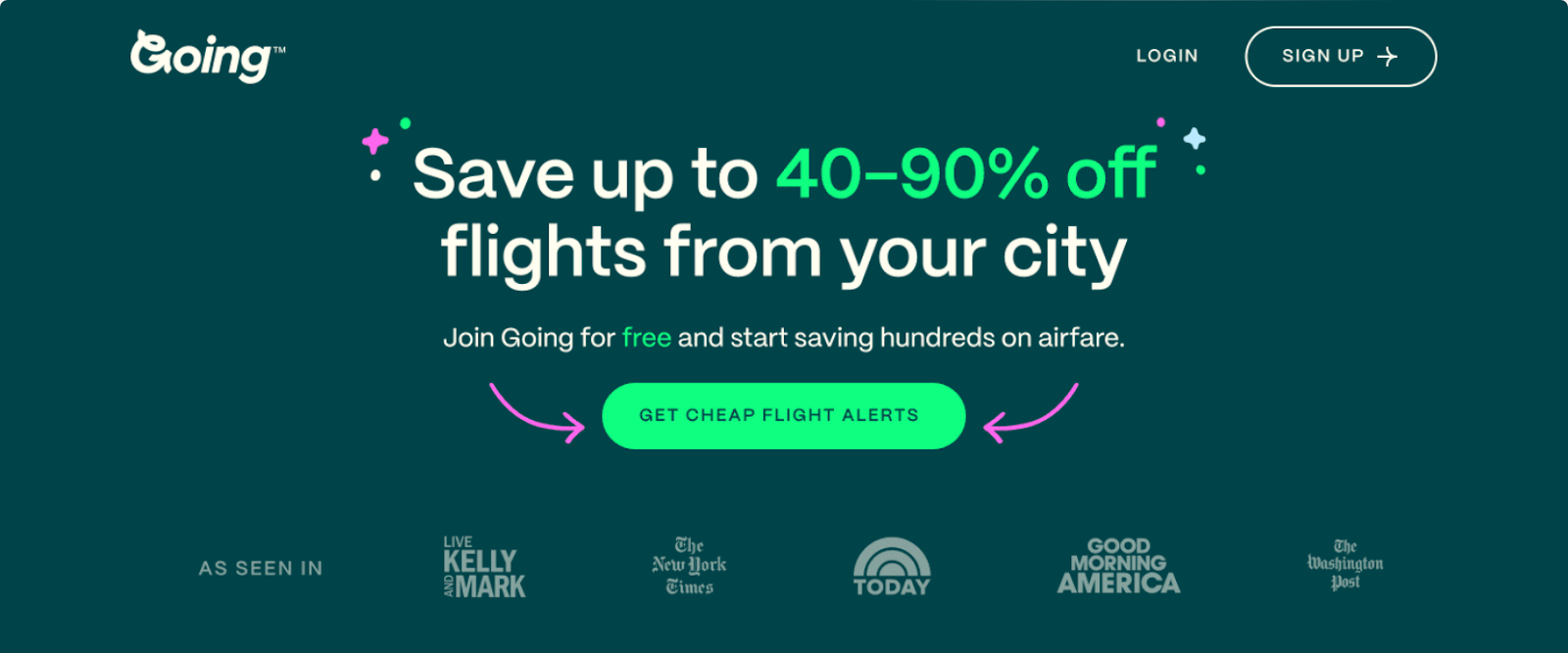
Going did well on their dedicated landing page that opens with a compelling, singular offer:
Establish Ad-to-Page Relevance
Landing pages don’t exist in vacuums. They are the post-click experience of an ad—whether a PPC ad, an email link, or a social media post. Creating a relevant connection between the advertising equation’s pre- and post-click components is the first crucial step to getting conversions.
Ensure consistent message match between the ad and the landing page that follows it. This means that both components should have a similar narrative, feature the same offer, and stay consistent with the overall brand tone.
Don’t advertise a free trial in the ad and ask for credit card information on the landing page—the offer and ask should be identical.
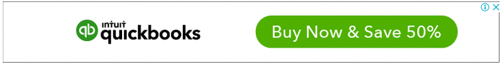
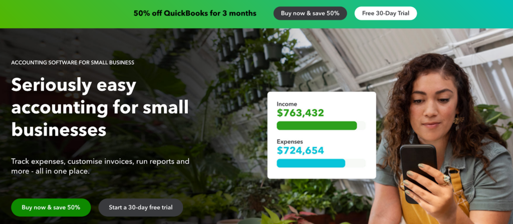
The QuickBooks ad and corresponding landing page features the same offer and stays consistent with the brand tone. The ad offers visitors the chance to sign-up for the paid version of the platform and save 50%. The landing page follows through with the same offer.
Segment Your Landing Pages
As audiences coming to landing pages are not the same—they need different conversion influences to motivate them to make a purchase. This is why it’s crucial to segment your audiences—you can do this based on pain points or by looking at use cases.
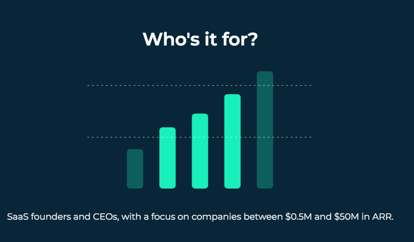
For example, Mogul.io segments its offer per use case—only targeting SaaS founders and CEOs.
Failing to segment your users could lead to irrelevant messaging and offers that don’t stand a chance of converting. A customer familiarizing themselves with your platform is unlikely to sign up for a monthly paid plan — you need to direct them to a free trial page first or offer them a complimentary resource.
Use Conversational Language
Using conversational language helps establish a human connection with visitors and also helps to engage and convert them. From the headline down to the CTA copy, use language your visitors relate to.
Stay away from stiff business jargon and abbreviations.
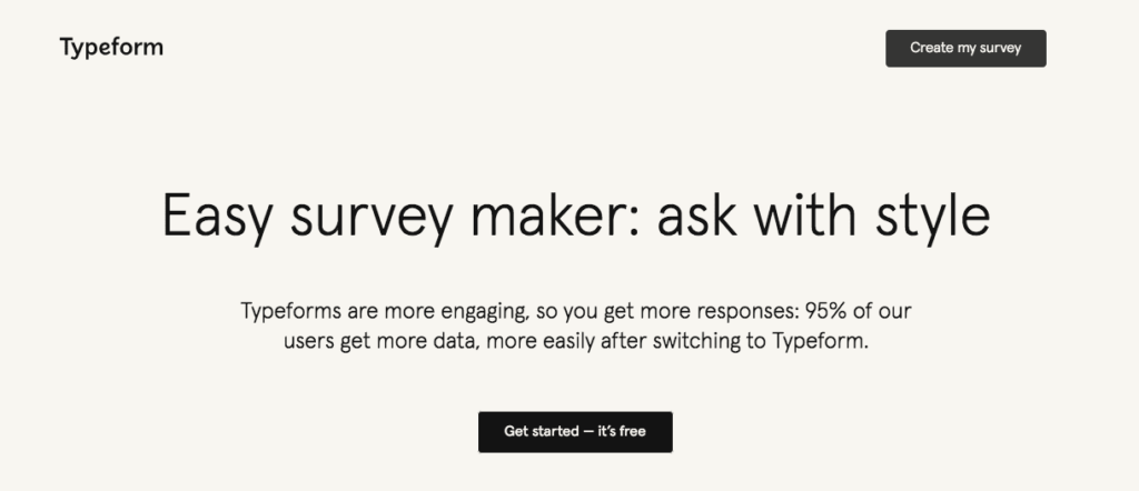
The Typeform landing page encourages visitors to get started for free by spelling out the benefits of Typeform surveys compared to other survey platforms.
Formulate a Headline Focused on Benefits
If you had to guess how long a visitor spends on a landing page, how long would it be? 2 minutes? 1 minute? You’re far off, as 55% of visitors spend fewer than 15 seconds on a landing page. This means that a considerable number of visitors don’t scroll down your page at all.
That’s why the headline is so important. If it’s catchy and clearly communicates the benefit of your offering, it will encourage the visitor to invest more time in learning about its value and possibly purchasing it.
Take a look at this landing page template to see what a captivating, value-oriented headline should look like:
Incorporate an Obvious, Action-Oriented CTA
Not having a CTA on your landing page is like throwing a party, announcing how great it is, but leaving out where it’s happening.
CTAs direct your visitors to the desired action – without it, conversions are impossible. To make them truly effective, pay attention to two things: design and copy. The CTA button should stand out from the rest of the landing page, usually by color contrast.
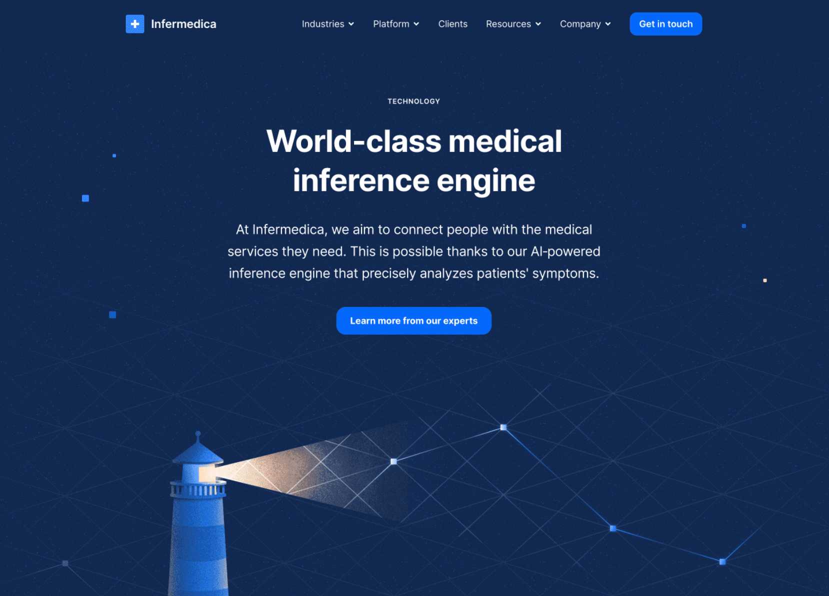
The CTA text should communicate what you want the visitor to do, using action verbs like “enroll,” “submit,” or “download.” Even better if you add the benefit or offering, too, like Infermedica did:
Integrate Social Validation
People often don’t trust brands. But they (almost) always trust other people. That’s why social proof is so influential in persuading people to take the desired action.
Build trust and credibility for your brand and products by incorporating social proof elements like testimonials, customer badges, or user-generated content on your landing page. Of course, if they showcase a positive experience with your product or service. Showcasing real cases of benefits will gently push your prospects to make sure of it themselves.
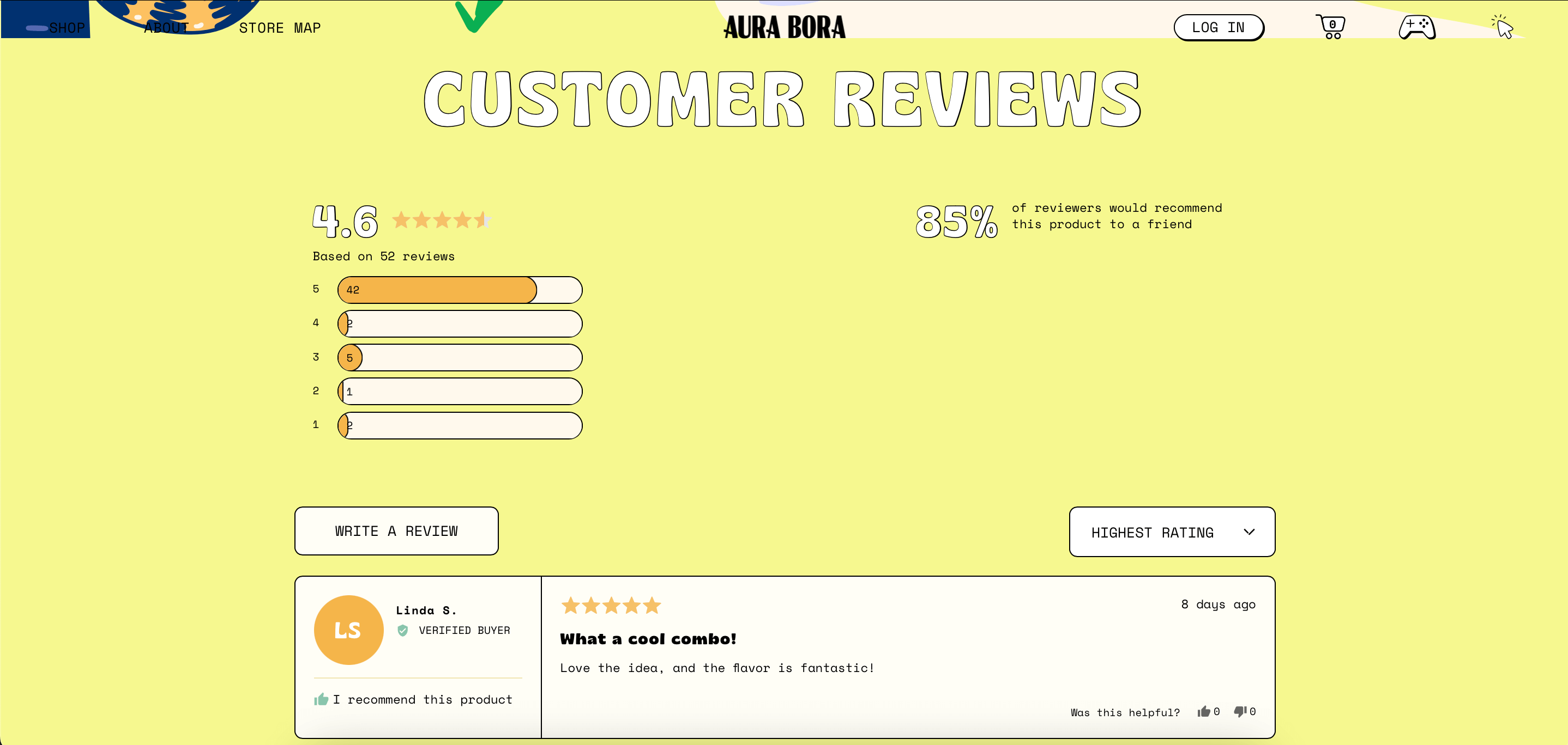
For example, Aura Bora has a selection of landing page templates for each of its new products. Each includes a handful of positive customer reviews:
Eliminate All Navigation & Exit Links
“If a visitor doesn’t click on the main CTA, maybe they’ll click on one of the other links on the landing page” sounds reasonable, but the truth says otherwise.
The more distractions you give your prospect, the more likely they are to abandon the page. So, each landing page should have a single goal—to convert a visitor—and stick to it with a single CTA that drives action.
It’s not just about having a single CTA but also about removing all other competing links. This includes internal links to other pages on your website. Doing so eliminates potential distractions and directs your reader’s attention solely to the main CTA, thereby enhancing the conversion rate.
Guarantee Rapid Page Loading
There’s little as annoying as a slow-loading page. Even worse, instead of waiting, your visitor will leave, possibly to never return.
Ensure rapid loading by optimizing your desktop and mobile landing page:
- Optimize landing page images and their sizes, especially for mobile devices, to reduce load times without sacrificing quality;
- Embrace responsive design principles to ensure your page looks great on any screen size;
- Prioritize the above-the-fold content so it loads quickly and grabs the user’s attention right away;
- Leverage browser caching to enable faster loading times for returning visitors;
- Optimize code and scripts to minimize render-blocking resources and improve overall page speed.
Experiment with All Elements
A landing page creator’s work is never done. It can always be better! Experiment to see how to make it such.
Try out different versions of elements like headlines, images, CTAs, and layout. Take it one step at a time to see what works best. Regarding headlines and copy, play around with different styles and tones to ensure your message hits home.
Try out various images and visuals to give your page some personality, and remember to mix up your CTAs with catchy phrases and eye-catching colors. Lastly, try different layouts and designs to ensure your page flows smoothly and feels welcoming. And then, do it all over again.
Don’t Forget to Test Your Pages
Testing helps you analyze your pages and see what’s working. It allows you to identify friction points on your pages and find ways to eliminate them.
You can collect data and run tests on your pages in the following ways:
Use Heatmaps to Gather Data
Like Google Analytics, a heatmap tracks user activity on your landing page, providing invaluable insights into visitor behavior. By analyzing heatmaps, you can focus on your visitors’ movement through their mouse clicks and scroll activity via screen recordings.
This deeper understanding allows you to identify hotspots of engagement and areas where visitors may be dropping off, pinpointing opportunities for improvement with precision. Whether optimizing the placement of your call-to-action buttons or refining the layout for better user flow, leveraging heatmap data empowers you to make informed decisions that drive higher conversions and enhance user experience.
Conduct A/B Tests to See What Resonates with Your Audience
A/B testing involves testing an original design (control) against an alternate version (variation) of that design to see which performs better. You can A/B test multiple page elements such as CTA button sizes, headlines, and lead capture form length to see which one your audience responds to the most.
However, it’s essential not to run blind tests but to create a sound hypothesis and then start testing. Before diving into A/B testing, take the time to formulate a clear hypothesis based on insights from user behavior, market research, or previous testing results. This hypothesis should articulate the expected impact of the changes you plan to make and the reasons behind them.
By establishing a hypothesis, you not only ensure that your tests are purposeful but also set clear expectations for what success looks like. This approach enables you to make data-driven decisions that drive meaningful improvements to your landing page performance.
As testing becomes more sophisticated, many teams also explore how AI in software testing and automation can complement traditional tools like heatmaps, session recording platforms, and A/B testing solutions to uncover issues faster and streamline repetitive checks.
The Importance of Following Best Practices for Landing Pages
It can happen tens, hundreds, or thousands of times a day. Your potential customer wants a product, service, or solution online, so they type in keywords. You’re lucky if your landing page is among the top search engines results, but it can all go to waste if it doesn’t fulfill the prospect’s expectations.
A good landing page must grab attention at first glance and be persuasive. To achieve this, you can rely on proven and effective practices that have consistently boosted conversions for many.
If you want high conversion rates, follow these practices from the minute you create landing pages. However, they also work wonders in optimizing landing pages that fail to convert well enough.
Create High-Converting Pages in 2024
Implement these best practices on your landing pages to increase conversions and ROAS in 2024. Ensure your pages are user-friendly, optimized, and personalized for your target audience.
Remember, it’s not just about making a page look pretty; it’s about creating an experience that resonates with your visitors and compels them to take action. By staying ahead of the curve with experimentation, thoughtful design, and structure, you’ll guide yourself to success in the competitive digital landscape of 2024.
Also read:
- 15 Must-See Product Landing Page Examples
- 12 High Converting Landing Pages Examples & How to Build One
- 8 Landing Page Examples PROVEN to Convert
Author Bio
Fahad is a Content Marketer at Instapage. He has been writing about landing pages, advertising trends, and personalization for 10+ years. His expertise spans advertising platforms, industry trends, optimization best practices, marketing psychology, and SEO.