



Email design best practices include mobile-friendly layouts, readable fonts, clear visual hierarchy, consistent branding, sufficient color contrast, relevant images, concise copy, prominent calls to action, and testing across email clients.
Together, these practices help subscribers understand your message and take the next step, whether they read on desktop or mobile.
This article is a part of our Email Design Guide.
Why Emails Break: How Email Clients Rewrite Your CSS
An HTML email is untrusted code inside someone else’s application. Before displaying it, an email client sanitizes its HTML and CSS, removing or replacing anything outside its permitted rules. Depending on the client and the code, that can mean stripping one declaration, an entire style attribute containing inline CSS, or a whole <style> block. The code you send is not necessarily the code that gets rendered.
Webmail clients may also rewrite CSS selectors to restrict styles to the message. This is called scoping: your rule for links should style your email’s links, not the inbox’s navigation. Clients can also replace HTML elements or change the surrounding structure, affecting which selectors match. These transformations help contain third-party content within the application displaying it.
Gmail illustrates the difference between browser support and email support. It supports embedded style blocks and common selectors, but not every CSS media query that works in a browser will work in Gmail. Unsupported properties or selectors may be ignored, so a successful email preview in one ESP does not guarantee the same result in Gmail or Apple Mail.
Classic Outlook for Windows introduces another obstacle: its Word-based HTML engine. Even when CSS survives filtering, that engine may not interpret it as a browser would. Its limited support for margins and padding explains why spacing that looks correct in Gmail can shift in classic Outlook. This is an email rendering limitation, not necessarily a security filter deleting your styles.
The distinction between Outlook versions matters, too. New Outlook for Windows uses WebView2 and an experience based on Outlook on the web, rather than classic Outlook’s Word-based approach. “Works in Outlook” therefore needs a version attached.
The useful debugging question is not simply “Is this valid CSS?” It’s: “Did the rule survive filtering, does it still match the intended element, and can this client render it?” Adding !important cannot restore a deleted declaration or give a rendering engine a feature it does not support.
Layout That Survives: Single Column, Widths and Touch Targets
Build on a responsive single-column email layout and highly-visible buttons with a clickable area. Here’s how to build mobile responsiveness into your email campaigns:
Give buttons a touch target of at least 44 × 44px. Apply this minimum to the actual clickable area – not just the button’s colored background – and leave space between neighboring links. Small, crowded targets make it easier to miss a button or open the wrong link. A large-looking button with only its text linked creates another problem: readers tap its edges and nothing happens.
Prioritize a responsive, single-column layout. Use 600px as your desktop template width, but let the layout shrink to 100% of the available width on mobile. A fixed desktop-width email can extend beyond the screen, forcing readers to scroll sideways. For multi-column desktop designs, stacking columns vertically on mobile helps prevent narrow text strips and excessive line wrapping;
Set body copy to at least 16px. Text that looks comfortable on a desktop can become difficult to read on a phone (which can lead to 71.6% of your users unsubscribing due to this reason alone). Below this recommended size, paragraphs can look miniature, leaving readers squinting or zooming in to follow your message. Larger text won’t fix an oversized template, so pair readable typography with a layout that fits the screen;
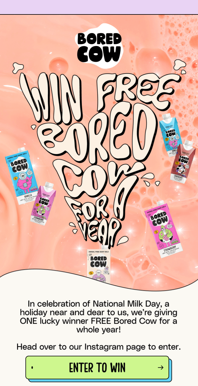
Simply choose one of the available email templates, customize it with the drag-and-drop email builder, then send yourself a test email and check it on different devices before sending to your clients.
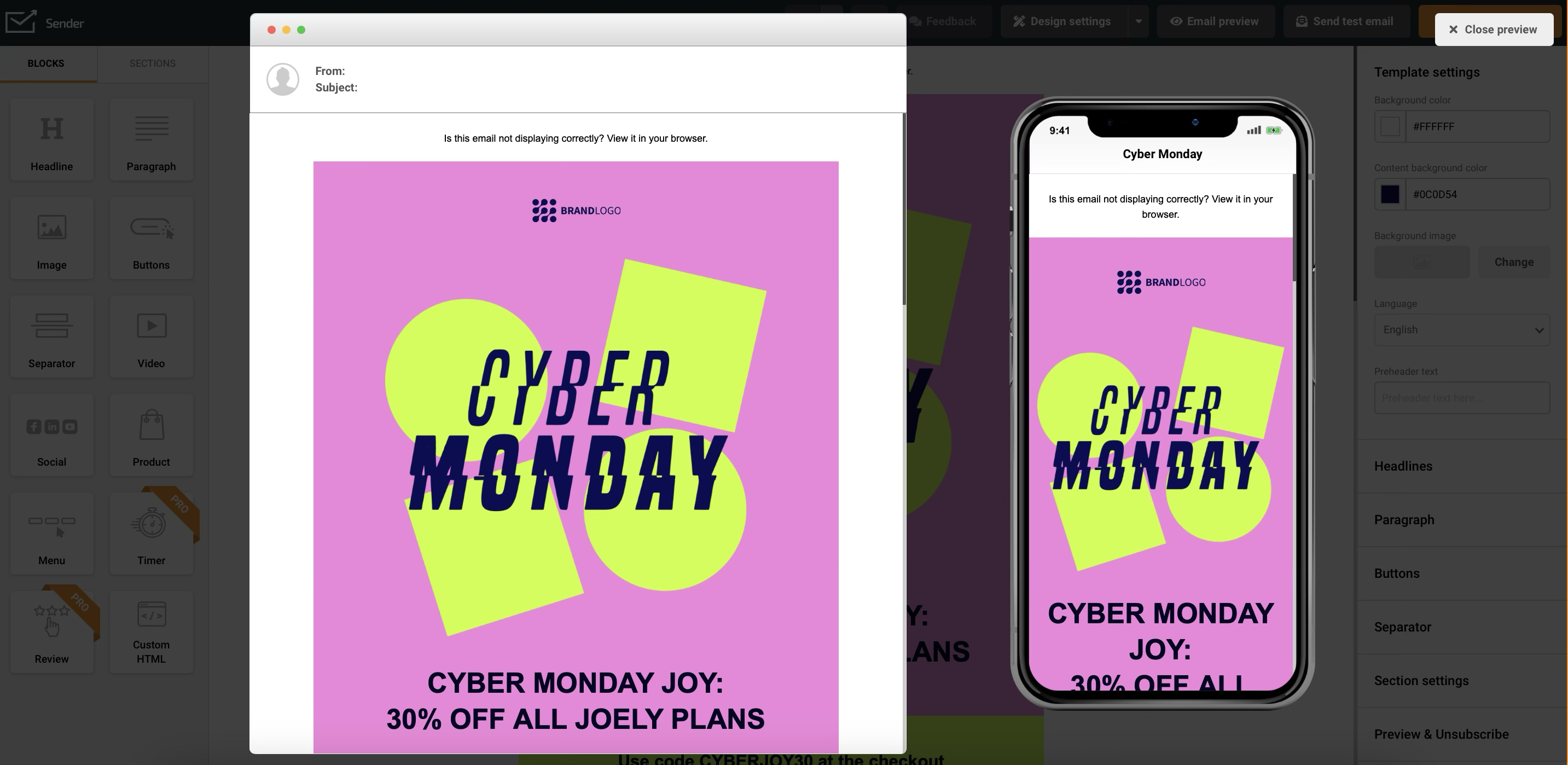
Visual Hierarchy and Whitespace
Visual hierarchy decides what a scanning reader sees first: font size and weight rank the message, whitespace separates sections, and visual flow leads to the CTA.
Here’s what you need to take into account if you wish to boost conversions and enhance newsletter UX:
- Headline hierarchy. Readers often scan the subject line and preview text in their inbox, then skim the opened email to decide whether it deserves their attention. A large, bold headline makes the main message immediately recognizable, while smaller subheadings help them locate relevant details without reading every line. Use font size and weight to establish that reading order: the key takeaway first, supporting information second;
- Whitespace use. Don’t be afraid of white space. Use it to separate different sections and give your content room to breathe. This makes your email less overwhelming and easier to scan, contributing to a reader-friendly design;
- Visual flow. Guide the reader down the page with strategically placed visuals, arrows, or other design elements that naturally lead to your call to action.
De La Calle is a master at visual hierarchy; notice how they cleverly use bold fonts, white spaces, and color blocks to separate information pieces and highlight certain parts:

Making Content Scannable: Bullets, Emphasis and Length
Readers skim a phone screen and a desktop preview pane differently, so break body copy into bullets and short paragraphs, and bold only the words carrying the point.
Here are the reasons why this is important:
- Getting to the point. Don’t bury the lead. Clearly state the purpose of your email in the first few sentences. This grabs attention from the moment the email is opened, improving your inbox display performance;
- Using bullet points and lists. Break up large chunks of text into easily digestible pieces using bullet points, numbered lists, and short paragraphs. This is especially important for body copy, making your content less intimidating – because subscriber reading patterns differ significantly between mobiles and computers;
- Highlighting key information. Use bold or italics to emphasize important words or phrases, but don’t overdo it. You can also use a contrasting background to highlight key information, provided it remains readable in both light and dark modes;
- Include a visible and easy-to-find unsubscribe button. While it might seem counterintuitive, making it simple for people to opt out improves your email list’s long-term health and reduces spam complaints.
Another good way to make your emails extremely easy to read is Suds’ way – using icons to draw attention, structure text, and help better understand the message:

Type and Live Text: Web-safe Fonts Versus Web Fonts
Keep your font choices limited and aligned with your brand. There are two time-tested ways to do that:
Web-safe fonts, such as Arial, Verdana and Georgia, are commonly installed on readers’ devices, so they don’t need an extra download. Web fonts load from a server and give you more distinctive styling – but only in email clients that support them.
The trade-off is dependable rendering versus greater typographic choice; neither guarantees an identical appearance everywhere.
When a web font fails to load, readers usually see a fallback font instead. Your words remain, but their proportions change: a headline can wrap onto an extra line, pushing everything below it downward. Without a suitable fallback, the client may choose its default.
Specify a web-safe fallback with similar proportions, then test the email with the custom font unavailable. Check line height as well as headline wrapping to make sure the fallback remains easy to read.
Don’t solve font differences by turning your copy into a picture. Keep your main message as live text – HTML text rather than words baked into an image. And there’s a few good reasons for that:
- Email accessibility. Screen readers can access the words directly, without relying on an image’s alt text. Readers can also enlarge the text without enlarging an entire graphic;
- Image blocking. Your offer and button labels remain visible when images are blocked, rather than depending on the artwork loading;
- Dark mode. Live text can change color to suit a dark background. Dark lettering inside a transparent image may instead disappear against it. That flexibility isn’t a guarantee: test your text and background contrast in both modes.
Images: Sizing, Alt Text, Blocking and Text Ratio
Compress image files, write specific alt text, keep the offer and CTA as live text so the email survives image blocking, and give every image a job.
Consider these visual best practices for your next email template:
- File size and load time. Sharp images matter, but oversized files make readers wait. Compress your images while checking that product details remain clear. Check the combined weight of your images, too: several product shots and a large animated GIF can create a slow-loading email even when each looks small on screen. Remove unnecessary images and trim GIF frames rather than sacrificing the clarity of visuals that support your message;
- Alt text and screen readers. Alt text gives screen reader users access to the information an image conveys. Make it specific: “Red backpack with reflective strips” tells readers more than “Product image.” The description should reflect the image’s purpose, not catalog every visible detail. W3C recommends an empty alt attribute (alt=””) for purely decorative images so assistive technology can ignore them. For an image that acts as a link, describe its destination or action, such as “Shop backpacks”;
- Images blocked by default. Classic Outlook blocks automatic downloads of remote images by default, although settings and trusted-sender exceptions can change that behavior. Instead of your artwork, readers may see empty spaces, placeholders or alt text. If your headline, offer and button are baked into one graphic, they disappear with it. Keep those essentials as live HTML text and an HTML button, then preview your email with images switched off. Alt text helps, but its visual display varies between clients;
- Image-to-text balance. Give each image a job: show a product, explain a feature or reinforce your message. There’s no single ideal image-to-text ratio for every email, so don’t add unnecessary copy just to reach a percentage. Instead, check whether the visuals complement the words rather than replace them. The practical test is straightforward: with images hidden, can readers still understand the message and identify the next step?
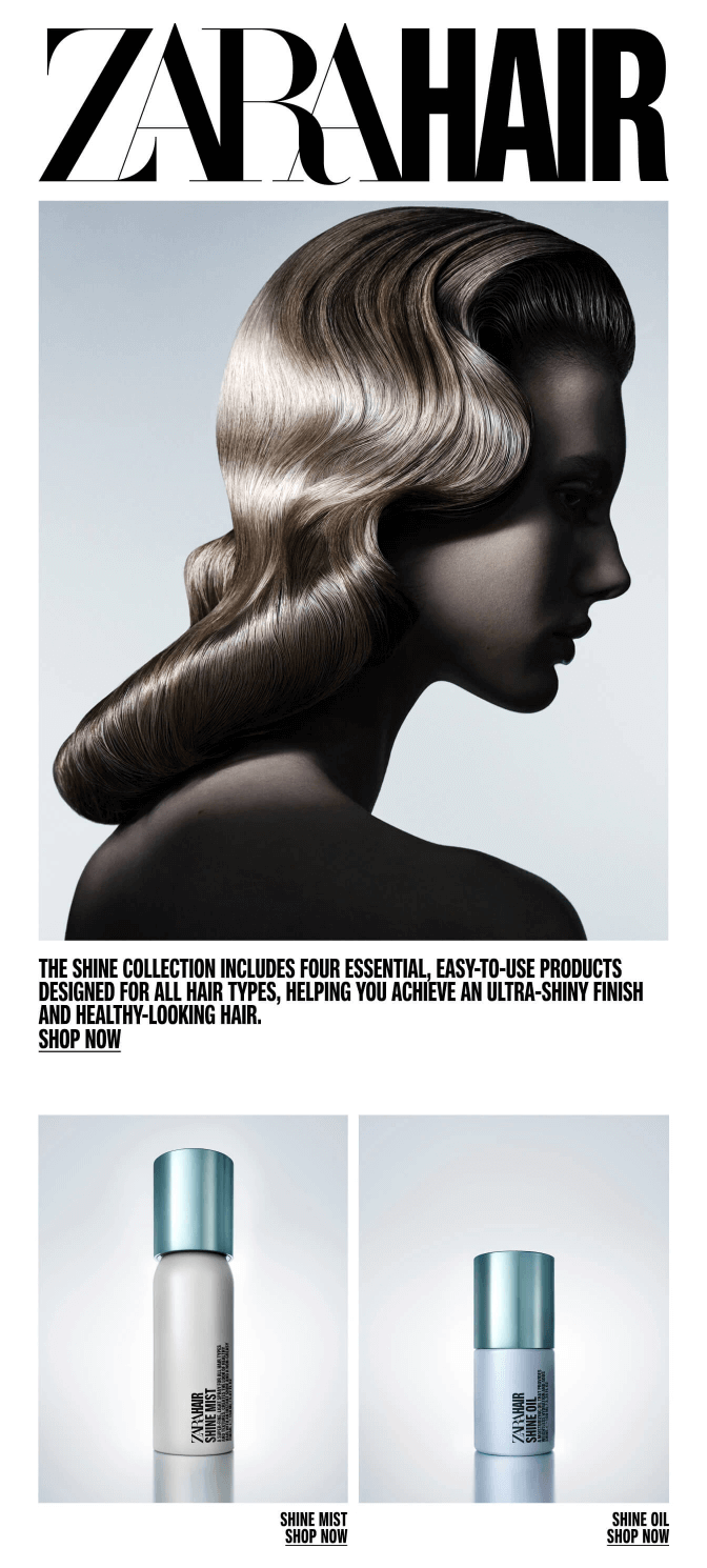
Zara always makes sure the images they use aren’t just stunning; they show the potential benefits as well:
CTAs that Stay Tappable
To make your call-to-action buttons effective:
- Make both the button and its text stand out. Choose a fill or border that separates the button from the surrounding email background, then check the contrast between the label and the button itself. Aim for at least 4.5:1 contrast for normal-size button text. A bright brand color doesn’t automatically make the label readable: readers need to recognize the button and read what’s inside it;
- Size the clickable area, not just the background. Aim for a touch target of at least 44 × 44 CSS pixels so readers don’t need pinpoint accuracy on mobile. Give the label room with padding, leave space between neighboring links, and make the entire visible button clickable. A large colored rectangle with only its text linked still has a small effective target – readers tap its edges and nothing happens;
- Use live-text buttons instead of image buttons. Build the CTA as an HTML link styled to look like a button, rather than uploading a graphic containing the label. When images are blocked, an image button can become a placeholder; a live-text button keeps the action visible without requiring an image download. Use a tested bulletproof button pattern, and check the result in your audience’s email clients. These code-based buttons still need testing: some implementations leave only the text clickable or render differently in classic Outlook;
- Give one primary action the strongest styling. Reserve your most prominent button treatment for the email’s main action. Supporting options can use outlined buttons or underlined text links, without becoming faint or difficult to tap. One primary action doesn’t mean only one link; it means a clear visual priority. When every button has the same prominence, the design gives readers no indication of which next step matters most.
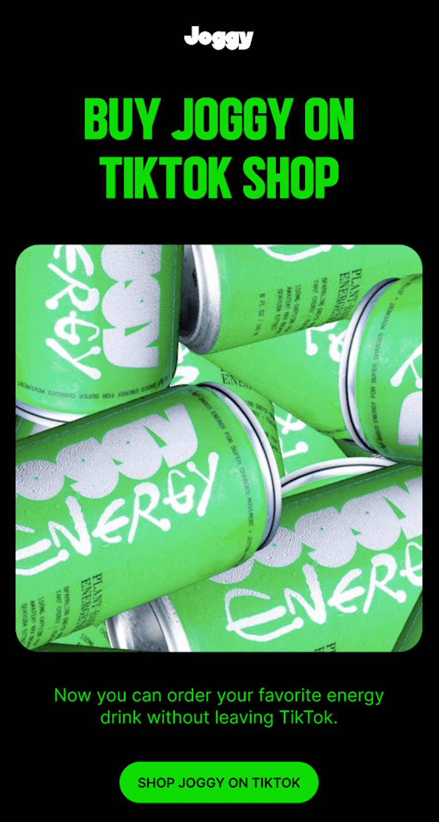
Joggy’s email design demonstrates an effective call to action – actionable, clear, and the button is hard to miss:
Dark Mode: Three Ways Clients Render it
Email clients handle dark mode three ways: no change, partial invert, full invert. Here’s what each means for your email:
- No change preserves your palette, so a transparent logo keeps its original background and contrast;
- Partial invert darkens light backgrounds and lightens dark text, generally leaving dark sections alone – a dark transparent logo can disappear against the newly darkened background;
- Full invert changes both light and dark sections, so dark areas can become light. Transparent logo images usually retain their colors, meaning either a light or dark logo can lose contrast.
Your logo is one area where this can go wrong. A transparent logo may keep its original colors while the background behind it changes, leaving your branding barely visible. Email clients handle dark mode in three main ways:
To design a logo that works for all three settings, add a light outline around a dark logo, or embed a contrasting solid background within the image itself. Don’t rely only on the background color behind the image – the client may change it. Check that the same logo remains recognizable against both light and dark surfaces.
Protecting your logo is only part of the job. Your body copy needs to stay readable, links should remain easy to spot, and buttons must stand out against their backgrounds.
Here’s how to keep the rest of your email clear in both light and dark modes:
- Choose colors by contrast, not fixed values. Follow the Web Content Accessibility Guidelines (WCAG) Level AA contrast thresholds: aim for a color contrast ratio of at least 4.5:1 between normal-size text and its background in both modes. Large text—at least 18pt regular or 14pt bold—can use 3:1. Tools like Coolors or Adobe Color help you build a palette that clears those ratios;
- Measure the colors readers actually see. Clients can shift your palette in dark mode, so check contrast on the rendered result rather than your original hex values. A palette that passes in your design file can fail once a client darkens the background behind it.
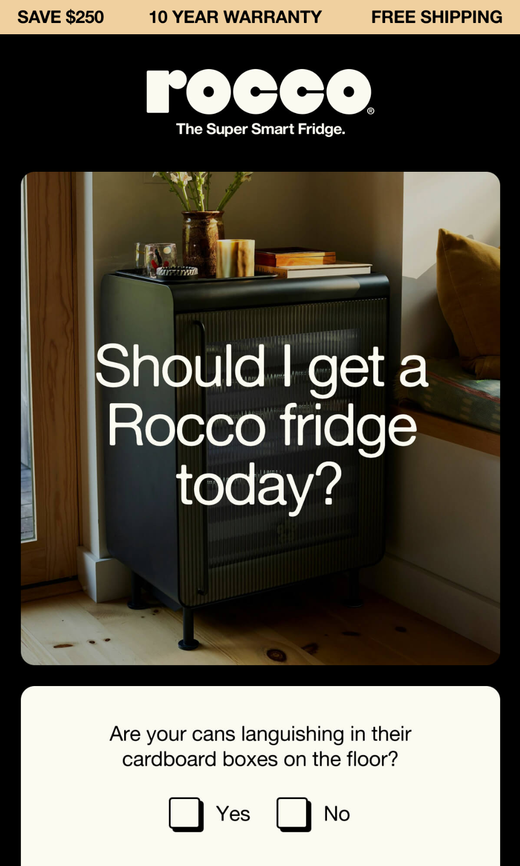
An email that can easily lure you to the dark side? I think Rocco’s dark mode email fits the role (even if the design still needs to look as fresh and readable in white mode):
When These Rules Don’t Apply
Email design rules are starting points, not a reason to force every message into the same template.
- Outlook-heavy B2B lists. When classic Outlook for Windows dominates, prioritize table-based layouts and web-safe fonts over custom styling. Test classic and new Outlook separately: they render differently. Wider, multi-column desktop layouts can work if they fit preview panes and stack on phones;
- Transactional email. Receipts may need compact tables, complete order details, and several utility links; in a receipt, the order details may deserve more visual prominence than any next action. Don’t force a promotional headline or sales button into a message whose main job is to confirm information. For a two-sentence confirmation, skip unnecessary subheadings and bullets. Links within sentences are exempt from the enhanced 44 × 44px target-size criterion;
- Plain-text sends. A plain text version has no HTML fonts, images, styled buttons or sender-controlled dark-mode palette. The 600px width and 16px font recommendations don’t apply; the reader’s client controls presentation. Use ordering, labels and line breaks for hierarchy instead;
- Single-product promos. An image-heavy layout can make sense when appearance is the selling point. Don’t compress away important product details or add filler to hit an image-to-text ratio. Keep the offer and CTA as live text; repeating that CTA in a longer email still represents one primary action.
Common Mistakes
A good-looking email still falls short if readers can’t see the message, tap the button or find the unsubscribe link. Here are the common design mistakes to watch for, why they happen and how to fix them:
- Image-only emails. Your email can look empty when images are blocked because the entire message depends on downloaded graphics. Keep the offer, essential details and CTA as live HTML text and a code-based button, then preview with images disabled;
- Text baked into images. Words can blur when enlarged because they’re part of the graphic, not adjustable text. Without equivalent alt text, screen-reader users may also miss the message. Move headlines, prices, and terms into live text instead of embedding them in artwork;
- A logo that disappears in dark mode. A dark transparent logo can vanish when the client darkens its background but leaves the image unchanged. Add a light outline or embed a contrasting background within the logo image itself, then test in both modes;
- Buttons too small to hit. Readers miss the CTA when the target is undersized – or only the label is linked. Aim for at least 44 × 44 CSS pixels of clickable area, make the whole button clickable and leave space between neighboring targets;
- An unsubscribe link nobody can find. Readers struggle to opt out when the link is tiny, faint or buried among email footer details. Give “Unsubscribe” a clearly labeled, underlined live-text link with readable type and sufficient contrast. It doesn’t need your primary button’s prominence, but it shouldn’t require a search. Where you include an email disclaimer, keep it readable and visually separate from the unsubscribe link.
How to Verify Before You Send
Don’t stop at the builder preview. Run the finished email through these four checks before sending it to your list.
- Preview across email clients. Run a rendering test in the clients your subscribers use, rather than relying on a browser preview. Don’t choose tests by inbox provider alone; Include classic and new Outlook separately where relevant. Look for broken spacing, unexpected line breaks, font changes, and cut-off content both in the email header and body. Check the layout with your fallback font, especially headline wrapping and button;
- Compare light and dark mode. Inspect your logo, body copy, links, buttons and email footer in both modes. Check contrast between the text and background colors readers actually see – not just your original palette. Confirm that the logo remains recognizable and the primary button still stands out;
- Load with images off. Can readers still identify the sender, understand the message and find the main action? Check that essential wording and buttons remain visible without artwork. Review alt text wherever it appears: it should communicate useful information, not filenames or vague labels like “image”;
- Open a real test on a real phone. Send a test through your email platform and open it in a mobile inbox. Read without zooming, check for sideways scrolling and tap the button’s edges – not just its label. Follow the links to their destinations, then check that the unsubscribe link is easy to find in the footer.
Fix any failures, resend the test, and repeat the affected checks. The goal is a readable, usable email across your test environments – not an identical appearance everywhere.
Brand Consistency
Brand consistency in email comes from three things: your brand color palette and fonts with web-safe fallbacks, your logo at the top, and a voice matching your other channels.
- Use your brand’s color palette and fonts. This helps create a cohesive visual identity across all your marketing channels. Also: keep font choices limited. Use your brand font where supported, with a web-safe fallback that preserves readability and a similar visual;
- Incorporate your logo. For HTML emails, place your logo prominently at the top of the email so subscribers instantly recognize who the email is from;
- Maintain a consistent tone and voice. Just like your visual branding, your brand voice should be consistent across all communication channels, including your emails. For one-to-one messages, follow email etiquette and choose an email sign-off that matches the relationship.
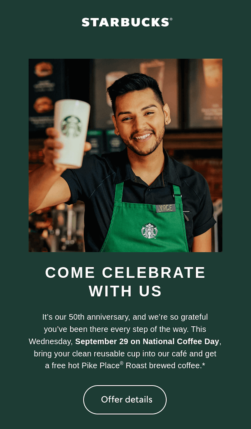
Tell me you don’t immediately recognize Starbucks when taking your first glance at the email. Now, that’s a recognizable branding:
Key Takeaways
- Start with mobile-friendly defaults. Use a responsive single-column layout, a 600px desktop width and at least 16px body text. Let the layout shrink on phones, and use clear headings and whitespace to make scanning easy;
- Keep essential content as live text. Give custom fonts web-safe fallbacks, and don’t bake offers or button labels into images. Compress supporting visuals, write purposeful alt text and avoid chasing a fixed image-to-text ratio;
- Make actions easy to find and tap. Give one primary action the strongest styling. Aim for fully clickable buttons measuring at least 44 × 44 CSS pixels, and keep the unsubscribe link readable and visible;
- Protect readability in dark mode. Check that logos remain recognizable against light and dark backgrounds. Aim for at least 4.5:1 contrast for normal-size text, checking the rendered colors – not just your original palette;
- Test before sending, and adapt the rules. Preview relevant email clients, both modes and images off, then open a real test on a phone. Aim for usability, not identical rendering. Adjust defaults for Outlook-heavy lists, transactional messages, plain-text sends and single-product promotions.