

The average inbox now delivers 100+ messages a day, with more than half of them getting opened on mobile devices. As email service providers continue to introduce new rules that impact deliverability by affecting design signals, optimizing your email design has become one of the most cost-effective performance levers you can use.
The same copy, the same offer, the same list will pull dramatically different click rates depending on hierarchy, spacing, button placement, and how the email survives Outlook, Apple Mail, dark mode, and a thumb scrolling at speed.
This guide is the complete walk-through every marketer, founder and designer should know: from the anatomy of an email, the design principles that hold up across every client, to the constraints you can’t design around.
What is Email Design?
Email design is the discipline of combining layout, visual design, and copy structure into a single piece of communication that drives one specific action. It’s the work of deciding what goes where, in what size, in what order, in what color, and how all of it survives the rendering chaos of Gmail, Outlook, Apple Mail, and a dozen smaller clients.
What it covers:
- Structure (how the email is laid out);
- Visual design (typography, color, imagery, whitespace);
- Copy hierarchy that supports both (headlines, subheads, body, CTA).
What it doesn’t cover:
- Deliverability authentication (SPF, DKIM, DMARC);
- Automation logic (who gets which email when);
- Broader strategy questions of segmentation and offer design.
Those are upstream and downstream of the design layer, and they belong in the broader email marketing strategy discussion rather than this one.
The reason email design sits at an awkward intersection is that it serves three masters at once:
- UX, because subscribers scan rather than read, and the design has to reward scanning.
- Brand, because a single email is one of the most direct expressions of your brand customers encounter.
- Conversion, because the entire point is to drive an action: a click, a reply, a purchase.
A pure brand piece looks beautiful and converts at 0.5%. A pure conversion piece converts well once and burns the list. The craft is keeping all three honest in the same 600 pixels.
Anatomy of an Email
Each email shares the same email anatomy with six structural parts: subject line, preheader, header, body, CTA, and footer. Each one carries a job, and design decisions at every level compound into the experience the subscriber actually has.
The walk-through below covers what each part does, how long it should be, and the most common ways teams get it wrong. Let’s break them down:
Subject Line
The subject line is the inbox gatekeeper. It decides whether the rest of the email exists, full stop. Subscribers scan their inbox in seconds, and your subject is competing with 100+ others for 2 seconds of attention.
What makes one work: specificity over vagueness, value over throat-clearing, curiosity that pays off rather than baits. “March Newsletter” loses to “Three changes to your dashboard this week” every time, because the second one tells the subscriber what they’re going to get if they open.
Keep it short. Mobile clients cut off around 30 to 40 characters, so frontload the most important word. If your subject only makes sense at character 60, half your audience never sees it.
Avoid the patterns that trigger spam filters: ALL CAPS, three exclamation points, “free money,” dollar signs in the subject line itself.
For length rules, formulas, and tested examples, see our full guide on email subject line best practices.
Preheader Text
The preheader is the subject line’s wingman: the short snippet of preview text that shows next to or below the subject in the inbox. Used well, it extends the pitch. Used badly, it leaks “View this email in your browser” or “Having trouble reading this?” and burns the most valuable real estate after the subject itself.
The job of the preheader is not to repeat the subject. It’s to add the second beat the subject doesn’t have room for. If your subject is “Three changes to your dashboard,” the preheader should preview what those changes are or why they matter, not say “Read about three new features.”
Aim for roughly 35 to 55 characters. Most inbox clients show this much before truncating, and the same mobile-first frontloading rule applies: the first six words do the heaviest lifting.
Header
The email header is the visible top of the email itself: the first thing a subscriber sees when they open. It usually carries the logo, sometimes a thin navigation row, and sets the tone before any body copy loads. Keep it simple – the header is a wayfinding element, not a billboard.
A logo around 100 to 200 pixels wide, anchored left or center, with enough padding around it that it doesn’t feel cramped. Skip elaborate top-of-email banners that push the actual message below the fold, especially on mobile where the fold is unforgiving.
Two design decisions deserve attention. The logo needs to render correctly in both light and dark mode (transparent PNGs with dark elements vanish against dark backgrounds, which is covered in the dark mode email design section). And if you include a navigation row, keep it to three or four links maximum. Subscribers came for the email, not the website.
Body
The body is where the message lives: email copy, supporting imagery, and the email structure that pulls the reader toward the CTA. The single rule that matters most is: one email, one idea. The moment you try to communicate three things at once, all three lose. Subscribers don’t read past the first ask if it doesn’t grab them.
Length depends on type. Image-heavy promotional emails work well at 50 to 100 words of supporting body copy, where the imagery does the persuading. Text-heavy newsletters or transactional emails can stretch to 100 to 200 words before scanability drops. Beyond that, you’re writing a blog post, and the body should link out instead.
For structuring what goes into the message, read our post on email content.
Paragraphs of one to three lines. Subheads break up longer bodies. Bullet points where the structure earns them. The body’s job is to make the case for clicking, not to make every case at once.
The sign-off is the body’s final beat before the footer. A short close, a name, optionally – a P.S. line that often gets read more than the body itself.
Keep it human – robotic sign-offs telegraph that no one wrote the email. For sign-offs that land, check how to end an email.
CTA
The call-to-action (CTA) is the single action the email is built around. Everything else, the subject, the preheader, the body, the imagery, exists to drive a click on this one button or link. Build the email around it, not the other way around.
The rule is one primary CTA per email. You can have a secondary text link further down, but a screen with three competing buttons is a screen where subscribers click none of them. Pick the most valuable next step and let everything else support it.
As for email CTA design, buttons beat text links for primary actions. They earn the eye, they tap better on mobile, and they signal “this is the thing to do.” Aim for at least 44×44 pixels (the iOS minimum tap target) with high contrast against the background and copy that’s specific. “See the new collection” beats “Click here.” “Get your shipping estimate” beats “Learn more.”
Footer
The footer is the trust-and-compliance zone: physical address, unsubscribe link, contact information, social links, and the legal text that keeps you out of regulatory trouble. It’s the part most teams treat as an afterthought, which is exactly why subscribers notice when it’s missing or sloppy.
CAN-SPAM in the US requires a valid physical mailing address and a clear, working unsubscribe link in every commercial email. GDPR in the EU requires the same, plus information about how to manage data preferences.
Burying the unsubscribe link in light gray 8px text is technically compliant and practically a complaint magnet. Subscribers who can’t find unsubscribe will mark you as spam instead, and spam complaints hurt deliverability for everyone on the list.
The footer also carries any legal disclaimers your industry requires (financial, healthcare, regulated SaaS). Include them, but don’t let them swallow the footer.
For what legal text to include and when, read our post on writing an email disclaimer.
Core Email Design Principles
These are the rules that hold up regardless of email type, client, or year. They’re the visual fundamentals that make any email readable in three seconds and scannable in less.
Five principles cover most of what matters: visual hierarchy, whitespace and email layout, typography, color and contrast, and imagery balance.
Visual Hierarchy
Visual hierarchy is the order in which the eye travels. Subscribers don’t read top-to-bottom; they scan, and the design either rewards the scan or wastes it. Three levers control hierarchy: size (bigger reads first), weight (bolder reads first), and placement (top and left in Western reading order read first).
The rule that matters: one focal point per screen. The headline is the loudest element. The CTA is the second loudest. Everything else supports those two.
If your hero image, headline, and CTA are all competing in the same visual weight class, none of them wins. Done well, hierarchy makes an email scannable in three seconds. The subscriber sees the headline, sees the CTA, decides whether to read the rest. That’s the bar.

Whitespace and Layout
Whitespace is the breathing room between elements, and cramped emails feel like ads. Subscribers can tell within a quarter-second whether an email respects their attention or just packs the page. Generous whitespace signals premium; tight packing signals desperation.
Pad CTAs with at least 20 to 30 pixels of clear space on all sides so the button has room to breathe and tap. Use 1.4 to 1.6 line-height on body copy so paragraphs don’t feel like a wall of text. Add space between sections with consistent padding (24 to 40 pixels) rather than fighting for every pixel.
Typography
Email typography is easy if you know and follow certain rules. For instance, web safe fonts (Arial, Helvetica, Georgia, Verdana, system stacks) survive client rendering without surprises. Custom web fonts work in some clients (Apple Mail, native iOS) and silently fall back to defaults in others (most Outlook versions). If you use a custom font, define the fallback explicitly so the email doesn’t render in Times New Roman by accident.
Body text at 14 to 16 pixels minimum. Anything smaller becomes a squint on mobile, where most opens happen. Headlines should sit at roughly 1.5 to 2x the body size to establish hierarchy without screaming. Line length stays around 50 to 75 characters per line for readability.
The heading-to-body ratio is a hierarchy tool: the bigger the gap, the louder the headline.
Color and Contrast
Brand colors should stay consistent across every send so subscribers recognize you in the inbox. The CTA button color usually breaks from the brand palette intentionally, picking the color with the highest contrast against the background to make the button impossible to miss.
WCAG sets a 4.5:1 contrast ratio as the minimum for body text against its background. Below that, body copy becomes hard to read for subscribers with low vision and (often) for everyone else too. Run your palette through a contrast checker before shipping.
Color choices need to survive dark mode inversion, where some clients flip backgrounds and text aggressively. Pure black (#000000) and pure white (#FFFFFF) get inverted most reliably, which is sometimes what you want and sometimes a disaster. Slightly off-white and off-black backgrounds give you more predictable outcomes.
Imagery and Text-to-Image Ratio
A 60/40 to 70/30 text-to-image ratio is the deliverability safe zone. Image-only emails are the spam-filter pattern of old promotional blasts, and filters still flag them aggressively. Live HTML text gives you copy that renders even when images are blocked, which still happens by default in many Outlook configurations.
Keep individual images under 200KB and total email weight under 100KB if possible. Gmail clips emails over 102KB, hiding the unsubscribe link and tanking deliverability signals. Always include alt text on every image.
Alt text serves two jobs: accessibility for screen readers, and a fallback message when images don’t load. “Logo” is a wasted alt; “Sender logo, return to homepage” earns the space.
Email Layout Frameworks
Layout frameworks are the structural blueprints, the named patterns that pair hierarchy and content type to predictable outcomes. Picking a framework before designing saves you from reinventing the wheel and gives you a starting point that’s already proven against subscriber scan patterns.
The four below cover most marketing and lifecycle emails – the choice depends on email goal and content volume.
Inverted Pyramid
The inverted pyramid pulls the reader from a wide attention-grabbing top to a single CTA at the point. A bold headline and hero image up top, narrowing supporting copy in the middle, one button at the bottom that the entire structure points to.
Use it when the email has a single action and a single idea: a product launch, an event invitation, a feature announcement. The narrowing structure visually funnels the eye toward the click, which is exactly what a one-action email should do.
Zig-zag (Z-pattern)
The Z-pattern alternates content blocks left and right down the page, matching the natural eye movement Western readers use to scan a layout. Image-left/copy-right, then copy-left/image-right, then image-left/copy-right.
Use it for product roundups, multi-feature announcements, and catalog-style emails where you have several items to showcase. The alternation keeps the layout from feeling repetitive across four or five blocks.
Single-column
A one-column layout stacks everything vertically: header, hero, copy, CTA, footer. Nothing sits side-by-side. This is the most mobile-friendly email design choice in email and the default choice for the majority of marketing sends in 2026.
Use it for newsletters, transactional emails, lifecycle automation, and anything where mobile rendering matters more than design ambition. Which is to say – almost everything.
Modular
Modular design is less a layout pattern and more a system: reusable content blocks (hero, product card, testimonial, CTA, footer) that the team mixes and matches per send. Build the blocks once, drag them into new templates, ship faster with consistent brand styling.
It’s increasingly the default for high-volume senders in 2026 because it solves the speed-versus-consistency tradeoff. Designers build the system – marketers assemble the emails.
Mobile-first and Responsive Design
Mobile-first is the default in 2026, not a consideration. Roughly 42-60% of email opens happen on phones (depending on the audience), and engagement rates on mobile now match or exceed desktop for most lists. Designing desktop-first and “making it work” on mobile is the inverse of how subscribers actually read.
The width conventions are stable. Desktop emails sit at 600 to 640 pixels wide; mobile renders at 320 to 480 pixels depending on device. Designs that flex between the two reliably are the ones that ship without surprises.
Touch target sizing is the easy win. Apple’s interface guidelines call for 44×44 pixel minimum tappable elements; Google recommends 48×48. Buttons smaller than that get mis-tapped, and a mis-tap is a lost click. Pad your CTAs accordingly, and leave 8 to 10 pixels of clear space around any tappable element so the thumb doesn’t accidentally hit a neighboring link.
Multi-column layouts need to stack on mobile. Two columns on desktop become one column on phones, with the most important content (usually the left column on desktop) appearing first in the stack. This is where responsive media queries do the work, and where teams using single-column layouts skip the problem entirely.
Font-size floors apply especially on mobile. Body text at 14 to 16 pixels minimum. Anything smaller forces subscribers to pinch-zoom, and pinch-zooming is the universal signal that the email wasn’t designed for them.
Test across clients before sending. Apple Mail on iOS, Gmail on Android, Outlook on Windows, Yahoo Mail. Each one renders the same HTML differently, and a design that looks perfect in your preview can break in the inbox where it counts.
For Outlook compatibility specifically, the fluid-hybrid approach (a combination of fluid widths, max-width constraints, and ghost tables) lets you go for responsive email design that don’t break in Outlook desktop’s Word-based rendering engine. It’s more code than a pure media-query approach, but it’s the pattern that ships across all major clients without surprises.
Accessibility in Email Design
Email accessibility is both ethics and performance. It’s the right thing to do, full stop, because subscribers with visual impairments, motor impairments, and cognitive differences deserve emails that work for them.
It’s also a 2026 deliverability signal: Gmail, Yahoo, and Apple now weigh accessibility patterns (alt text presence, contrast ratios, semantic HTML email design) into how they classify and place messages. In other words: accessible emails land better.
Descriptive alt text on every image. Not “image” or “photo.” A short sentence that conveys what the image shows or what role it plays. For decorative images that add nothing semantic, an empty alt attribute (alt=””) tells screen readers to skip them.
Contrast at WCAG 4.5:1 minimum for body text. Run your color palette through a checker. Light gray text on white backgrounds is the most common violation in email marketing design, as it fails for subscribers with low vision and for everyone reading on a phone in bright sunlight.
Semantic HTML. Use real heading tags (h1, h2, h3) for headings, not bolded paragraph text styled to look like a heading. Use lists for lists, not paragraph blocks with manual bullets. Tables remain a longstanding compatibility quirk for layout, but tables presenting data should use proper table markup.
Descriptive link text. “Read the full report” beats “Click here.” Screen readers announce links out of context, and a subscriber tabbing through hears “click here, click here, click here” with no idea where any of them lead.
Logical reading order. The source order of the HTML should match the visual reading order. CSS positioning that visually rearranges content but leaves the source order scrambled creates a bad experience for assistive tech and for any client who ignores your CSS.
Plain-text fallback. Every HTML email should ship with a plain-text version. Some subscribers prefer it; some clients fall back on it. A thoughtful plain-text version reads as the email’s bones: headline, body, link with the URL spelled out, sign-off, footer.
Accessible design benefits everyone, not just users with impairments. Subscribers in bright sunlight, on slow connections, with images blocked by default, on older devices. The design that works for the hardest cases tends to work better for every other case too.
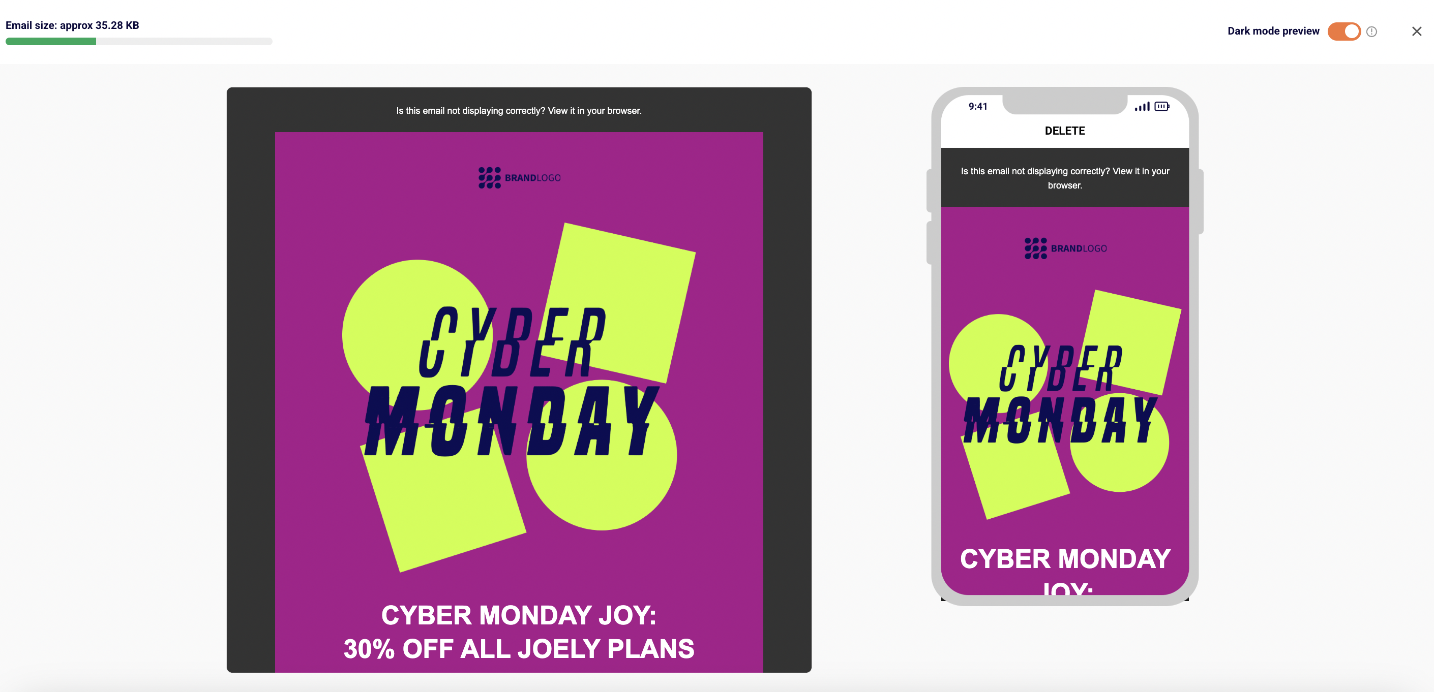
Designing for Dark Mode
Dark mode is a design variable in 2026, not a trend. It’s the default on iOS and Android, the preferred setting for a meaningful share of subscribers, and a rendering layer your email passes through, whether you designed for it or not.
The three-client problem is real and worth understanding:
Apple Mail gives designers the most control and supports the preferred-color-scheme media query, which means you can write CSS that targets dark mode specifically.
Outlook is fragmented: Outlook for Mac handles dark mode reasonably; Outlook on Windows applies aggressive full-color inversion in some versions and partial inversion in others.
Gmail ignores prefers-color-scheme entirely and applies its own logic, with Gmail mobile apps doing the most aggressive inversion of the major clients.
The specific design failures are predictable (and can be avoided):
- Transparent PNGs with dark elements (a black wordmark on transparent background) vanish against dark backgrounds in inversion-aggressive clients.
- Button colors invert in unintended ways: a navy CTA can become orange, breaking your brand and your contrast ratio.
- Subtle borders, light gray dividers, and faint shadows disappear entirely when the background flips to black.
The fixes are practical:
- Use PNGs with a visible outline or a light background plate around the logo so it stays visible regardless of what the client does to the background.
- Set explicit background colors behind logos and key visual elements rather than relying on transparency.
- Avoid pure black (#000000) and pure white (#FFFFFF), which invert most reliably. Use slightly off-black (#1a1a1a) and off-white (#f8f8f8) for more predictable outcomes.
- Test in dark mode on real devices before sending, not just in a desktop preview tool.
- Perfect cross-client parity is impossible. The goal is a design that holds up reasonably well for every client, not one that looks identical everywhere.
Email Design Best Practices
Best practices are the applied checklist. Each one is small. But together? They’re the difference between an email program that compounds and one that plateaus.
- Use a recognizable sender name. “Marketing Team” loses to a real human name or the brand name itself. An unfamiliar sender name in the inbox is a fast trip to ignore or delete.
- Front-load value in the subject and preheader. The first 30 to 40 characters do the work. If your value lives in character 50, you’ve buried it.
- One primary CTA per email. A screen with three competing buttons is a screen where none of them get clicked. Pick the most valuable next action and let the rest of the email support it.
- Maintain a 60/40 to 70/30 text-to-image ratio. Live HTML text instead of text baked into images. This protects deliverability, accessibility, and the experience for subscribers who load mail with images blocked.
- Always ship a plain-text fallback. A small effort, a meaningful signal. Some subscribers prefer it; some clients fall back on it.
- Consistent brand styling across every send. Same logo, same color palette, same typography, same tone. Subscribers learn to recognize your emails in the inbox; consistency is what makes that possible.
- Test across clients before sending. Apple Mail, Gmail, Outlook, Yahoo. Both desktop and mobile. Light mode and dark mode. Fifteen minutes of testing prevents the broken send that costs days of trust to recover.
- Respectful send frequency. Every send should earn its slot. Mail-bombing your list does not improve revenue per send; it accelerates unsubscribes and complaints.
- Honor unsubscribes immediately. CAN-SPAM gives you 10 business days, while under recent Gmail/Yahoo’s bulk sender rules, unsubscribes must be processed within 2 days. Subscribers who unsubscribed and still get emails do not become re-engaged customers – they become spam complaints, and spam complaints hurt every other subscriber on the list.
- Personalize beyond the first name. “Hi {{first_name}}” is not personalization. Behavioral cues (recent browsing, recent purchase, lifecycle stage) are. Even a small shift from generic to relevant lifts engagement noticeably.
The human layer matters as much as the visual rules. Tone that respects the reader, copy that doesn’t manipulate, offers that match what subscribers actually signed up for. Design without email etiquette is a brochure. Design with etiquette is a relationship.
As for the full best-practices breakdown with examples, see our detailed post on best practices for email design.
Email Design Trends in 2026
Most “trends” articles are fashion lists. The email design trends below are the shifts actually changing how senders design in 2026, and each one earned its place by solving a real problem.
- AI-powered dynamic templates and hyper-personalization. Instead of one campaign sending to 50,000 subscribers, the same campaign sends 50,000 slightly different versions: product blocks tuned to browsing history, hero imagery picked per segment, copy variants generated and selected per recipient.
Klaviyo, Bloomreach, and Movable Ink ship the strongest tooling here. Worth adopting when your underlying data is clean and your segmentation is already strong; not worth chasing if you’re still sending one batch to everyone. - Hybrid plain-text design. A minimalist look (light backgrounds, simple typography, no hero images) with one high-contrast CTA. It reads as personal rather than promotional, which is exactly why it works in 2026’s noise-saturated inbox.
Heavy retail brands look weak in plain-text style, but for SaaS, B2B, and creator newsletters, hybrid plain-text often outperforms heavily designed emails on opens and clicks. - Micro-animations on CTAs and loading states. Subtle motion (a hovering button, a pulsing accent, a small loading state) earns the eye without feeling like a banner ad. Apple Mail and Gmail render CSS animations reliably; Outlook ignores them.
Use them where they enhance, skip them where they don’t. - Bold oversized typography as the hero element. Large headline type, sometimes 40 to 60 pixels, replaces the traditional hero image entirely. It loads instantly, looks sharp on every device, and communicates fast.
The trend is partly aesthetic and partly performance: every image you skip is weight you save. - Dark-mode-by-default as a design reality. Designers in 2026 mock up every email in both modes from the start rather than designing in light mode and patching dark mode after.
- Not every trend needs to be adopted at once. The brands that survive test what aligns with their voice and their data, not the ones that chase every shift.
Tools for Designing Emails
Three categories cover most teams. The right one depends on team skill, send volume, and how much brand consistency matters.
- Drag-and-drop builders inside ESPs. Mailchimp, Sender, Brevo, Klaviyo, and most other email service providers ship visual editors that let non-designers assemble emails from blocks: hero, copy, image, CTA, footer. They’re fast, they handle responsive behavior automatically, and they keep the design inside the same tool that sends.
- Dedicated template builders. Tools like Stripo, BeeFree, and Chamaileon let teams design emails outside the ESP, then export the HTML or push directly into the sending platform. They give designers more control than ESP builders, support advanced patterns (modular blocks, design systems, brand libraries), and are the right answer when you have a designer who needs to ship templates faster than the ESP allows.
- Code-based frameworks. MJML and Maizzle let developers write email in a structured framework that compiles to cross-client HTML. They produce the most reliable rendering across Outlook, Gmail, and Apple Mail, and they’re the right answer for teams with developer support and high send volume.
The decision is simple. Marketing team without a designer? ESP builder. Designer or design team, no developer? Dedicated email template builder. Developer support, high volume, brand-critical? Code framework.
Most teams mix two: a code framework for the master templates, an ESP builder for the day-to-day email campaigns built on top.
For a full walkthrough of the top tools with pros, cons, and email template design tips and tricks, see our guide to the best email template builders.
Testing and QA’ing Your Email Design
Every email gets tested before it ships. Not “if there’s time,” not “for the big sends,” every send. Fifteen minutes of QA prevents the broken-link, broken-merge-tag, broken-rendering disasters that cost days of trust.
The pre-send checklist:
- Preview across major clients. Gmail (web and mobile), Outlook (desktop and web), Apple Mail (macOS and iOS), Yahoo Mail. The same HTML renders differently in each one, and a design that looks perfect in your editor can break in Outlook in ways you’d never predict.
- Dark mode preview. Test in dark mode on real devices, not just a desktop preview tool. Check that logos stay visible, contrast holds up, button colors don’t invert into something off-brand.
- Mobile vs. desktop rendering. Open the test send on a phone. Tap the buttons. Check the line wrapping. Most emails get opened on mobile first, and a desktop-only QA misses where the majority of subscribers actually read.
- Link and merge-tag checks. Click every link in the test version. Confirm merge tags resolve correctly and don’t render as “{{first_name}}” in the live send. The two most embarrassing email failures (broken links, broken personalization) are both caught in 60 seconds of pre-send QA.
- A/B testing one variable at a time. Subject line OR send time, not both. A clear hypothesis, a meaningfully sized sample, one variable changed. Testing two things at once tells you the result, not which change caused it.
Tools that earn their place: Litmus and Email on Acid for cross-client previews and inbox-level rendering tests. Most ESPs ship their own preview tools, useful for quick checks but not a full substitute for high-stakes sends.
The rule that matters most: no email ships without human review on a real device. Automated checks catch broken HTML; human review catches the email that’s technically correct and reads completely wrong.
Conclusion
Good email design is a system, not a one-off aesthetic choice. The anatomy gives you the parts, while the principles give you the rules. The frameworks give you the patterns. The constraints give you the floor every design has to clear. The tools and testing discipline keep any of it from breaking on send.
The teams shipping the best email design in 2026 aren’t running a secret aesthetic – they’re running the fundamentals with more discipline than the rest. They mock up every email in both light and dark mode. And they keep the CTA singular and the message short.
Now, pull up your last send, read the subject line out loud and open it on your phone. Check the dark mode rendering. Count the CTAs. Most senders find at least three things they’d fix in the next one. And remember: the next email is your chance to do it better.