


If websites are regular salespeople, landing pages are hard closers. They’re not there to tell your brand story or get a casual scroll. They’re built for action — sign up, book a demo, join a waitlist, claim that offer.
And when you add a form to the mix? You’re collecting intent. But here’s the tricky part: most people don’t want to fill out a form — unless you make it frictionless.
That’s why great landing pages with forms feel effortless. In this guide, we’ll look at 8 real-world landing pages with forms and break down what makes them work.
Whatever your goal — trial signups, growing a newsletter, or launching a product, these examples will help you design high-converting form-based landing pages.
Let’s get started.
What is a Landing Page with Form?
A landing page with a form is a focused, standalone page designed to drive a single action — filling out a form. Unlike your homepage or a blog post, this page strips away distractions like menus or multiple links. It guides the visitor toward a single outcome.
What makes it work isn’t just the opt-in form itself — it’s how seamlessly the form fits into the page. The headline pulls you in, the visuals create context, and the form offers a quick way to say ‘I’m interested’.
Depending on the use case, that form asks your name and email, or more contact information, if it’s related to the B2B industry or high-ticket sales.
And when done right, it feels less like ‘giving away data’ and more like unlocking value for the visitor.
Elements to Make a Good Landing Page with Form
Most people don’t wake up thinking, ‘Can’t wait to fill out a form today’. So, what makes landing pages with a form effective?
As a marketer, your job isn’t just to get attention; it’s to make taking action feel effortless. The best landing pages reduce resistance at every step. They make the offer irresistible, the lead generation form simple, and the path to conversion incredibly clear.
Here are the elements to create the perfect landing page:
- Benefit-focused headline. Your headline should instantly tell the visitor what’s in it for them. There should be no jargon. For example, ‘Get Your Free WordPress Site Audit in 60 Seconds;’
- Subheadline that supports the promise. This adds depth to your headline and nudges visitors to act. Say, for the example above, something like, ‘No tech skills needed. Just enter your URL’ will push them to act;
- Purposeful form fields. Only ask for what you need. Every extra field increases drop-offs. Start with name + email. Add more only if it serves a specific goal;
- Visual hierarchy and flow. Guide the eye naturally, from headline to form to CTA. Use spacing, font weight, and contrast to create a natural rhythm;
- Actionable CTA. Replace vague buttons like ‘Submit’ with benefit-driven CTAs like, ‘Send my free audit’ or ‘Book a free demo;’
- Add trust signals and social proof. Add testimonials, logos, or trust badges near the form to reduce hesitation. When people see others have done it, they’re more likely to follow;
- Mobile-friendly design. Over 82% of internet users visit landing pages on mobile devices. So, it’s crucial that your form submission page is responsive and the form is easy to complete on phones.
8 Landing Page Examples with Forms (Different Use Cases)
If you’re looking for inspiration to create a high-converting landing page with form, we’ve some great examples to save.
The following real-world examples show how to sync page and form design with your campaign goal.
Zola — Beautiful Landing Page with Contextual Form
Every landing page is different and some act as a great starting point for a strategic lead funnel, such as Zola’s wedding registry landing page.
Instead of a single message or one-time goal, Zola’s wedding planning page meets users where they are — emotionally, logistically, and behaviorally. Have a look:
- Landing page goal: Sign up for the service.
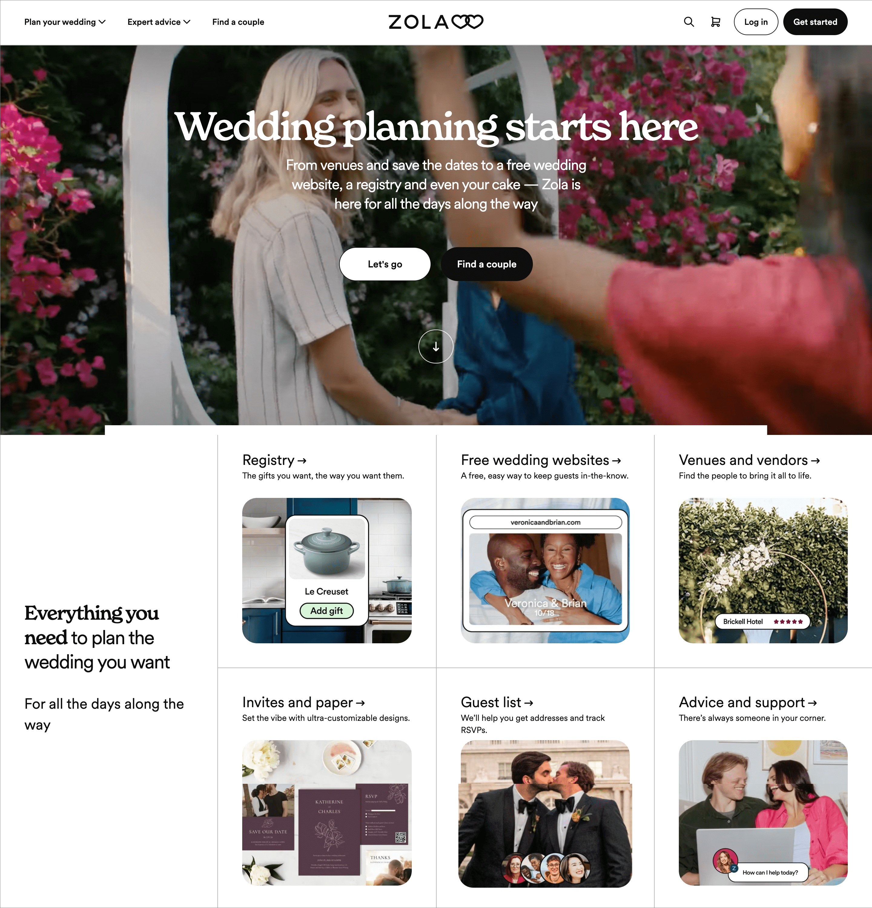
The page starts like a typical landing page — aspirational messaging, compelling visuals, a primary call-to-action and another button for secondary conversion. But once you click the primary CTA, the real magic begins — a multi-step form that first qualifies you based on your wedding stage, then collects just enough details to personalize the journey.
We’ve tested many onboarding flows, and Zola’s tiered format feels more like a guided experience than a form — a tactic that’s brilliant for reducing drop-offs while building trust.
This top-of-funnel layout casts a wide net — CTA buttons like “Start Planning” trigger an interactive journey rather than a traditional registration form.
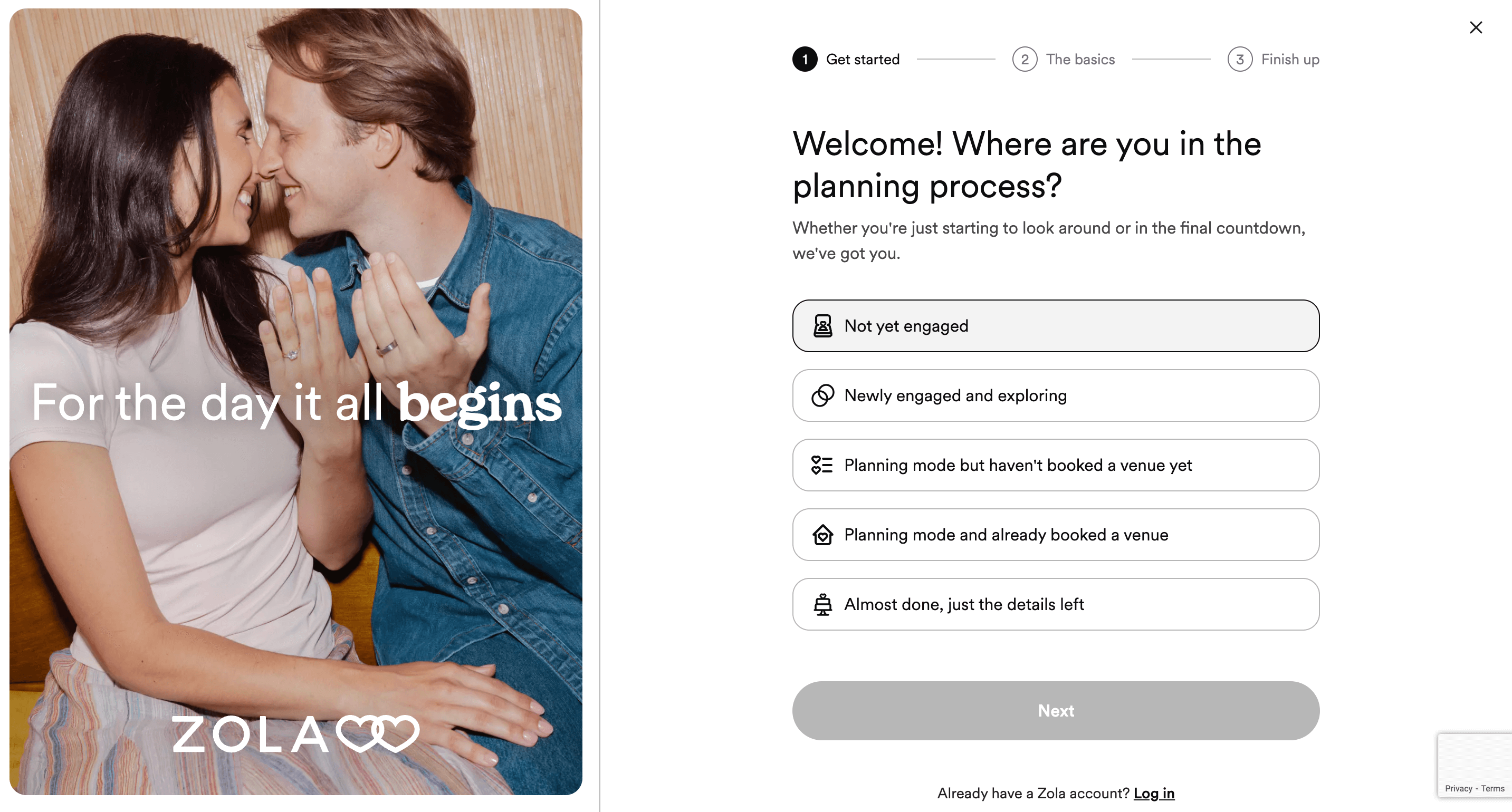
Instead of assuming all users are ready to book vendors, Zola asks where you are in the process — “Not yet engaged” to “Almost done.” This reduces friction and tailors everything that follows.
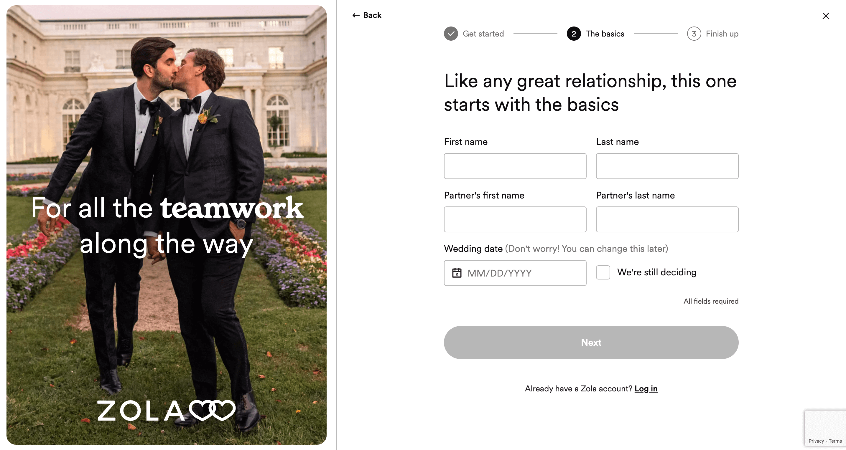
Once qualified, users input names and tentative dates. It’s a smart balance — Zola gets useful data without overwhelming the user upfront.
Key Features:
- Headline. “Wedding planning starts here” — short, clear, and emotionally aligned. No jargon, just targeting with intent;
- CTA button. Opens a guided form instead of a static sign-up. This interaction feels like personalized help, not data collection;
- Great form experience. Multi-step smart forms with progress indicator (“Get started > The basics > Finish up”). Visitors feel guided, not rushed;
- Segmentation by intent. Prospective customers self-select their planning stage, ensuring more relevant follow-ups and fewer irrelevant recommendations;
- Emotional Visuals. High-quality, inclusive images reinforce warmth, personalization, and relatability — key for a niche like weddings;
- Conversion intelligence. Every step of the landing page form feels contextual. From using warm language to showing empathy (“we’re still deciding” toggle), it’s deeply user-aware to increase conversions.
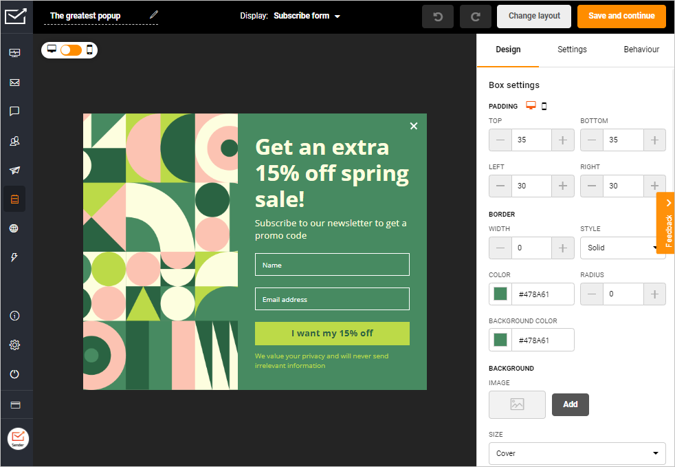
Creating signup forms & popups with Sender is faster than brewing a cup of coffee. No design or coding skills needed.
Lyft — Lead Generation Landing Page
Lead gen pages work best when they answer the ‘Why should I?’ question right off the bat. Instead of selling or promising something, great lead capture pages sell a transformation. That’s why simplicity and directness matter more than detail or design flair in such pages.
Lyft nails this concept with its driver sign-up landing page. It doesn’t waste time explaining the platform. Have a look:
- Landing page goal: Lead generation.
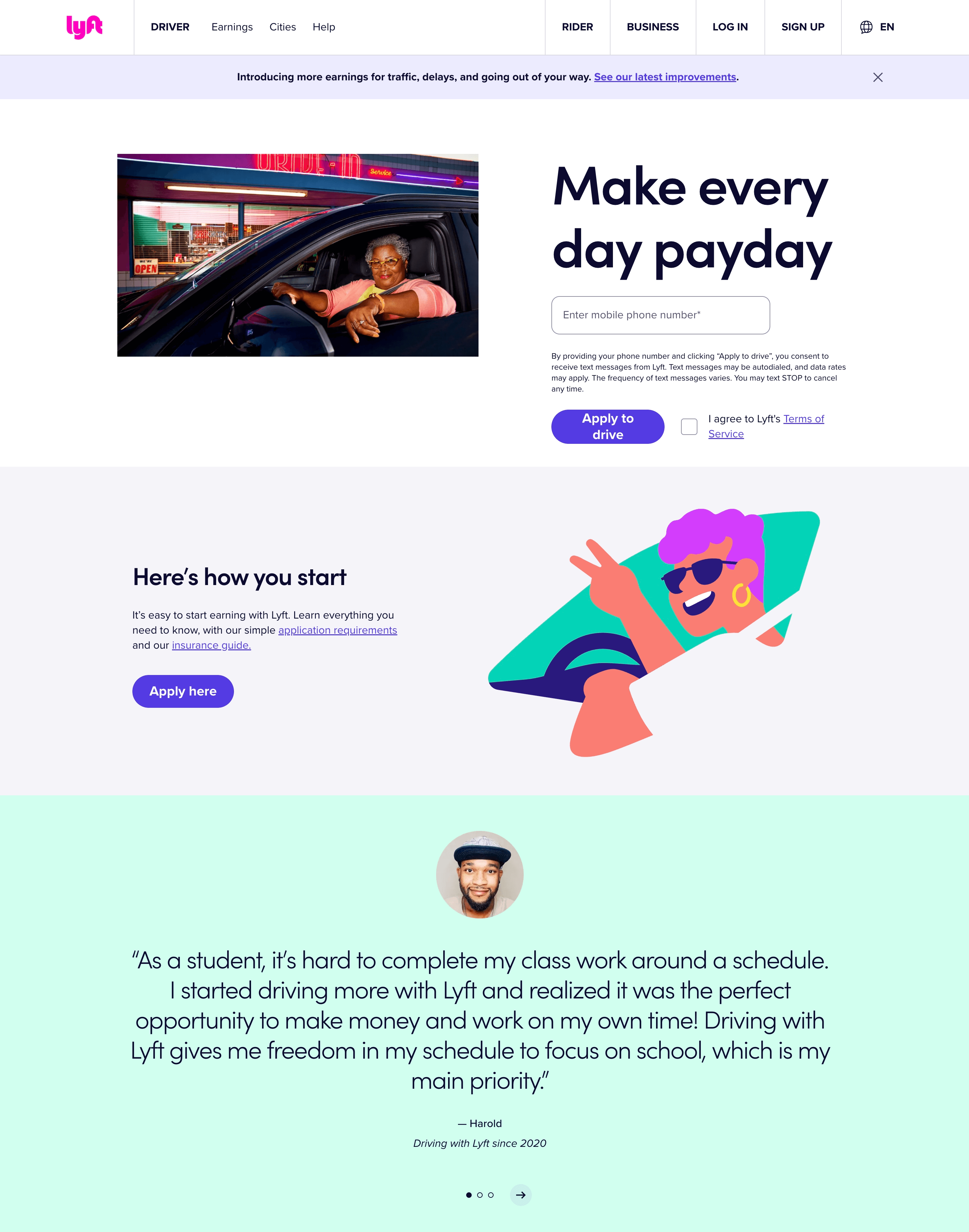
The page promises what every potential driver wants to hear: consistent payouts and flexible work. From an attractive headline to the frictionless one-field form, the message is clear — you’re one step away from earning.
Key Features
- Headline. Emotionally charged and benefits-first headline that appeals to desire, not duty;
- Form. Single-field form promotes speed and intent capture over qualification. No one wants to upload a resume on the first click;
- CTA button. Simple ‘Apply to drive’ is action-oriented and job-specific, increasing the chances of a click;
- Trust signal. The testimonial from a real student-driver builds relatability and makes the reader visualize themselves in a similar situation;
- Visuals. Hero image feels personal and confident and the lifestyle illustrations and app screenshots create a realistic vibe.
Netflix — Click-Through Landing Page
Click-through landing pages don’t force decisions — they guide them. They’re perfect for low-friction offers where you want to warm up the visitor before the big ask.
In Netflix’s case, the only thing you need to do? Enter your email. No plan selection, no card info. Just signal interest — and you’re in. Have a look:
- Landing page goal: Get more paid subscribers.
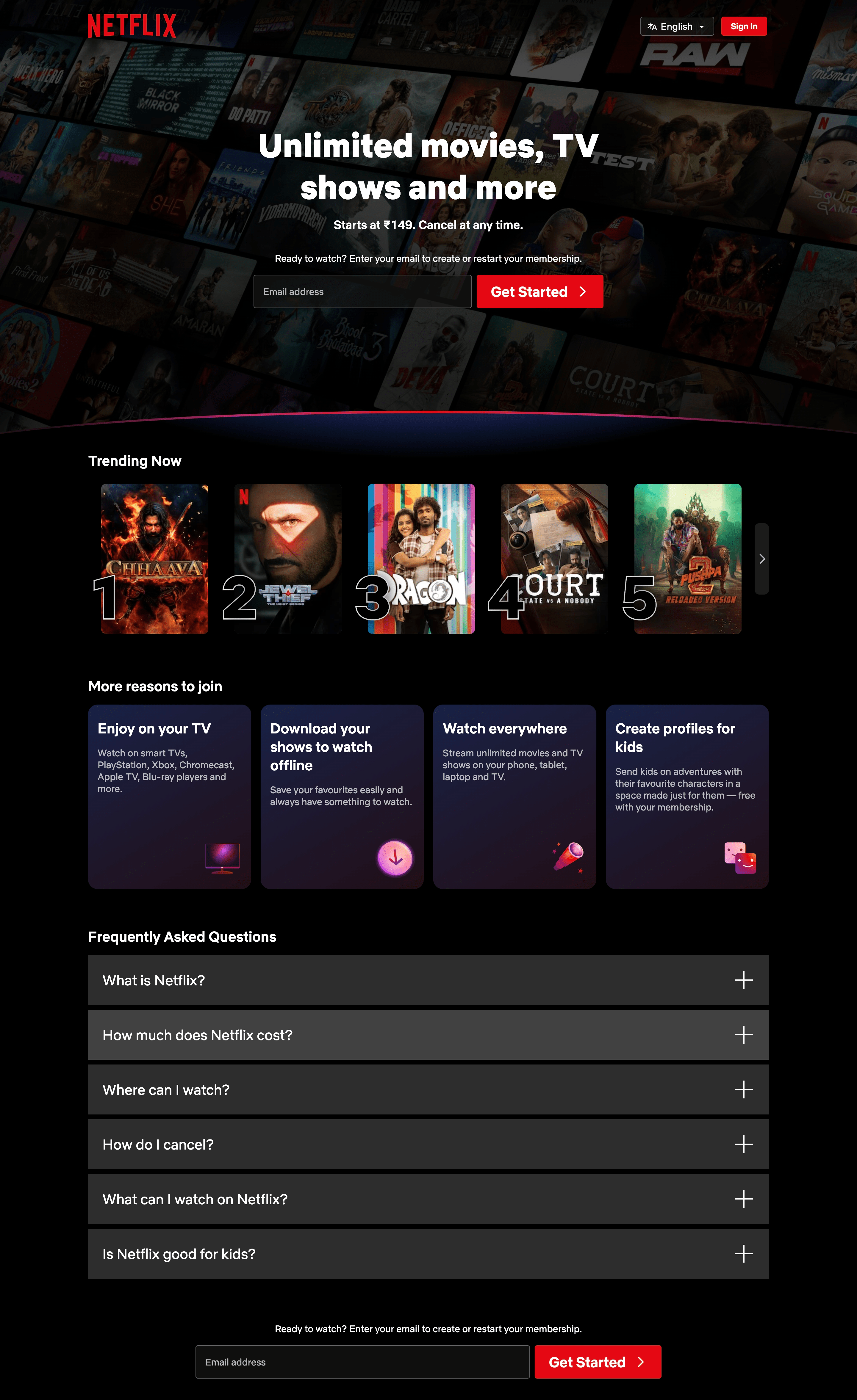
Netflix’s email capture page doesn’t try to convince with features upfront. Instead, it leans on a universal craving — endless entertainment. With a single headline and compelling CTA, it gets out of its own way. Having seen many streaming sites, we’ve understood one fact — less choice = more action. And that’s exactly the case here.
Key Features:
- Headline. Broad, inclusive, and wish-triggering headline. It doesn’t explain; it excites;
- Subheadline. Price mention and cancellation promise instantly addresses objections;
- Form field. Single field ensures zero friction. It’s a warm-up, not a long signup process;
- CTA button. Active, friendly, and strategically repeated across the page to reinforce momentum;
- Visuals. Hero background with recognizable titles builds instant trust. Below-the-fold content reinforces value without cluttering the top fold;
- Addressing apprehensions. The FAQ and ‘More reasons to join’ sections lower uncertainty and handle apprehensions well.
Madison Logic — Event Registration Landing Page
Event registration pages need to do two things well: capture interest and build trust through credibility.
People don’t sign up for webinars just because it’s happening. They sign up when the value is specific, expert-backed, and relevant to their problems. Madison Logic gets this right with its 2025 B2B marketing trends event page. Have a look:
- Landing page goal: Increase webinar attendees.
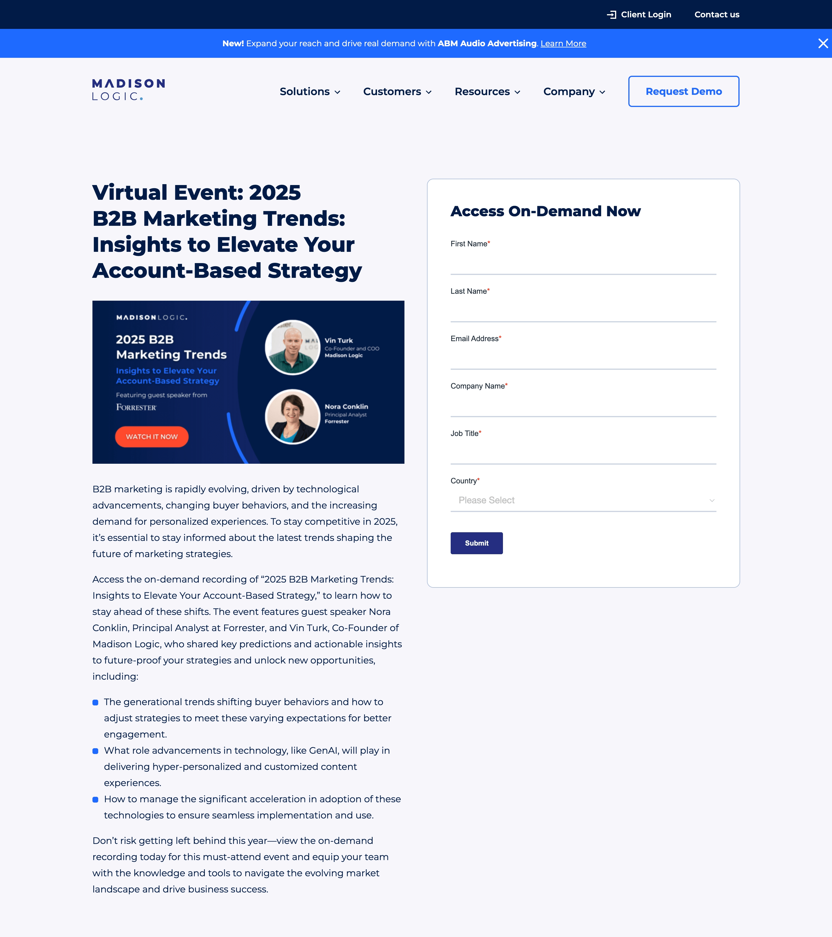
The landing page doesn’t over-promise but builds trust through expert names, clear outcomes, and precise takeaways.
We’ve seen too many B2B squeeze pages loaded with fluff to understand this one earns the sign-up by being grounded, scannable, and high-intent. It makes the event feel too relevant for people in marketing or sales leadership to ignore.
Key Features:
- Headline. Mention of the core agenda makes the event’s benefit and format clear upfront;
- Form fields. Standard but necessary B2B fields — name, email, company, job title, and country to capture qualified leads only;
- Trust signals. Speaker credibility is the backbone here — names, roles, and a strong partner mention (Forrester) instantly level up trust;
- Content structure. The bulleted summary of takeaways does a lot of heavy lifting — it’s persuasive, skimmable, and immediately useful.
Service Titan — Demo Request Landing Page
Demo request pages have only one job — qualifying the right leads for business without overwhelming visitors. This usually means asking thoughtful questions that help your sales team without making visitors feel like they’re filling out taxes.
- Landing page goal: Get more demo requests.
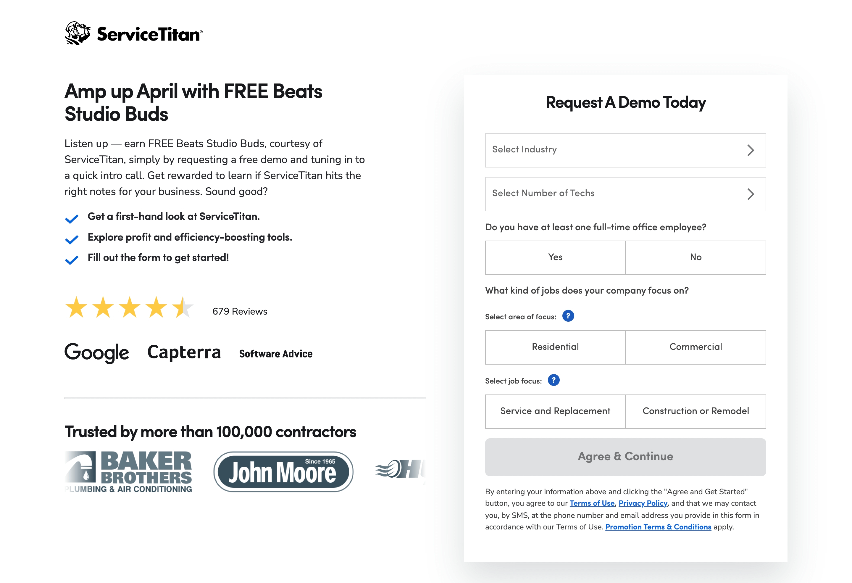
ServiceTitan balances this beautifully with its demo request page. The page combines a generous incentive (that no one expects) with a layered form that feels more helpful than intrusive.
They’ve used a smart layout to simplify the experience. Plus, they let trust do the heavy lifting — with review stars, big logos, and social proof from over 100K contractors.
Key Features:
- Headline. Attention-grabbing, promotional, and time-sensitive. It’s less about the brand (demo) and more about what’s in for the visitor;
- Form fields. Smart segmentation without the overload. There are explanatory field labels, and each field has simple buttons and dropdowns for speed;
- CTA button. Clear, compliant, and forward-moving. Not pushy;
- Trust signals. Review stars, known brand logos, and the ‘Trusted by 100,000+ contractors’ line all work to build instant credibility;
- Visual design. Balanced and clean design with lots of white space. The left side sells the offer; the right side collects data. No clutter. No distractions.
G Adventures — Contest / Giveaway Landing Page
Giveaway pages don’t just promise; they sell a dream. That’s why the best ones feel less like a form and more like an experience. The hook must be immediate, the reward irresistible, and the form? Effortless.
G Adventures nails the emotional appeal with their landing page for ‘Love the World Giveaway’. Have a look here:
- Landing page goal: Increase giveaway participation.

From the moment you land on the page, you start thinking about where you’d travel, not the form you must fill out. With a massive prize ($30,000 dream adventure + weekly trips), the page plays on aspiration and supports it with strong visuals, a clean layout, and gamified ‘challenges’ to keep visitors hooked.
Key Features:
- Headline. Emotionally rich, visually distinctive, and easy to remember. Not some average headline you see on giveaway pages;
- Landing page copy. Offers a clear breakdown of the grand prize and recurring rewards. Everything’s upfront with no fine print games;
- Form. Short and sweet — name, email, country, and opt-ins to make it faster to enter the giveaway;
- Engagement add-on. Community Challenges extend the page’s appeal. Instead of a one-time visit, users are encouraged to come back — turning a simple giveaway into an ongoing campaign;
- Visuals & UX. Travel photos, winner stories, and past experiences help build emotional resonance. The FAQ covers all contest doubts, boosting trust and transparency.
Morning Brew — Newsletter Signup Landing Page
When it comes to newsletter signups, friction is the enemy, and clarity is king. You’ve got seconds to answer: “Why should I give you my email?” And the answer has to be sharp and value-centric.
Morning Brew delivers that perfectly through its signup conversion page. Have a look:
- Landing page goal: Increase newsletter signups.
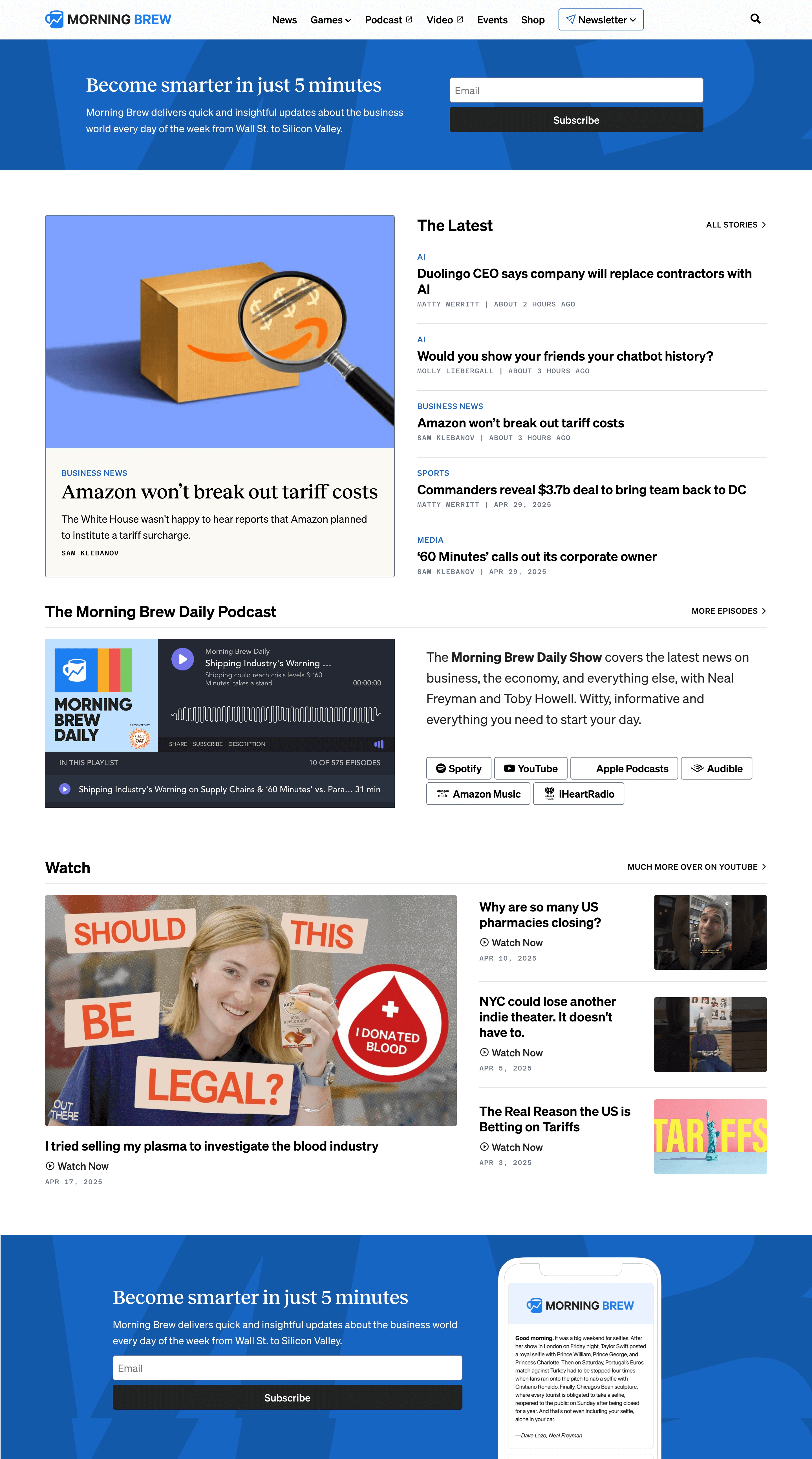
The promise — “Become smarter in just 5 minutes” — is short, sticky, and outcome-driven. It doesn’t look like a page about Morning Brew; it feels about you. That single focus, paired with a bold, above-the-fold subscription form and social proof baked into the brand (4M+ subscribers), makes this a masterclass in newsletter landing.
According to reports, they’ve had a high conversion rate since their launch, and making it about the reader seems to be one of the reasons.
Key Features:
- Strong headline. Shows clear benefit, minimal time investment for the maximum appeal;
- Subheadline. Explains what you’ll get briefly to keep it grounded and specific;
- Trust signals. Multiple form sections for primary conversion, mobile mockup of the newsletter, and strong brand recall with big stories from past editions. They are not just depending on review stars, but on popularity and relevance;
- Visual hierarchy. The form is impossible to miss — bold, centered, and repeated mid-page and in the footer. It’s the main event, not an afterthought.
Robinhood — Pre-Launch Signup Landing Page
Pre-launch landing pages are all about building anticipation and capturing interest before a product hits the market. One of the most rewarding pre-launches in recent times was from Robinhood, that helped the brand achieve the milestone of 1 million users with just a simple landing page, even before the app launch.
Robinhood’s approach involved opening a waitlist using a landing page with a clear and compelling value proposition. Have a look:
- Landing page goal: Build anticipation and get more users.
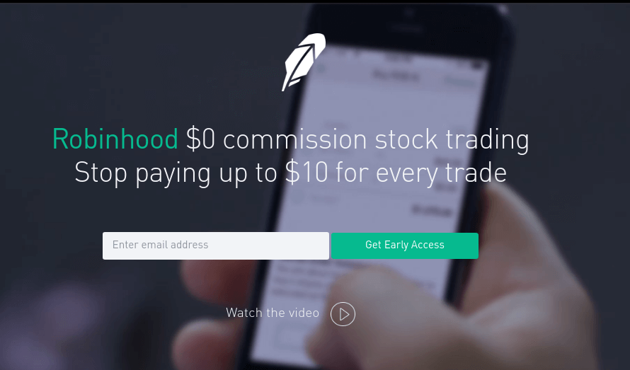
The page had a description in very simple language. And then there was a button that let you sign up, and then when you signed up, you put in your email, and you would join this waitlist where we would actually show you: There’s this many people ahead of you, this many people behind you.
— Tenev, Co-founder at Robinhood
What truly set their campaign apart was the implementation of a viral referral waitlist. After signing up with just an email, users were shown their position in the queue and encouraged to move up by inviting friends. This gamified system tapped into users’ desire for early access and exclusivity, turning them into active promoters of the platform.
As a result, Robinhood amassed nearly one million sign-ups before its official launch, demonstrating the power of combining simplicity with referral marketing.
Key Features:
- Clear headline. Directly addresses a common user frustration, making the value proposition immediately clear;
- Complementing subhead. Reinforces the main benefit by highlighting the cost savings;
- CTA button. Creates a sense of urgency and exclusivity without overdoing it;
- Referral mechanism. Post-signup, users saw their waitlist position and were incentivized to share a unique referral link to move up the queue to gamify engagement;
- Visual design. Clean and minimalist design focuses on the core message and clear call-to-action without unnecessary distractions.
FAQs
What is the ideal number of form fields?
The number of fields depends on your landing page goal. A look at the examples above will tell you that there should be as few fields as possible. If you’re collecting newsletter signups, stick to 1-2 fields — usually, name and email are enough.
However, if you’re qualifying B2B leads or scheduling demos, you might need more info like company size or budget. Every extra field on your contact form landing page adds friction, so ask yourself: Do we really need this info right now? Or we can confirm the missing info later.
How can I reduce form abandonment rates?
Form abandonment usually happens for three reasons: it’s too long, feels risky, or looks like extra work. To fix that, you should keep your form short and skimmable, use autofill and smart defaults where possible, and avoid too many required fields. Reassure users with privacy notes or trust badges near the form and test CTA buttons during the web form optimization process.
Also read:
- 20 Best Landing Page Examples Confirmed to Convert
- 10 Best Landing Page Builders for 2025 (Free & Paid Options)
- Landing Page Best Practices to Follow in 2025