

Having an email list is a prerequisite for running successful email marketing campaigns. But how to get started with an email list when you’ve just got a website (and/or a blog) and zero signups?
Adding strategic newsletter popups and signup forms to high-traffic pages is a useful tactic to start your email marketing journey.
You must be thinking — but how to set up a high-converting email sign-up form? In this blog, we’ll share how to create the perfect email list subscription forms, where to add them to your website, and how successful brands are using sign-up forms for email newsletters.
So, let’s begin.
What Makes a Great Newsletter Signup Form?
Do you often think about setting up a newsletter signup form on your website but abandon the idea? The reasons might be as simple as not having the time or getting confused about what to include in your subscription form.
Here are a few best practices for creating a highly converting signup form for your website:
- Clear value proposition. Explain what email subscribers will gain from your newsletter. Tell them about the frequency, content type, etc;
- Compelling call-to-action (CTA). Use action-oriented language that encourages immediate signups.
- Minimal required fields. Ask only for essential information to make signup faster;
- Eye-catching design. Create a visually appealing form that aligns with your brand while keeping everything minimal;
- Trust signals. Display privacy promise or subscriber count to build credibility. You can also add social proof such as testimonials;
- Personalization. Tailor the form’s content to the visitor’s interests or behavior. Add a relevant welcome offer for newsletter opt-in.
15 Email Newsletter Signup Examples
The best way to start something new is to learn by exploring. So, we collected a few email newsletter signup form examples to inspire you to design your own. Check them out below:
Signup Popup by Shinesty
Pop-up forms for newsletter signups are known to have a high conversion rate when the offer is contextual and unobtrusive. Shinesty, an ecommerce platform, has killed it in its popup with clever copywriting and a great offer. Have a look:
Newsletter Signup Form Type: Full-page popup signup form
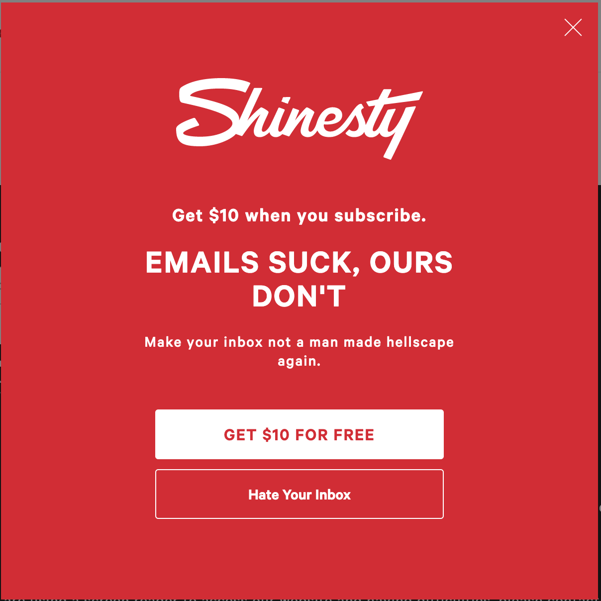
The bold red popup will make readers stop scrolling and read it. The clever copy and an attractive offer will make people sign up. Who would say no to $10 for free? The call-to-action button placement and the copy are also click-worthy, making it an effective newsletter signup form example to imitate.
What we love about it:
- Make the offer or incentive useful, like real store credits;
- Know your customers deeply and use the knowledge to write popup copy;
- Employ reverse psychological tactics (like the hate your inbox button) wherever possible.
Sender offers a variety of popup and signup form templates, plus an intuitive builder that helps you create high-converting forms in minutes.
Email List Signup by Recess
Brands employ all sorts of tactics to make visitors interested in what they offer. Who knew you could use FOMO to drive users toward mailing list subscriptions? Recess, the alcohol-free beverage brand, has used a similar tactic in its signup form:
Newsletter Signup Form Type: Designer newsletter signup popup form
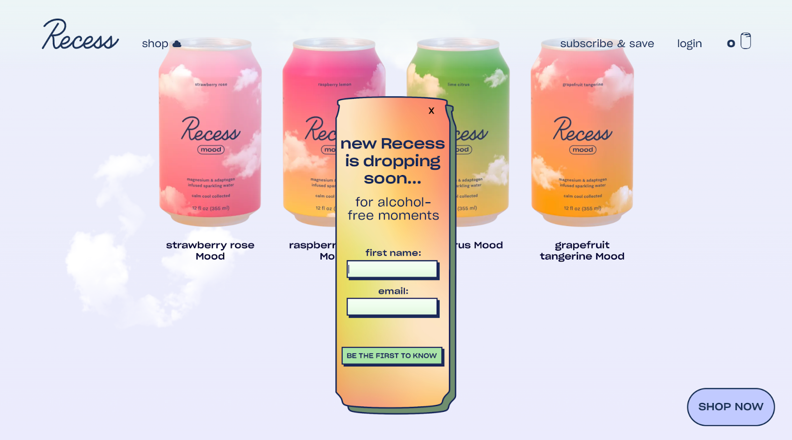
The unique shape of the signup form is definitely a scroll stopper. Plus, see how they’ve carefully used a FOMO-inspired copy and CTA button to make users sign up. The CTA button is tactical, as everyone wants to be the ‘first’ to know something new.
What we love about it:
- Experiment with unique shapes and layouts;
- Add an exciting reason to signup — like exclusive access to deals or special collections;
- Write something different than ‘subscribe’ in your CTA buttons;
Spin-to-Win Popup by Sender
One of the best ways to engage visitors (without intruding) is to gamify their experience through a spin-to-win popup. Here’s an example by Sender:
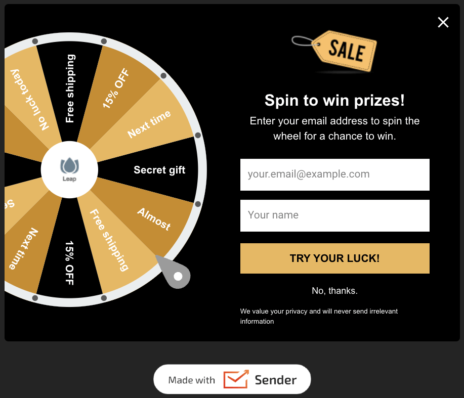
The popup nudges the buyer to try to win a secret gift, extra discount, or free shipping by sharing their email. The sliding popup with an interactive angle is a great way to make users stop scrolling. Plus, your store gets extra points for not being ‘boring’ while asking users to join an email list.
What we love about it:
- Gamification of information collection process;
- Bold and prominent CTA button;
- Upfront incentive for the visitor.
Email Capture Form by RockMerch
RockMerch is an online store specializing in vinyl records, official band merchandise, pop culture merchandise, and rock band-themed apparel and accessories.
Their form below is a simple but good example of classic email capture form:
Newsletter Signup Form Type: Embedded email capture form
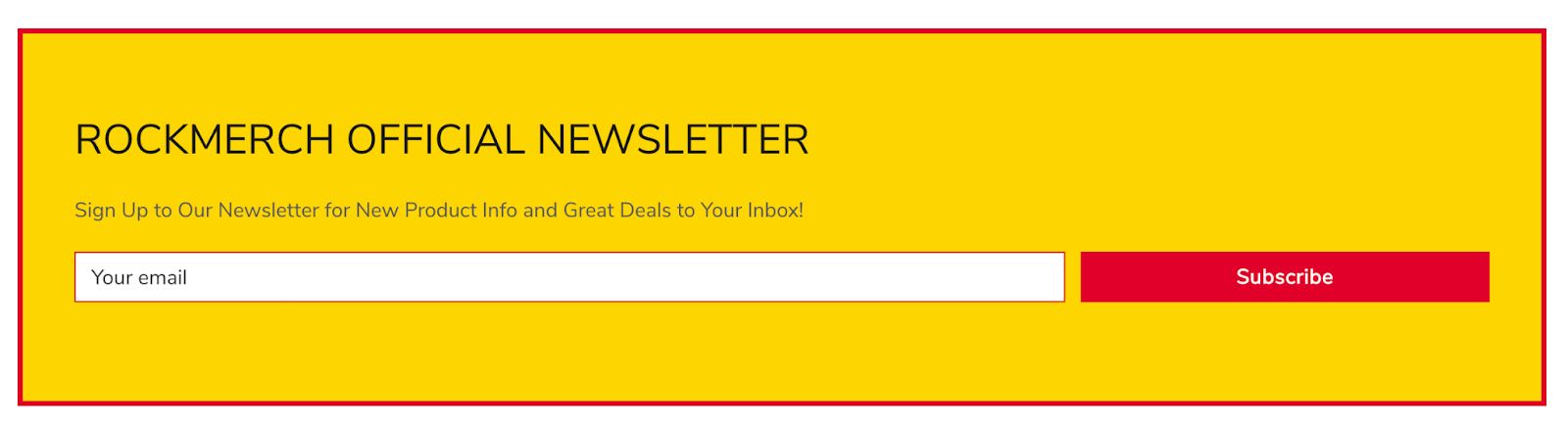
Some persuasive writing here could boost the number of signups. Instead of saying “Rockmerch Official Newsletter”, maybe say “Exclusive Newsletter for Rock Enthusiasts Only”. The fact that this is exclusively only for rock aficionados will also encourage them to join.
What we love about it:
- Hard to miss — It’s a simple form embedded right in the middle of their website’s home page;
- The use of on-brand colors adds to the branding element.
Stationary Form by Midland Radio
Midland Radio is a leading manufacturer and supplier of high-quality two-way radios, walkie-talkies, and related accessories.
Not all email signup forms must be loud, space-consuming, and on the reader’s face. Midland Radio’s form is a perfect example of how to create something subtle yet eye-catching and beautiful.
Newsletter Signup Form Type: Embedded signup form

Again, something punchy like “Every month we bring you two amazing newsletters with exclusive subscriber-only offers and cutting-edge updates from our red-hot labs”, followed by a CTA like “Join this Amazing Newsletter” would make this newsletter signup example stand out even more.
What we love about it:
- Eye-catching, mobile-friendly design that’s hard to miss on their huge home page, despite its puny size;
- Great choice of background image that is fully relevant to their offerings;
- Asks for the email addresses without being too nosy on other details.
Popup Example by My Seoul Box
My Seoul Box is an online retailer of authentic Korean snacks, drinks, lifestyle items, and other culture and pop merchandise, all of which are shipped directly from South Korea.
Their email collection form is the attractive-looking popup shown below.
Newsletter Signup Form Type: Email capture popup form
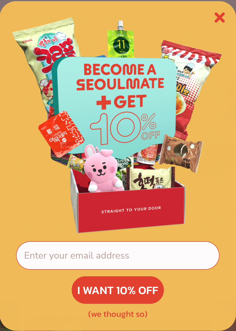
What we love about it:
- Great copy in the form of wordplay — “Seoulmate” instead of “Soulmate”;
- Nice-looking product picture with an unmistakable 10% OFF offer;
- Again, the tiny punch of copy below the CTA button is simple yet highly entertaining.
For once, this email capture element looks so on-brand and super-optimized that we wouldn’t want to change anything about it except, perhaps, embed it as a form on a separate newsletter signup page or the same page since some readers can view popups as intrusive.
Email Sign-up Form by The Mrs. Book
This email signup form example might appeal to your inner minimalist if you’re not a fan of loud popups or signup forms.
Newsletter signup popups needn’t be complicated, and if you have a strong incentive, they’ll work towards helping you grow your mailing list. Take a look at this simple signup form by The Mrs. Book:
Newsletter Signup Form Type: Lead magnet form
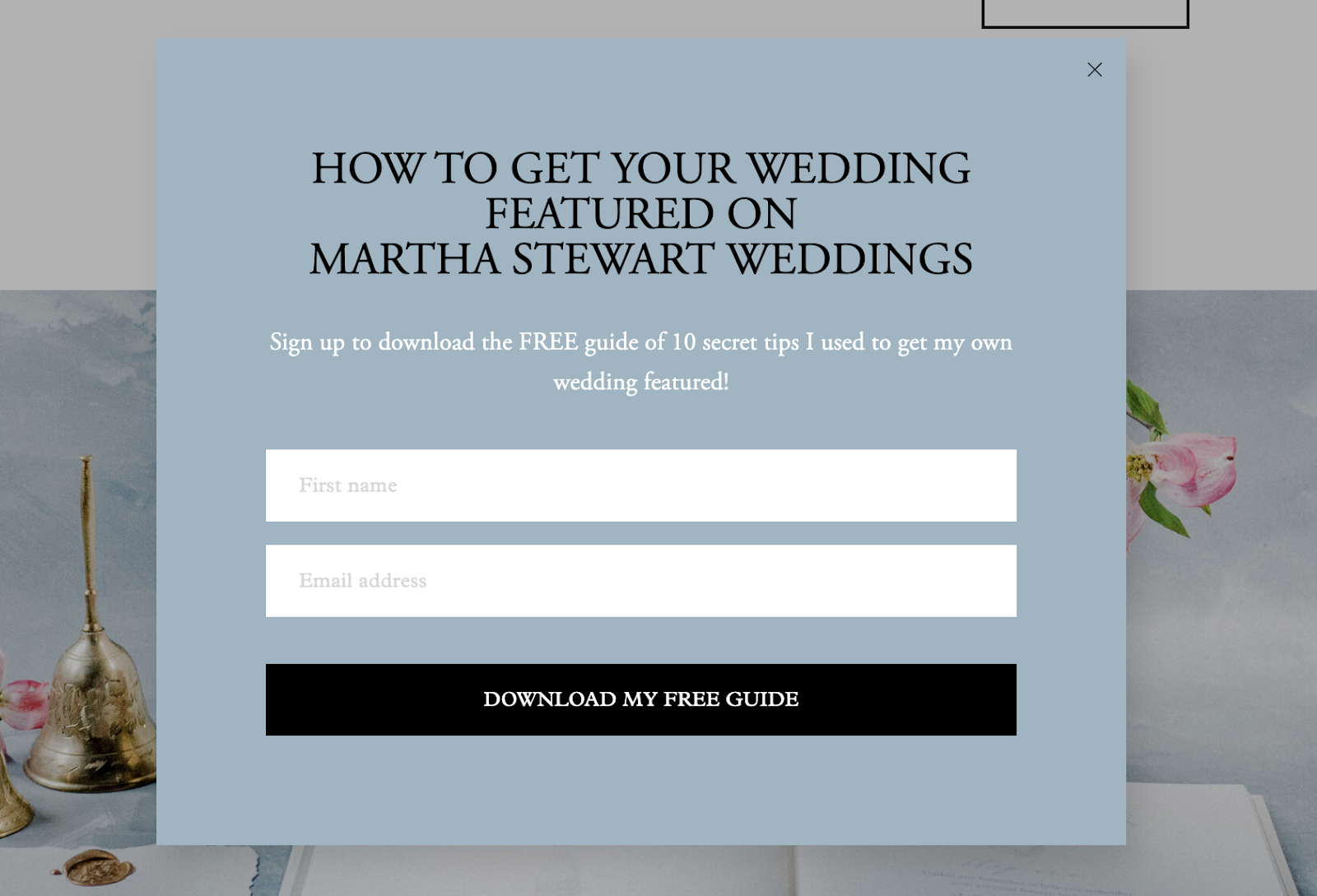
The signup form might look ‘standard’ at first glance, but the messaging, especially the mention of Martha Stewart, can make any wedding enthusiast stop instantly. Considering the website is in the wedding industry, the chance to download such a guide is a great offer. The color of the newsletter signup popup is also refreshing.
What we love about it:
- Add authority and relevance to your signup offer;
- Make your CTA button stand out from the rest of the popup;
- Add a timer or behavioral attribute to your popups to show them at the right moment.
Colorful Newsletter Signup by Too Timid
TooTimid is an online marketplace specializing in privately and discreetly shipping a wide range of adult ‘toys’ and lingerie. The flashy and colorful email newsletter form catches attention instantly.
Newsletter Signup Form Type: Embedded newsletter sign-up form
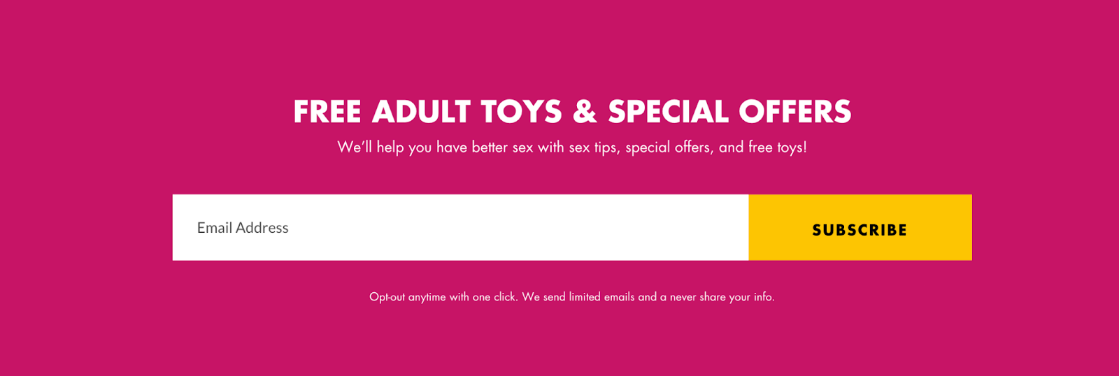
What we love about it:
- A bright and colorful form that is in line with the brand’s emotions and products;
- A great headline that uses the power word “FREE”;
- Use of a sub-headline with supportive copy that enhances the headline messaging.
If we could, we’d probably change the typo below the email address box and the CTA to something like “Sssh! Let this be our little Secret!”
Subscribe to Newsletter Form by Stegmann
Stegmann offers sustainably made, high-quality footwear for men and women, including wool clogs, comfortable shoes, boots, sandals, and more.
Their email registration form below is simple yet highly effective in getting sign ups.
Newsletter Signup Form Type: Subscribe to the newsletter form
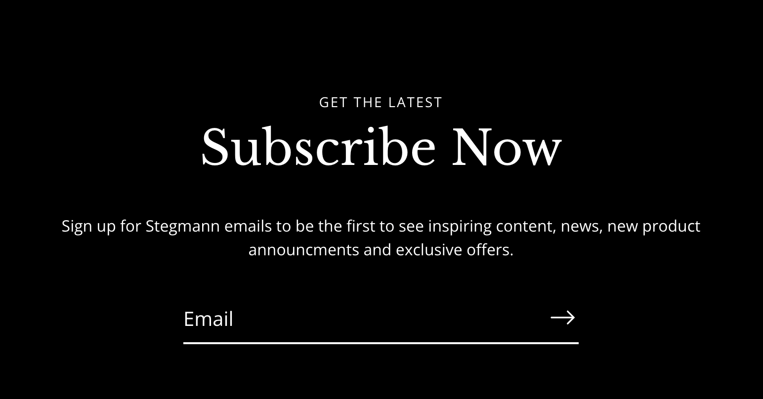
What we love about it:
- Great choice of aristocratic black and white colors denoting premium branding;
- Simple messaging exhorting the reader to sign up to be the first to know about anything and everything related to Stegmann;
- Mobile-friendly, scroll-stopping design with thoughtful typography.
In the quest for a stylish design, they probably missed the opportunity to insert a beautiful CTA like “Join the Legacy”, which goes well with their 1888-era-based branding.
Popup with a Prominent Header by Stelton
Everyone in ecommerce has some form of signup form popup on their website. But only a few manage to nail it when growing their email list. Adding a special offer for visitors who choose to subscribe is a known ‘tactic’ to increase signup rates.
Here’s how Stelton targets visitors to signup for newsletter:
Newsletter Signup Form Type: 2-column newsletter signup form
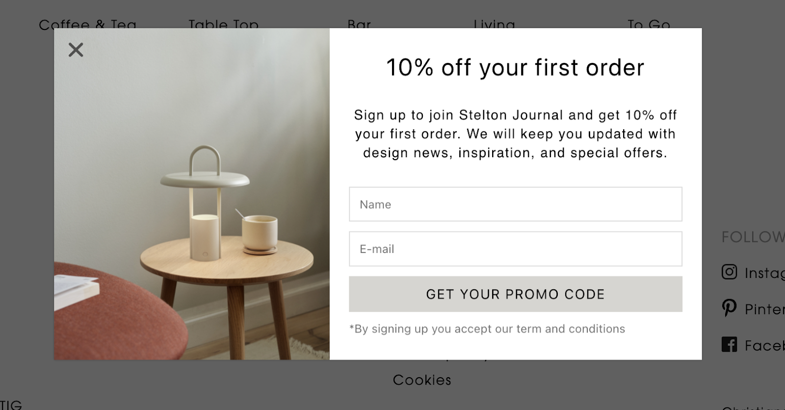
The popup opens when a website visitor clicks on a floating message at the bottom of their screen, which is a fantastic tactic.
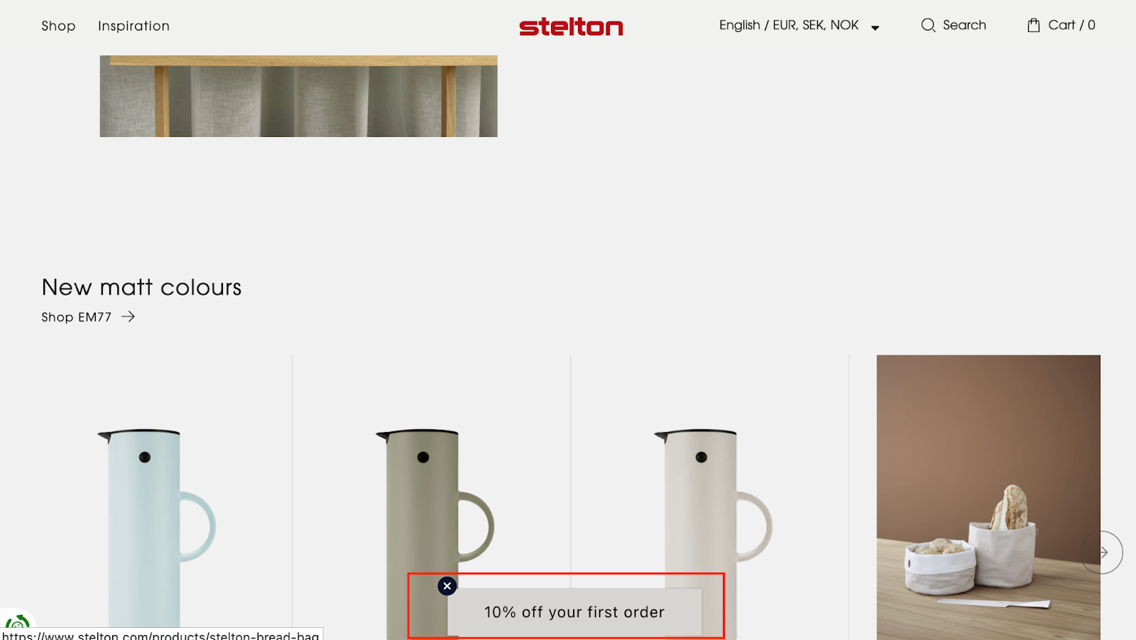
The popup with a prominent header promising 10% off on the first order will lure the prospective buyer. Plus, the way the signup form presented itself (and placed on the website) is worth experimenting with if you’re a fan of unintrusive popups.
What we love about it:
- Experiment with your signup form placements;
- Create a special offer for visitors who are ready to buy;
- Keep the layout simple and easy on the eyes.
Join Our Newsletter by Stitched Stories Embroidery Kits
Stitched Stories Embroidery Kits is an online store that offers complete embroidery sets and kits for beginners and embroiderers of all levels. Their join our mailing list form is clean and embedded neatly just above the website footer.
Newsletter Signup Form Type: Sign up for news form
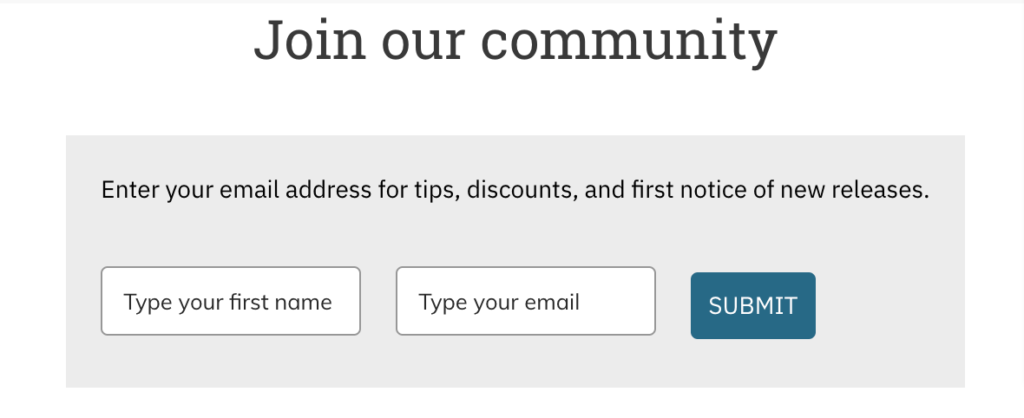
The simple headline “Join the Community” reflects that the subscriber will be part of a group rather than just an email in a corporate email list. The sub-head shares what to expect when you join.
What we love about it:
- Neat and clean design;
- Simple yet effective copywriting;
- Clean typography.
Exit-Intent Popup by Domino’s
Domino’s is known to use its brand value to promote its special offers and increase signups via popup forms on its website. Here’s an example of how it used a behavioral form to target website visitors who abandon their cart:
Newsletter Signup Form Type: Incentive-based popup form
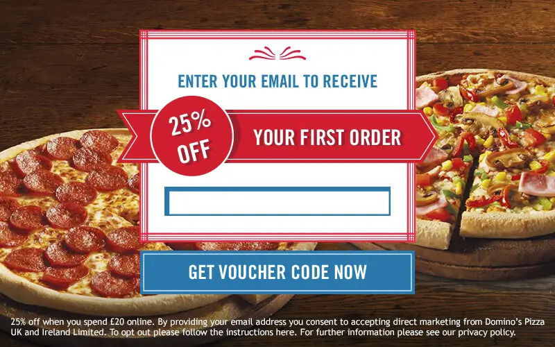
This popup is shown to visitors who are just about to exit and abandon their cart. It offers a tempting 25% off on their cart value with a single form field. Such a signup form is known to increase signups. According to the brand, this single form helped them capture 58,000 new email leads and increased conversion rates by 13%.
What we love about it:
- Behavioral visibility targeting users with a useful offer;
- Great incentive to signup and avail the offer;
- Clear information about the benefits in the footer.
Adding an incentive and displaying a relevant popup based on online behavior is a nice idea to grab attention. Plus, the users who sign up can be nurtured with future email campaigns and personalized promotional campaigns.
Bright Yellow Popup Form by Moscot
Using bright colors for your newsletter signup form button is a great idea to stand out in the world full of ‘subscriber now’ and other boring CTAs. Moscot has used this tactic in their signup form to increase the newsletter subscription rates.
Newsletter Signup Form Type: Minimalist subscription popup form
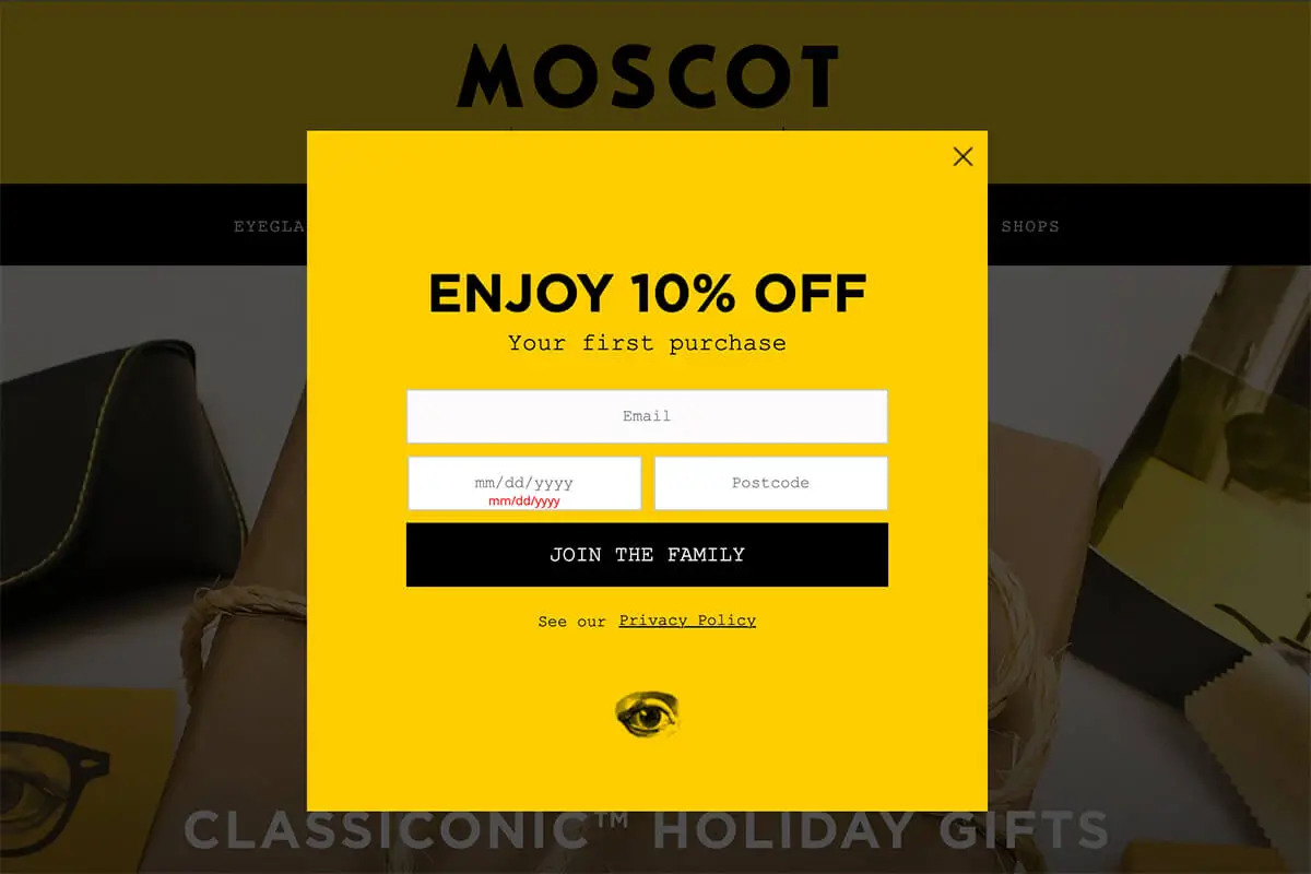
The bright yellow popup form is aligned with the brand colors and stands out immediately. Its headline straight away informs about the benefit – a 10% off on the first purchase, tempting potential customers on the fence to check out.
The cherry on top is the CTA copy – ‘Join The Family’ as it gives a sense of warmth and belonging to the entire newsletter signup exercise.
What we love about it:
- Bright and on-brand colors that immediately stand out;
- Clear benefit for the website visitor visible prominently;
- Unique CTA button copy adds a layer of friendliness and belonging.
Considering the brand is a generational business, this CTA button is so on-point. Just hope they’ve topped up the signup with an automated welcome email that showcases the same warmth and belonging.
You can also add a dash of warmth to your forms by addressing the visitor in the first person. For example, use ‘Enroll Me’, ‘Count Me In’, or ‘Join the Tribe’ in your CTA button.
Floating Bar Form by RemoteOK
RemoteOK is a remote job board that has understood the importance of an email list. They use a clear, minimalist, and unmissable newsletter signup form as the floating bar on the homepage. Have a look:
Newsletter Signup Form Type: Floating bar subscription form
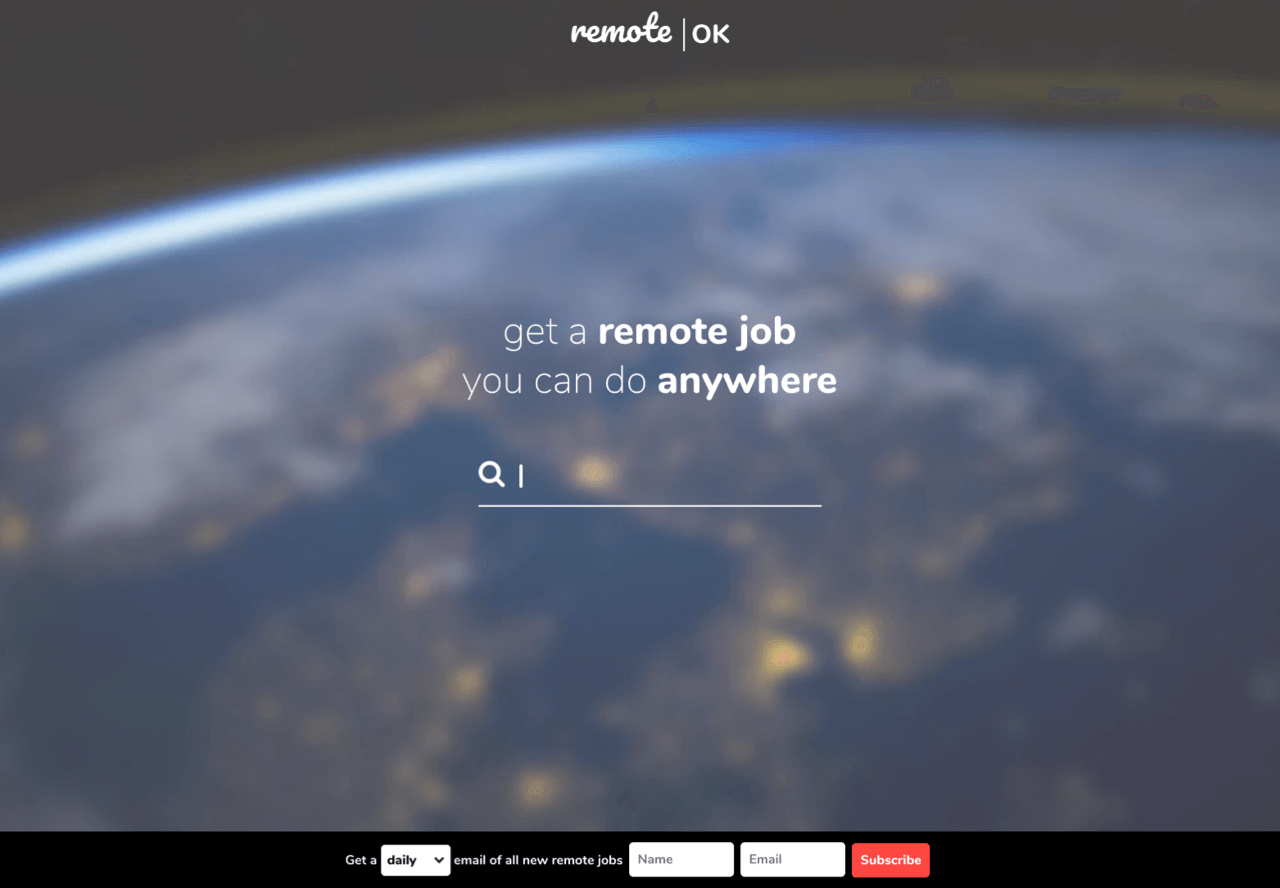
First, the floating bar is at the bottom (and not the top), making it an eye-catching detail for a visitor. Then, they’ve added a unique field – the frequency you’d like to receive mail.
Plus, the copy is impactful and makes a connection, as if someone were personally asking how many times you’d like to receive job posts from the portal.
What we loved about it:
- Clear and minimal design with only the necessary fields;
- Unique form placement, which is unintrusive but attention-grabbing;
- Addition of a frequency field with a dropdown, making the visitor feel in control.
Such popups work as food for thought for everyone that there isn’t just one right way to make things happen. The key is to understand your audience, experiment, and try new things to increase signup rates.
Sign Up for Updates by Nike
If you’ve ever visited Nike’s website, you’ll notice their clean popup form that asks you to subscribe for email updates. Here’s their email subscription form:
Newsletter Signup Form Type: Newsletter subscription form
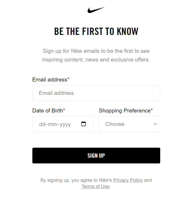
They’ve used their iconic ‘swoosh’ followed by a catchy headline, making the visitor feel excited about filling the details. Though the form might look it asks a lot, such tactic is great for the brand to segment their email lists and provide relevant offers and deals for you.
What we loved about it:
- Clean and minimalist layout based on brand guidelines;
- Smart approach asking for personal details from visitors;
- Attention-grabbing headline.
Creating Free Newsletter Signup Form
Creating a signup form is not as hard as you think. In fact, Sender has a drag-and-drop form builder, in-built, that you can even use on a free plan.
If you’re looking to create your first newsletter signup form, follow the steps below and set up a functional newsletter signup form by the end of the day:
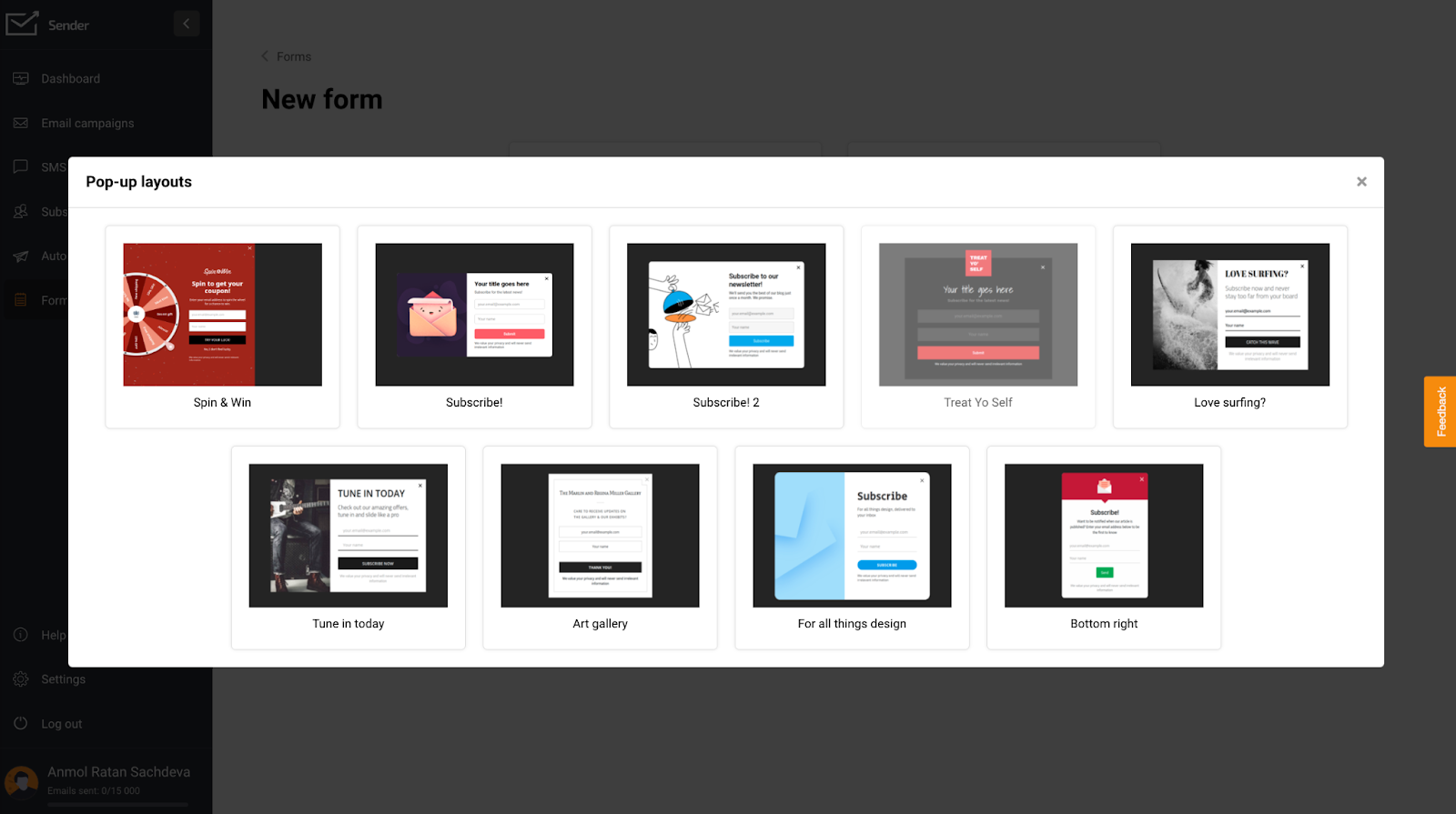
Step 1: Choose Newsletter Signup Type
Picking the right newsletter signup form is crucial for converting visitors into subscribers. Your choice should align with your goals as well as your audience’s preferences. Consider these popular options:
- Embedded forms. Seamlessly integrate into your pages or blog posts as inline forms;
- Popup forms. They pop out and appear over content to capture attention based on behavior;
- Spin-to-win popups. Gamified version of popup forms to boost engagement.
To create a signup form, you should:
- Open your Sender dashboard;
- Click on ‘Forms’;
- Select your preferred form type;
- Pick newsletter signup templates or create a form from scratch.
Step 2: Customize the Text and Visuals
Once you select the desired email signup form template, you can customize your newsletter signup form.
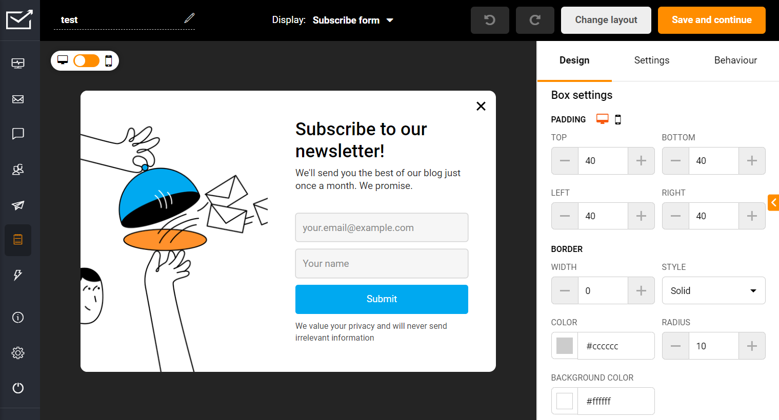
Use Sender’s drag-and-drop builder to customize different elements, such as text, visuals, etc., to make it attractive and suitable to your brand guidelines.
Step 3: Review the Functionality Settings
Customize your form’s behavior using the right panel settings. Options vary between popups and embedded forms.
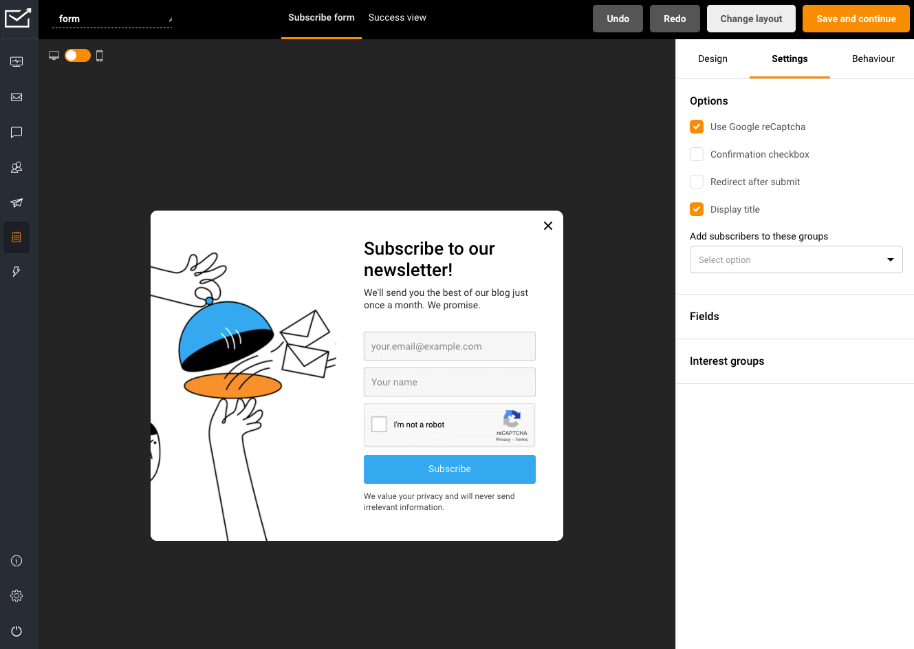
You can trigger popup forms based on:
- Exit intent;
- Scroll depth;
- Time on page;
- Click on specific elements.
Adjust frequency and scheduling to balance visibility with user experience. Once configured, your form is ready for website integration.
Step 4: Enable your Email Newsletter Registration Form
The final step is to add your form to your website. Enable your form, add the required scripts, and you’re ready. All that’s left to do is monitor your email list’s growth.
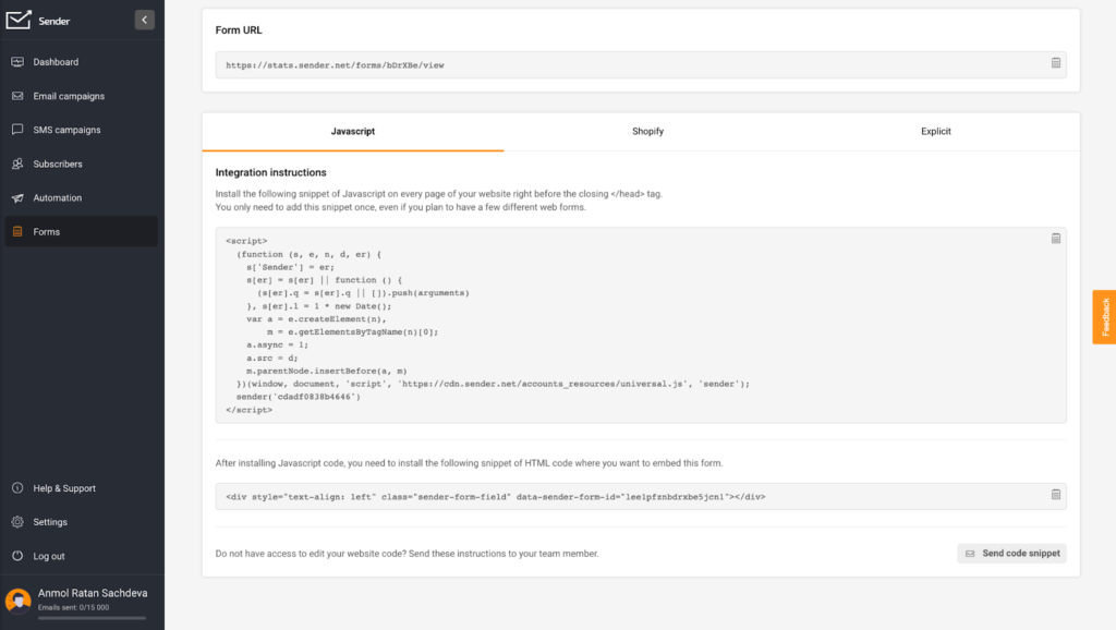
P.S. If you have a Sender’s integration for WordPress, WooCommerce, or Shopify, you won’t need to add any code, so you’re good after step 3.
Newsletter Signup Form Types & Common Placements
Remember, your signup forms must be eye-catching to attract more visitors to sign up. However, where you place them is also critical to growing your subscriber list.
Here are some of the most rewarding locations to place your sign-up forms on a website:
- Header or navigation bar. This prime real estate is the first thing that catches the eye. Hard to miss, it ensures your sign-up form is visible on sitewide;
- Sidebar. Ideal for blogs or content-heavy sites. It stays in view as readers scroll, offering a constant reminder without being intrusive;
- Footer. These forms target users who’ve scrolled to the bottom, indicating potential interest in more content;
- Popup or modal. Grabs attention and increases signups when used strategically. Timing is key, so make it appear after someone has spent time on your site;
- Homepage. Targets visitors at the beginning of their journey. Give a sneak peek into what’s in store for subscribers;
- About us page. Perfect opportunity to invite interested visitors to subscribe for more information about you or your products;
- Blog posts or content pages. Targets readers interested in your content, making them more likely to subscribe for more updates;
- Contact page. Visitors on this page are keen to reach out. A sign-up form can be included here to convert one-time queries into long-term connections;
- Exit intent popups. Appear when visitors are about to leave. Add a valuable offer to hook the visitor;
- Embed within content. Add a contextual offer for engaged visitors on high-traffic pages to capture emails without friction;
- On social media pages or profiles. Add a signup form link in your bio or as a button on your social media profile;
- Sticky bar. Hovers when users scroll, making it persistently visible without taking up much space.
Mixing and matching two or more locations can help you supercharge your email list signups. Test to see what works best with your target audience.
Looking for the perfect tool for capturing emails? Let us help you with that: