


If you’re sending traffic to your homepage, you’re wasting leads. In 2025, visitors’ attention is currency; you have seconds to convince them they’re in the right place. That’s where landing pages come in.
Real estate landing pages strip away the noise, highlight what the visitor came for, and prompt them to act, be it scheduling a call, checking their home valuation, or booking virtual tours.
Over the last few years, we’ve audited hundreds of real estate landing pages. This blog rounds up 10 of the best ones.
These aren’t just pretty design templates. They’re actual real estate lead capture landing pages from brands that know how to turn clicks into clients.
Let’s look at them.
What are Real Estate Landing Pages?
Real estate landing pages are dedicated web pages built with a landing page builder for one purpose — to turn clicks into leads. Unlike your homepage, which speaks to everyone, a landing page speaks to one specific person, with one specific goal in mind.
Whether it’s getting someone to schedule a property tour, request a home valuation, or sign up for mortgage advice, these pages cut the clutter and focus on the call to action.
They’re built to promote direct offers and showcase benefits, not share standard information. And when done right, they don’t just collect emails — they start conversations that drive conversions for your real estate business.
Why Real Estate Landing Pages Matters?
People don’t have the luxury of time like they used to. So, no one wants to browse random real estate listings and ‘explore your site.’ They want to solve their problem — get their home valued, search for real listings, or seek expert consultation quickly. If they don’t find solutions fast? They’ll hop on to your competitor’s website.
That’s why a well-built landing page isn’t optional anymore — it’s your silent closer. It does the job your homepage can’t do: moving the right leads towards direct action.
Here are some reasons why you should create landing pages:
- Higher engagement. Every element speaks to a single target audience, with one goal — converting your visitors for the offer they clicked for;
- Higher conversions, lower bounce. No distractions = more forms filled, calls booked, and offers requested;
- Better paid ads ROI. Sending paid traffic to tailored landing pages means less ad spend wastage, more leads;
- Improved lead quality. You control what they see and the form they fill out, which helps you qualify and prioritize the hottest leads.
What Types of Real Estate Landing Pages Exist?
Not every page on your site needs to do everything. In fact, the most effective landing pages are designed with a single goal in mind.
Whether you aim for more visitors for an open house or generate leads for a valuation, there’s a landing page you can use for real estate marketing.
Here are five landing page types for real estate websites:
- Real estate lead capture page. This is your digital signup sheet — clean, simple, and built to turn curious visitors into real leads. Use it to offer updates on listings, market reports, or buyer guides;
- Home valuation landing page. Perfect for attracting sellers. These pages ask for property details and offer an instant or follow-up valuation — one of the highest-intent lead sources out there;
- Real estate squeeze page. No nav bar. No distractions. Just one offer (like a gated neighborhood guide or property shortlist), video testimonials, and a form. Great for building an email list fast;
- Real estate open house landing page. Promotes a single property and collects RSVPs. Helps you filter genuine interest and prep follow-up conversations before prospects walk in;
- Real estate PPC landing page. Tailored for paid traffic. These pages align with your Google or Meta ad copy and push for the desired action — whether that’s scheduling a consultation or downloading a brochure.
Real Estate Landing Pages Examples
It’s one thing to know the types of landing pages you can use — it’s another to see what great ones actually look like. So, here are some of the best examples that will give you real-world inspiration you can actually use.
Let’s break down what they’re doing right and what you can borrow to improve your own high-converting landing page.
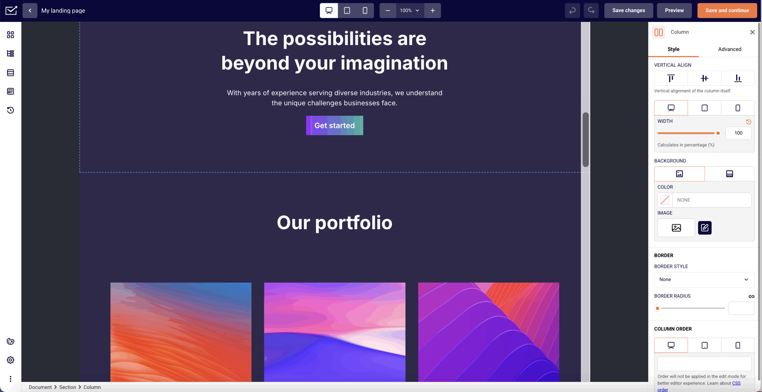
Zillow’s Property Listing
Zillow nails what most property landing pages miss — simplicity. The moment you land, the listing takes center stage: big, bright photos, clear pricing, and instant agent visibility.
This page seamlessly targets a property showcase for conversion intent. The open house timings are placed right below the price, which is smart. It removes friction and nudges the visitor toward action without ever needing to scroll.
In real estate, landing pages shouldn’t be just about aesthetics. And Zillow nailed it with clarity, ease, and flow. This page feels like it’s built for potential clients who are ready to move.
Why it works?
- Creative visual design. Visitors don’t have to hunt for property pictures, increasing the listing’s appeal;
- Action-ready info layout. Price, agent contact info, and open house schedule are above the fold; no digging required;
- Zero distraction UI. The page minimizes friction. No unnecessary pop-ups, no confusing nav, just straight into the property.
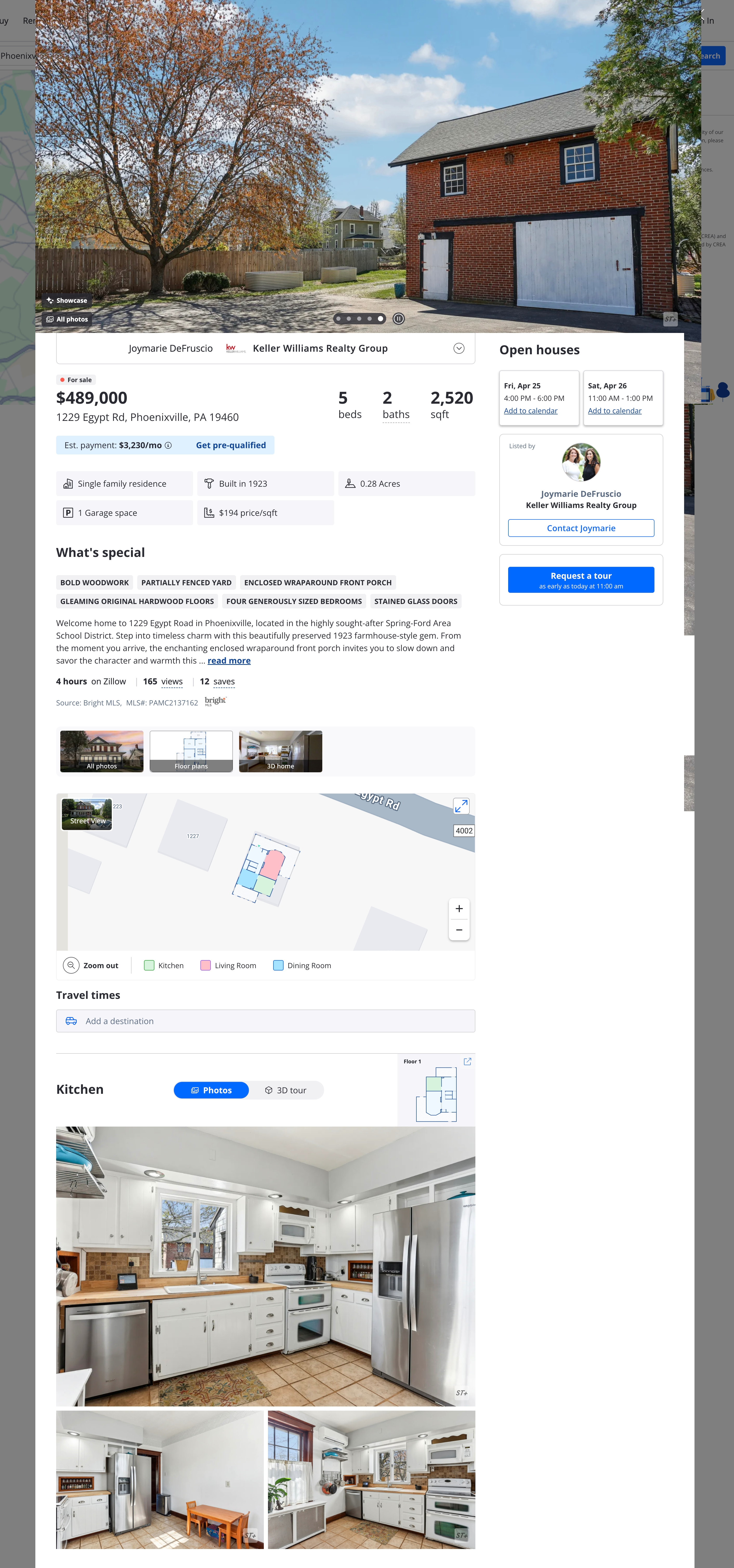
Redfin’s Home Valuation
This landing page takes a minimal approach to lead gen pages. And it works because it respects the user’s intent. The page doesn’t waste time with fluff. It knows why you’re here: you want to know what your house is worth. So, it puts that question in bold and follows it with a frictionless, single-field lead capture form.
What sets it apart is the clarity of the layout and the offer. No overwhelming copy. No over-explaining. As a real estate agent, this is the kind of page you should build when you’re attracting targeted traffic — it’s instant, helpful, and feels like zero effort.
Why it works?
- Question-based headline. Starts with a relatable question every seller thinks about, instantly pulling them in;
- Single-field form. The less you ask upfront, the more likely people are to engage;
- Minimal design. The clean layout feels modern and safe, which boosts credibility and conversions.
Create stunning landing pages in hours, not days, with Sender – no coding needed.
Realtor.com’s Mortgage Pre-Approval
This page is a great example of how to reduce overwhelm for first-time visitors. Instead of dropping users into a long form, it opens with a simple, focused question: “What type of home are you looking for?” That first step feels easy, and that’s intentional. It removes friction and slides people into the funnel.
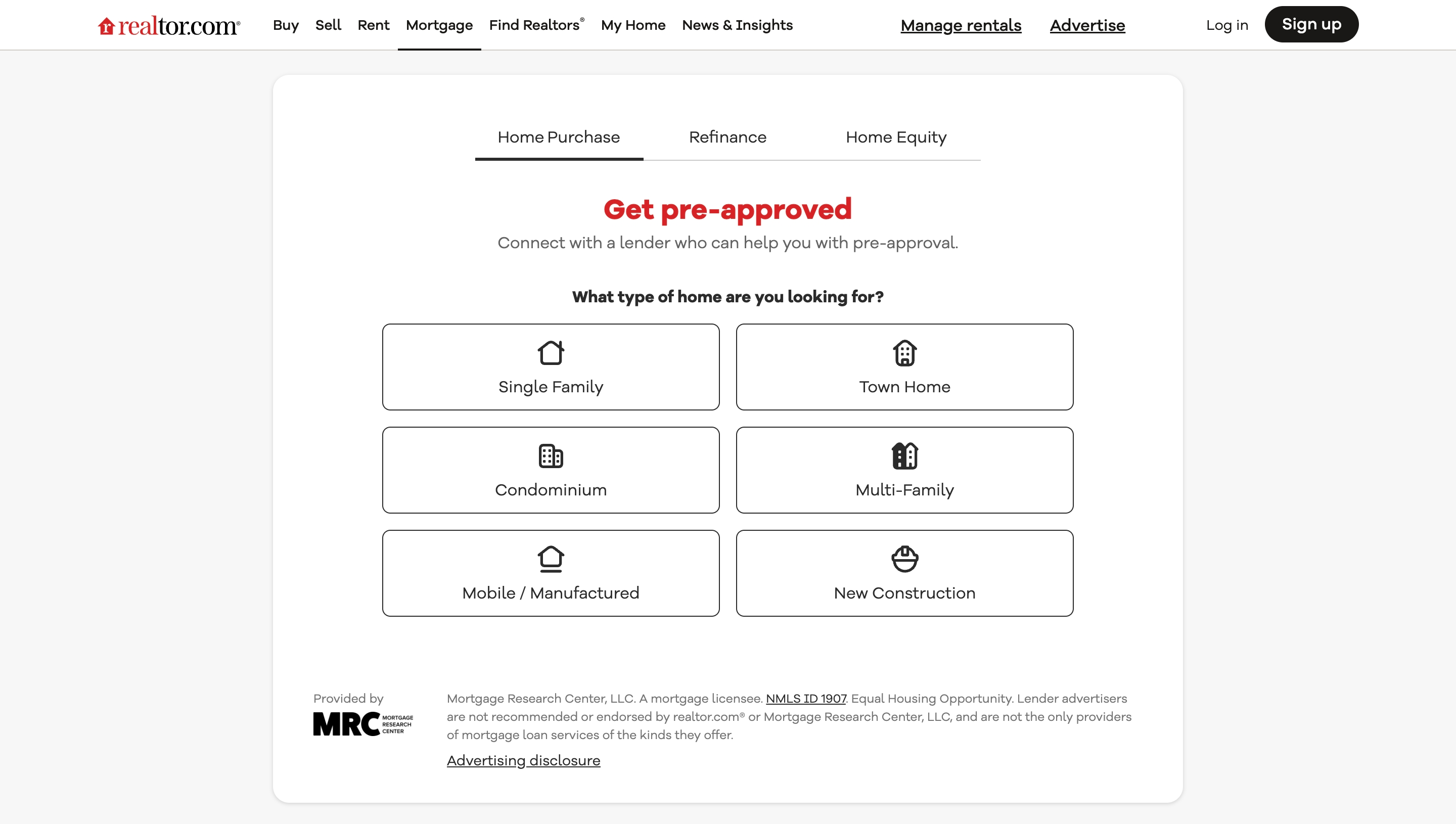
Each choice is presented as a big, tappable button, which is mobile-friendly. This is a great model for agents if you’re guiding leads into lender conversations. It makes a complex financial process feel approachable.
Why it works?
- Step-by-step onboarding. Breaking the form into easy questions lowers drop-off and keeps users engaged;
- Clear intent targeting. It’s obvious who this is for: potential buyers ready to take the next step financially;
- Touch-friendly design. Button-style choices make this experience seamless for mobile users;
Compass’ Real Estate Agent Lead Capture
Compass is speaking directly to agents through this landing page. So, instead of a traditional lead form at the top, you’re hit with sleek visuals, bold confidence, and a cinematic video that sells the lifestyle of being a Compass agent.
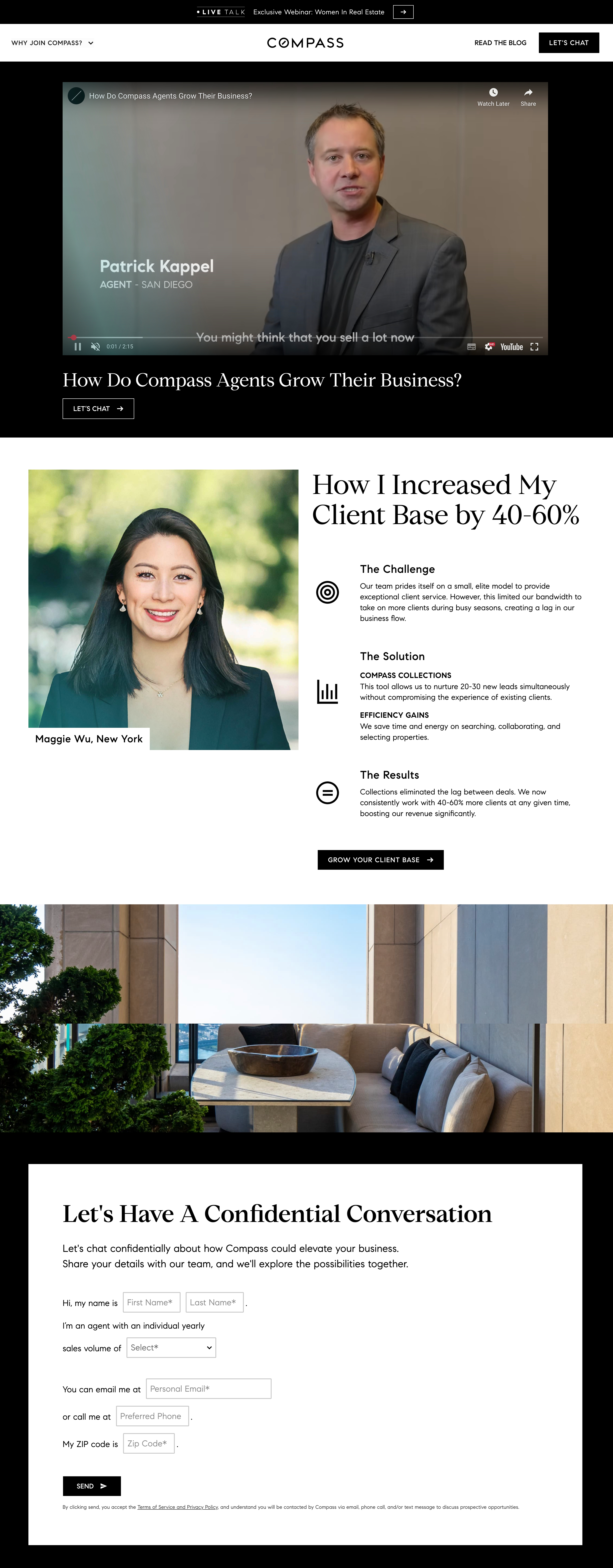
What makes this page work is that it’s emotionally aspirational. It isn’t trying to convert with bullet points; it’s pulling in with brand magnetism. If you’re looking to recruit or grow your team, this is a reminder: people don’t just buy into offers; they buy into the vision.
Why it works?
- Emotion-led branding. Video and visuals tell a story — not just what Compass offers, but how it feels to be part of it;
- High-end production = high trust. The polished aesthetic signals legitimacy and success, which appeals to ambitious agents;
- Conversational CTA. “Let’s Chat” feels human — not salesy. It invites connection, not just form fills.
Opendoor’s Instant Cash Offer
Image source: Opendoor
Opendoor understands that potential sellers are often overwhelmed, uncertain, and craving momentum. This page speaks directly to that emotion. One simple question (“Enter your home address”) promises exactly what a seller wants: clarity, speed, and control.
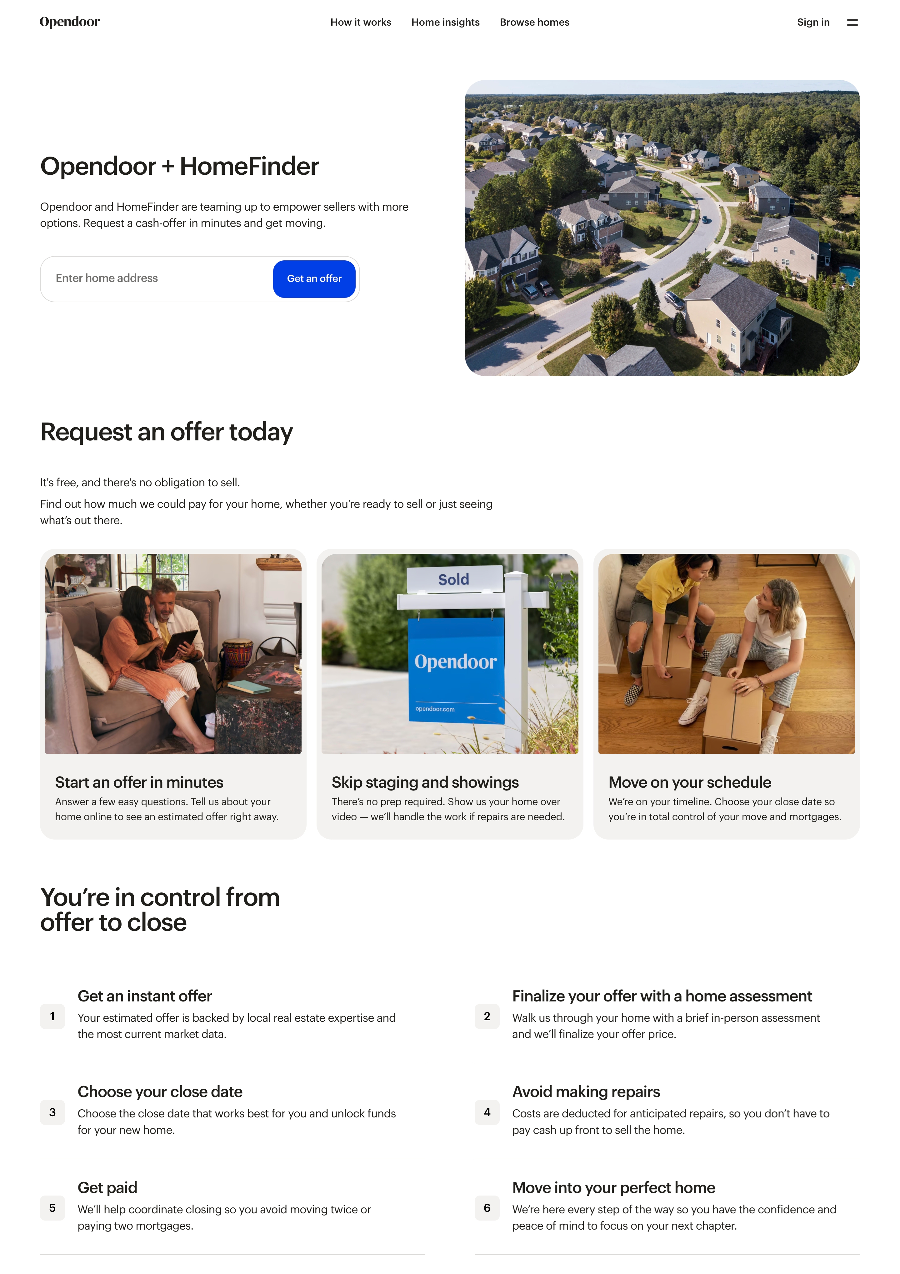
Using white space, a frictionless form, and a trust-laden brand presence promises the visitor that they’re in good hands. This page offers a great lesson — understanding what not to say, cutting the fluff and leading with value.
Why it works?
- One-field CTA = low resistance. The easiest way to get started — no account, no long form, just action;
- Laser-focused messaging. Every word supports the promise of speed, options, and seller empowerment;
- Modern design. Sleek visuals and white space give the page a calm, confident feel;
Airbnb’s Host Signup Landing
This is how you make a landing page feel like a money calculator. Airbnb doesn’t pitch hosting. It instantly shows you how much you can earn. No copy overload, no heavy forms. Just a number tied to your location and property type. That one dynamic hook does 90% of the convincing.
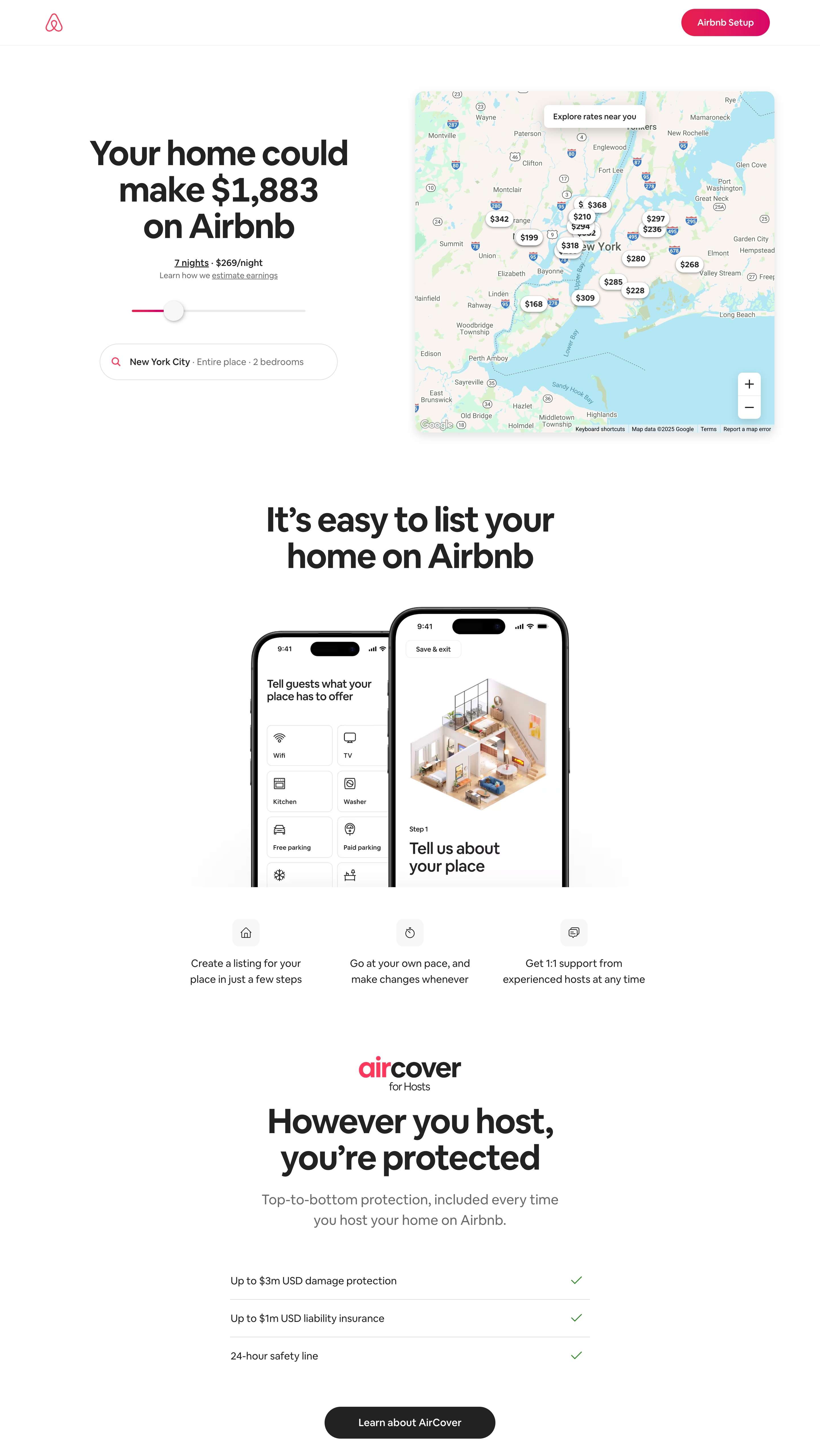
Real estate agents who work with rental property owners or short-term investors should take notes here: This page answers the question every prospect is already asking — “What can I make?”, and uses live local data to back it up.
Why it works?
- Personalized projections. Everyone wants to know “what’s in it for me?” — this answers it visually and instantly;
- Interactive UI builds trust. The map and sliders give users control and transparency, which increases engagement;
- Zero scroll conversion path. Everything needed to convince and convert sits right above the fold.
Win’s Home Buyer Consultation
WIN Home Inspection taps into a real buyer fear: making the wrong decision in a fast-moving market. The copy acknowledges that buying a home is overwhelming, and positions the consultation as an informed next step.
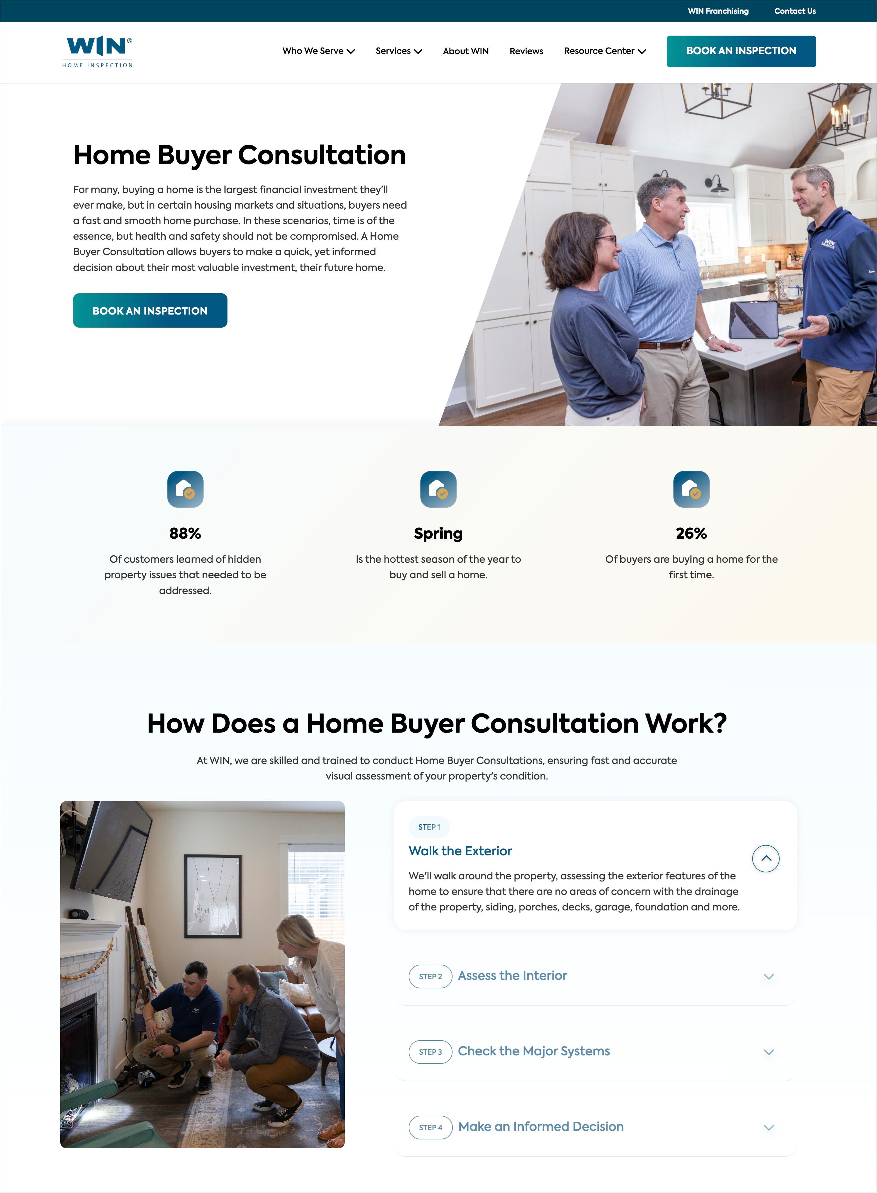
What makes this landing page work is how human it feels. The image of an in-home discussion, the clean layout, and a single CTA create a soothing appeal. For agents looking to guide unsure home buyers, this is a great example of how to blend expertise with empathy throughout the selling process.
Why it works?
- Problem-first copywriting. It leads with a common buyer challenge — not a product pitch — which builds instant connection;
- Service positioning, not selling. ‘Consultation’ sounds helpful, not transactional, which lowers resistance;
- Clean CTA design. A single, bold button clarifies the next step without overwhelming the user.
WeBuyHouses.com’s Fast Cash Offer
This landing page uses straightforwardness as its strength to capture seller leads. The offer is blunt: “Sell your house for cash.” No clutter, long scrolls, or fancy animations. The form is right there, asking for just one thing: your property address. This page will convert really well for a motivated seller on a timeline or an unsure one.
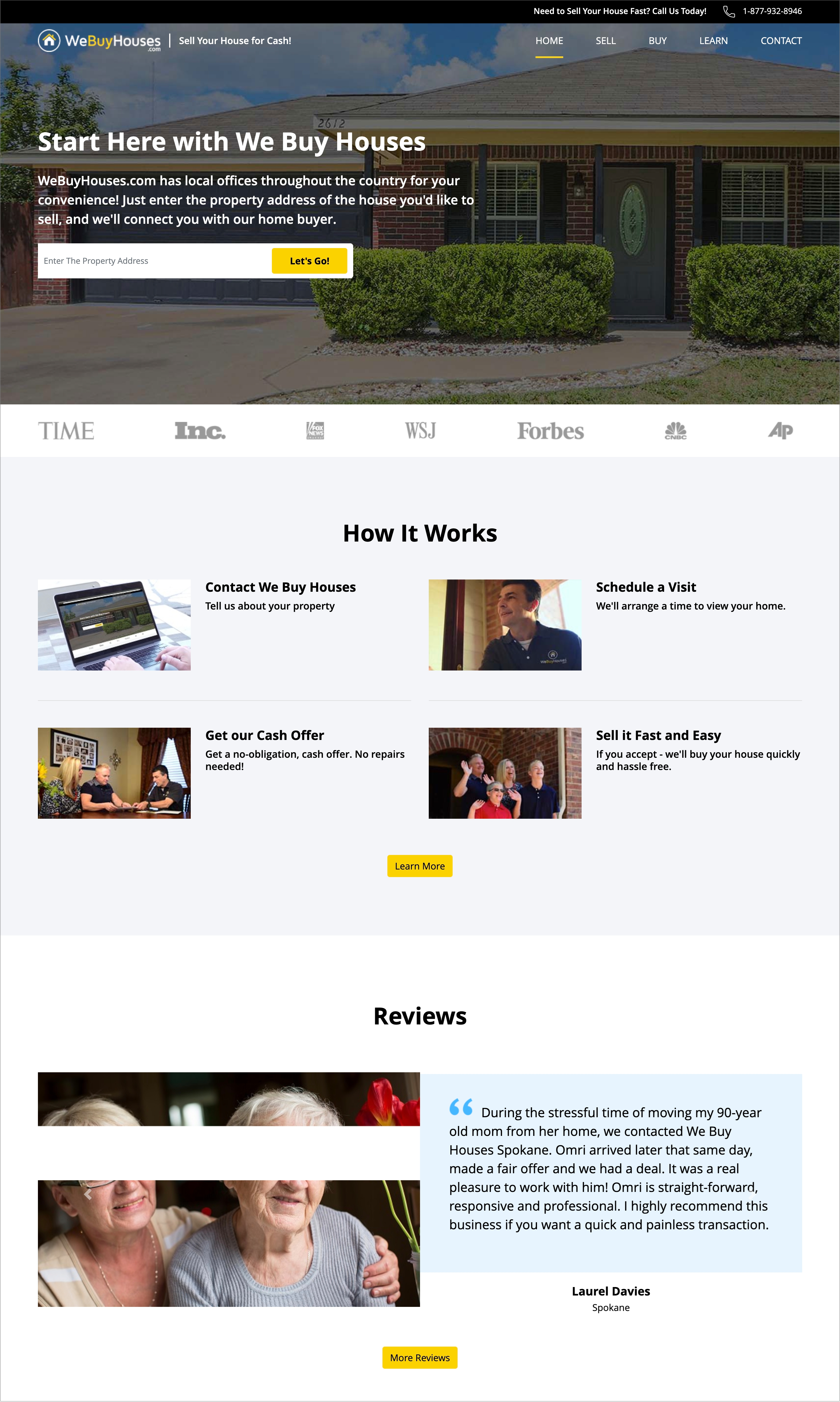
All the landing page design choices are intentional. The background image is a relatable home, high-authority logos about media mentions, and a CTA that’s not pushy. It’s all built to show the process is fast and safe.
Why it works?
- Direct headline. It says exactly what it does, which offers instant clarity to the prospect;
- One-step entry point. A single field lowers friction and lets visitors act immediately without overwhelm;
- Authority-driven trust signals. Media logos at the bottom quietly say, “You can trust us”, without needing long-winded proof.
Trulia’s Neighborhood Guide
This page flips the script on traditional real estate landing pages. Instead of jumping straight into listings or pricing, Trulia takes a lifestyle-first approach. The page helps users decide where they want to live before what they want to buy. That’s a brilliant strategy, especially for agents working with relocation clients or first-time buyers unfamiliar with a city.
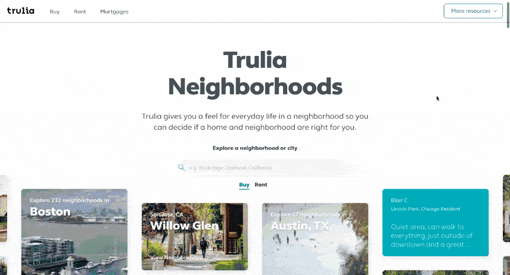
It feels like a digital neighborhood tour: visual, intuitive, and filled with local insights. The search bar is front and center, but what really shines is the UX — location tiles, testimonials as social proof, and renter/buyer toggles make exploration feel fun, not transactional.
Why it works?
- Lifestyle-first content. Instead of selling a home, it sells the feeling of living in a place, which is a great way to drive action;
- Highly visual interface. The image tiles make neighborhood discovery easy and scroll-worthy;
- Built for early-stage buyers. It meets leads before they’re ready to talk price, and earns trust early.
Coldwell Banker’s New Listings Page
Coldwell Banker’s home search landing page is designed for serious buyers who are ready to browse, compare, and act. The map-to-list view layout is intuitive, and filters like price, beds, and home type are placed exactly where the user needs them.
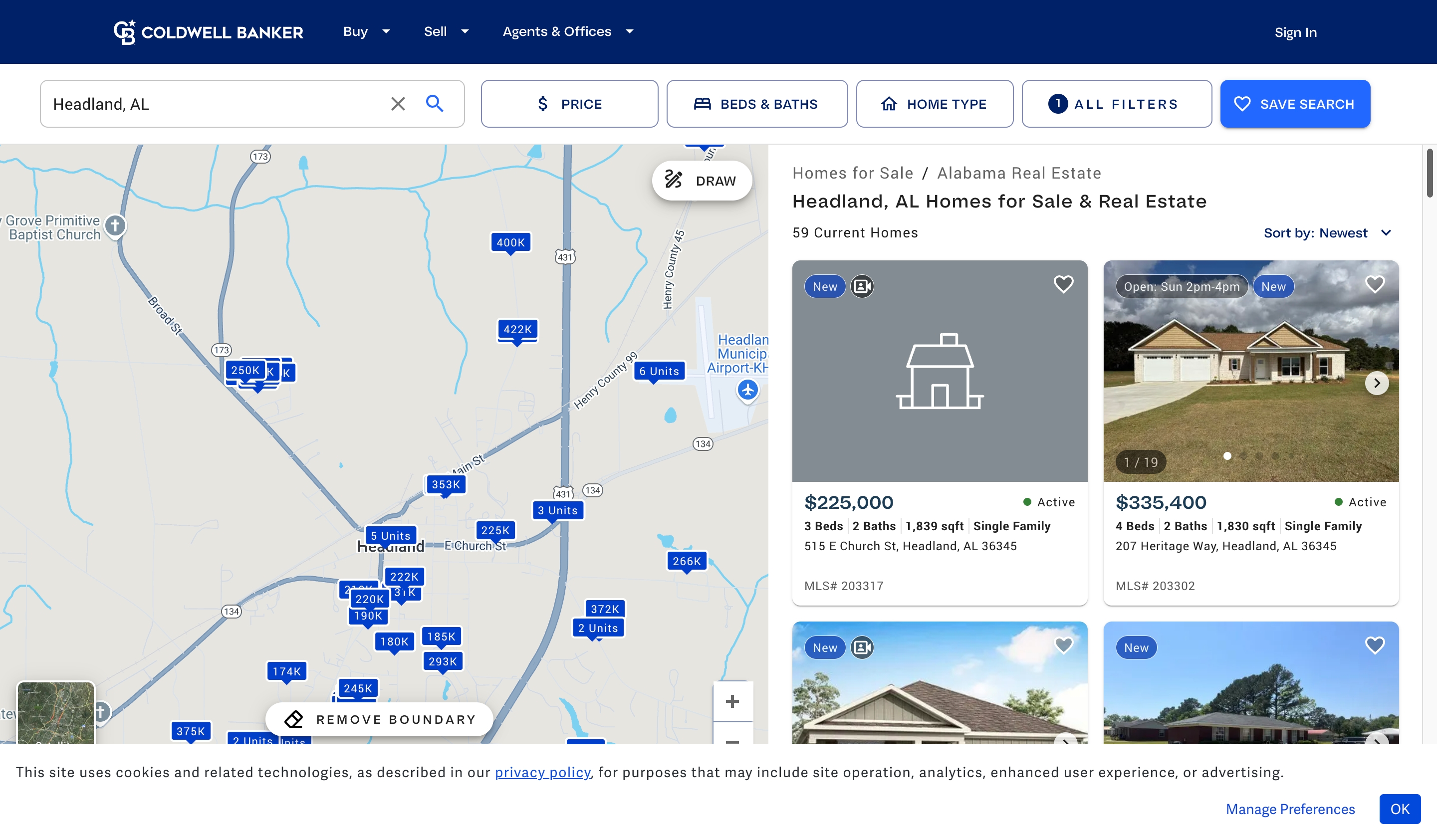
But what makes this landing experience smart is the “Save Search” feature, a subtle but powerful lead capture tool. For the entire real estate industry, this is a prime example of how to make a high-traffic page work harder.
It’s not just about showing homes; it’s about building a pipeline of engaged and returning visitors.
Why it works?
- Map-first design for location-driven buyers. Users can visually navigate inventory before even clicking, ideal for local or relocation clients;
- Sticky filters for faster sorting. Keeps the experience smooth and personalized without needing reloads or deep nav;
- Organic lead magnet. Save search feature is a non-pushy way to capture high-intent users right when they’re most interested.
How to Improve Real Estate Landing Page Conversion Rates?
You’ve just seen what great real estate landing pages look like. But inspiration means nothing without execution.
To boost your landing page conversions, start with one thing: clarity. The best-performing pages strip away the fluff and get straight to the value.
Keep your forms short. Highlight one CTA. Use real photos and language that feels local, not corporate. And if something’s not converting? Try landing page optimization through A/B testing. A different headline, button color, or offer can make a lot of difference to your lead pipeline.
Also read:
- 15 Must-See Product Landing Page Examples
- 7 Ecommerce Landing Pages Examples: What Works and Why
- Landing Page Best Practices to Follow in 2025