


Ever tried convincing a stranger to give you their email? Not easy unless you’ve got a squeeze page that does the hard work for you.
Squeeze pages are designed for this exact job—getting visitors to hand over their email in exchange for something valuable. It could be a discount, a checklist, or a free course. When done right, they convert like crazy.
In fact, 49.7% of marketers say online forms and squeeze pages bring in their highest-quality leads.
We’ve tested dozens of squeeze pages for ecommerce stores, SaaS tools, and info-product creators. And today, we’ll share how it’s different from a landing page, share 6 real-life examples and tell you how to create one that gives your visitors a reason to share their emails.
Let’s get started.
What is a Squeeze Page?
A squeeze page is a short, high-converting landing page designed with one job—to capture email addresses.
Unlike traditional landing pages, it doesn’t try to sell. Instead, it persuades. Meaning you offer something valuable—like a free ebook, discount, checklist, or early access, in exchange for their email. Simple deal, right?
We’ve found that the best-performing squeeze pages follow a minimal but strategic formula:
- A strong headline that clearly communicates what’s in it for the user;
- A short, benefit-driven copy that makes them want in;
- A clean opt-in form (usually an email address with the first name) embedded right on the page—no distractions.
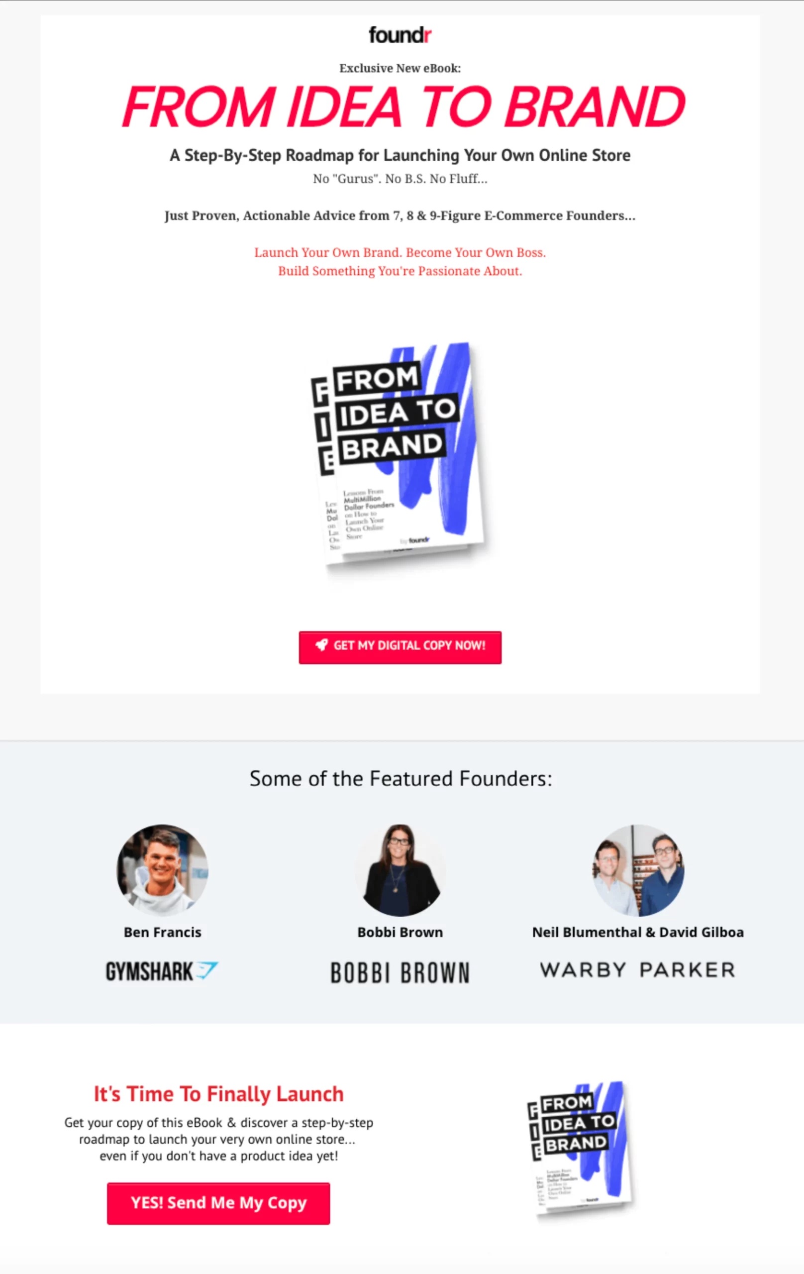
We used the same squeeze page basics to build a Black Friday ebook squeeze page for an ecommerce toolkit. Have a look:
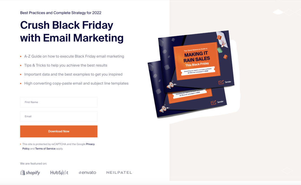
Here’s why it performed exceptionally well:
- The headline targeted a frustrating pain point;
- The supporting copy shared why the value inside the lead magnet;
- A strong call to action that tells what to do next.
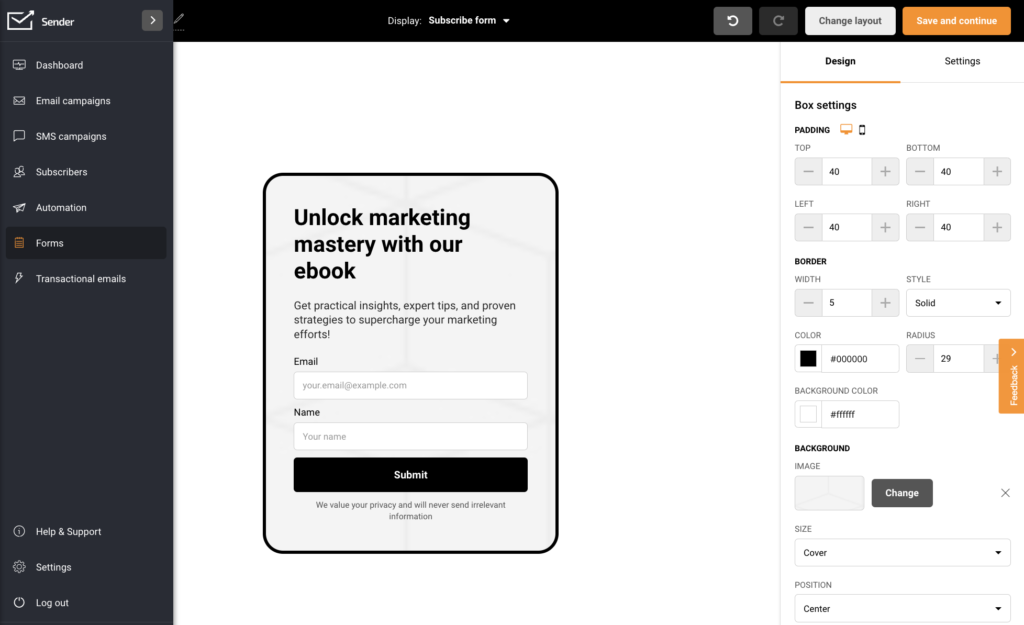
Anyone can easily create such a great squeeze page using a free form builder like Sender. Check how easy it is.
Why Are Squeeze Pages Important?
Squeeze pages work because they remove distractions, focus on one goal, and give visitors a clear reason to say yes. They’re your best shot at turning cold traffic into warm leads, and starting a relationship that actually converts later.
Who Uses Squeeze Pages?
Squeeze pages are used in all business niches—from eCommerce and fashion to SaaS companies.
That’s because squeeze pages aren’t industry-bound—they’re goal-bound. When your business thrives on email marketing, relationship-building, or warm leads, a squeeze page is essential.
Here are a few types of businesses that regularly rely on squeeze pages:
- Ecommerce brands. Offer 10% off, early access, or exclusive bundles in exchange for email signups;
- SaaS companies. Share free tools, templates, or email courses to convert traffic into qualified leads;
- Coaches & creators. Use lead magnets like ebooks, guides, or “free training” for email list building;
- Service-based businesses. Offer free audits, strategy calls, or downloadable case studies to capture high-intent prospects.
No matter your niche—if your goal is long-term customer relationships, it always starts with a name and an email.
Conversion Rate Statistics and Benchmarks
If you’ve already got ideas on how to use squeeze pages and are wondering what kind of results to expect, we’ve got some insights.
Check out some industry benchmarks to create a performance metric for your squeeze page performance:
- 12% is considered a good squeeze page conversion rate as per industry standards;
- With strategic conversion optimization, marketers can increase it up to 27% or more;
- For an email opt-in page, the conversion rate is between 5% and 15%;
- The average landing page conversion rate stands at 7.12%;
- Pages that load faster than 2 seconds have a 9.6% conversion rate;
- 53% of mobile visitors abandon a page if it takes longer than 3 seconds to load;
- Companies that improve conversions in the past year do 50% more A/B test than others;
- A webinar registration squeeze page conversion rate can be as high as 51%.
Squeeze Page vs. Landing Page
Both of these might feel similar, but a squeeze page and a landing page serve different purposes—and knowing the difference helps you use each one effectively.
We’ve seen many brands confuse the two and lose conversions simply because they picked the wrong format.
A squeeze page is laser-focused on getting an email address—nothing else. A landing page design, on the other hand, can have broader goals: sales, sign-ups, or downloads.
Here’s a side-by-side comparison with a few key differences:
| Feature | Squeeze Page | Landing Page |
| Length | Short and to the point (1 scroll max) | Can be short or long depending on goal |
| Form Fields | 1–2 fields (typically just email, sometimes name) | Can include multiple fields (email, phone, company, etc.) |
| Goal | Collect email addresses only | Can drive sign-ups, purchases, downloads, etc. |
| Buyer Journey Stage | Top-of-funnel (awareness or lead capture page) | Can be used across the sales funnel (TOFU, MOFU, BOFU) |
| Traffic Sources | Mostly from paid ads or SEO | Can be from ads, social, email, organic search |
| CTA Type | Always includes a subscriber form | May include forms, buttons, or multiple CTAs |
| Distractions | No external links or navigation | May include links, testimonials, or secondary CTAs |
How to Create a High-Converting Squeeze Page?
Creating a squeeze page isn’t just about setting up an email signup form and hoping for leads. It’s about understanding your audience, offering real value, and removing friction.
Whether you’re running a Shopify store or building a personal brand on WordPress, a landing page builder like Elementor, Divi, along with Sender can help you create a clean, conversion-focused web page without needing to write a single line of code.
Let’s look at the exact steps with all the elements we use to create good squeeze pages:
1. Define Your Target Audience
To hook and keep your squeeze page visitors, you need to target your audience precisely. Find out their interests, values, and goals before you create your first squeeze page. You can extract more details from your customer profile.
Then, address your visitors’ interests and pain points, and emphasize the main benefit of your proposal.
2. Propose a Captivating Offer
Before you design your squeeze page, you must create a lead magnet — something you’ll give website users in exchange for their email addresses.
The lead magnet is usually a digital asset such as:
- eBook
- Newsletter
- Video or webinar
- Whitepaper
- Podcast
- Free report
Ensure that the offer promised on the squeeze page is exclusive to website visitors and unavailable elsewhere.
Also, the gated content should appear valuable. Consider what kind of potential customers you want to collect emails from and offer something to their needs.
For example, inexperienced users might be more drawn to extensive guides like webinars and reports, while experts are more interested in quickly digestible content like newsletters or whitepapers.
3. Write a Killer Headline and Powerful Copy
The first thing website visitors notice when they see your squeeze page is your headline. So, the headline must clearly inform them of the benefit your lead magnet will offer.
Here are some effective headlines you can use:
- Learn How _____ Makes ____ Per Year
- Learn How to ____ In _____ Minutes
- Get ____ With Less ____
- Free ebook: Inside _____ Free Tips From Experts
In the meantime, your copy should always supplement the headline information – elaborate on the offer – or create urgency. Here are some example phrases:
- Limited time, this month only, now
- Once in a lifetime, last chance, never again
- Offer expires, now or never, final
- Already used by ___ users, downloaded ___times
4. Create a Squeeze Page Design
To create an effective squeeze page, use relevant, high-quality images and pay close attention to the page structure — it should be clean, concise, and have high readability. Consider the association you want to create with your product and choose a complementary design and color.
Limit the number of form fields visitors need to fill out. People will only sign up if you ask for as little information as possible. Also, no need to use two opt-in forms in your design. Just add a form above the fold.
That said, creating popup and opt-in forms with Sender is easy. Sender has user-friendly builders with ready-to-use form templates that you can use on your custom page.
5. Create a Clear CTA
CTAs encourage visitors to take action. It should be specific so visitors can follow it easily. “Book a demo”, “Buy now,” and “Click to subscribe” are all examples of effective CTAs.
Make sure that the call to action button stands out. Use vibrant and contrasting colors and ensure it is large enough for desktop and mobile users to engage with.
6. Technical Implementation Best Practices
Even the best-designed squeeze page won’t convert if it loads slowly or looks bad on mobile. That’s why technical execution matters just as much as design.
Here are a few squeeze page best practices to double-check before launching any squeeze page:
- Mobile responsiveness. Most of your traffic will come from mobile. Test your page on multiple devices to ensure it looks and works great everywhere. Avoid tiny CTAs or cluttered layouts;
- Fast load times. A 1-second delay in page load can reduce conversions massively. Compress images, minimize scripts, and avoid unnecessary plugins for conversion rate optimization;
- Form integration & autoresponder setup. Make sure your squeeze page template and form connect directly to your email platform (like Sender), and set up an automatic welcome email or lead magnet delivery;
- Thank you page or success message. After submission, show a clear confirmation. A simple thank-you page also lets you track conversions more accurately in tools like Google Analytics.
- Privacy compliance. If you’re collecting user data, make sure your page includes a visible link to your privacy policy and complies with GDPR or other applicable regulations.
3 Popular Types of Squeeze Page
Over the years, we’ve tested different formats depending on the audience, offer, and traffic source. The best one for you depends on where your visitors are coming from and what you’re offering.
Here are three common types of squeeze pages we recommend:
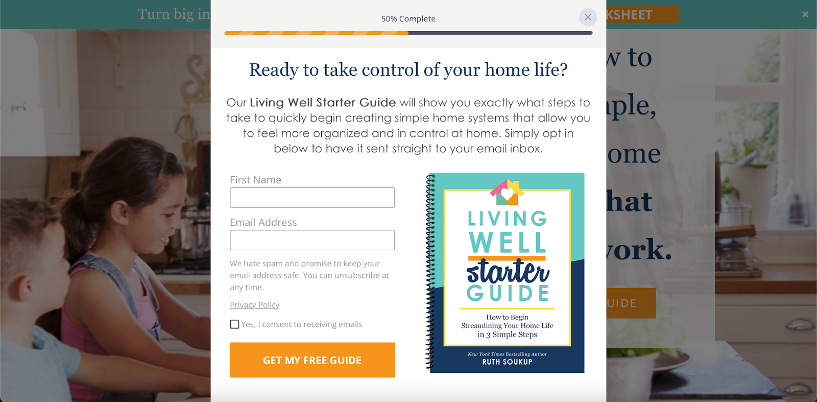
1. Opt-In Popup Squeeze Pages
These appear as pop-ups on a website—triggered by scroll behavior, time delay, or exit intent. They’re perfect for capturing attention without redirecting the visitor to another page. The content is short, usually just a headline, one or two benefit points, and a form.
Here’s an example of an effective popup squeeze page:
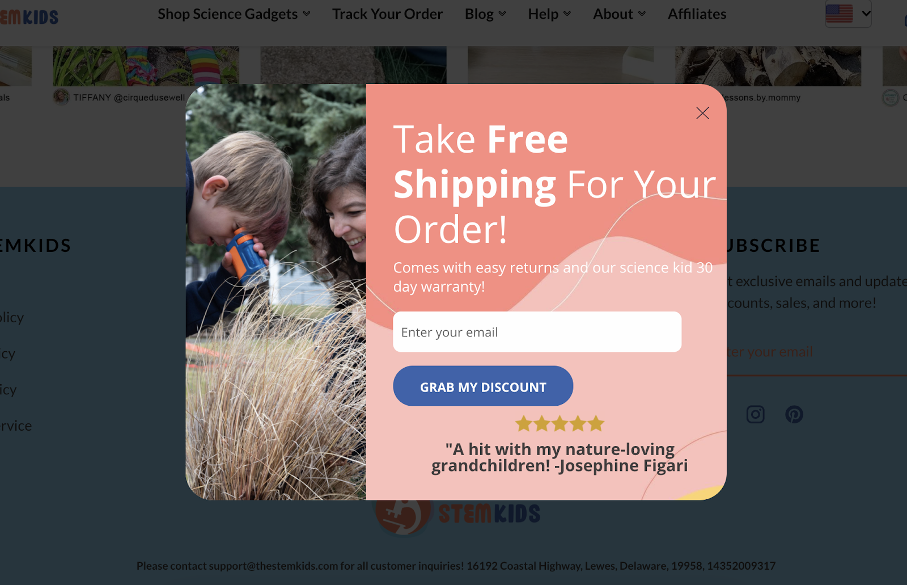
They work really well on blogs and product pages where readers are already engaged because such squeeze opt-in grab attention in-context—without breaking the flow. Here are some important characteristics:
- Minimal copy and form fields;
- Can be triggered based on behavior (exit intent, scroll %, etc.);
- Highly visible without needing a new page.
Best For:
- Capturing leads on blog posts or product pages;
- Offering lead magnets like discounts or downloads;
- Newsletter squeeze page to encourage signups without disrupting the flow.
Pro tip from Team Sender: Keep the opt-in page popup timing subtle—too early, and it’ll feel spammy; too late, and you might lose them.
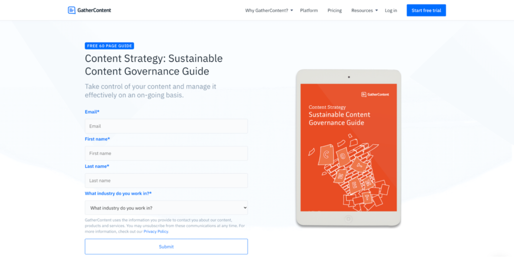
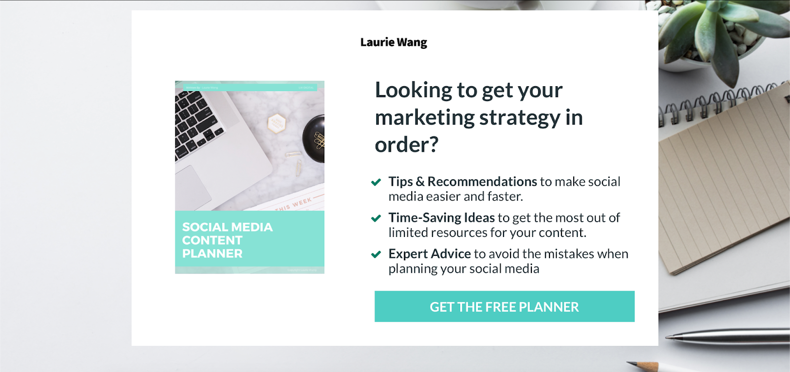
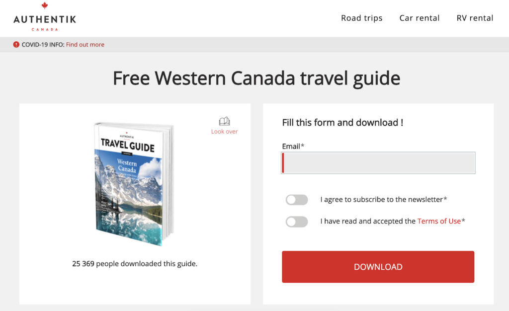
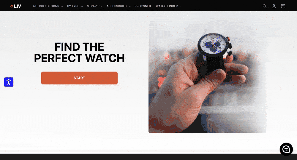
2. Standalone Lead Magnet Squeeze Pages
These are single-purpose pages with no distractions—just one goal: get the email in exchange for a valuable lead magnet. These pages usually feature a strong headline, a short benefit-driven description, and a simple form. No menus, no links, just focus.
Have a look at this example for a lead magnet squeeze page:
Think of standalone squeeze pages as a conversion page for paid ad campaigns or SEO traffic targeting specific offers. We’ve used these when promoting free ebooks, cheat sheets, or masterclasses.
Because they’re so focused, they tend to convert really well—especially when paired with a highly relevant offer.
Here’s what you should remember while making such a squeeze page:
- Clear headline + benefit-driven copy;
- Add social proof for credibility;
- No navigation links or distractions.
Best For:
- Running paid traffic campaigns (Google Ads, Meta Ads, etc.);
- Organic SEO pages targeting specific lead magnet keywords;
- Building marketing funnels for specific buyer personas or segments.
Pro Tip from Team Sender: Test different headline angles—urgency, curiosity, or value-driven—to see what resonates with your audience.
3. Quiz/Survey Squeeze Pages
Such kind of squeeze pages are more interactive and engaging. They’re great for gathering both emails and extra data about leads—like their goals, preferences, or stages in the buying journey.
Here’s a great example from an ecommerce brand:
Visitors answer a few questions, and at the end, they’re prompted to enter their email to view the results. This format builds curiosity and personal investment, which makes users more likely to opt in.
If you’re planning to use such a format, remember the following about interactive quizzes:
- Interactive and personalized;
- Captures more user data than typical pop-up forms;
- Often fun and engaging format, which boosts time on the page.
Best For:
- Ecommerce product recommendations;
- Coaches or consultants offering tailored advice;
- SaaS tools with onboarding or feature-fit flows.
Pro Tip from Sender Team. Position the email request after the quiz to avoid early drop-offs—let them invest first, then ask.
6 Best Squeeze Page Examples
One of the best ways to guide you when creating a squeeze page is to look at successful cases.
Here are some of the best squeeze page examples to inspire you:
Copyblogger
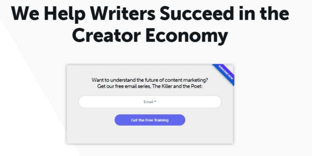
Copyblogger provides content marketing services, training, and valuable resources. So, email marketing is essential for building an audience and retaining long-term relationships with them.
Here’s what we loved about their squeeze page:
- An eye-catching headline with an intriguing perspective;
- A close-to-perfect copy, promising a way for the reader to reach an ambitious goal;
- A compelling offer of free training in exchange for a visitor’s email address.
Marie Forleo
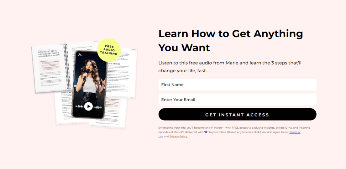
Marie Forleo is an influential entrepreneur and motivational speaker known for her dynamic personality and empowering approach to life and business. She uses email marketing to share exclusive insights nurturing her community while leveraging the power of personalized communication to strengthen her brand presence.
Here’s what we loved about her squeeze page:
- A headline with an offer that’s hard to miss out on;
- Clear CTA encouraging to act immediately;
- A lead magnet tailored to her busy target audience to be consumed on the go;
- Assurance that the visitors can unsubscribe anytime, in case they’re now worried about spam pages.
Ramit Sethi
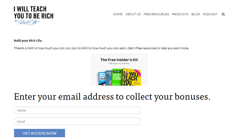
Ramit Sethi is a renowned personal finance expert, author, and entrepreneur who has transformed how people approach money. Email marketing enables his brand to deliver personalized and targeted content and establish itself as a trusted authority in personal finance.
What we loved about this squeeze page:
- A short yet powerful headline;
- The copy mentions “The Free Insider’s Kit” to make visitors feel like they’re part of the inner circle;
- The fear-of-missing-out (FOMO) tactic used to collect email addresses.
HubSpot
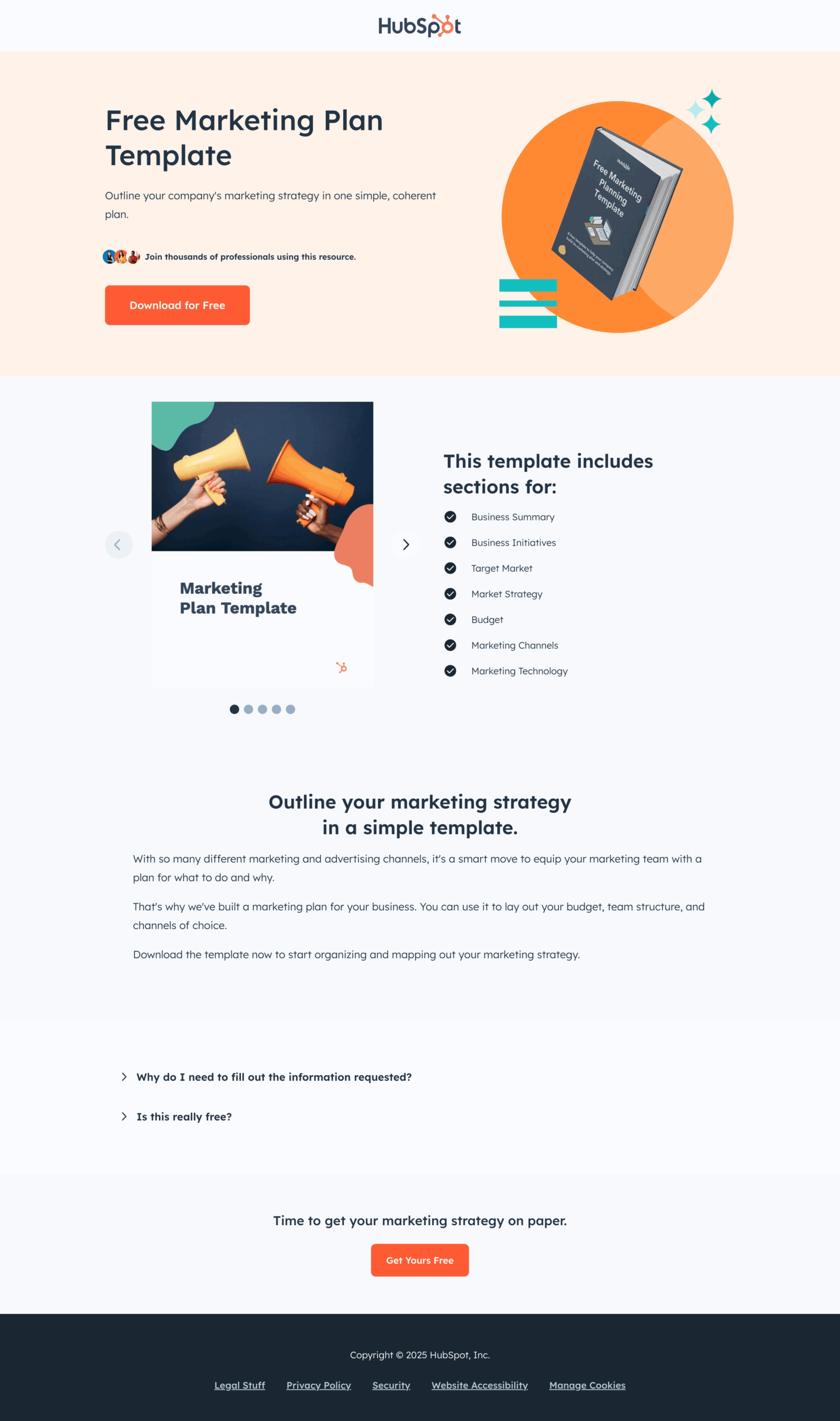
HubSpot’s squeeze page highlights a clear value proposition and focuses on conversions. With a reputation built on inbound marketing, they know exactly how to use free value to grow an email list of high-intent prospects.
The offer—a free Marketing Plan Template is perfect for attracting leads like marketing teams, small businesses, and agencies looking for structure in their strategy.
What we loved about this squeeze page:
- Straightforward headline that depicts the value, right away;
- Subheading to build trust by explaining how this resource simplifies planning;
- Subtle social proof embedded above the fold;
- Clear and action-driven CTA at multiple places.
Neil Patel
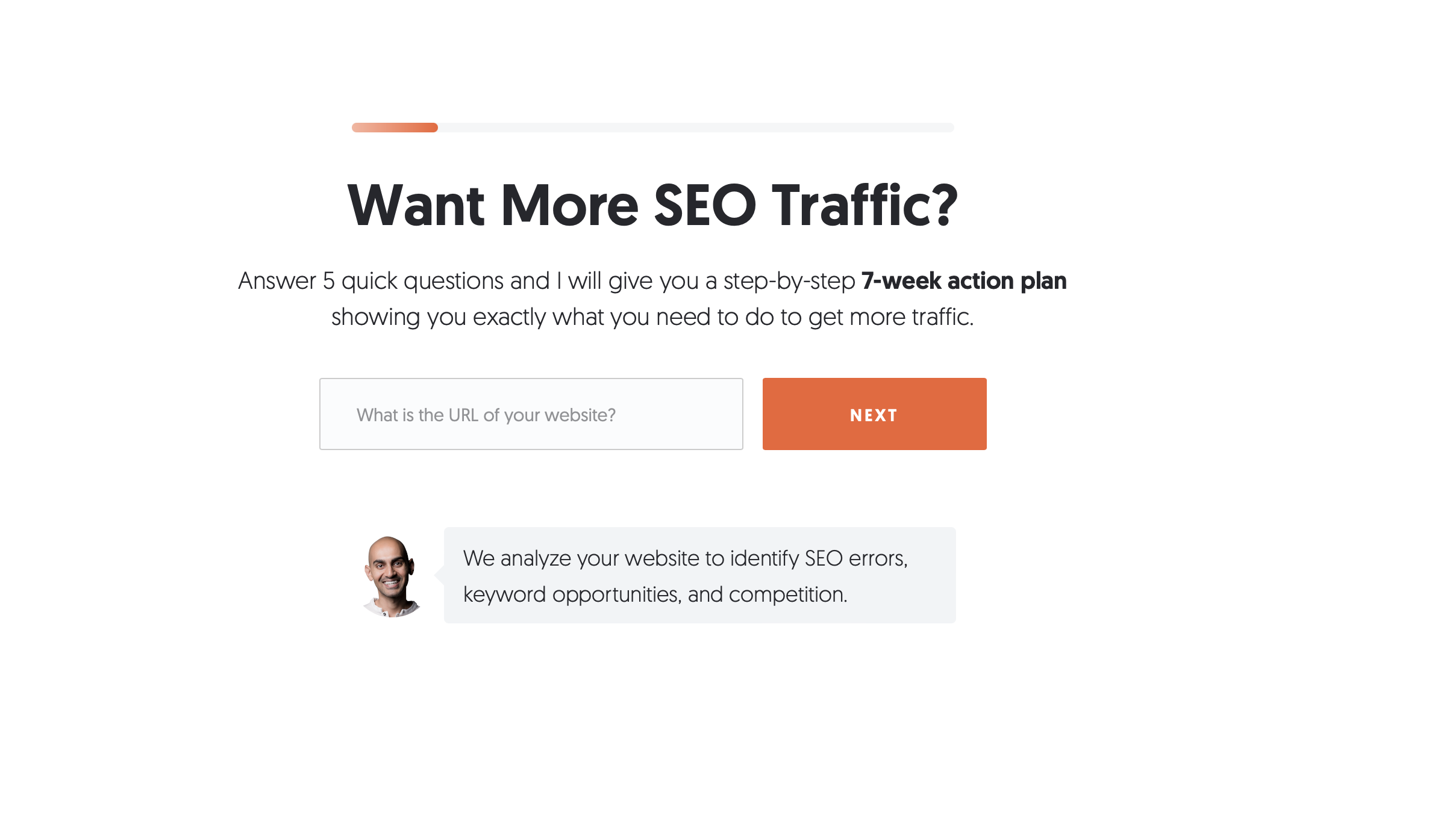
Neil Patel is a popular name in the SEO world and this squeeze page is built around a simple question—“Want More SEO Traffic?”—which directly targets user intent.
What makes this page stand out is how interactive and low-friction it feels. Instead of a static form, users are guided into a quiz-like flow that builds curiosity.
What we loved about this squeeze page:
- The headline is bold, benefit-driven, and asks a relatable question;
- A 7-week action plan is positioned as the reward—clearly framed and specific;
- Use of minimal form fields, making the form is short and friendly;
- The use of a progress bar subtly encourages completion.
Backlinko (Brian Dean)
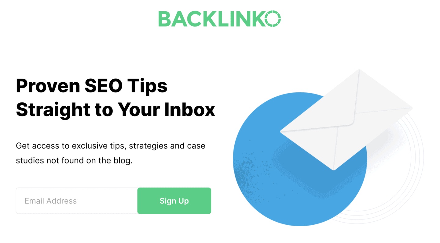
Backlinko, created by SEO expert Brian Dean, has long been known for deep-dive SEO content—and that reputation extends to its email strategy.
This squeeze page is the definition of clean, minimal, and conversion-focused. There’s no fluff—just a headline that promises exclusive insights straight to your inbox. This page reflects Backlinko’s core philosophy: high-value content, low-pressure opt-in.
What we loved about this squeeze page:
- The headline instantly tells you the benefit: “Proven SEO Tips Straight to Your Inbox”;
- Subheading explains the value clearly—exclusive tips, strategies, and case studies not available on the blog;
- Only one field to fill—just your email address, reducing friction;
- The green CTA button stands out and uses a simple action word.
Key Takeaways: Squeeze Pages
- Squeeze pages are highly effective in collecting email addresses and generating leads, with online forms being one of the high-converting lead generation tools.
- Businesses can benefit from squeeze pages regardless of niche, size, or location.
- Before you create squeeze pages, define your audience and tailor them to an irresistible offer that cannot be found anywhere else.
- Best practices to create a high-converting squeeze page include a killer headline and powerful copy, a page design with relevant imagery, and a clear CTA.
Use one of Sender’s free form builder templates to create and optimize squeeze pages for successful lead generation.
Also read: