


Email marketing remains one of the most effective ways to engage audiences, turn visitors into leads, and convert prospects into paying customers. It is no surprise, then, that 41% of marketers consider email their most effective marketing channel.
While there are many different elements that define successful email marketing campaigns, attention-grabbing subject lines and clear calls-to-action can make a real difference. Personalization and smart timing help boost open rates and conversions, too.
In this blog, I will look at how businesses use email as part of their email marketing strategies and also share relevant tips and email marketing campaign ideas to help you get started. Let’s dive in!
This article is part of our Email marketing guide.
What is an email marketing campaign?
An email marketing campaign is a well-coordinated effort where marketing emails are sent out in a series of related emails. The main goal of these campaigns is to get recipients interested, whether that means buying something or introducing new products.
Successful email campaigns depend on more than strong copy. Compelling subject lines, focused calls to action, thoughtful personalization, and well-timed delivery can all encourage engagement and improve conversion rates.
Types of Email Marketing (manual, automated & transactional)
Before diving into specific examples, it’s worth understanding the three core types of email campaigns you’ll encounter. Each serves a different purpose in your email marketing strategy, and the most effective brands use all three in harmony. Let’s break down each one:
Manual Email Campaigns (Batch)
Manual email campaigns are one-time sends created and scheduled by your marketing team. Think newsletters, seasonal promotions, product announcements, or flash sales–anything that goes out to a segment of your email list at a specific moment.
When to Use Them:
- Announcing limited-time offers or sales;
- Sharing company news or product launches;
- Sending holiday or seasonal campaigns;
- Distributing newsletters or content roundups.
Characteristics:
- Use segmentation to reach a defined audience group;
- Require manual creation, scheduling, and list selection;
- Timely and tied to specific dates or events;
- Performance depends heavily on timing and how you optimized it using A/B testing;
- Best for campaigns where relevance is time-bound rather than behavior-driven.
Automated Email Campaigns (Triggered)
Automated emails, also known as triggered flows, are pre-built sequences triggered by specific user actions or behaviors. Once set up, automations run on autopilot–delivering the right message at the right moment based on what a subscriber does (or doesn’t do).
When to Use Them:
- Welcoming new subscribers or customers;
- Recovering abandoned carts or browse sessions;
- Nurturing leads through drip sequences;
- Re-engaging inactive subscribers;
- Celebrating customer’s birthday or anniversary.
Characteristics:
- Triggered by user behavior (signup, purchase, inactivity, etc.);
- Highly personalized and contextually relevant;
- “Set it and forget it”–runs continuously once built;
- Typically higher engagement rates than batch emails;
- Requires initial setup but saves significant time long-term.
Transactional Emails
Transactional emails are automated messages triggered by a specific transaction or user request. Unlike marketing emails, their primary purpose is functional–confirming an action, delivering information, or providing account updates.
When to Use Them:
- Order confirmations and shipping notifications;
- Password resets and account verification;
- Receipts and invoices;
- Subscription or booking confirmations;
- Account activity alerts.
Characteristics:
- Expected by the recipient (highest open rates of any email type);
- Legally required or functionally necessary;
- Focused on clarity and utility over persuasion;
- Often exempt from unsubscribe requirements;
- Opportunity for subtle branding and cross-sells without being pushy.
29 Best Email Marketing Examples (by type)
Successful email marketing campaigns are a great way to build trust and nurture long-term relationships with your target audience. Strategic segmentation and automation can make messages more relevant and timely, while A/B testing can refine subject lines, content, and calls to action to improve the open rate and overall engagement.
If you’re wondering what successful (and beautiful) campaigns look like, check the best email campaign examples I’ve compiled. Your inspiration for the best email marketing templates might be among them!
- Welcome Email Examples
- Newsletter Examples
- Promotional & Seasonal Email Examples
- Abandoned Cart & Browse Email Examples
- Re-engagement & Win-back Email Examples
- Drip & Nurture Campaign Examples
- Transactional & Order Confirmation Email Examples
- Follow-up Email Examples
- B2B Email Marketing Examples
- More Email Marketing Examples Worth Stealing
Welcome Email Examples
Welcome campaigns help you make the most of a subscriber’s first moment of interest. Since 74%* of consumers expect a welcome email, sending one right after signup is more than a nice touch – it’s a chance to introduce your brand, set expectations, and guide new subscribers toward their first action.
Food52
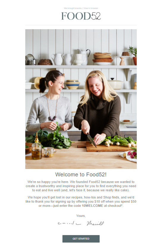
Here’s why it works:
- It sets clear expectations from the start. Rather than jumping straight into a promotion, Food52 introduces its recipes, cooking guides, and curated shop, giving subscribers compelling reasons to stay engaged beyond the welcome email.
- The founder-style sign-off adds a personal touch. Ending the email with a signature makes the message feel more like a personal letter than an automated campaign, helping build trust from day one.
- The incentive encourages an immediate first purchase. A welcome discount gives subscribers a low-risk reason to explore the online store while they’re still excited about joining the community.
- The call-to-action (CTA) keeps the next step simple. Instead of overwhelming new subscribers with multiple links, the prominent ‘Get Started’ button gives them one clear action, making it easier to continue their journey with the brand.
Food52’s welcome email works because it combines a warm brand introduction, clear expectations, and a timely incentive to turn new subscribers into engaged customers.
Grammarly (onboarding)
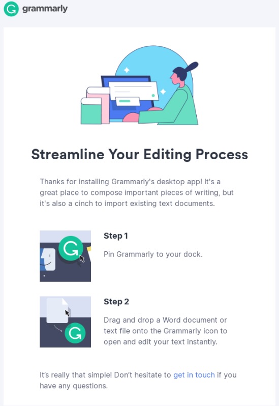
Here’s why it works:
- It bridges the gap between welcome and onboarding. While the message greets users after installing the desktop app, its main purpose is to help them complete setup and start using Grammarly successfully.
- It focuses on immediate value. Rather than explaining every feature, the email shows users how to streamline editing by importing and opening existing documents.
- The instructions are simple and visual. Breaking the process into two numbered steps, supported by screenshots, makes the email easy to follow without overwhelming new users.
- It arrives at the right moment. Sending guidance immediately after installation helps users act while their interest is still high, reducing the chance that they abandon the product before experiencing its benefits.
Grammarly’s email works because it combines a welcoming first touch with clear onboarding steps that help new users reach value quickly.
Newsletter Examples
Newsletter campaigns are recurring emails brands send to keep subscribers updated and build brand awareness over time. Think of them like catching up with your audience over a cup of coffee. Rather than constantly pushing products, the best newsletter email marketing strategies focus on building relationships by sharing content people genuinely value rather than constantly pushing products.
Goodreads
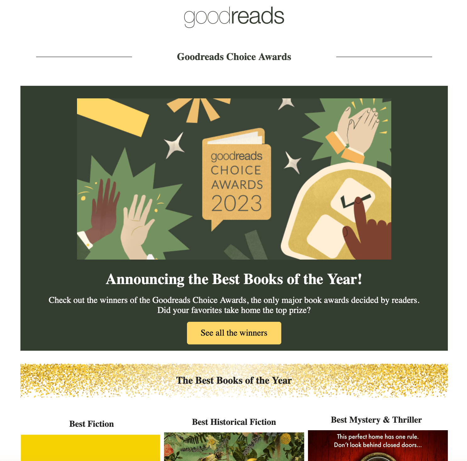
Why it works:
- It stays true to the Goodreads brand by celebrating books and reading rather than pushing a product. The newsletter reinforces its role as a trusted community for readers, making the content feel authentic and relevant to subscribers’ interests.
- The email is highly scannable, with a bold hero image, a clear headline, and a single primary CTA (“See all the winners”). Not only does it increase click-through rate (CTR), readers can also understand the message in seconds without scrolling through blocks of copy.
- It sparks curiosity by leveraging personalization through shared interests. Whether subscribers voted in the Goodreads Choice Awards or simply have favorite authors, the email naturally encourages them to click to see if the books they supported made the final list.
- The timing creates built-in relevance. Announcing the annual Goodreads Choice Awards turns the newsletter into a timely event rather than just another update, giving subscribers a compelling reason to open it while the results are still fresh.
Goodreads’ newsletter works because its scannable design, curiosity-driven message, and clear CTA turn an annual awards announcement into an engaging experience for book lovers.
Save time and effort creating engaging newsletters with Sender’s drag-and-drop email builder and responsive email templates.
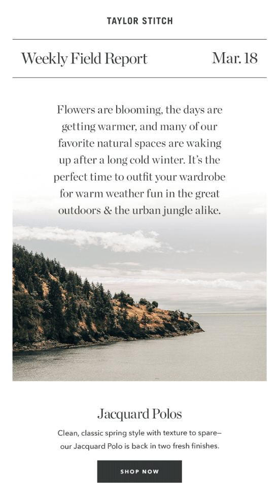
Taylor Stitch
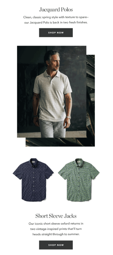
Here’s why it works:
- It leads with a relatable seasonal story instead of a product pitch. By talking about warmer weather and spending more time outdoors, Taylor Stitch creates a natural transition into its spring collection.
- The newsletter feels editorial rather than promotional. Framed as a “Weekly Field Report,” it reads like lifestyle content first, making subscribers more receptive to the product recommendations that follow.
- The visuals reinforce the message. The scenic outdoor photography evokes the feeling of spring adventures, helping readers picture themselves wearing the featured pieces in similar settings.
- The CTA follows naturally from email content. After setting the scene and introducing the season, the newsletter presents curated outfit ideas and invites readers to shop, making the call-to-action feel like a helpful next step rather than a hard sell.
Taylor Stitch’s newsletter works because it pairs seasonal storytelling with relevant product recommendations, making its CTA feel like a natural extension of the content instead of a sales pitch.
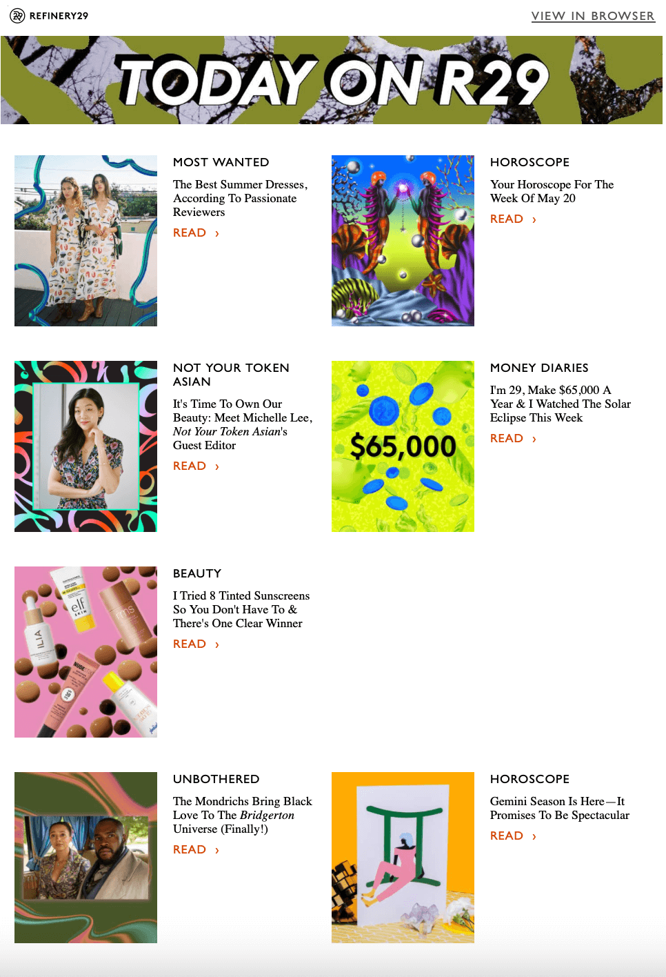
Refinery29
Why it works:
- It offers a curated content roundup instead of overwhelming readers with every new article. By highlighting a handful of featured stories across categories like beauty, fashion, horoscopes, and culture, subscribers can quickly find topics that match their interests.
- The grid layout is easy to scan. Clear category labels, bold headlines, eye-catching images, and repeated “Read” CTAs make it effortless for readers to browse the newsletter and choose what catches their attention.
- It caters to different audience interests in a single email. Rather than focusing on one topic, the newsletter mixes lifestyle, entertainment, career, and pop culture content, increasing the likelihood that every subscriber finds something worth clicking.
- The newsletter drives website traffic without feeling promotional. Every featured story acts as a teaser, giving readers just enough information to pique their interest before encouraging them to continue reading on the website.
Refinery29’s newsletter works because it curates diverse, visually engaging stories into a highly scannable format that encourages readers to click through and explore more content.
PANGAIA
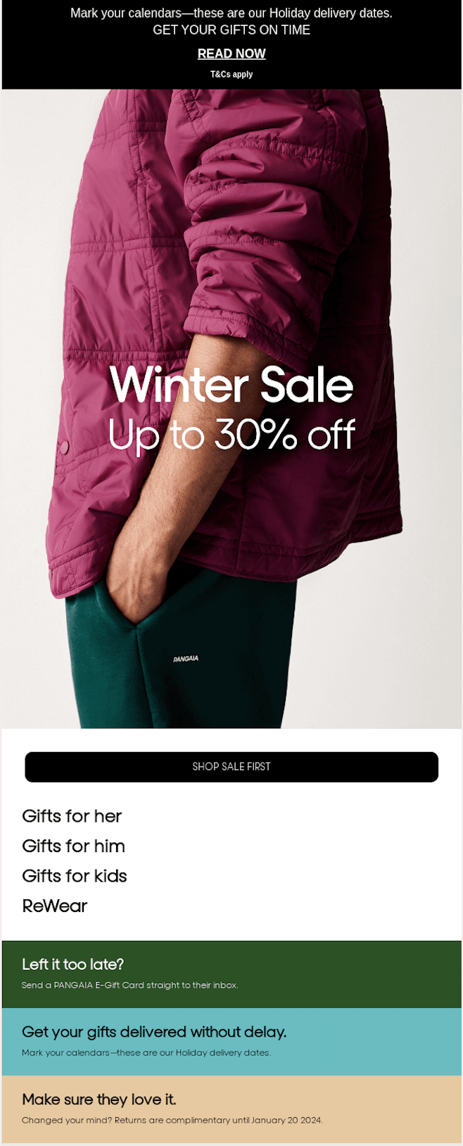
Why it works:
- It combines a promotion with genuinely useful information. While the headline promotes the Winter Sale, the newsletter also highlights holiday delivery deadlines, gift cards, and extended returns, making it a helpful shopping guide rather than just another sales email.
- The content matches the customer’s seasonal mindset. By acknowledging the holiday shopping period, PANGAIA gives subscribers multiple timely reasons to visit the store–from finding gifts to ensuring they’ll arrive before the holidays.
- The hierarchy naturally guides readers to action. The bold sale announcement grabs attention first, followed by a prominent “Shop Sale First” CTA, while the supporting information addresses common purchase concerns like delivery times and returns.
- It reduces purchase hesitation. Reminding shoppers about delivery cutoffs, offering instant e-gift cards for last-minute buyers, and highlighting complimentary returns removes common barriers to buying during the busy holiday season.
PANGAIA’s newsletter works because it blends seasonal promotions with practical shopping information, making it easier for subscribers to buy with confidence during the holiday rush.
Everyday Oil
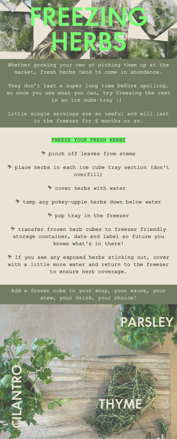
Here’s why it works:
- It leads with genuinely useful content. Instead of immediately promoting a product, Everyday Oil teaches subscribers how to preserve fresh herbs, giving them a practical reason to read and save the email.
- The advice is specific and easy to follow. Short, step-by-step instructions turn a simple household tip into actionable content readers can use right away.
- The visual style feels distinctive and on-brand. Natural photography, earthy tones, and playful typography create a homemade, editorial feel that matches the brand’s wellness-focused identity.
- It builds trust without relying on a hard sell. By sharing helpful lifestyle content, the brand positions itself as a useful presence in subscribers’ inboxes rather than just another company promoting products.
Everyday Oil’s newsletter works because it delivers practical, save-worthy lifestyle advice in a distinctive format that builds trust without relying on a direct sales pitch.
Promotional & Seasonal Email Examples
Promotional emails are marketing emails that inform your audience about a running promotion or offer. Any time a discount lands in your inbox, you are likely looking at a promotional email – an email campaign type that typically generates open rates of 20% up to 28%. Send such emails to promote limited-time offers, exclusive deals, and seasonal or holiday promotions.
Headspace
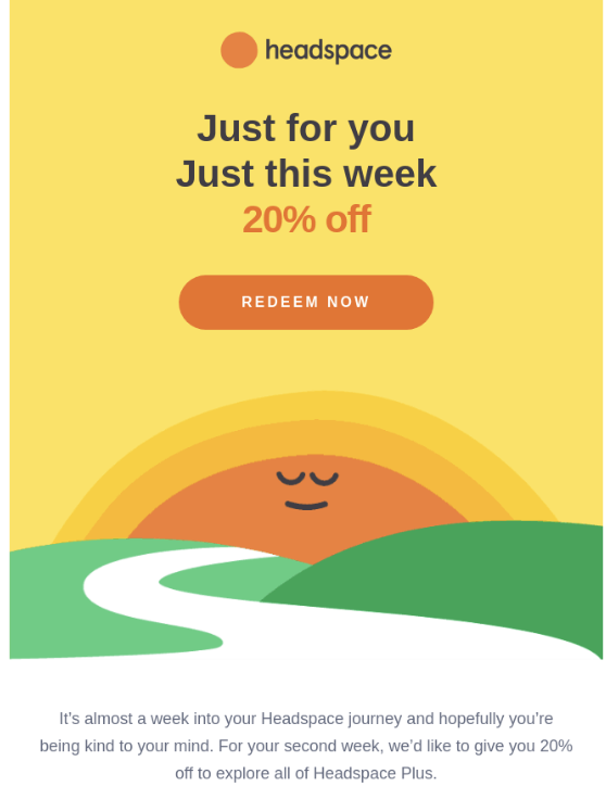
Here’s why it works:
- It makes the offer feel exclusive. Phrases like ‘Just for you’ and ‘Just this week’ create a sense of personalization and urgency, making subscribers feel they’re receiving a special, limited-time reward.
- The value proposition is instantly clear. The bold “20% off” headline is the focal point of the email, so readers immediately understand what’s being offered without having to read the body copy.
- Email marketing design reflects the brand’s personality. Soft illustrations, warm colors, and plenty of whitespace reinforce Headspace’s calm, approachable identity, making the promotion feel consistent with the app’s mindfulness experience.
- The CTA is impossible to miss. A single, high-contrast ‘Redeem Now’ button keeps the next step simple, helping readers act immediately instead of weighing multiple options.
Headspace’s promotional email works because it pairs a timely, personalized discount with calming visuals and a single clear CTA that encourages subscribers to upgrade.
Apple
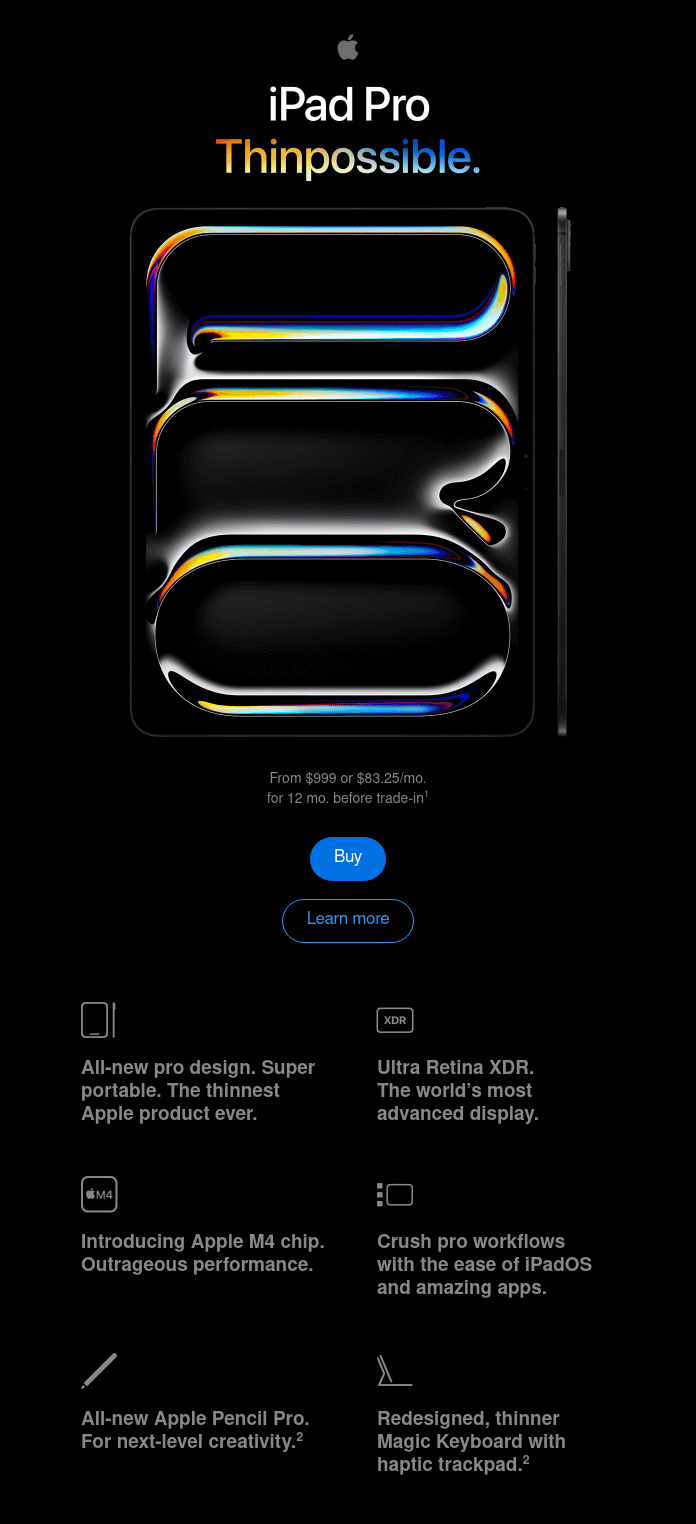
Here’s why it works:
- Apple’s promotional email puts the new iPad Pro at the centre of the campaign. Its minimalist layout, bold product imagery, and generous use of whitespace immediately draw attention to the device without overwhelming readers with unnecessary information.
- The campaign communicates the offer quickly and clearly. The “Thinpossible.” headline introduces the iPad Pro’s ultra-thin design, while the starting price and monthly payment option give recipients practical purchase information at a glance.
- The campaign also appeals to recipients at different stages of the buying journey. The prominent ‘Buy’ button encourages ready-to-purchase customers to take immediate action, while the ‘Learn more’ CTA gives less committed readers an opportunity to explore the product first.
- Every design choice reinforces Apple’s premium brand identity. The dark background, polished product image, distinctive typography, and restrained copy create a sophisticated promotional message that is instantly recognisable as Apple.
The campaign works because it combines eye-catching creative, transparent pricing, and clear calls to action. It promotes the new iPad Pro effectively while keeping the path from initial interest to purchase simple.
Forever 21 (New arrivals)
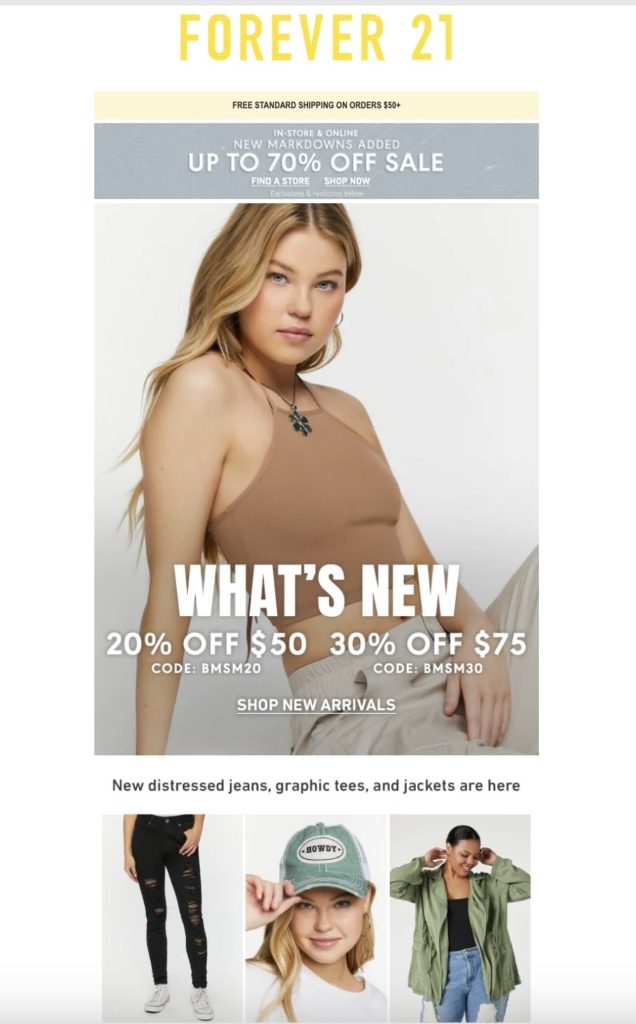
Here’s why it works:
- It combines new arrivals with a limited-time discount. Instead of simply announcing the latest collection, Forever 21 gives subscribers an extra incentive to shop now by pairing new products with tiered promotional offers.
- The hero section communicates the main message instantly. A bold “What’s New” headline, discount details, and a prominent “Shop New Arrivals” CTA make the purpose of the email clear within seconds.
- It uses lifestyle imagery to sell the collection. Featuring the products on models helps subscribers imagine how the pieces look when worn, making the new arrivals more aspirational and appealing.
- The product grid encourages further browsing. After grabbing attention with the hero image, the email showcases several featured items, giving readers a preview of the collection and increasing the chances they’ll click through.
Forever 21’s email works because it combines new arrivals, limited-time discounts, and eye-catching product imagery to encourage subscribers to browse and buy.
Fast Times Skateboarding
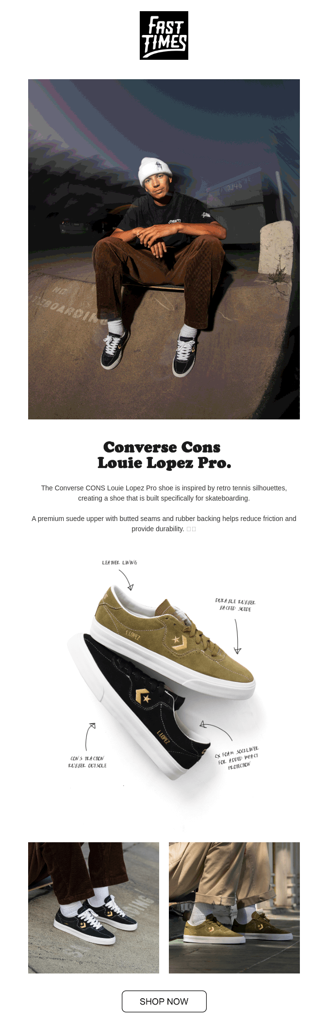
Here’s why it works:
- It leads with lifestyle, not a hard sell. The opening image places the product in an authentic skateboarding setting, helping the campaign connect with its audience before introducing the shoe.
- The collaboration adds credibility. Featuring professional skateboarder Louie Lopez gives the launch a clear story and makes the product more relevant to customers who follow skate culture.
- It explains the product’s practical benefits. The copy highlights details such as suede construction, reduced friction, and added durability, showing why the shoe is suited to skateboarding rather than relying on appearance alone.
- Annotated product imagery makes the features easy to understand. Handwritten callouts draw attention to specific design elements, giving the email an editorial, behind-the-scenes feel.
Fast Times Skateboarding’s email works because it combines an authentic athlete-led story, practical product details, and strong lifestyle imagery to make the shoe feel credible and desirable.
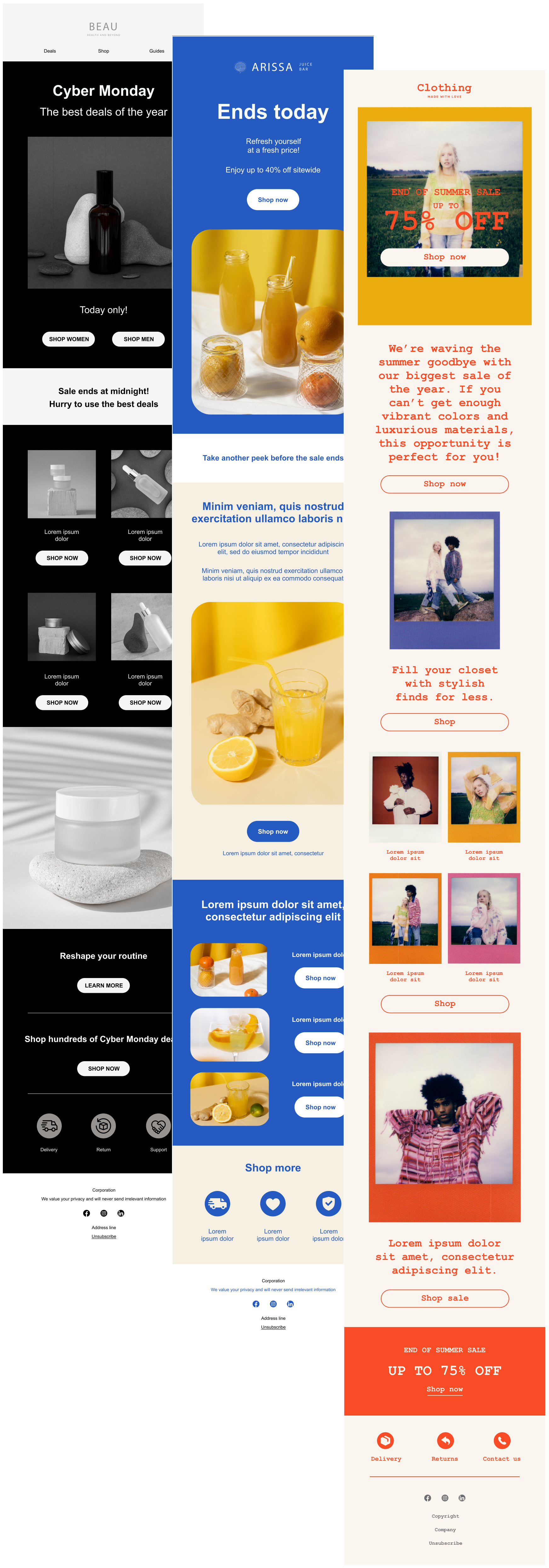
Sender (Seasonal Promotion)
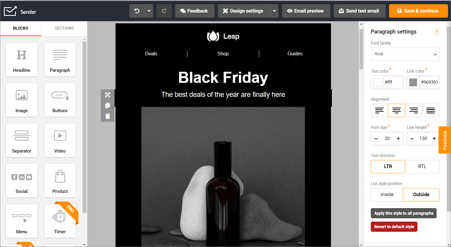
Why it works:
- It capitalizes on seasonal buying intent. Black Friday is one of the biggest shopping events of the year, making it the perfect opportunity to reach subscribers when they’re already expecting deals and actively looking to buy.
- The message is immediately clear. A bold “Black Friday” headline paired with a simple supporting line (“The best deals of the year are finally here”) leaves no doubt about the campaign’s purpose within seconds of opening the email.
- Simple navigation encourages exploration. Links to Deals, Shop, and Guides let subscribers browse the content most relevant to them, making the campaign useful whether they’re ready to buy or still researching.
- It creates urgency without overcomplicating the message. Rather than overwhelming readers with multiple discounts and banners, the email builds excitement around a limited-time shopping event and encourages immediate action.
This Black Friday campaign works because it combines timely seasonal messaging, a clean design, and a focused value proposition to capture shoppers’ attention when they’re most ready to buy.
Abandoned Cart & Browse Email Examples
Abandoned cart and browse emails help recover potential customers who showed interest but left before making a purchase. Whether someone added an item to their cart or simply viewed a product, these automated campaigns serve as timely reminders that reignite interest and encourage shoppers to return and complete their journey.
ASOS (Abandoned cart)
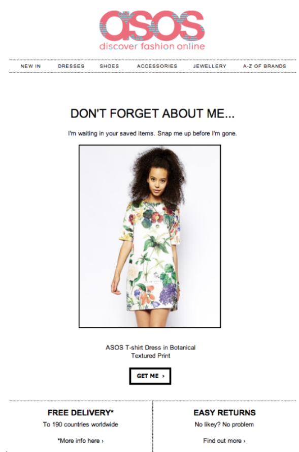
Here’s why it works:
- It uses playful, product-led copy. “Don’t forget about me” gives the abandoned item a personality, making the reminder feel light and engaging rather than pushy.
- It adds gentle urgency. The line “Snap me up before I’m gone” hints that the item may sell out, encouraging action without relying on an aggressive countdown.
- The CTA is specific and easy to act on. “Get me” matches the playful tone while taking shoppers straight back to the product.
- It removes common purchase concerns. Free delivery and easy returns reduce hesitation and give the shopper extra reassurance before completing the order.
ASOS’s abandoned cart email works because it combines playful urgency, a clear product reminder, and reassuring delivery and return details to bring shoppers back.
Sometimes Always (Abandoned browse)

Here’s why it works:
- It opens with a strong, personality-led headline. “You’ve got great taste” flatters the reader and makes the message feel more playful than a standard product reminder.
- It references the shopper’s browsing behavior directly. The copy makes it clear that the recommendations are based on bottles they already viewed, which adds relevance without overcomplicating the message.
- The product recommendations are easy to browse. Clear bottle images, names, prices, and individual shop buttons let readers quickly return to the items that interested them.
- It gives readers several ways to convert. Alongside product-level CTAs, repeated “Shop Now” buttons offer a broader route back to the store.
Sometimes Always’ browse-abandonment email works because it combines personalized product reminders, flattering copy, and scarcity-driven urgency to bring interested shoppers back.
Re-engagement & Win-back Email Examples
Re-engagement and win-back campaigns are designed to reconnect with subscribers who have stopped opening emails or interacting with your brand. Instead of pushing another promotion, these emails acknowledge the silence and give people a compelling reason to return–whether that’s a special offer, updated preferences, or simply a reminder of what they’re missing.
Animoto
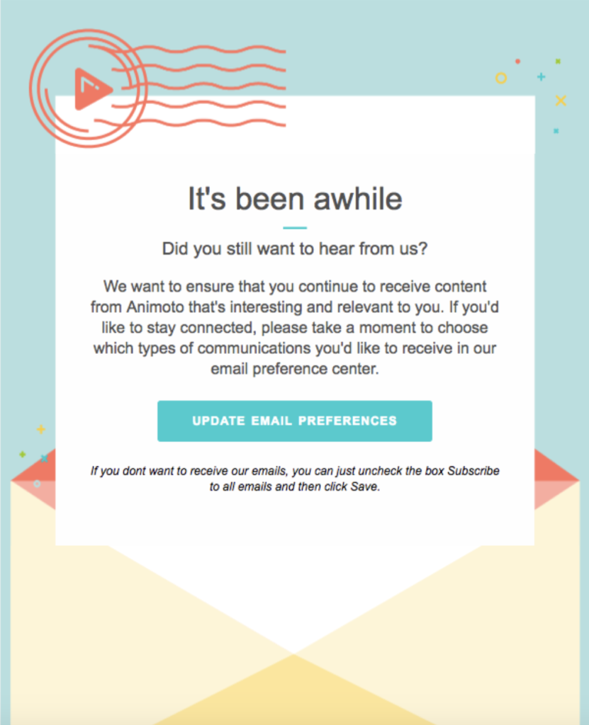
Here’s why it works:
- It acknowledges inactivity without sounding judgmental. The simple opening, “It’s been awhile,” recognizes that the subscriber has been inactive while keeping the tone friendly and conversational.
- It gives subscribers control over their inbox. Instead of asking users to simply stay subscribed, Animoto encourages them to update their email preferences, allowing them to choose the content they actually want to receive.
- The value proposition is subscriber-focused. The email emphasizes sending content that’s “interesting and relevant” rather than promoting a product or discount, reinforcing that the brand wants to improve the subscriber experience.
- The CTA is clear and low commitment. Updating email preferences feels like a smaller ask than making a purchase or starting a free trial, making inactive subscribers more likely to engage.
Animoto’s re-engagement email works because it gives inactive subscribers control over their inbox while using a friendly, low-pressure approach to rebuild engagement.
Drip & Nurture Campaign Examples
Drip and nurture campaigns are automated email sequences designed to guide subscribers through the customer journey over time. Rather than pushing for an immediate sale, they build trust with timely, relevant content that educates, answers questions, and gradually moves leads closer to making a purchase.
Framebridge (Nurturing)
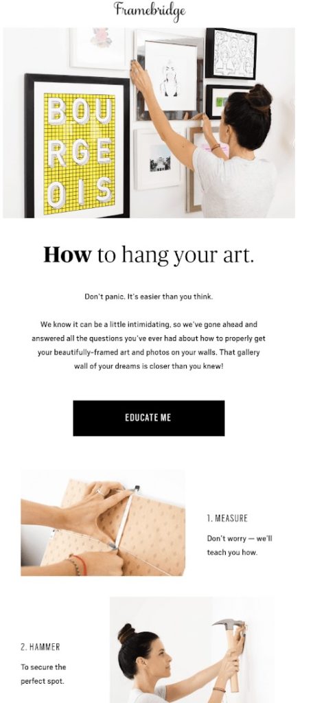
Here’s why it works:
- It educates instead of selling. Rather than promoting another product, Framebridge helps customers solve a common challenge–hanging framed artwork. This value-first approach makes the email feel genuinely helpful and strengthens trust in the brand.
- It reduces uncertainty with simple guidance. The reassuring headline (“Don’t panic. It’s easier than you think.”) addresses a pain point head-on, while the step-by-step instructions make the task feel achievable for anyone.
- The visuals reinforce the tutorial. Each step is paired with clear photography, making the instructions easier to follow than text alone and encouraging subscribers to keep scrolling.
- The CTA matches the reader’s intent. Instead of pushing a purchase, the ‘Educate Me’ button promises more helpful advice, making the click feel like a natural continuation of the learning experience.
Framebridge’s nurture email works because it delivers practical, educational content that helps customers succeed while building trust in the brand.
General Assembly (Event reminder)
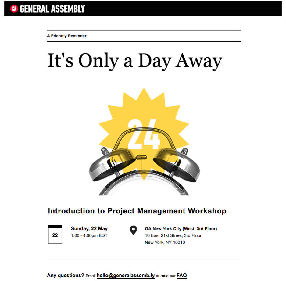
Here’s why it works:
- It creates urgency without sounding pushy. The headline, ‘It’s Only a Day Away,’ reminds attendees that the event is approaching, encouraging them to prepare rather than pressuring them to register.
- It highlights the most important information first. The event date, time, location, and workshop title are clearly presented, so recipients can quickly confirm the details without searching through long paragraphs.
- The visual reinforces the countdown. The alarm clock graphic and bold “24” immediately communicate that the event is just one day away, making the reminder easy to understand at a glance.
- It keeps the focus on the event. With minimal copy and a clean layout, the email avoids distractions and serves its primary purpose: ensuring registered attendees remember to show up.
General Assembly’s reminder email works because it combines a clear countdown, essential event details, and a distraction-free design that helps attendees show up prepared.
Transactional & Order Confirmation Email Examples
Transactional and order confirmation emails are triggered by a specific customer action, like a purchase or booking. Their main job is confirming everything went through – but they’re also a chance to reassure customers, reinforce your brand, and smooth the post-purchase experience.
Airbnb (Order confirmation)
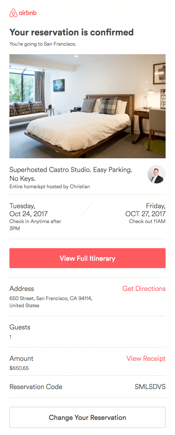
Here’s why it works:
- It provides instant reassurance. The clear “Your reservation is confirmed” headline immediately tells travelers their booking was successful, removing uncertainty after completing the purchase.
- It surfaces the most important information first. The property photo, host details, check-in and check-out dates, and address are presented prominently, allowing guests to confirm everything at a glance.
- The visuals build excitement. Featuring a large image of the booked accommodation transforms a standard confirmation into something more memorable, helping guests look forward to their upcoming stay.
- The CTA is practical rather than promotional. Instead of encouraging another purchase, the ‘View Full Itinerary’ button helps travelers access all their booking details whenever they need them.
Airbnb’s confirmation email works because it combines clear booking details, reassuring messaging, and a practical CTA that helps travelers manage their reservation with confidence.
Austrian Airlines (Thank you)
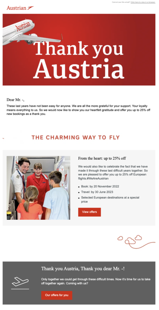
Here’s why it works:
- It leads with appreciation before promotion. Instead of opening with a discount, Austrian Airlines thanks users for customer loyalty, making the offer feel like a genuine gesture of gratitude rather than a sales tactic.
- The message feels personal and empathetic. Acknowledging the challenges of recent years adds emotional context and reminds customers of the relationship they’ve built with the airline.
- The reward reinforces customer loyalty. Offering up to 25% off future flights gives loyal travelers a tangible reason to book again while making them feel valued for their continued support.
- The CTA naturally follows the message. After expressing appreciation and explaining the offer, the “View offers” button provides a simple next step without overshadowing the thank-you message.
Austrian Airlines’ thank-you email works because it leads with genuine appreciation before rewarding loyal customers with a relevant offer that encourages future bookings.
Follow-up Email Examples
Follow-up emails keep the conversation going after a customer’s purchase, download, or signup. They deliver timely value, answer common questions, and encourage customers to stay engaged after the first conversion.
Blendtec
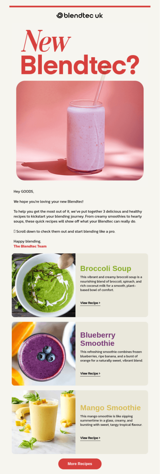
Here’s why it works:
- It arrives when customers are ready to use the product. Instead of ending communication after the purchase, Blendtec follows up with practical recipes that help new owners get immediate value from their blender.
- The content is educational and inspiring. Rather than listing product features, the email showcases simple recipes that demonstrate what the blender can do, encouraging customers to use it more often.
- The recipes are easy to explore. Large, colorful food photography paired with short descriptions and individual ‘View Recipe’ links makes the content highly scannable and encourages clicks.
- It encourages long-term engagement. The ‘More Recipes’ CTA invites customers to continue exploring Blendtec’s recipe library, keeping them connected with the brand well beyond the initial purchase.
Blendtec’s follow-up email works because it helps customers get immediate value from their purchase with useful, inspiring content that encourages ongoing engagement.
B2B Email Marketing Examples
B2B email campaigns help businesses educate prospects, nurture leads, and drive product adoption throughout the buying journey. Unlike consumer-focused emails, they emphasize solving business challenges, demonstrating measurable value, and helping decision-makers understand how a product or service fits into their workflow.
Slack
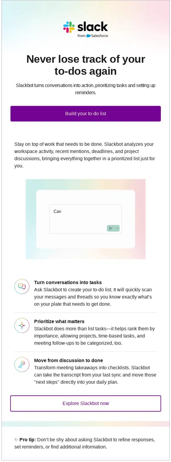
Why it works:
- It focuses on solving a business problem. Rather than leading with product features, Slack addresses a common workplace challenge–keeping track of tasks–making the email immediately relevant to its target audience.
- The value proposition is clear from the start. The headline, ‘Never lose track of your to-dos again,’ communicates the core benefit in seconds, while the supporting copy explains how Slackbot helps users stay organized.
- The content is easy to scan. Short sections, icons, and concise descriptions allow busy professionals to quickly understand the feature without reading lengthy paragraphs.
- The CTAs encourage product adoption. Buttons like ‘Build your to-do list’ and ‘Explore Slackbot now’ invite users to try the feature immediately, helping increase product engagement rather than simply driving website traffic.
Slack’s B2B email works because it focuses on solving a real workplace problem, clearly communicates business value, and encourages users to adopt a feature through simple, benefit-driven messaging.
More Email Marketing Examples Worth Stealing From
A brilliant email marketing campaign is hard to come by. To help, I’ve handpicked examples that show how different campaign types work in practice, along with a quick breakdown of what makes each one effective.
Clay (Product Launch Email)
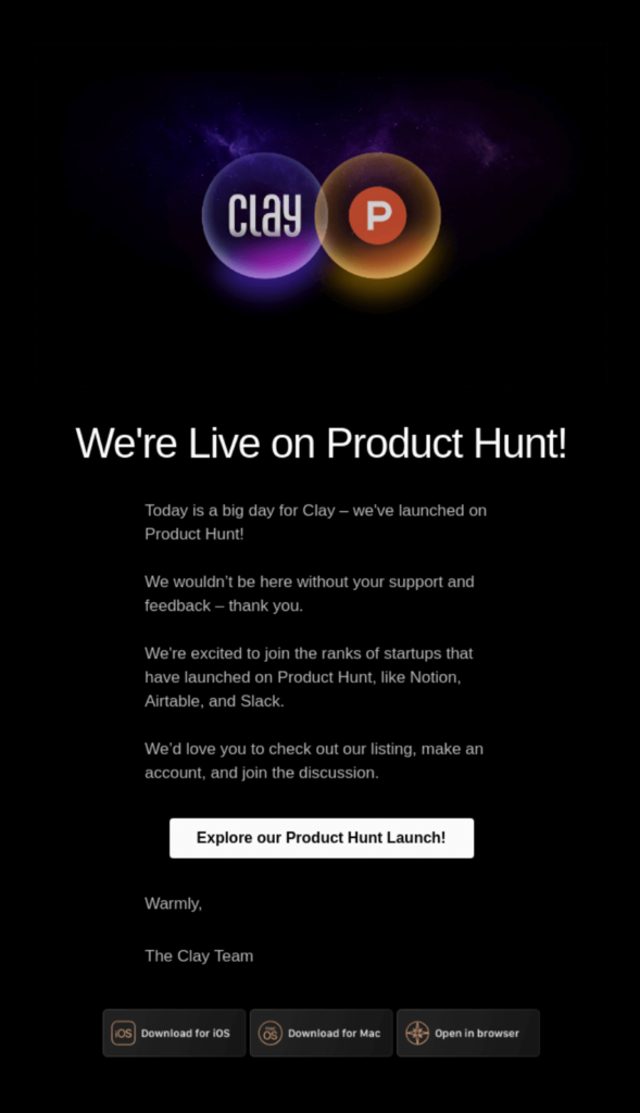
Here’s why it works:
- It announces a milestone, not just a product. Launching on Product Hunt turns the email into an event, giving subscribers a compelling reason to engage beyond simply learning about a new feature.
- It makes the audience feel part of the journey. By thanking subscribers for their support and feedback, Clay acknowledges its community and makes readers feel like contributors to the launch rather than passive recipients.
- It builds credibility through association. Mentioning well-known startups like Notion, Airtable, and Slack provides social proof and positions Clay alongside respected companies that launched on Product Hunt.
- The CTA is clear and action-oriented. The ‘Explore our Product Hunt Launch!’ ‘button gives subscribers a single, obvious next step, making it easy to support the launch and join the conversation.
Clay’s product launch email works because it turns a company milestone into a community moment, using gratitude, social proof, and a clear CTA to encourage engagement.
DocuSign (New Article Emails)
Here’s why it works:
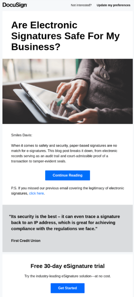
- It addresses a real customer question. Rather than simply announcing a new blog post, the email leads with a question many businesses have about electronic signatures, making the content immediately relevant, as well as encouraging opens.
- It previews the value without giving everything away. A short summary explains what readers will learn–such as audit trails, legal validity, and tamper-evident seals–while leaving enough unanswered to encourage clicks.
- It reinforces the brand’s expertise. By publishing educational content around compliance and security, DocuSign positions itself as a trusted authority rather than simply promoting its software.
- It keeps readers engaged beyond one email. The postscript links to a related article, encouraging subscribers to continue exploring the brand’s content and spend more time learning about the topic.
DocuSign’s new article email works because it addresses a common customer concern, previews valuable insights, and uses educational content to strengthen trust in the brand.
National Express (Feedback Email)
Here’s why it works:
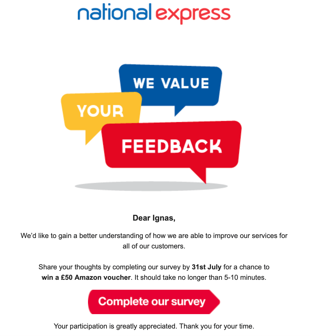
- It clearly explains why feedback matters. Rather than simply asking recipients to complete a survey, National Express tells customers their responses will help improve future services, giving them a meaningful reason to participate.
- It offers an incentive to increase participation. The chance to win a £50 Amazon voucher rewards customers for their time and makes completing the survey feel more worthwhile.
- It sets clear expectations. Mentioning that the survey takes just 5–10 minutes and including the submission deadline reduces uncertainty and helps recipients decide whether they have time to participate.
- The CTA is prominent and action-oriented. The bold ‘Complete our survey’ button stands out immediately, making it easy for recipients to understand the next step.
Customer feedback email campaigns work because, instead of talking at customers, you’re asking them to talk back. People appreciate it when brands want to hear their thoughts – especially when you can offer them something in return.
Trustpilot (Personalized Email)
Here’s why it works:
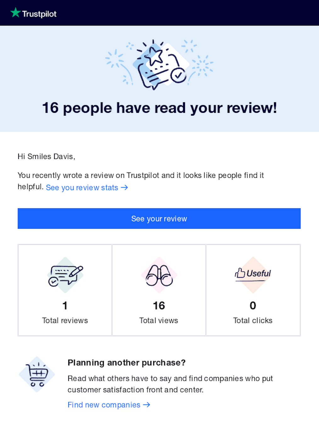
- It personalizes the message with meaningful customer data. Rather than stopping at the recipient’s name, Trustpilot shows how many people viewed their review, making the email feel relevant and rewarding.
- It reinforces the value of contributing. Telling users that others found their review helpful reminds them that their feedback has real impact, which can encourage them to leave more reviews in the future.
- The results are easy to understand. A simple stats panel breaks down total reviews, views, and clicks, giving recipients a quick snapshot of their activity without overwhelming them.
- It extends engagement beyond the original review. The final section encourages users to explore other companies, smoothly moving them from contributor activity back into the wider Trustpilot platform.
Personalized emails work because they make people feel seen rather than just marketed. Think happy birthday emails or product suggestions based on your browsing history. This creates this little moment of, “Oh, they actually pay attention!”
Cometeer (Referral)
Here’s why it works:
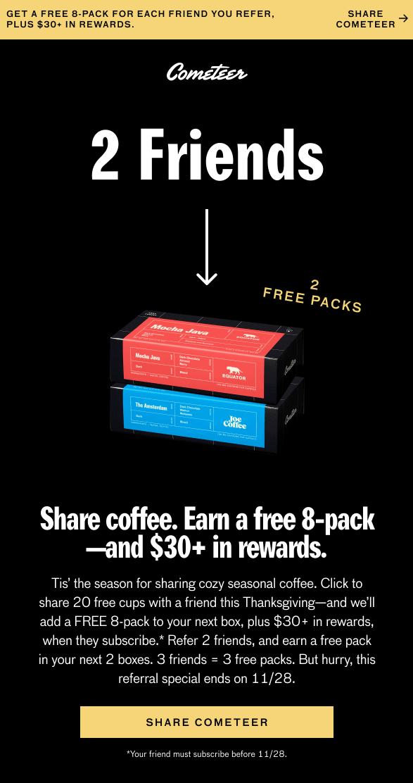
- It communicates the reward immediately. The headline clearly explains the value of the referral program, so subscribers instantly understand what they’ll earn by inviting friends.
- The offer benefits both parties. Friends receive free coffee to try the product, while the referrer earns free packs and additional rewards, creating a win-win that makes sharing more appealing.
- It explains the program simply. The email breaks down how many friends to refer and what each milestone unlocks, making the rewards easy to understand without requiring extra research.
- It creates urgency to encourage action. Mentioning that the offer is seasonal and available for a limited time gives subscribers a reason to share sooner rather than putting it off.
Referral emails work because they tap into genuine trust between friends. When your friend tells you about a product they love, you’re far more likely to give it a shot than if you saw it in a sponsored post.
Figlia (Social Proof)
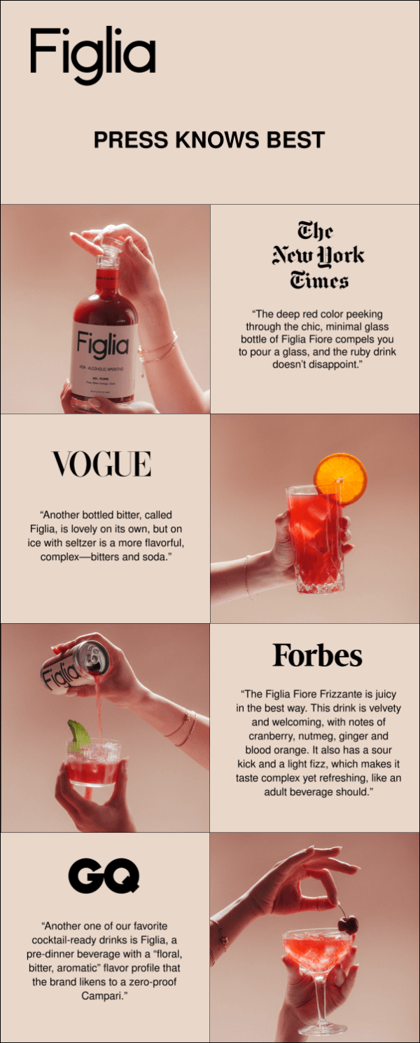
Here’s why it works:
- The testimonials are specific and descriptive. Rather than generic endorsements, the quotes highlight the product’s taste, appearance, and drinking experience, helping subscribers imagine what makes it special.
- The visuals reinforce the premium positioning. Minimalist product photography and elegant lifestyle imagery create a sophisticated aesthetic that complements the prestige of the featured publications.
- It builds trust through recognizable brands. Featuring well-known media outlets gives subscribers confidence that the product has been independently reviewed and recommended by credible sources.
- The layout keeps the focus on the proof. By pairing each quote with clean visuals instead of excessive marketing copy, the email allows the reviews to speak for themselves.
Social proof emails work because humans are fundamentally social creatures who look to others when making decisions. Also, these emails are effective because they let user experience and industry insights do the selling.
Dollar Shave Club (Upsell/Cross-sell)
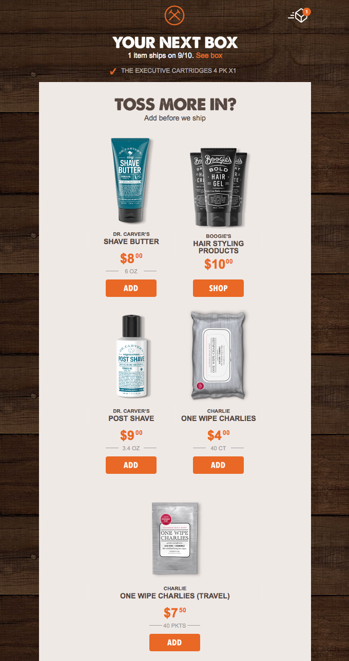
Here’s why it works:
- It reaches customers at the perfect moment. The email arrives before the next subscription box ships, giving subscribers a convenient opportunity to add products without placing a separate order.
- The recommendations are highly relevant. Instead of promoting unrelated items, the email suggests complementary grooming products that naturally fit alongside the customer’s existing purchase.
- It makes adding products effortless. Individual “Add” buttons let customers include extra items in their upcoming shipment with minimal effort, reducing friction and increasing the likelihood of an additional purchase.
- The messaging emphasizes convenience. The headline, ‘Toss More In?’, frames the offer as a simple add-on before shipping, making the upsell feel helpful rather than overly promotional.
Upsell and cross-sell emails work because they meet customers at a moment of maximum receptivity. Someone who just purchased a camera might need a memory card or carrying case – simple logic.
Bellroy (Post-Purchase)
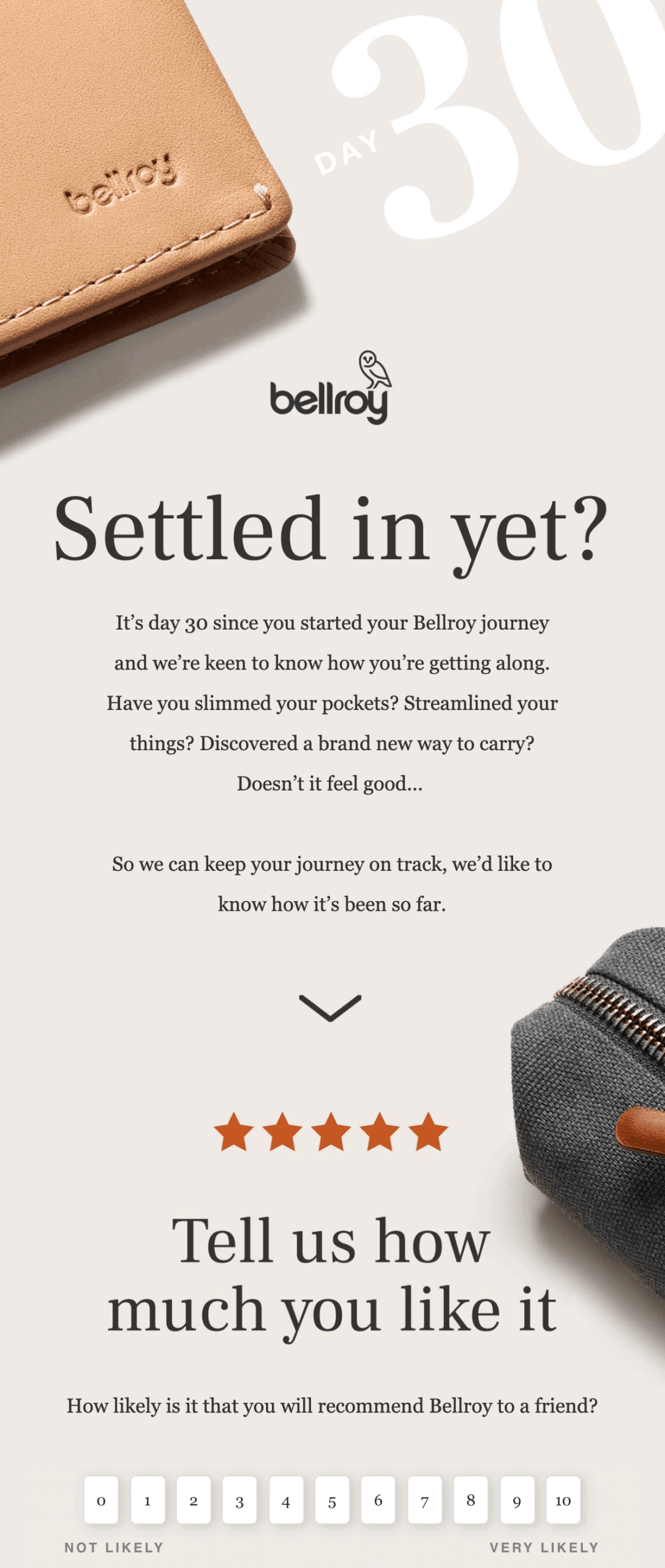
Here’s why it works:
- It checks in at the right time. Reaching out 30 days after purchase gives customers enough time to use the product, making the follow-up feel thoughtful rather than automated.
- It focuses on the customer’s experience. Instead of selling another product, Bellroy asks how the customer is getting on, reinforcing that their satisfaction matters beyond the initial sale.
- The copy reinforces the product’s value. Questions like ‘Have you slimmed your pockets?’ remind customers of the benefits they expected, helping validate their purchase decision.
- It encourages two-way engagement. Inviting customers to share how their journey has been so far makes the email conversational and provides an opportunity to collect valuable feedback.
Post-purchase nurture emails work because they meet customers exactly where they are–excited about their new purchase but potentially unsure about what comes next.
Frequently Asked Questions
A welcome email is a common example of email marketing. For instance, Food52 sends new subscribers a warm, personal message right after signup to introduce the brand, set expectations, and start building a relationship. Other email marketing examples include promotional offers, newsletters, abandoned cart reminders, onboarding emails, and order confirmations.
The main types of email marketing are manual campaigns, automated campaigns, and transactional emails. Manual campaigns include newsletters, promotions, and announcements. Automated campaigns are triggered by user actions, such as welcome emails or abandoned cart reminders. Transactional emails confirm key actions, such as purchases, bookings, receipts, or password resets.
Start with a clear goal, then write for a specific audience segment. Use an attention-grabbing subject line, concise copy, and one strong CTA. Personalize the message where possible, match the offer to the recipient’s needs, and test elements like subject lines, timing, and design to improve opens and clicks.
Automated email marketing, for instance purchase confirmations, is often the most effective. This is because it’s triggered by user behavior, such as signing up, abandoning a cart, or becoming inactive. These emails feel timely and relevant, which can improve engagement. Welcome emails, abandoned cart reminders, onboarding sequences, and re-engagement campaigns are strong examples.