
Email authentication support
Our platform supports SPF, DKIM, DMARC, and reliable SMTP delivery to ensure authenticated email delivery and protection of your domain reputation.
No Credit Card Required. Cancel Anytime.
No Credit Card Required. Cancel Anytime.
No Credit Card Required. Cancel Anytime.


A newsletter creator focuses on designing emails—templates, layouts, and content. While newsletter software goes a bit further: it helps you manage subscribers, automate campaigns, segment audiences, send emails at scale, and track performance. In short, creators design the message; software powers the entire newsletter strategy end to end.
A newsletter platform is built for ongoing content—regular sends, subscriptions, and audience growth. An email marketing tool is broader, focusing on promotions, automation flows, and sales-driven campaigns aimed at different audience segments.
Sender stands out by offering a rare mix of powerful features and genuinely free access. You can send up to 15,000 emails per month to 2,500 subscribers on the free plan, while still getting automation workflows, segmentation, A/B testing, and strong deliverability tools. Add a clean drag-and-drop editor, solid analytics, and no hidden limits, and it feels less like a trial—and more like a full newsletter tool built to scale.
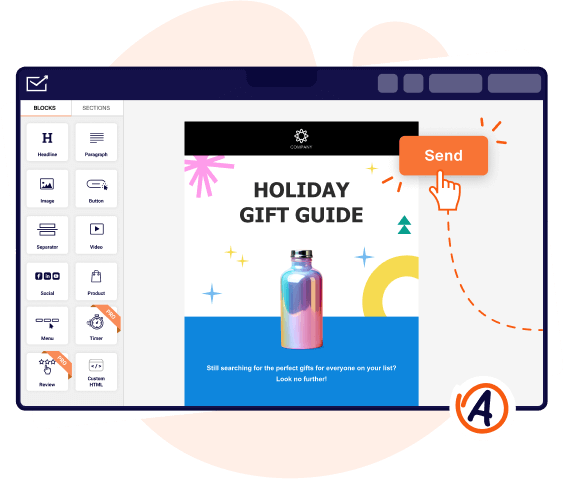
Yes, Sender includes an intuitive drag-and-drop email editor that lets you build newsletters visually. You can customize layouts, reuse saved blocks, add branded elements, and choose from pre-designed templates without touching a line of code. All designs are mobile-responsive, so your newsletters look great on any device.
Yes, with Sender you can easily migrate subscribers from another email platform by importing contact lists via CSV or syncing through integrations. You can bring over subscriber data, tags, and custom fields, then continue sending newsletters and automations without starting from scratch. The process is straightforward and designed to minimize downtime.
