Email Display on Mobile Devices
This guide shows how to optimize your email for mobile devices in Sender. It walks you through previewing, adjusting, and fine-tuning your email campaign design so it looks great on smaller screens.
Where to Find This Feature
In the Sender dashboard, go to:
Email campaigns → select your campaign → Design → Edit design


This opens the drag-and-drop builder, where all mobile display controls are located.
Steps to Optimize Email Display on Mobile
Step 1 — Preview Your Email on Desktop and Mobile
In the top toolbar of the email builder, click the Preview icon (eye icon). This opens a split-screen view showing your email on a desktop frame (left) and a mobile phone frame (right) simultaneously.


Use the Dark mode preview toggle in the upper-right corner to check how your design renders in dark mode on both views. The Email size indicator at the top left shows the approximate file weight, which affects mobile load times.
Step 2 — Adjust Mobile Spacing for Sections
Open Template settings by clicking the palette icon in the left sidebar, then scroll to Section settings. Below the standard SPACING controls, you will find a separate MOBILE SPACING section.

Set the Top, Bottom, Left, and Right values independently for mobile screens. Adjust the mobile Column spacing to control the gap between columns when they stack on smaller devices.
Step 3 — Control Column Visibility and Alignment on Mobile
Click any content block in the editor to open its settings on the right. Scroll down to Column settings and use the Visibility on mobile toggle to choose Show or Hide for that column on mobile devices.

For blocks like Logo, you will also see an Alignment on mobile option, which lets you set a different alignment (left, center, or right) specifically for mobile screens.
Step 4 — Optimize Buttons and Images for Mobile
Select a Buttons block and expand Button styles in the right panel. Use the Width option to choose full-width for buttons, making them easier to tap on mobile screens.

For images, add descriptive Alternative text in the image settings so content remains accessible if images are slow to load on mobile connections.
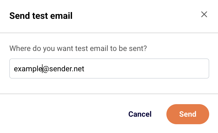
Step 5 — Send a Test Email to a Mobile Device
Click Send test email in the top toolbar. Enter your email address in the dialog and click Send.
Open the test email on your phone to verify the layout, spacing, font sizes, and button tap targets look correct on an actual mobile device.
What Happens After You Save
After saving, your email is stored as a draft in Email campaigns. You can continue editing or move to the next step. Use the Preview icon in the builder or Send test email to verify your mobile adjustments before proceeding to Recipients and Review and send.
Common Issues
Email looks different on mobile than in the builder preview — Mobile email clients apply their own rendering rules. Send a test email and open it on an actual device to confirm the layout.
Columns appear too narrow on mobile — Reduce the mobile Column spacing value in Section settings under MOBILE SPACING, or hide non-essential columns using the Visibility on mobile toggle in Column settings.
Buttons are hard to tap on mobile — Set the button Width to full-width in Button styles and increase the Vertical padding value for a larger tap target.
Images load slowly on mobile — Keep the total Email size under 100 KB where possible. Compress images before uploading and always add Alternative text so readers see a description while images load.
FAQs
Can I set different spacing for desktop and mobile separately?
Yes. Under Template settings → Section settings, use the SPACING controls for desktop and the MOBILE SPACING controls for mobile independently.
How do I hide a block on mobile only?
Select the block, scroll to Column settings in the right panel, and set Visibility on mobile to Hide.
Does the builder preview match how emails actually look on phones?
The mobile preview in the builder provides a close approximation. For the most accurate check, use Send test email and open it on your mobile device.
Can I preview dark mode for mobile?
Yes. Click the Preview icon in the top toolbar and enable the Dark mode preview toggle to see how your email renders in dark mode on both desktop and mobile frames.